在吕伐登市被评为2018年欧洲文化之都之际,公主博物馆也迎来了其100周年的纪念日。借此机会,博物馆进行了重大的改造,旨在提升对游客的吸引力和自身的便利性。i29事务所为这座源于18世纪的历史建筑打造了非凡而现代的室内空间,其最具特色的部分包括博物馆商店和茶室所在的门厅、博物馆广场以及容纳了大量藏品的展览空间。
Leeuwarden is the European Capital of Culture 2018, and museum Princessehof celebrates its 100th birthday. This anniversary was the motive for a major renovation of the museum, with the goal of increasing its appeal and accessibility to visitors. i29 interior architects created a surprisingly modern interior in the monumental buildings, which date from the 18th century. The design features an entrance hall including the museum store and tearoom, the museum square and exhibition areas for the vast collections.
▼博物馆外观,exterior view
设计的主要挑战是在较为封闭的历史建筑中创造一个友好且具有现代感的入口区域。与博物馆高度契合的新室内空间凭借其永恒的质感成为灵感与惊喜的源泉。博物馆还希望对藏品进行全面整理,从而为游客带来清晰而引人入胜的体验。不过,项目的资金预算十分有限。i29事务所受托与传媒机构The Ambassadors of Aesthetics共同致力于该项目的实现。
The main challenge was to create a welcoming and contemporary entrance area in the rather closed monumental buildings. A timeless interior that matches the museum as a place for inspiration and surprise. In addition, the museum wanted to reorganize their comprehensive collection with the goal of having a clear and surprising customer journey. However, the available financial resources for achieving these ambitions were rather limited. i29 interior architects was asked, together with communications agency The Ambassadors of Aesthetics, to translate this vision into reality.
▼新的入口区域被完全打开, the entrance area is entirely opened up
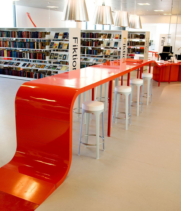
博物馆的入口区域被完全打开以吸引更多的游客,同时便于将观者引至茶室和博物馆商店。游客们可以从博物馆的前方和后方进入。宽阔的入口大厅使游客得以充分享受日光,同时使博物馆商店、收银台区域和茶室形成连接。空间中的平面形成微妙的高差,与土壤(陶瓷的源头)的分层形成呼应。柜台后方的坡道为残疾人士提供了进入博物馆的通道。与茶室相连的大型花园也同样向公众开放。
To attract more people and offer visitors the option of perusing the tearoom and museum store, the entrance area is entirely opened up. Visitors can now access the museum from both the front and back entrance. The new area welcomes visitors in a spacious entrance hall with lots of daylight. The space also connects the museum store, cash register area and tearoom in one. The horizontal alignment and level differences in these objects are a subtle reference to layers of earth, the natural resource of ceramics. Behind the counters integrated ramps offer disabled people access to the museum. A large garden that is adjacent to the tearoom has also been made accessible to the public.
▼宽阔的入口大厅使博物馆商店、收银台区域和茶室形成连接,the new space connects the museum store, cash register area and tearoom in one
▼茶室,tearoom
▼座位区域的陶瓷饰品,ceramic decorations in the seating area
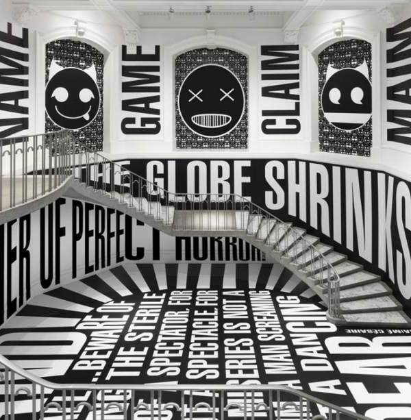
i29事务所为室内空间,尤其是走廊区域赋予了鲜明的对照性,以营造出强烈的感官体验。举例来说,茶室使用了十分明快的色彩,博物馆商店则以宁静的灰色调为主,从而将游客的注意力引向商品。从现代化的入口到华丽的博物馆广场的转变也十分令人惊讶。博物馆广场的墙壁铺设以手绘的壁纸,空间中设有整齐的图解装置、座椅和信息屏幕。经过充分的历史调研之后,The Ambassadors of Aesthetics将其余的房间修复至原本的样貌。
To create an intensive experience throughout the various spaces i29 added clear contrasts, which is most visible on the passage areas. For example, the tearoom features vibrant fresh colours, while the museum store, in contrast, has tranquil grey tones so that all of the attention is focused on the products. Also the transition from the contemporary entrance area to the monumental museum square is a surprising metamorphosis. The walls of the museum square boast hand-painted wallpaper, and has a sleek graphical installation with seating elements and information screens. Other rooms were restored in original colours after historic research by The Ambassadors of Aesthetics.
▼茶室使用了十分明快的色彩, the tearoom features vibrant fresh colours
▼博物馆商店以宁静的灰色调为主,将注意力引向商品,the museum store has tranquil grey tones so that all of the attention is focused on the products
▼博物馆广场,museum square
▼空间中设有整齐的图解装置、座椅和信息屏幕,the museum square has a sleek graphical installation with seating elements and information screens
在“大规模生产”展厅,一些看似简单堆叠的、发光的白色盒子将参观者置身于瓷器的海洋。与该装置相连的是“新艺术”展厅,它所带来的体验与前者恰恰相反。这是一个全然昏暗的空间,独立摆放的展品看上去如同漂浮在空中。简洁的设计介入与古典的建筑外观形成了对比,新与旧、历史性与现代性在该项目中实现了互补,共同构成一个富有力量的整体。它将建筑的历史价值放置在现代的背景当中,而不止于功能性的层面。塑造震慑人心的环境并不一定要仰仗昂贵的材料和技术,i29通过该项目向我们证明了他们的设计哲学。
For the ‘Mass Production’ room, an installation was made of what seems to be simply stacked, brightly lit white boxes where visitors are fully encircled by ceramics. This installation leads to the ‘Art Nouveau’ room, where the experience is exactly the opposite. The room has been completely darkened, isolating the exhibited objects and making them look like they are ‘floating in the air’. The pronounced simplicity of the design interventions contrasts with the monumental shell. The contrast between old / new and monumental / contemporary complements each other, and together they form a powerful and surprising whole. It places the monument back into the here and now, not only in the functional sense. In line with i29’s design philosophy that an inspiring environment is not dependent on expensive materials or technical show, this project was completed on a very tight budget.
▼“大规模生产”展厅,’Mass Production’ room
▼看似简单堆叠的、发光的白色盒子将参观者置身于瓷器的海洋,an installation was made of what seems to be simply stacked, brightly lit white boxes where visitors are fully encircled by ceramics
▼展品细部,detail
▼“新艺术”展厅是一个全然昏暗的空间,the ‘Art Nouveau’ room is completely darkened
▼独立摆放的展品看上去如同漂浮在空中,the isolated exhibits look like ‘floating in the air’
▼室内展厅,exhibition room
▼色彩的对比无处不在,impact through contrast
▼平面图,plan
Client : The Princessehof Museum Interior design: i29 interior architects: Jaspar Jansen, Jeroen Dellensen, Begona Masia, Shyla Rietveld, Egle Jacinaviciute Concept/communications: The Ambassadors of Aesthetics, Menno Landstra Surface area: 1,200 m2 Location: Leeuwarden Project management: FMXXL Contractor: bouwbedrijf Van Marrum bv Interior construction: Zwartwoud bv Photography: Ewout Huibers
{{item.text_origin}}


