Architects:Studio 2Pi Architecture
Area :180 m²
Year :2019
Photographs :Pygmalion Karatzas
Manufacturers : Chaos Group, AGGELAKOPOULOΙ BROS, Adobe, Alpha Shadow, Bentley, INTRADOOR, ISOMAT - EPS INSULATION, KAFKAS, Knauf, Mapei, PSICTOTHERMIKI, SINTECNO, TO YIALI, Trimble, VIVECHROMChaos Group
Landscape :S2PiA
Design Team : Konstantinos Salapatas
Clients : NEON BAKERY & COFFEE
Engineering : Giorgos Taraviras Structural Engineer
City : Dalamanara
Country : Greece
Our proposal was concerned with the renovation and refurbishment of an existing building that hosted an old taverna and was revamped as a bakery and coffee shop. It is a ground floor building constructed before 1955. Its positioned along the National Highway between Argos & Nafplio and as a result its use and the architectural design is predetermined by the constant flow of people and goods in this busy road. The existing building consisted of adobe walls and a timber roof with byzantine tiles as covers.
Not being able to intervene in the original sell we decided to clad the walls with a “fine dress” made from wavy Perforated Aluminium Sheets that can accommodate all the ancillary infrastructure supporting the facades. Sliding doors, gutters, lights, cameras, alarms all placed between the existing walls and the new cladding system. The existing walls are painted white in order to disappear behind the new façade.
There has been a conscious decision to minimize the visual information that the eye receives in terms of geometrical forms and an effort to maximize the purity of the existing volumes. The traveller that passes by has very limited time to register the information of the building, this is a result of the busy road and the speed that he is moving at that time. During the night the building shines and the diffused lighting behind the perforated sheets imitates a lantern. Our efforts were focused on showcasing and highlighting the building itself and not to use signs or other means to invite new consumers.
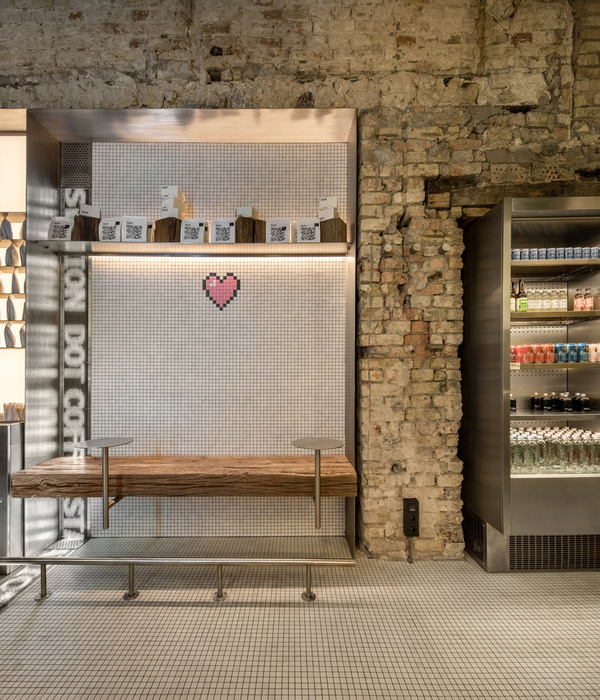
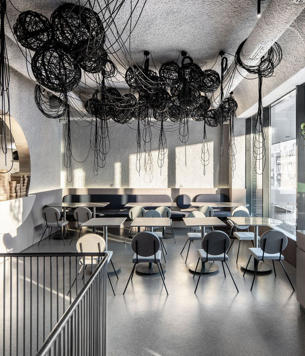
The shape of the roof maintains the original hipped design but now relates to the rest of the building visually by replacing the byzantine roof tiles with the white render of the external insulation. Gutters and rainwater pipes are hidden either within the roof or behind the new cladding. In the interior the concrete flooring along with the white pleated gypsum decoration of the walls behind the counters create a visually “clean” environment that allows the products and goods to take the leading role.
The counters and the food trays are coloured black so the bakery goods, pastry goods, drinks and sodas with their colourful presentation and wrapping invite customers to pick them up. A small gesture for the plane of Argolida that lies behind us and an attempt to divide the open space, so the uses are defined but not exclusive was the positioning of a sole tree in the centre of the interior space. The scale of the tree keeps close to the human body so the connection to the citrus trees that are typical throughout the entire plane is easily adapted.
▼项目更多图片
{{item.text_origin}}

