Firm: Ted Moudis Associates
Type: Commercial › Office
STATUS: Built
YEAR: 2014
SIZE: 10,000 sqft - 25,000 sqft
Photos: Brent Gollnick (8)
Initiative is a part of the Mediabrands family under the IPG umbrella of marketing agencies. Ted Moudis designed a new workplace for the organization, helping them to transition from an office-heavy setting and bring the Initiative Chicago office into the “open office” standard being practiced throughout the country at other Initiative and IPG locations. The project team was comprised of Ted Moudis Associates as the designer and architect of record, Jones Lang LaSalle as the client’s Project Manager, ConopCo as the Landlord’s Project Manager, ESD for engineering, DSI as the general contractor, and Lane Office as the furniture dealership. This project was running simultaneously with a project for another division of the IPG family that would be located within the same building on a different floor.
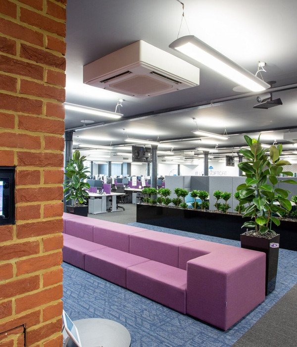
Initiative’s previous office environment was comprised of a 60% to 40% split of workstations (with a traditional panel-based system) to private offices. The plans for the new environment created a space that was 100% open office with 30% of the total square footage dedicated to shared areas. There was initial resistance to this change, but the inclusion of the various styles of meeting spaces: open, enclosed, large, small, writable wall surfaces, tackable wall surfaces, video conferencing, training rooms, and a town-hall room with a bar (to highlight one of their key clients) helped to facilitate the transition.
The simplicity of the design starts with the elevator lobby. Inspiration was drawn from the prominent clock tower across the way. By playing off of the black wrought iron and bringing in a sense of the outdoors through the rugged sconces and pendants, the interior blends with the exterior. Once inside, the use of oversized sliding glass doors allows for the conference room to open up to the reception area and to continue the expanse to the lounge space, creating a town-hall center for the entire office while still maintaining visual clearance to the three distinct rooms when not combined. The large conference room, while sleek and clean, brings an element of rustic exposure in the live edge reclaimed-wood table. In the open office area, all shared spaces were brought inboard to allow the natural light to wash over the staff as well as to let the vividly branded colors act as a revolving backdrop to the space.
{{item.text_origin}}

