- 项目名称:莫干山溪岸民宿
- 设计单位:Z.H.D.I
- 完成年份:2020.06
- 主创设计:周恒
- 设计团队:李立
- 项目摄影:周恒
- 家具定制:永辉家具
- 项目地址:浙江省莫干山风景区
- 建筑面积:600平方米
- 主要材料:木饰面,水泥,不锈钢
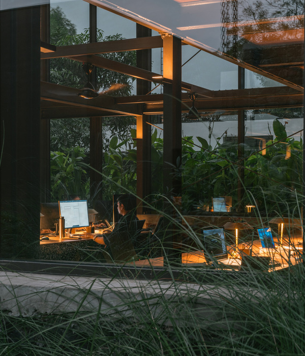
项目位于莫干山国际登山步道41号,接手时建筑立面已完成且无法改动,所以设计重点主要在景观环境与室内展开。
The project is located at No.41 Moganshan International Hiking Lane. The design is mainly focused on the landscape and the interior, as the architectural structure was completed before I joined in.
▼空间一览,overall view of the project
业主是一位刚从古巴回来酷爱人文摄影的女孩子,也在古巴和德国做过相应个展,这也为民宿定了主基调。在探讨中我们希望在主楼阁楼的空间和外围原车库空间设置两个艺术展厅,在这两个点之间的景观、大厅、房间公共空间也无规律地分布展示点,通过车库位引入,最后在阁楼位有一个更深度的体验,包括视觉与听觉的结合展示等可能性,这样将整个民宿各个空间通过展览方式紧密连接在一起。
The owner of the residence is a photographer-lover, who held solo exhibitions in Germany and Cuba. It sets the keynote for the design. We decide to make two exhibition spaces, one in the garage, one on the top attic. Different exhibition points are laid out between these two ends, stretching through the landscape, main hall, third-floor public space, etc. The garage is a lead-in, and the guests can experience a mixture of intense visual and audio sensations on the attic. In this way different spaces are connected through exhibitions.
▼一层平面图,first floor plan
景观营造以白色为主,为后期做展提供更多色彩可能性,又与周边的绿色相得益彰。入口通道转折设置,解决了原来不规则地面的问题,又为走动和拍摄带来了更多的趣味性。不同高度墙面的穿插,遮挡了不同角度视线以下杂乱的周边环境,低矮的水泥长条凳又借了对岸大芭蕉树的景,整体达到了梳理与周边环境关系的目的。
The landscape applied the pure white tone, which offers more possibilities for exhibition layout. The sharp white also contrasts well with the surrounding green. The Zigzag path at the entrance solves the problem of irregular land surface, and creates more fun for walking and photo-making. The paralleling high and low walls shelter the redundant surroundings. And the long cement bench contrasts well with Chinese banana trees at the other bank of the stream, forming a good relation between the architecture and its surrounding environment.
▼白色为主的景观,landscape in white tone
▼通向建筑的景观台阶,landscape steps connecting to the building
▼转折的入口通道,zigzag path at the entrance
▼休息区,rest area
▼泳池,swimming pool
原大厅独立的柱子比较多,三开间又相对封闭,所以大厅的主要设计目标是尽可能打开空间,通过有实际意义的结构与材质来梳理地面、墙面、柱子、顶面的关系,达到统一性和形成合理动线的同时,为每个功能区在封闭与开放之间寻求一个最舒适的平衡点,局部区域的留白也为以后展示预留更多可能性。
The main hall originally has four independent pillars, which makes one feel boxed in there. So the design aims to open up the whole space as far as possible. Only essential structures and materials are remained, so as to balance the relation among the floor, the wall, the pillars and the ceiling. The simplification helps to form reasonable and flexible moving lines, reaching a balance between confinement and openness for each functional area. Besides, the organized blankness in certain areas also leaves more possibilities for future exhibitions.
▼大厅休息区,lobby lounge
▼吧台,bar
▼就餐区,dining space
▼展示区,exhibition shelf
▼泳池侧的休息区,lounge at the side of the swimming pool
▼楼梯与大厅之间的视线连接,visual connection between the staircase and the loby
▼楼梯间,staircase
三楼公共区域与阁楼之间新加了一个中空,在不“大动干戈”的前提下将上下两个展示空间联系起来,阁楼从而形成了一个回行廊道,创造了更多展示面,天窗的自然光打到有色彩的原屋顶、又反射到中空里面,达到了一个舒适的光影状态。阁楼作为主要的展示空间全部设置白墙,又在业主在古巴摄影作品中找了一个老爷车的颜色作为原屋顶的色彩点缀。
A new hollow space is added between the third-floor public space and the attic, connecting the two exhibition spaces without making a big fuss. The attic thus forms a circling corridor, creating more surfaces for future exhibitions. Natural light from the skylight hits the green-painted wooden ceiling, and shines through the hollow space, reaching an interesting light and shadow play.
▼三层中空的公共空间,double-height space on the third floor
▼阁楼展示区,exhibition space in the attic
客房也以手工感较强的白水泥墙、浅色木纹、藤编等材质为主,相应的家具也进行了设计,极简的家具在生产成本和视觉上也达到了一个比较好的平衡点。不同的房间根据形状与视线不同都做了不同主题的设计,包括有泡汤房、茶室房、亲子房等等。
The guest rooms feature white cement walls, light wood grain and rattan, with custom made furniture dot in-between. The furniture of minimalism strikes a good balance between visual appeal and the cost. Different rooms are designed accordingly with different themes concerning the shapes and sight lines. They are the spring room, the tea room and the family room, etc.
▼客房,浅色材料为主,guest room with materials in light color
▼浴缸,bathtub
▼木制和藤编家具装,wooden and rattan furniture
本案更多的是在解决问题,在合理的需求和成本下,通过各关系的梳理,构造,拉近与环境、光的关系,在达到商业目的的前提下,营造一个简洁、舒适、平和而不造作的空间环境。
The case also delivers the importance of problem-solving. Particularly, the building illustrates how to strengthen the relations among the building, environment and natural light by clarifying such relations while meeting certain requires and reaching cost control. It is also the built proof that through design, we can create a simple, comfortable and nature-connected living space meanwhile achieving commercial objectives.
▼客房中的茶室,tea room in the guest room
▼阳台上的休息区,rest area on the balcony
▼二层平面图,second floor plan
▼三层平面图,third floor plan
▼四层平面图,forth floor plan
项目名称;SeeAnn溪岸民宿
设计单位:Z.H.D.I
设计内容:室内设计、定制家具设计、景观设计
完成年份:2020.06
主创设计:周恒
设计团队:李立
项目摄影:周恒
家具定制:永辉家具
项目地址:浙江省莫干山风景区
建筑面积:600平方米
主要材料:木饰面、水泥、不锈钢
{{item.text_origin}}

