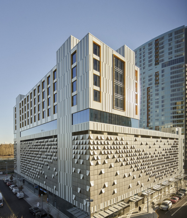
FCA designed the expanded Hackensack Meridian Old Bridge Medical Center in Hackensack, New Jersey.
To address growing patient volumes, the Hackensack Meridian Old Bridge Medical Center will debut an expanded Emergency Department with additional treatment rooms in early 2022. Serving Central New Jersey for more than 40 years, Old Bridge Medical Center brings broadened emergency services and capabilities to the community. The organization turned to architecture and design firm FCA to expand their current campus while implementing a new emergency department. This 24,000-square-foot expansion project will more than double the center’s existing footprint.
Having worked with Old Bridge Medical for over four years on various projects, FCA’s in-depth understanding of the existing facility allowed the team to reimagine the emergency department and the campus circulation, utilizing state of the art healthcare design. As both the architect of record and project designer, FCA worked closely with the clinical team to minimize any on-site disruption during the multi-phase expansion process.
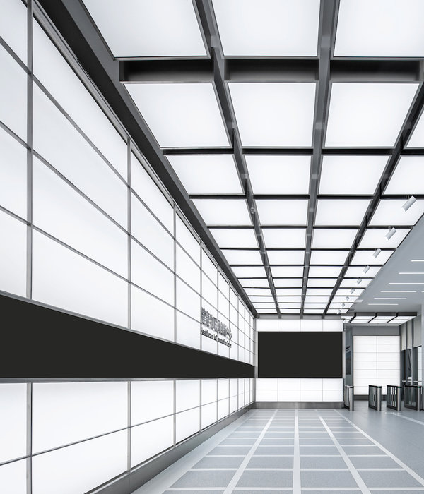
In addition to renovating and expanding the emergency department, the Old Bridge Medical Center needed more connectivity between the three buildings to further enhance the campus’ wayfinding and accessibility. The building’s bright interior shines through to the exterior, allowing it to illuminate the surrounding area throughout the night. The lighting emphasizes the facility’s stance as a beacon to the community as it continues to serve patients 24 hours a day. The primarily glazed exterior creates a new concourse with visible sightlines to approaching patients and visitors. As a result, people can be seen traversing through the corridor, which helps visitors and new patients easily navigate the facility.
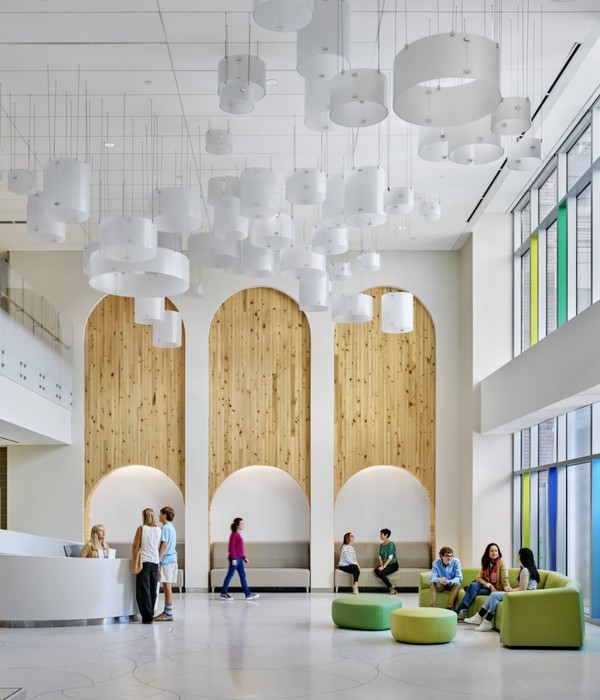
FCA added warmth to the dated clinical spaces through clean, modern surfaces while utilizing color as a wayfinding tool. The interior wall of the concourse exudes a prominent color wash, starting with the Old Bridge Medical branded blue at the main lobby and later transforming into a warm red to reinforce the emergency department walk-in entry point. The concourse is very neutral to allow the color gradation to be prominent.
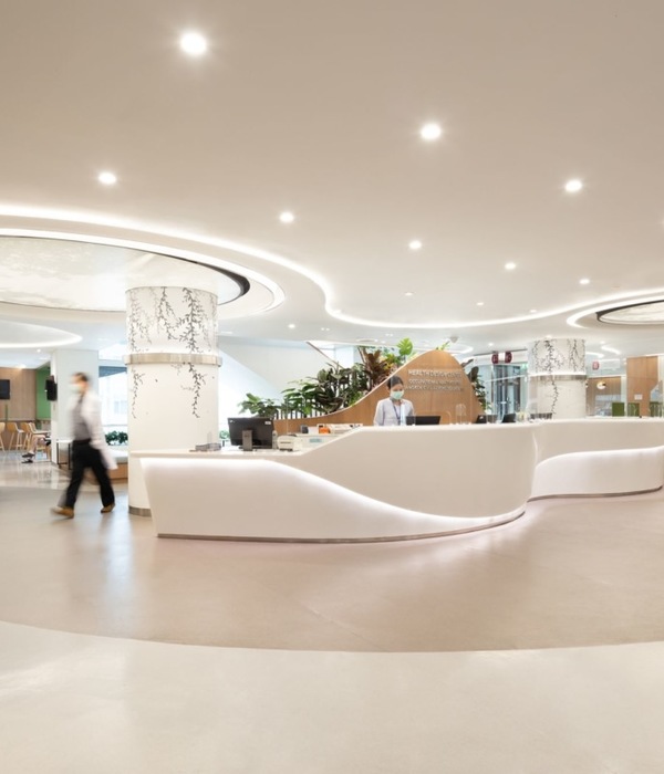
Within the emergency department, the color palette intentionally creates a calming effect for both patients and staff. Subtle color shifts in various locations help patients and visitors recognize the different areas within the emergency department. A more concentrated level of finish is used at the nurse stations to emphasize the location of the clinical teams and indicates where individuals can go for assistance. FCA utilizes natural textures throughout the space, including wood-like patterns and fabrics, to create a bright yet relaxing atmosphere. The new main lobby is the focal point for arriving patients and includes a new café and waiting space linking the hospital to the adjacent medical office building. Custom elements such as the new main check-in desk, colorful wall coverings, and custom abstract graphics give the expansion its unique look and feel.
To ensure a cohesive design, FCA added a new main entrance connecting directly to the new campus concourse. The efficient layout of the expanded emergency department is set to decrease patient wait times and lend to an overall smoother visitor experience. Through modern elements and innovative wayfinding techniques, the Old Bridge Medical Center’s newly expanded emergency department will be aesthetically pleasing in addition to providing state of the art medical care.
Design: FCA Photography: Jeffrey Totaro
Design: FCA
Photography: Jeffrey Totaro
8 Images | expand images for additional detail
{{item.text_origin}}

