大都会神学院翻新与扩建 / ACXT
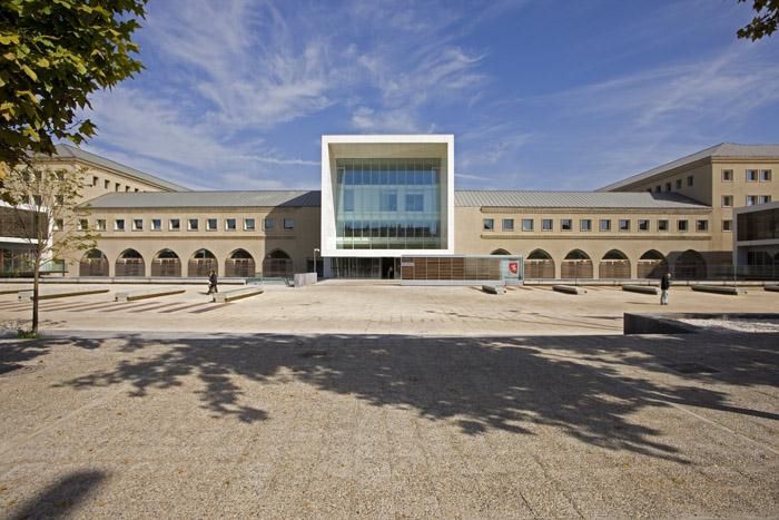
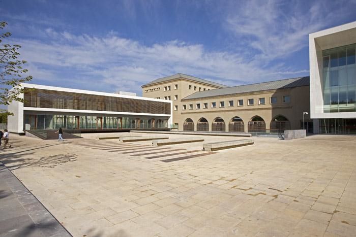
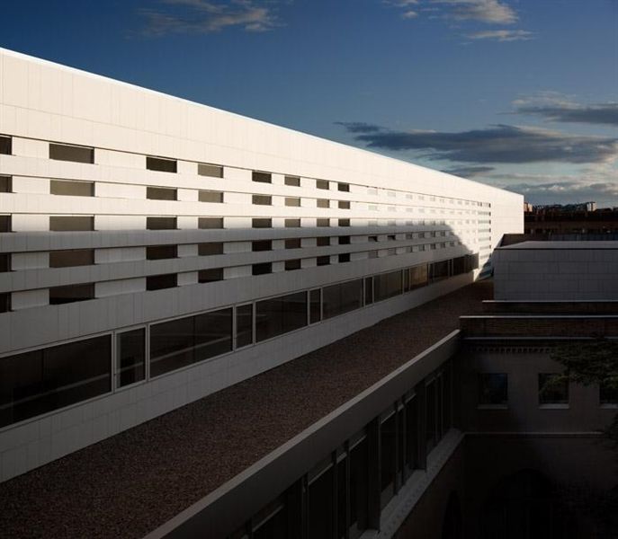
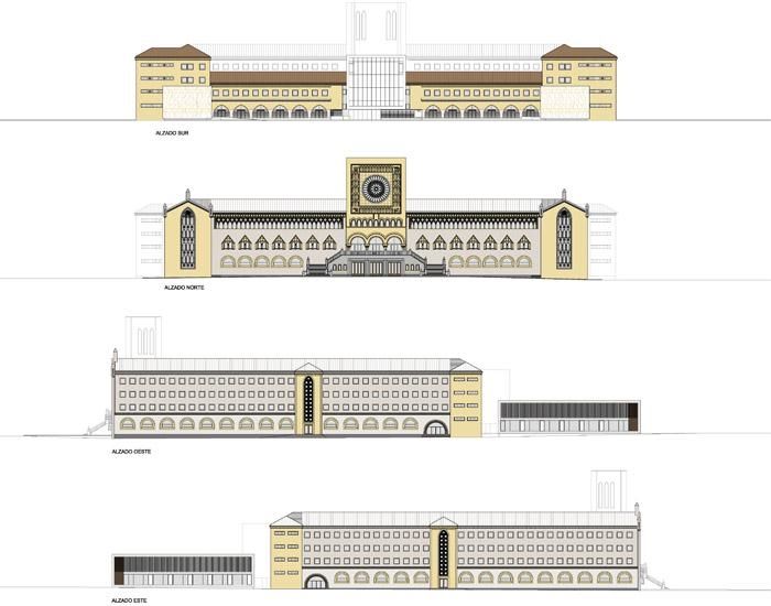
This renovation and enlargement project makes no attempt to conceal its architectural additions and respects the style of the original building. The new sections are designed to blend in with the old and seek to create a fluid dialogue between the renovated area and the enlargements.
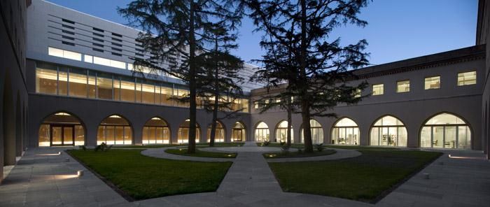
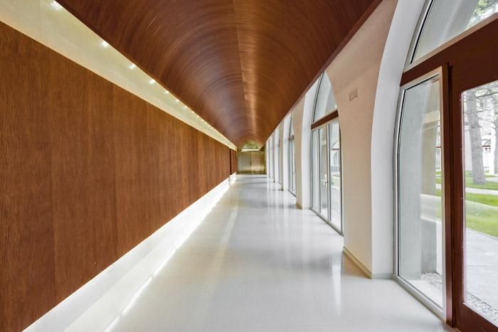
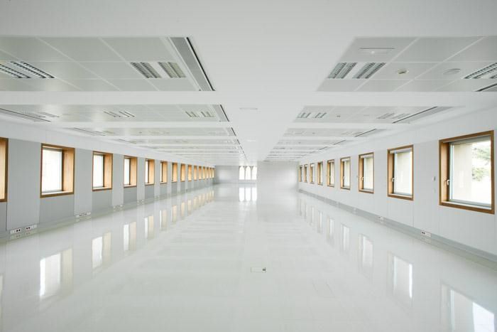
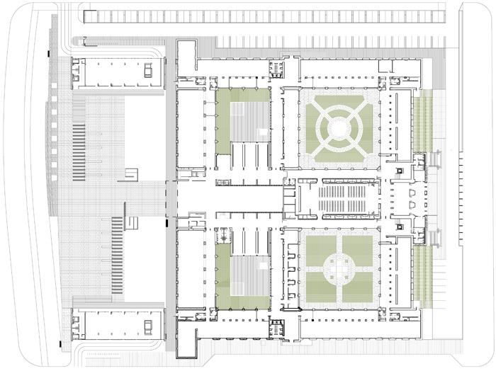
The original building featured the long corridors typical of cloisters, unsuitable for the quick, direct traffic required in a major admin centre. Our project overcame this problem by converting the cloisters – attractive, calm places to work – into offices, eliminating the enormous corridors as much as possible and creating two-fronted admin areas.
The proposal concentrates movements and common areas in the inner crossing areas, where the most important functions are to be located, reserving the perimeter wings for the building´s admin functions. The main north-south crossing areas is the core of the building whilst the east-west crossing area is a hub leading to the different departments. The proposal envisages a natural filter between public and restricted areas running south-north along the main axis and from the ground floor to the top floor.
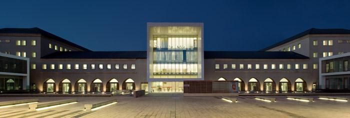
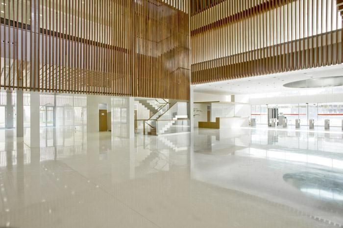
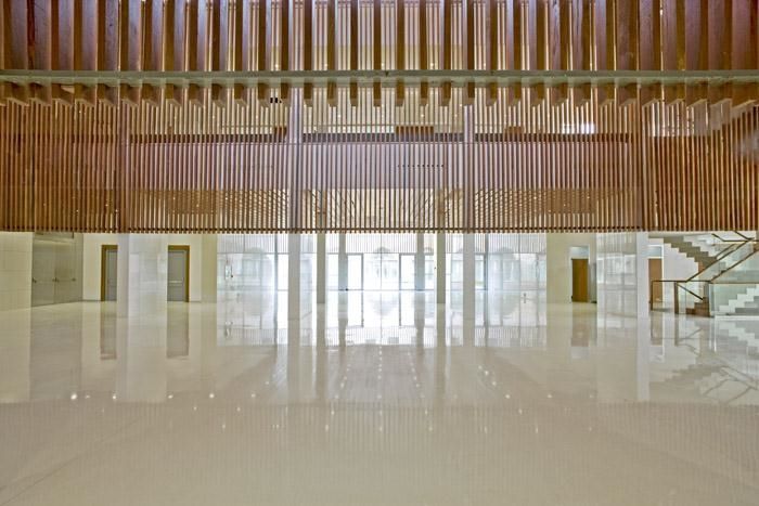
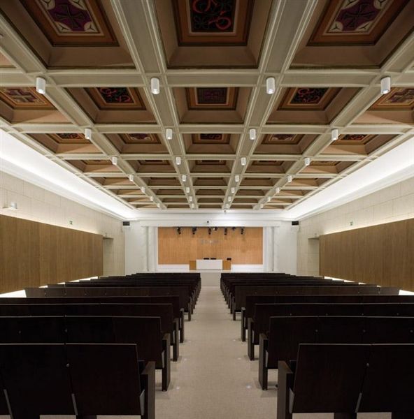
The large lobby acts as the building´s new cloister, linking the building´s two crossing areas and organising the general public´s movements around the assembly room and the other main rooms. The resulting functional layout is simple, straightforward and immediately clear to users. This lobby becomes the building´s representative public area and reception hall for all users.
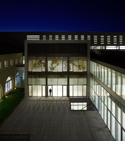
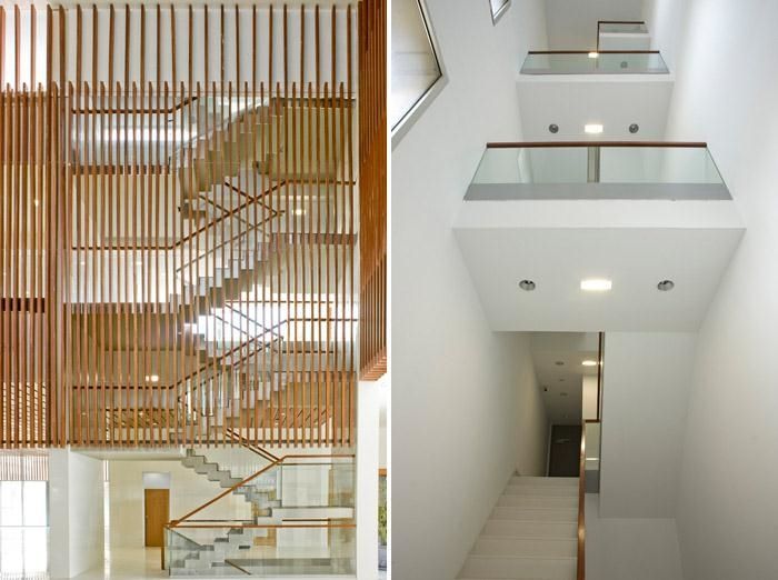
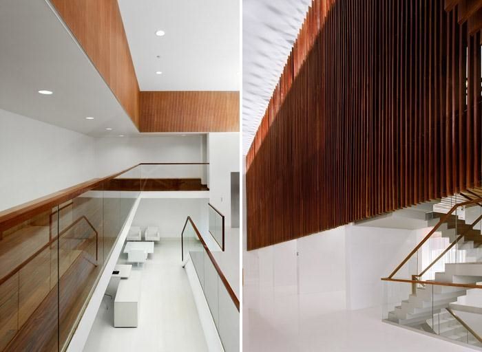
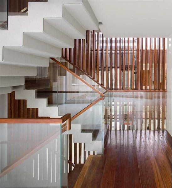
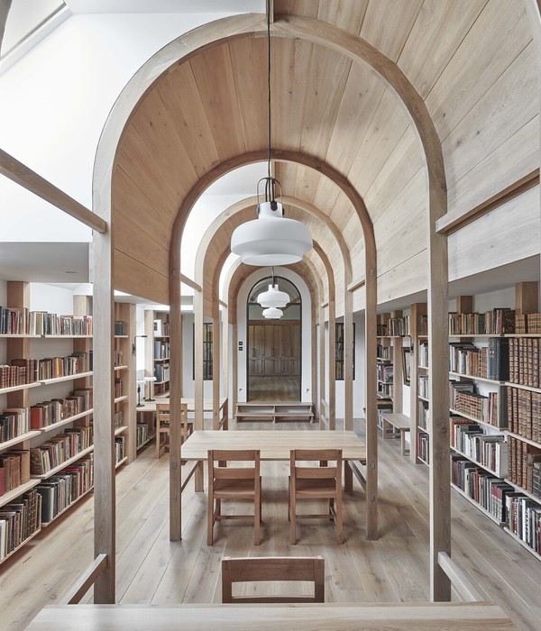
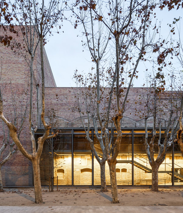
The project is clearly designed from the outset to control daylight. The new frames on the renovated façades ensure good ventilation and air- and water-tightness. These low-key frames convey an image of a compact building, accentuating the original windows and traceries. By night, artificial light will outline each window. By day natural daylight will flood the offices, with wooden slats to filter and control it in the corridors.
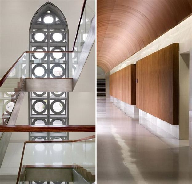
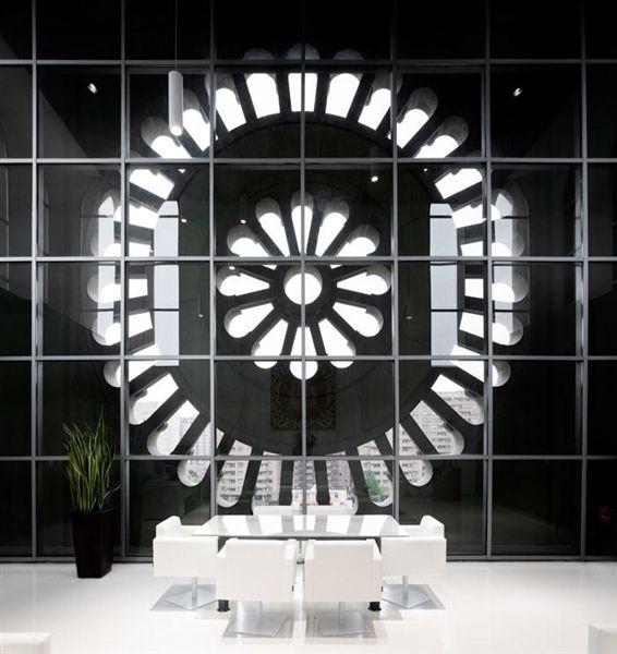
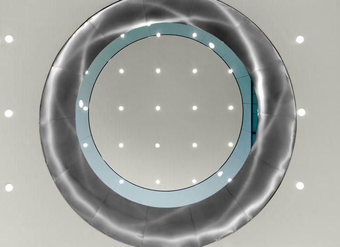
A large, new oculus in the south façade will echo the block with the rose window and become the new icon of the seminary plaza.
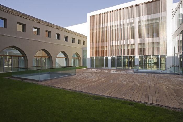
项目的翻新及扩建尊重原有建筑风格,没有掩盖原有建筑的势头,而是寻找了新与旧的结合,增大使用面积又加强新老间的对话。
原有建筑的回廊式交通不符合管理中心的交通方式,设计师因此加上了楼梯和走廊,让流线快捷有效,办公环境舒适安静。
建筑的“翼”在交汇的地方产生公共空间用以活动。南北轴是建筑主要区域。修道院两侧建筑的汇聚出有着为人们提供的大接待区,公共区和会议室。设计用外墙上的新格栅表皮控制日光,保持通风和湿度。同时这一低调的外表皮让新建部分谦虚,原有建筑依然是醒目的存在。晚上,灯光又从格栅透过,映射在地上。南侧立面上一个大的玫瑰型窗户成为神学院广场的新标志。
