Montessori 幼儿园 | 自由成长的环境
"To help a child, we must provide them with an environment that allows them to develop freely" - Maria Montessori.
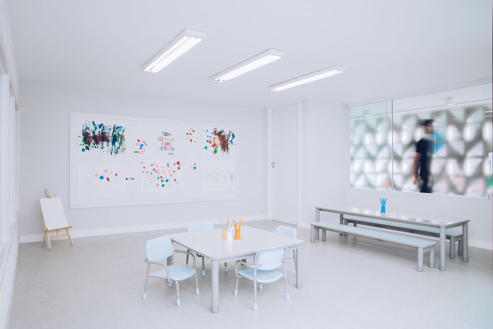
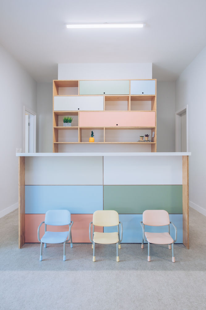
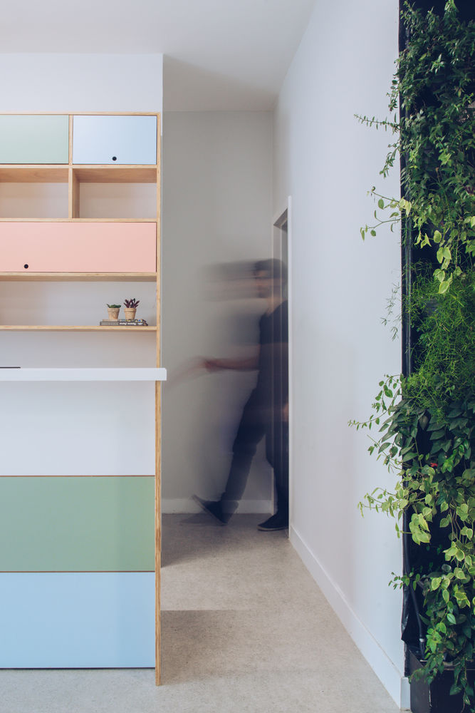
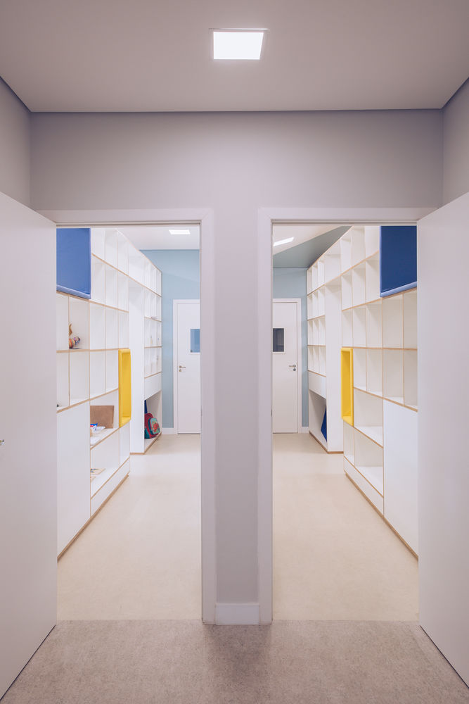
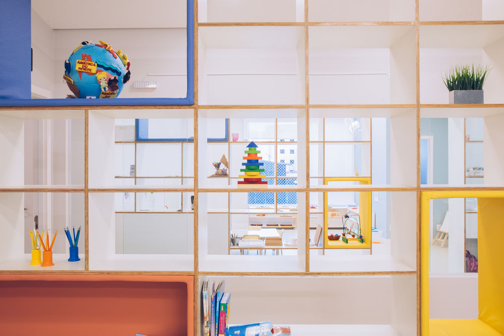
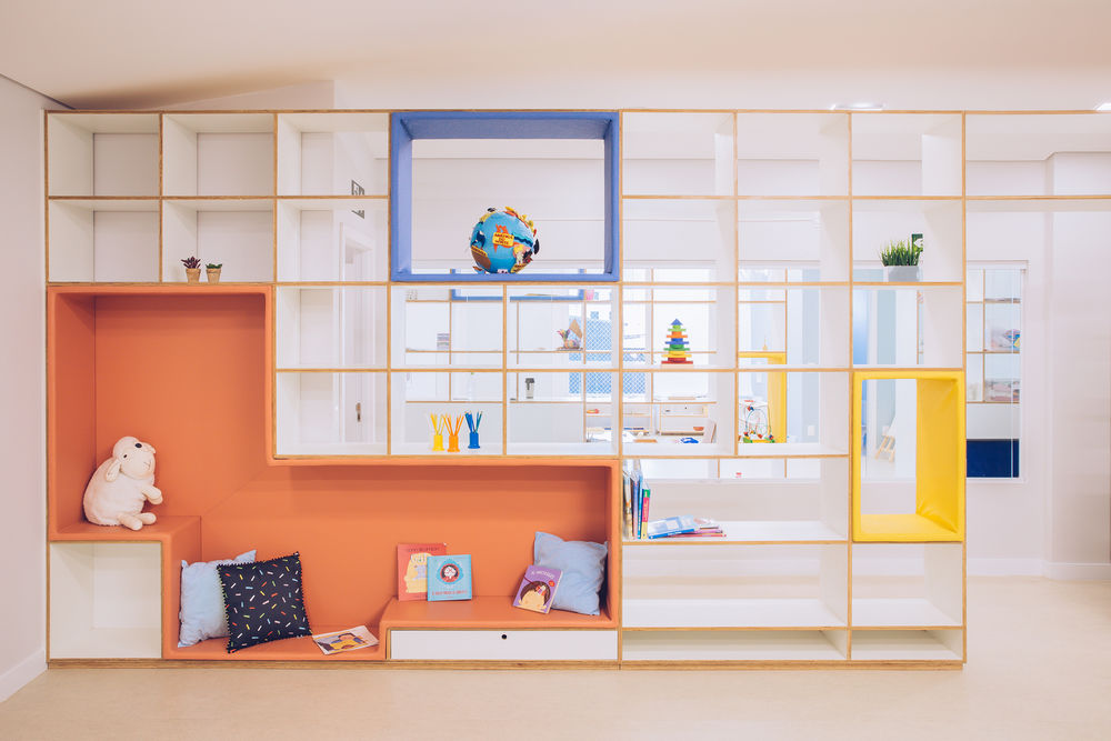
Taking this phrase as a design premise, we needed to serve the client in a specific way, thinking like children. Firstly it would be necessary to choose colors that could suit the children, taking into account the importance of primary colors. However, we did not want to work with saturated colors in the interior, so we adapt furniture, carpentry, and coatings with a more neutral palette.
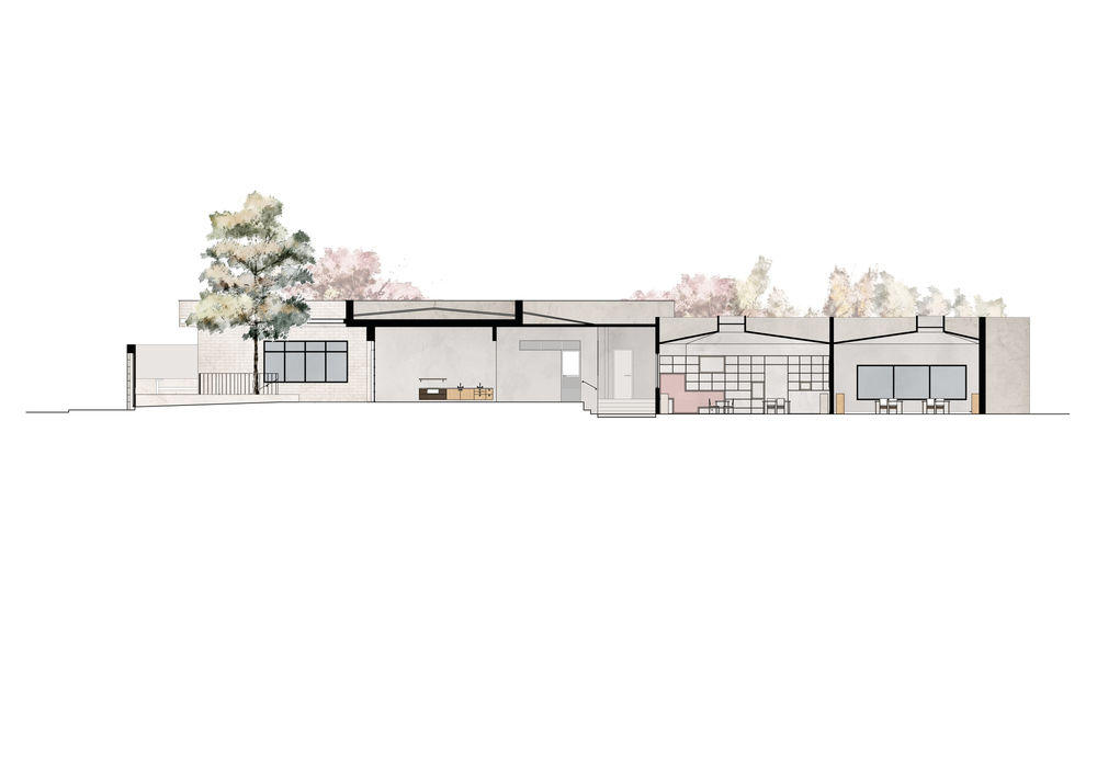
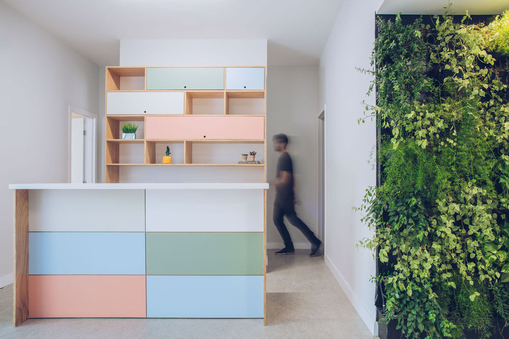
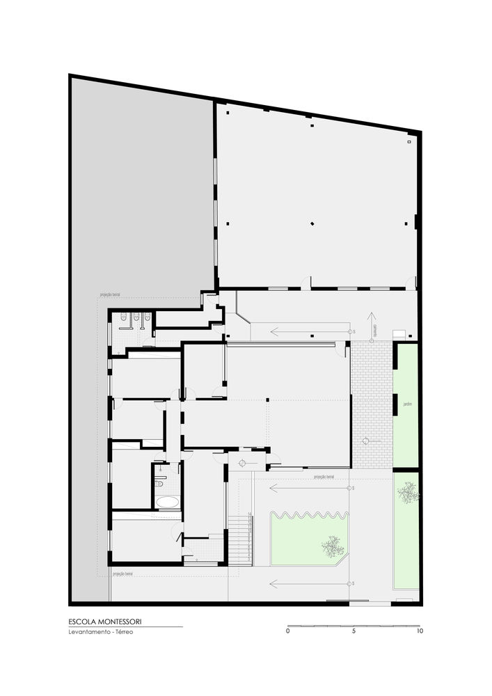
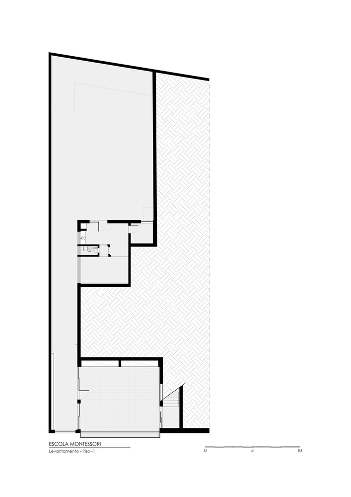
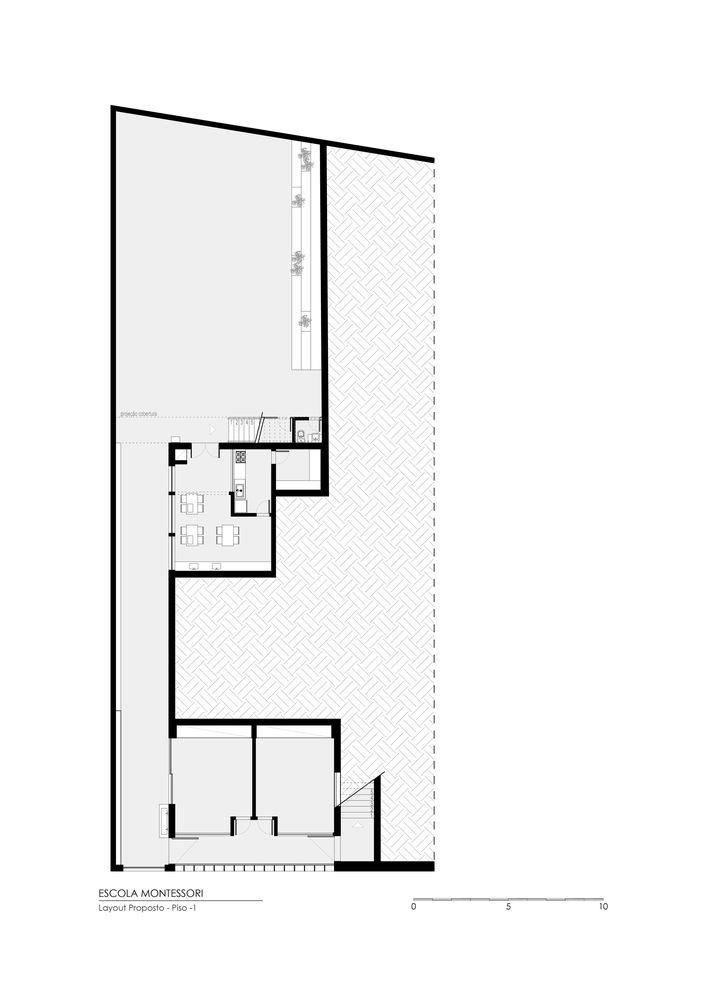
The existing building was designed in the 1950s, where the approved project already contained pertinent modifications for residential use. After the 2000s, it became a college preparatory courses for college entrance exams, so it once again underwent major modifications in its functional and even aesthetic structure.
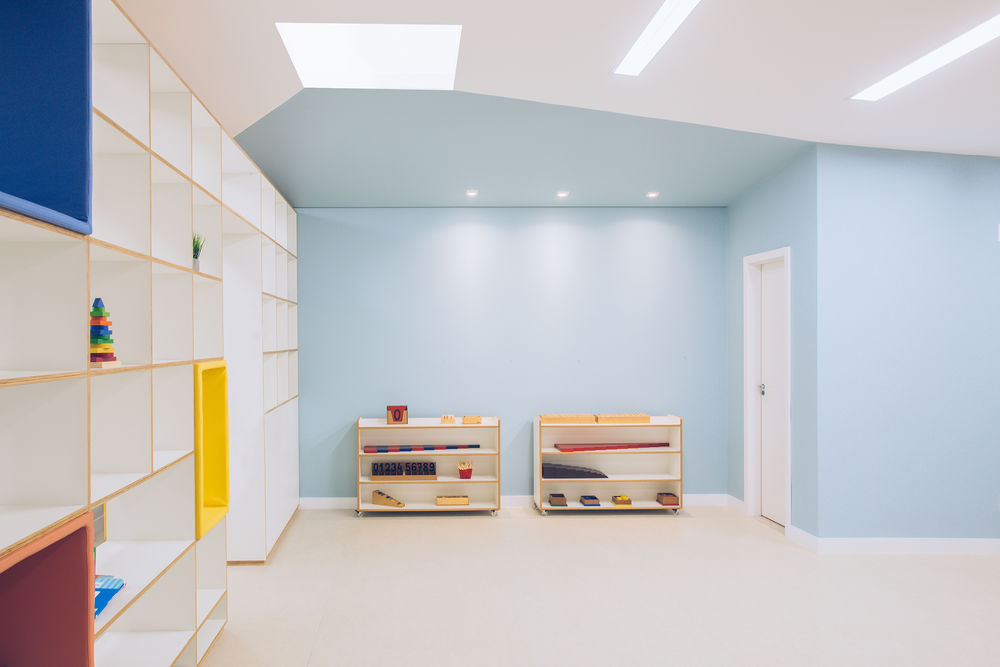
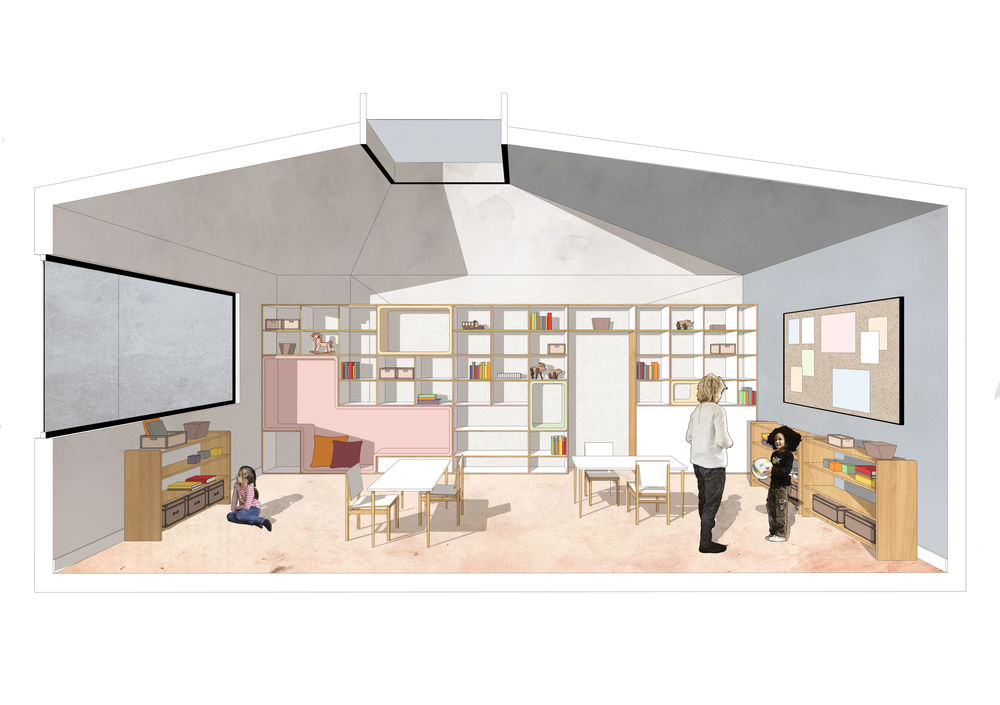
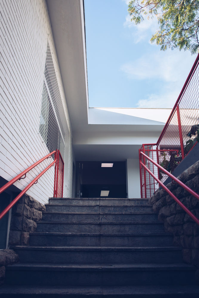
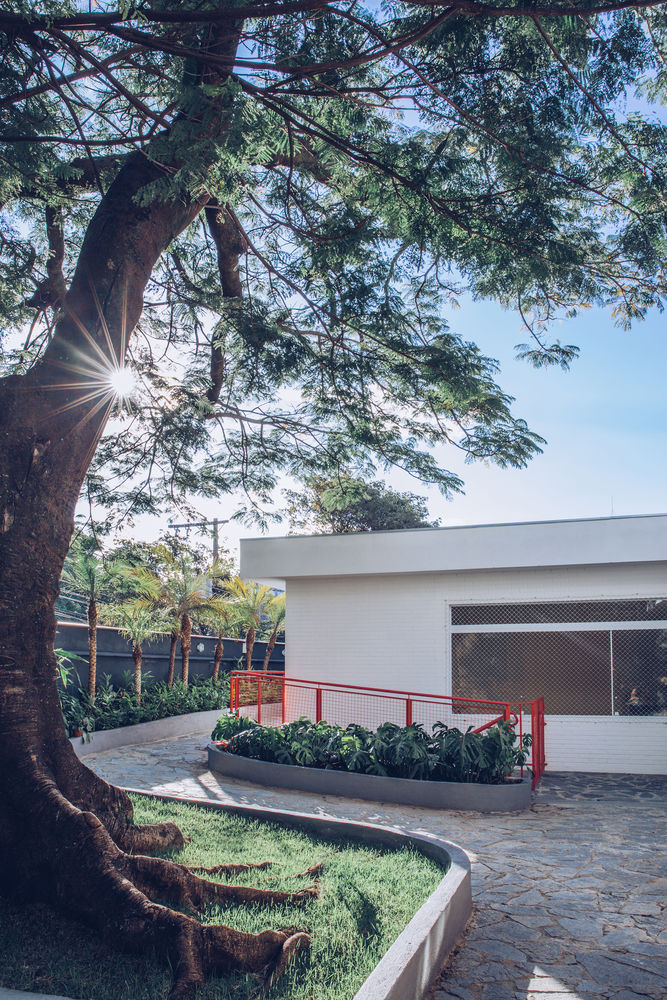
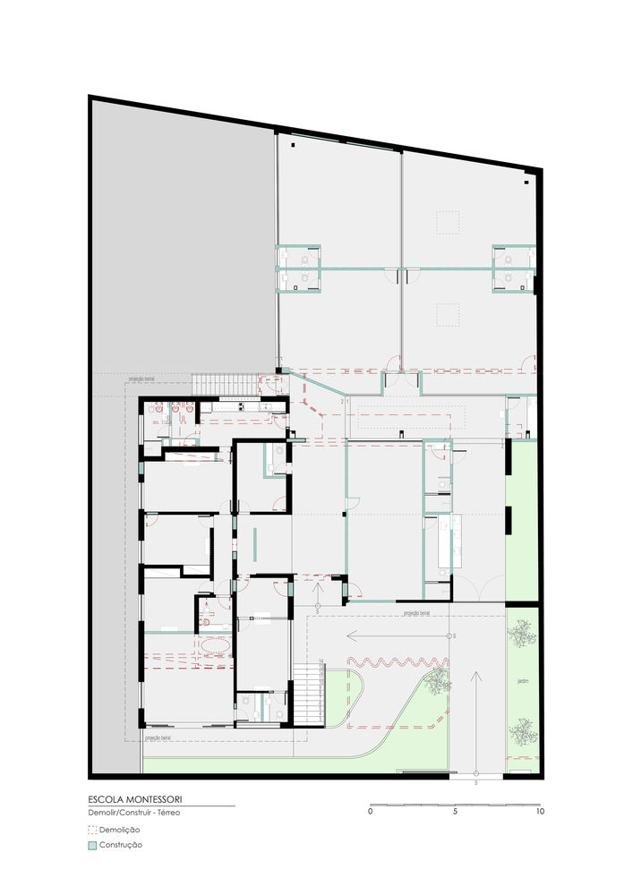
Accesses, walls, windows, and doors have been adapted, internal spaces have been replaced and a large shed was created to receive the lined desks of modern learning. In order to adapt this common usage to a well-lit and ventilated Montessori space, another change was required, where we created zenith openings, openings for visual communication, new, more dynamic flows, and more apparent the original architecture of the existing house.

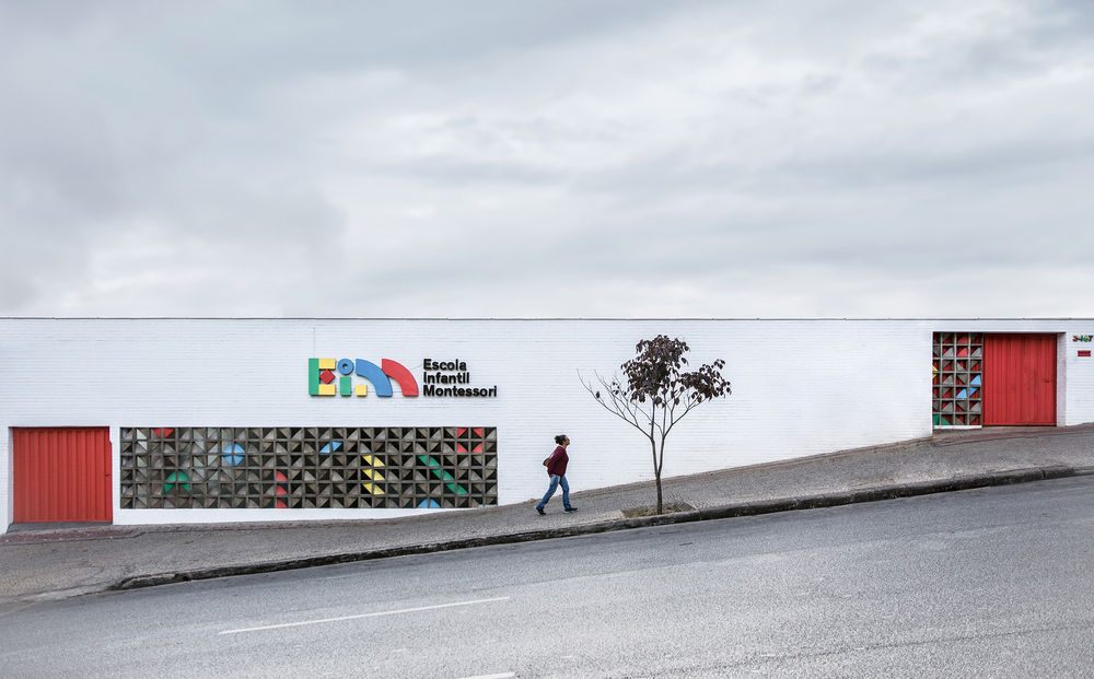
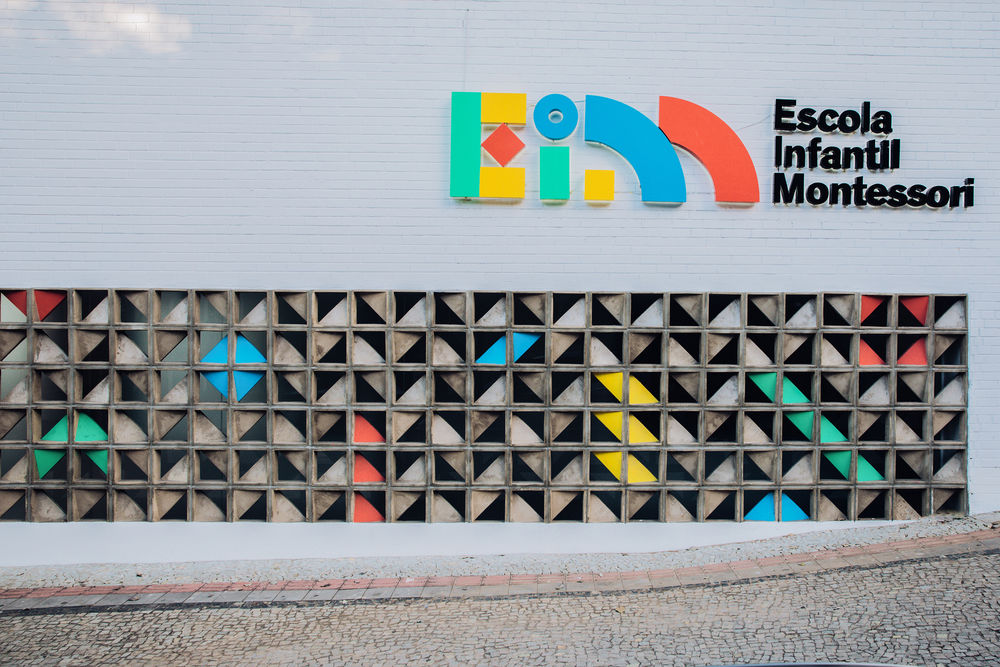
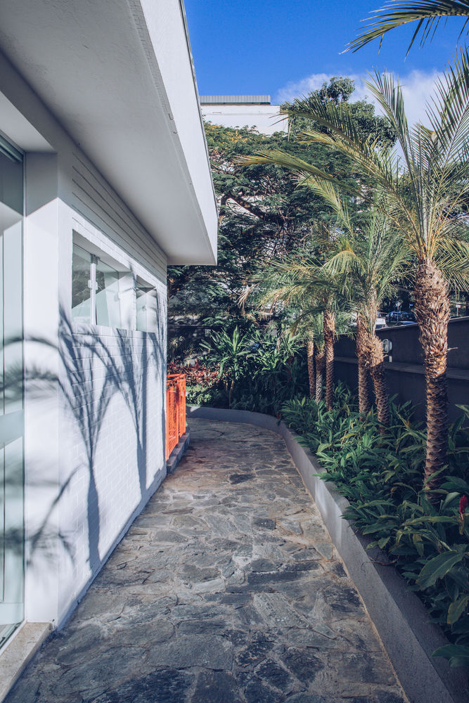
The old façade was repainted and the garage door covered with new cobogos, where fellow designers entered the collaboration so that the façade had an integrated identity with the rest of the logo already worked on.
