"Harrison Bainbridge 医疗中心 | 环保、高效、人性化的 24 小时诊所设计"
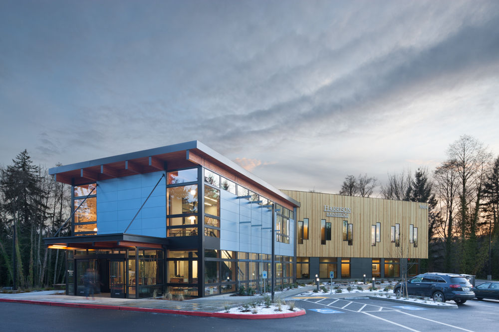
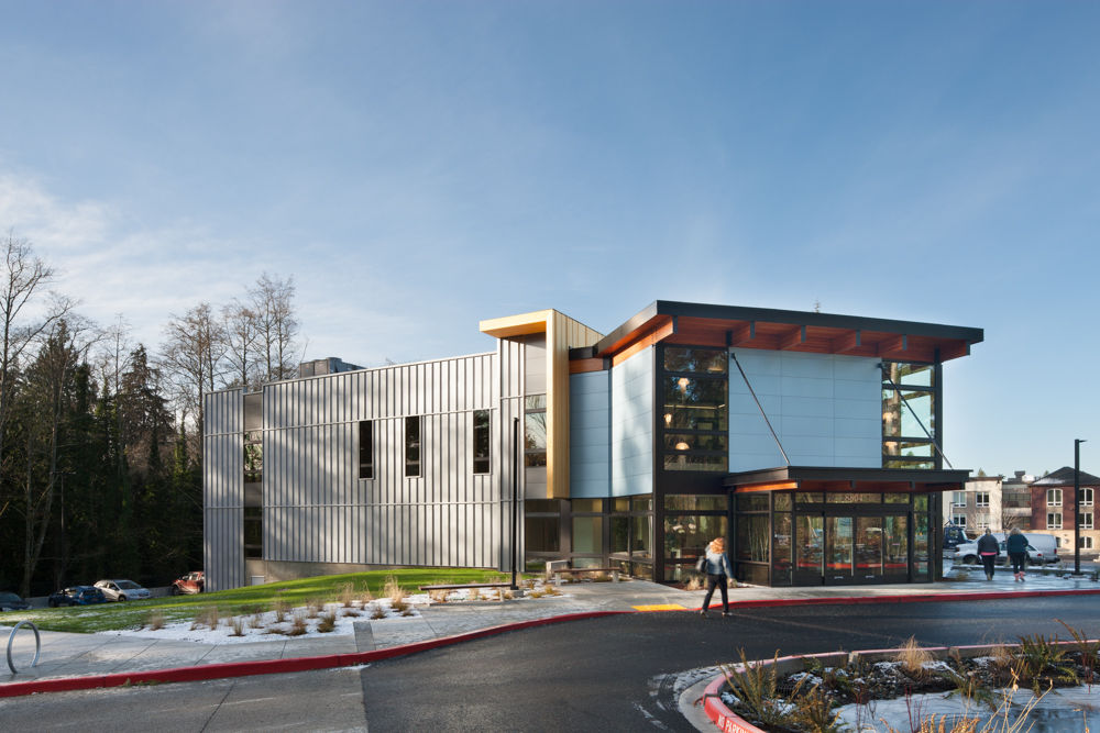
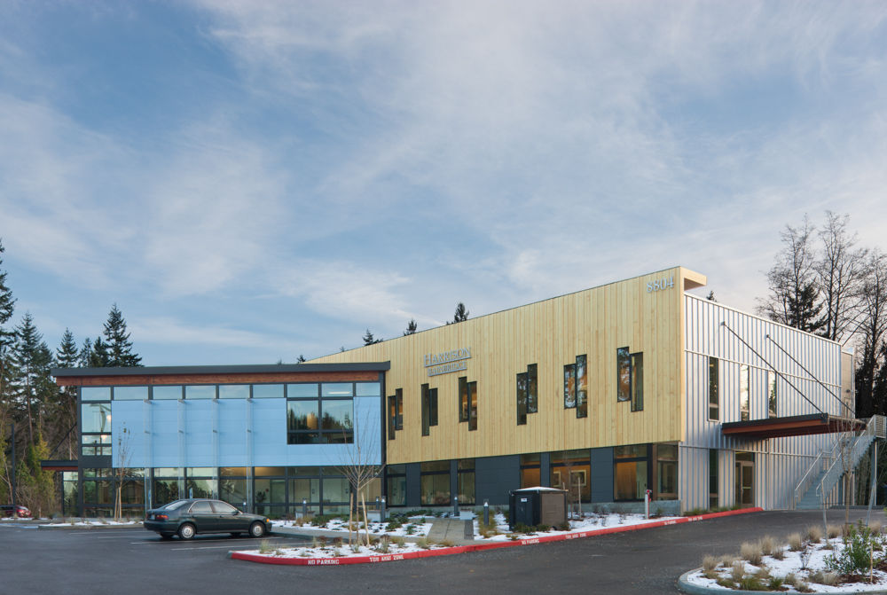
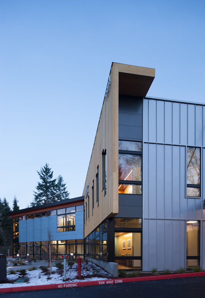
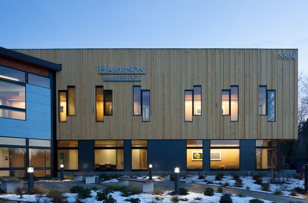
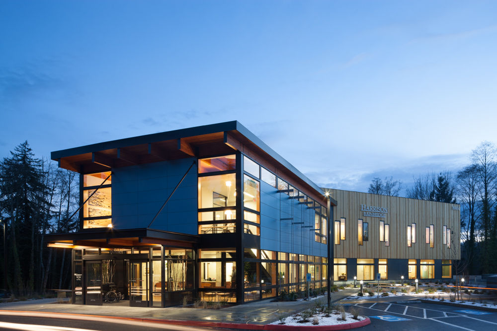
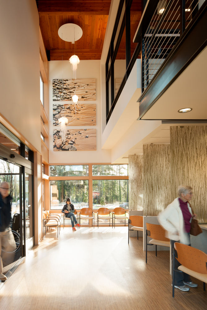
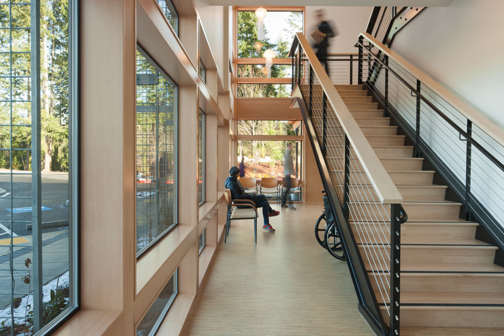
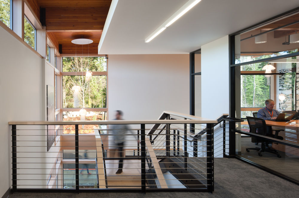
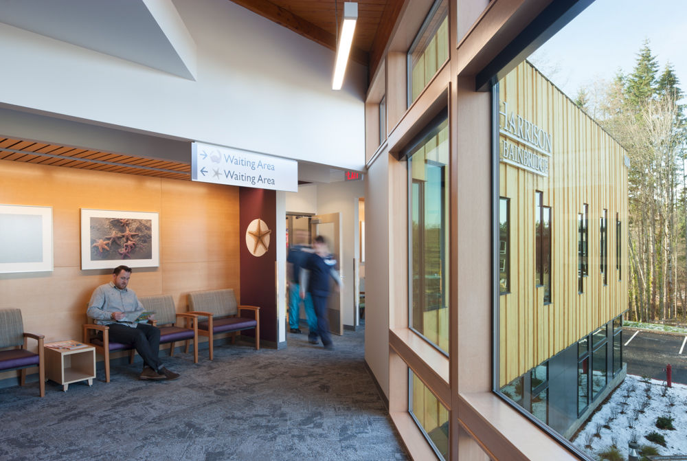
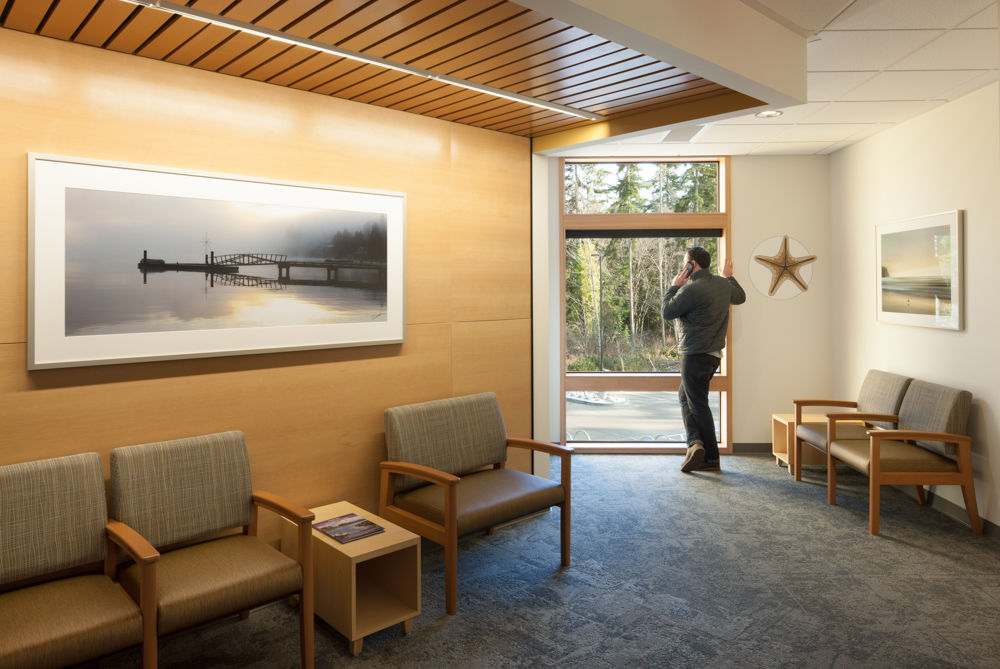
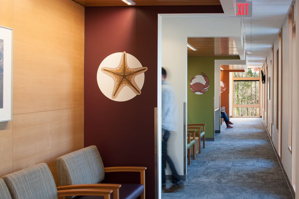
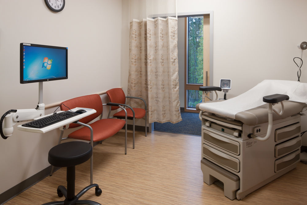
Harrison Bainbridge Urgent Care is Bainbridge Island’s first 24/7 urgent care facility. It consists of 25,000 square feet of primary, urgent, and specialty medical care with laboratory and diagnostic services. Coates Design Architects was chosen to fulfill ambitious goals: patient-centered care that is both innovative in its approach as well as cost-effective. The client required a building that was environmentally-friendly, low-cost, and could be built quickly to allow for immediate patient care. All of these goals, and more, were met in the final design for this one-of-a-kind facility.
Functionally, this site was ideal for Harrison due to its street-front visibility and connection to existing emergency services on the island. The building was thoughtfully oriented to meet another of the client’s requests: room for expansion. Great care was taken during the design and planning phase to avoid harmful effects to the stream and wetlands adjacent to the project site. Storm water was managed naturally using pervious paving, rain gardens, and a retention pond. Avoiding toxic wood treatment methods, the design team selected the highly weather-resistant but sustainably-treated Accoya brand wood. This exterior siding was one element of the maintenance-free and highly-efficient building envelope designed for this project.
The project was designed to fit the site and remain architecturally relevant to Bainbridge Island and the Pacific Northwest. With this in mind, the design team highlighted the forest that surrounds the site by echoing the vertical elements onto the building’s façade. These elements are repeated in the exposed framework of the building’s entry and through the pairs of offset vertical windows along the wing. Metal trellises reach skyward at right angles to continue this theme, with the intention that vines will grow to provide shading from the sun to the west and further integrate the building with the forest behind it.
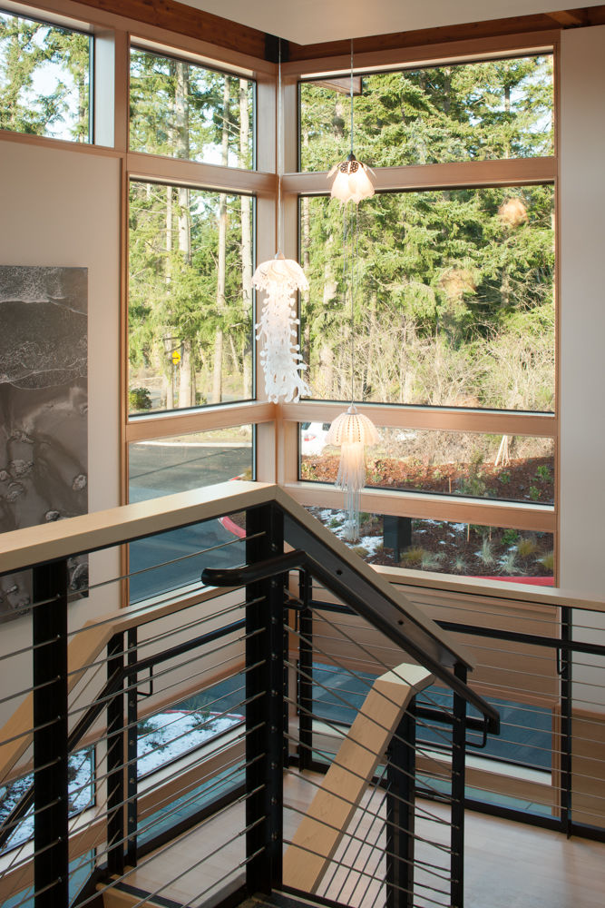
Naturally, the most important goal of the project was to ensure a positive experience for patients and visitors. Details like proportions, color, and scale were used to make the space feel welcoming. The glass-filled area, projecting out from the wings of the building, creates a clear, inviting entry. Daylighting and connections to the natural surroundings were conscious design decisions intended to improve wellbeing and lower stress levels of occupants. A “pod” design concept was implemented, in which patient’s rooms surround a main area that a doctor and their team work from. This reduces the time doctors have to spend walking to their patients, tracking down nurses, and sending in labs, which translates to efficiency in the office and better care and privacy for patients.
Features: Connection of occupants to the natural surroundings Natural stormwater management Daylighting Cost-effective Potential for future expansion Landscaping that doubles as shading

