The Context. Our history with the homeless in the care of Sister Małgorzata Chmielewska and her Foundation Chleb Życia began in 2018. Then, for the first time, we visited shelters for the homeless and sick in
and shelter for the homeless and disabled in Jankowice. One year later, in 2019 a new house for the homeless in Jankowice was opened and two years later a tiny one in Niegorzyce. In 2021 the Foundation received a plot of land in Warsaw from the city government to build a modern shelter. The new building was supposed to replace two shelters for men and women which were in very bad condition and were planned to be closed at the beginning of 2023.
The aim was to create a shelter for temporary stay for homeless, disabled, and sick people. They often do not have ID cards and personal documents so it is impossible for them to use public health services. In the shelter residents can receive help with establishing identity and obtaining documents, they get medical help, diagnosis and therapy. After the recovery process, they can be directed for further treatment in a hospital or another institution as well as get support with finding social housing. The project was created during the pandemic, which has shown the disadvantages of existing shelters. We decided to add the second entrance, two isolation rooms and the entrance square is big enough to set up medical tents.
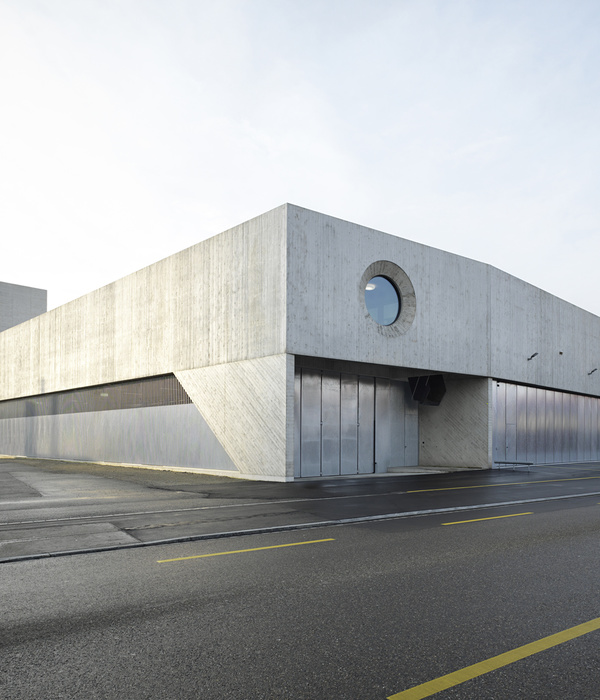
In the beginning, context seemed to be the biggest challenge. The ring road behind acoustic screens, planes flying overhead every 10 minutes, warehouses, scrapyards, small single-family houses. The damaged road was without pavement, puddles, and mud. That was what we saw on the site. What can an architect offer in such surroundings? What can you do to not stand out and blend in with what is there? We proposed a simple, geometric block on a concrete base. This ordinary concrete with imprinted formwork boards not only refers to the raw surroundings but also recalls the subtle wooden facade from our previous home for the homeless in Jankowice. The apertures scattered around the elevation create a subtle rhythm. The idea of their arrangement is visible from the inside. The windowsills in the rooms are lower near the tables and higher above the beds. Smaller windows can be opened but the bigger ones are fixed. This reduced the costs as well as ensured the safety and comfort of the residents.
The elevation of the first floor is covered with brick-colored mosaic plaster. We took inspiration from the neighborhood. While walking in this rather chaotic area we noticed rusty, brownish coral tones reappearing now and then on the roofs, fences, walls, old sheds and forgotten things hidden in the backyards that corroded a long time ago. By combining the modest concrete base with the geometric coral top we have blended in with the surroundings. That was exactly our goal – to make the building belong to this place. Most of the trees on the plot have been preserved, but the most precious one is the old pear tree in front of the building. Leaning, twisted, yet full of life and fruits. Now it welcomes us as a symbol of survival and hope.
The house was designed for 80 people in crisis of homelessness. These are mainly sick and physically disabled people of different ages. Each of them has their own story that they don't always want to share. Some continue to exist, others fight, others wait. Each of them is waiting for something. It can be an assignment to another house, surgery in a hospital, or social housing. They usually have to wait between 2 and 3 years, which is how long it takes to complete all the procedures. The residents are not very sociable and open, they prefer solitude. However, social life is flourishing in the two smoking rooms, they are always full and buzzing. What is more, the small pond across the street turned out to be a place of integration with the locals. Men have bought the fishing rods and they spend time by the pond fishing and getting to know each other with the neighbours which is an essential element of therapy.
The locals have welcomed new residents with kindness. Elderly people drop in from time to time for a warm dinner and a little chat. There is a group of neighbors who come to the chapel for a mass every Sunday. The open square and no fence in front of the building give the message that everyone is invited.
The Building. In the central part of the shelter, there is a chapel made of CLT. We decided to use CLT because wood is a traditional building material in Poland so a wooden house is something that brings back good memories, gives the feeling of coziness, and, most importantly, safety. This kind of sacrum, quiet space was very much needed in the existing shelters but they were never big enough. People who come here are in crisis, often in their worst and most difficult moments in life so they very much need comfort, relief, and hope. It is a catholic chapel but, needless to say, everyone can come here to have a meditation or talk with their god. Every day at 7 pm the community gathers here for a prayer. The front wall of the chapel can be fully open so the chapel can be connected with the living and dining room which is especially useful during Sunday masses.
The inner courtyard with living room and chapel is surrounded by all the other rooms on two floors. There are 6-person bedrooms, separate for women and men. In each room, there are medical beds for bedridden people. The residents support each other, often the stronger ones take care of those who need help. On the ground floor, apart from the bedrooms, there are isolation rooms necessary in case of viral infections as well as a medical part with a rehabilitation room, a doctor's office, and a treatment room. There is also a kitchen and a dining room with big windows overlooking the garden.
On the first floor, there are more bedrooms and a section with apartments for employees. People who take care of the homeless live here together. They have a shared living room with a kitchenette and a couple of rooms, each with a private bathroom. There are two big sunny terraces with a view of the garden framed by the big cutouts in the facade. The interior is bright and clean. There is a peace. There is a working ventilation. These are the advantages of the building noticed by the residents who, not so long ago, used to live on bunk beds in overcrowded rooms located in the basement with tiny windows barely letting in any light.
Technical and utility rooms are located in the basement. There is a laundry and drying room and spacious storage. When leaving the shelter, each resident receives a special package usually containing two sets of clothes, shoes, and a mug. In the basement, there is a place for all the shoes and clothes collected from donors but also cleaning products and cosmetics supplies, suitcases, wheelchairs, crutches, and other medical equipment.
The Interior. The interiors are filled with daylight and bright colors. The design is modest and inexpensive. The walls are white so they can be easily repainted. Floors and doors are in contrasting colors to make the place safe for elderly people and those with vision problems. What is more, the space layout is clear so it is impossible to get lost. The living room is decorated with a mural painted by Marcin Czaja and Anna Wardęga-Czaja. He made a big, colorful wall painting in the home for the homeless in Jankowice, but here he created a very calm, organic plant pattern. It combines the colors used in the interior, which subtly brighten upwards. The internal courtyard with an openwork balustrade on the first floor gives us a sense of space and control at the same time. We can calmly observe the life on the ground floor, we can talk with those below or keep our distance if we need to. The ceiling, or rather its structure, also turned out to be an interesting solution. To minimize the costs of constructing the roof, we used prestressed concrete beams filled with prefabricated chipboard shapes. The result is a lightweight roof with interesting structure and color and very good acoustic parameters, important in such a large, open space. Thanks to the roof windows the interior is bathed in light and sunshine which significantly helps to save electricity costs.
Accessibility. The building is fully accessible for people with disabilities. The layout is clear, there are wide corridors with handrails, and surfaces like floors, walls, and doors are in contrasting colors to make them easier to notice. The toilets are evenly distributed throughout the building and they are all adapted for persons with various disabilities – there is a bathtub equipped with a lift, there are grab handles and chairs in the showers, and toilets for both right- and left-handed persons are provided. The emergency assistance alarm system is installed not only in the toilets but also in all of the bedrooms. There are no door thresholds and all the path declines do not exceed 5%.
{{item.text_origin}}

