Architects:HONEYCOMB architects
Area :3476 ft²
Year :2022
Photographs :Althaf. A. R
Manufacturers : Century Plywood, Grohe, Hafele, Hettich, Jaquar, Saint-Gobain, Asian Paints, Greenlam Laminates, Kairali TMT, UltratechCentury Plywood
Interior Designers :HONEYCOMB architects
Landscape Architects :HONEYCOMB architects
Civil Contractors :N C Associates
Painting :Crayon Paints
Interior Carpenter :Relevant Interior
Design Team : Divin. P, Ahammed Faiz
Client : Mr. Faizal
Flooring : S M Flooring
Glass Supplier And Installation : K V Fabricators
Steel Fabrication : K V Fabricators
Country : India
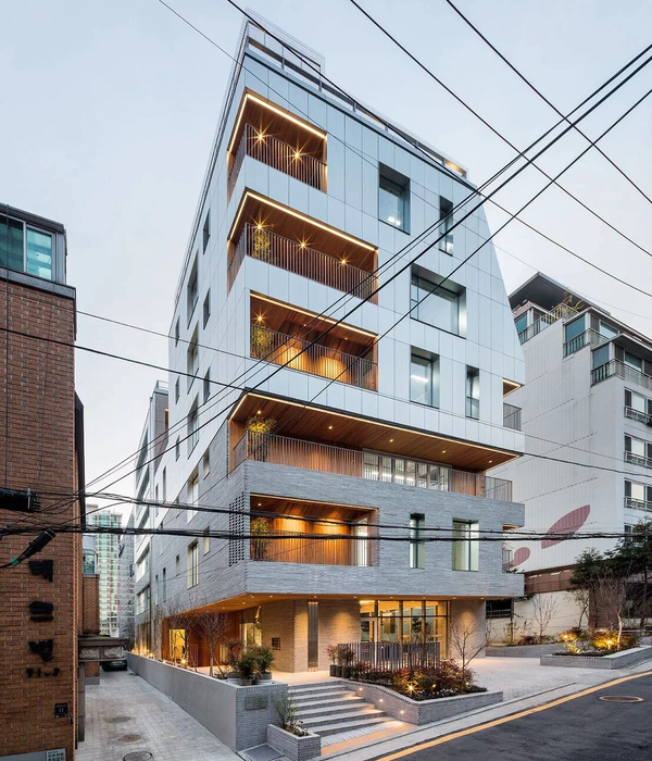
Brief - The brick screen house is a renovation project envisioned as a synthesis of contextual parameters and user functional requirements. The project promises a better environment of living for the client from the old congested and messy house, which also architecturally enhances the climatic, and contextual potential of the location. The main design intent was to blur the boundaries between the built and the natural elements. This is a south-facing corner plot in a tropical location experiencing long monsoons and hot summers. The project plot has an entry road and large open plots in front, existing houses on the northern and eastern sides, and a side road on the west. The concept is seamlessly blended with the context in a way that it’s a play of multi-directional air movement in the house
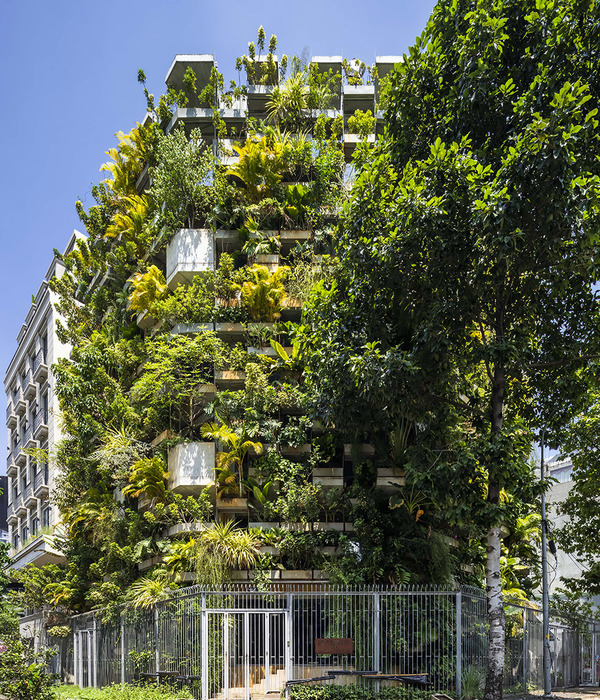
Concept - Since there is a presence of more local winds on the south side which formulates the concept of a perforated screen in the front façade which effortlessly directs the wind and protects the building from the harsh southern sun. This brick screen maintains a comfortable internal temperature all the time. The screening is even more efficient by providing green patches in the sunshade in between the building and façade, extended sunshade space also acts as a buffer for protecting and heating up walls thus performing as double skin for the building.
The facade screen is designed in such a way that each brick is kept in a zig-zag manner both in horizontal and vertical directions. This arrangement creates small diagonal openings, when air passes through these small openings the air becomes even cooler and maintains a comfortable temperature in the building. The thoughtful selection and strategically applied natural materials for the façade protect the main walls from heating up and allows air movement simultaneously.
Layout - The layout promises the proper functional flow for the spaces, the sit out in the front with customized furniture adds to the total aesthetics of the space. A living room with double height is sandwiched in-between the dining and sits out space; the double-height ensures the vertical visual connection and carries out the Stack effect perfectly. Light-colored furnishing in the living area goes along with the home interior and makes the room visually spacious. A dining area with a lush green internal courtyard also plays a significant role in making the space even cooler and cozy. The unconventional arrangement of the courtyard produces more dynamic spaces inside. The opening in the roof slab allows the sunlight and moonlight in the area to make the space a magnificent one.
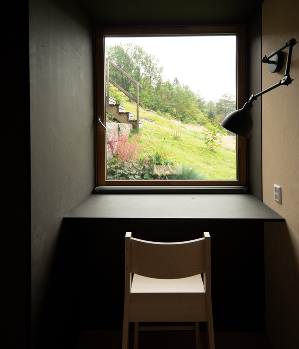
Most of the furniture is designed and cast on-site. Colored laminates used for the tabletops create an acceptable vibrancy inside. Two bedrooms on the ground floor have proper cross ventilation, natural lighting, and interiors that complement the entire design character. These bedrooms follow the same color palette for almost all furniture. The first floor with three bedrooms and family living has exposed concrete ceilings which follow the same rustic and sustainable character of the entire structure. The angled pattern for the handrails and kota green shade in the flooring match perfectly with the interiors. A simple contemporary bookshelf with indoor hanging plants adds more aesthetics to the TV wall in the family living. Each bedroom interior is done with a customized cot, study tables, and side tables considering the user’s architectural interests. All the bedrooms have exposed concrete ceilings with minimal wooden reaper works on them.
The bedroom on the first floor positioned in the southwest corner has a brick backdrop with sensibly chosen photo frames. These elements were considered and kept raw in their form for making the space even more sustainable. The colored laminate ceiling becomes an interesting interior element that goes along with the total interior design character. The brick and cement grey color complement each other and make the space a better one. The other two bedrooms on the first floor have their own unique interior characteristics. The different color in the laminate defines the entire character of the rooms. The material palette is kept very minimal and sensible. The selection of natural paving, flooring materials, plants, and landscape elements was carefully done and applied very sensibly in the project which blends with total design and context. The built structure and the landscape blend together to form a cozy and very positive atmosphere throughout the project.
▼项目更多图片
{{item.text_origin}}

