This cabin in Ulvik, Western Norway, is a homage to country-road architecture. Important as sources of inspiration are the works of Rudolf Olgiati; with its blend of vernacular architecture and historical design principles, as well as the romantic nationalism paintings of Hans Gude. The latter both in a direct, landscape way and in a more abstract way being within the tradition of design as a method of slow and steady progression.
In fall the ochre yellow walls are pure camouflage in the aspen forest, and the long lines of the stone walls of the surrounding landscape are met, and interrupted, by the shielding southern wall of the building. This way of making an extra thick and protective wall towards the dominating wind and rain is typical for this area. The slanted beam on the opposite gable wall gives the building a supportive push in the same direction, and thereby further underlines the defining weather conditions. This last element is double functional as it also holds the drainage pipe from the roof.
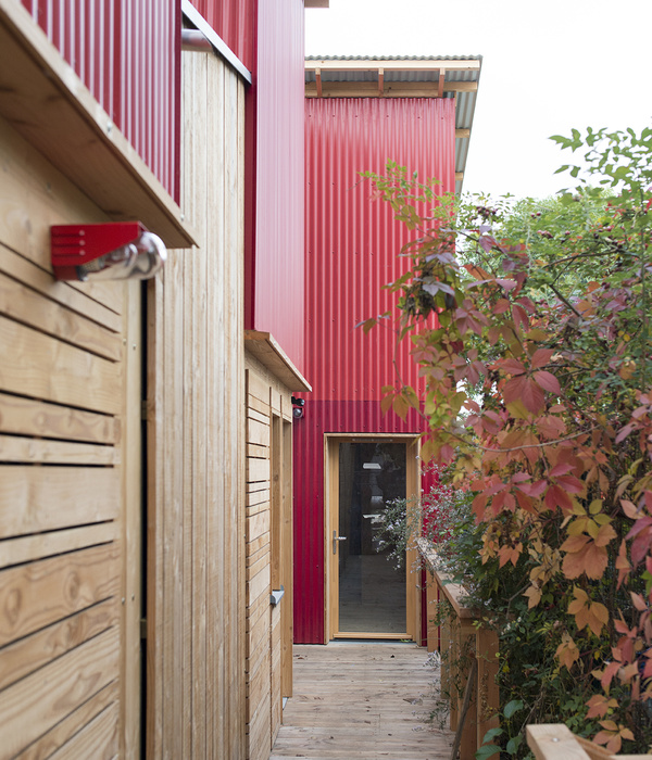
As a complex, the cabin together with its annex has the composition of a traditional small-scale farm linked by the access road. Being pinky-yellow the cabin is a merge between the traditional house on such a farm, normally painted white, and the barn normally painted a warm red. Cabins as such were introduced to this area in the middle of the 20th-century as recreation for the upper-middle class, were meant to function somewhere between the comfort of a house, and the roughness of a barn. This intermediate state can also be traced in the facade composition of this building with some features commonly found in barns and others commonly found in houses.
Further pointing to the ambiguous character of the building the facade facing the fjord is both representative and plebeian. The cornice over the main door is lifted to a parapet to signal entrance and dignity, while the eaves over the large window give a low-key impression (as well as provide shelter for the window).
More subtle the concrete arch inside the glass facade balance the slanted beam on the outside, but, contrasting the aggressiveness of the wooden beam, the arch is withdrawn in shape and character to provide room for the door. As for composition, inside and outside, the building is more juxtaposition of ordinary elements than a display of the unique. More thoughtful use of off-the-shelf items than tailor-made solutions, although not pure even in this
▼项目更多图片
{{item.text_origin}}

