挪威海边服务亭 / Carl-Viggo Hølmebakk with Manthey Kula
尽管这座位于Jektvik渡轮码头的小小的服务亭并非重要项目,但建筑师没有怠慢,而是在这里进行了一些建筑设计和构造上的尝试。Jektvik地处挪威北部,离北极圈只有几公里距离,在夏天和冬天有着漫长的极昼和极夜。服务亭中设有等候区和两间厕所,建筑师巧妙地运用了透明和半透明材料,使这个小建筑富有趣味。
Despite the informal program, the small service building on Jektvik ferry terminal gave rise to a number of constructional and architectural experiments. Besides meeting some pragmatic functions – a waiting room and two rest rooms – the project developed to become a study on transparency and translucency, being in the northern part of Norway which is characterized by dark winters and light summers. (Jektvik is just a few kilometres from the Arctic circle.)
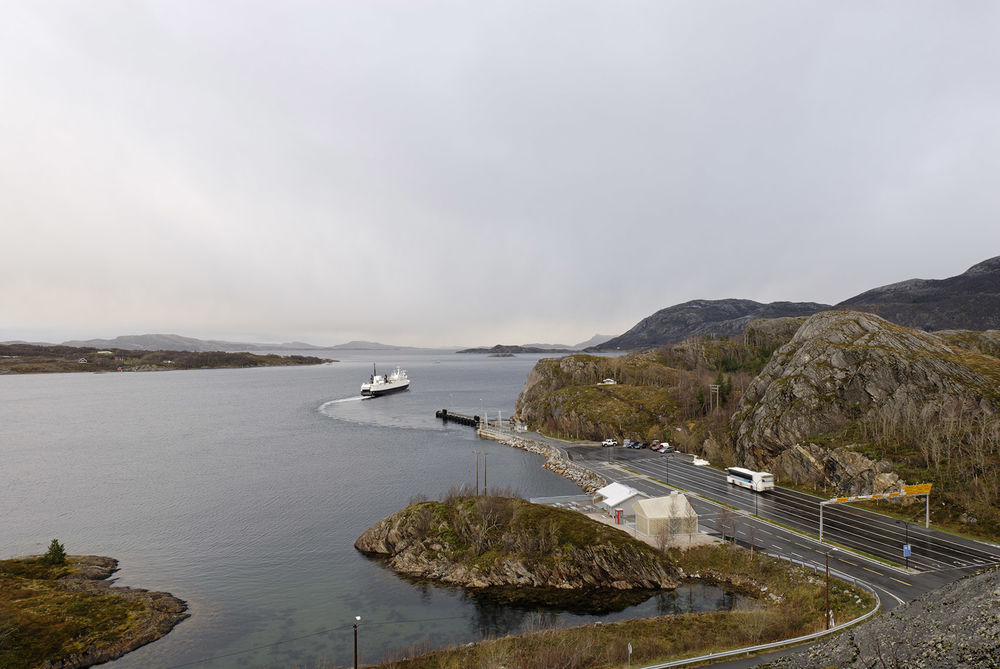
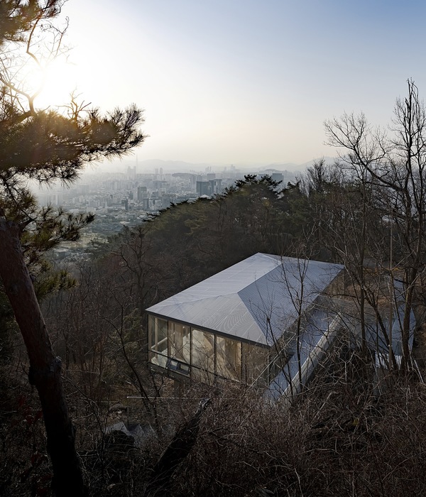
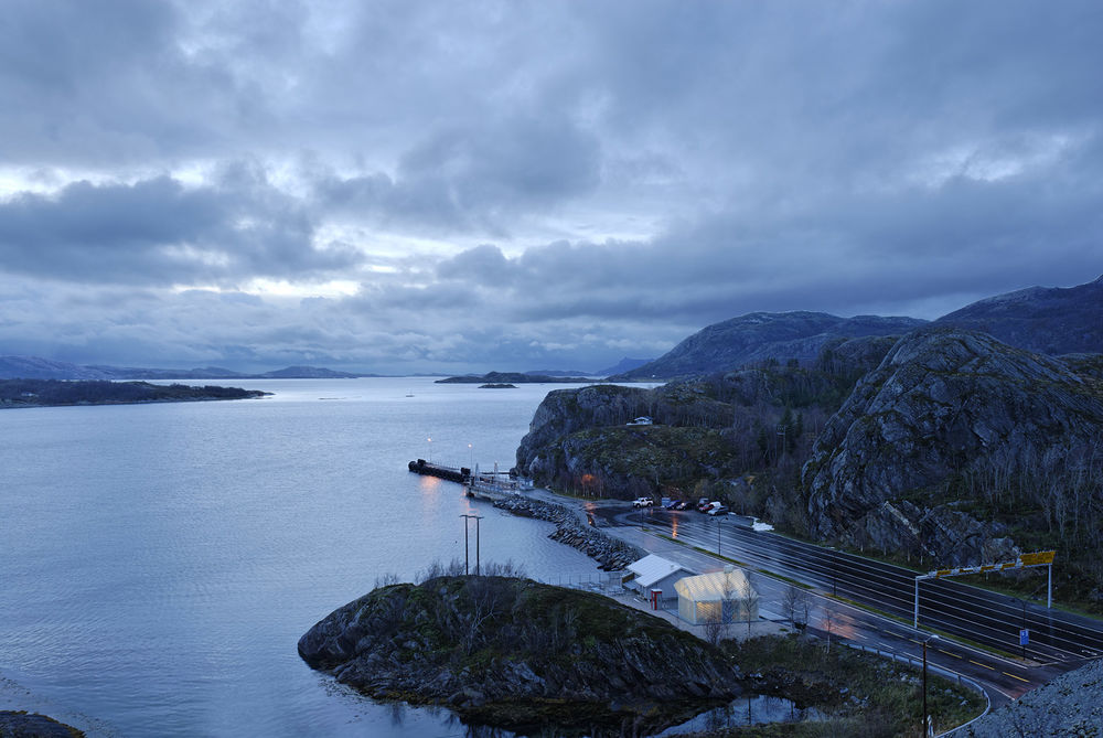
▼远景,view in a distance
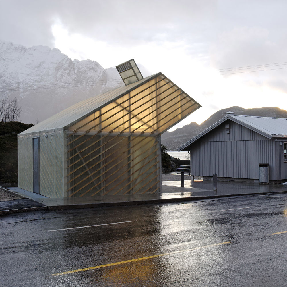
▼建筑外观,external view of the building
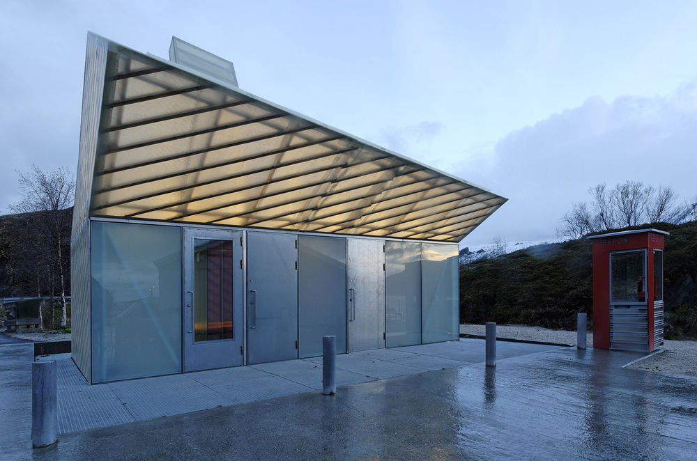
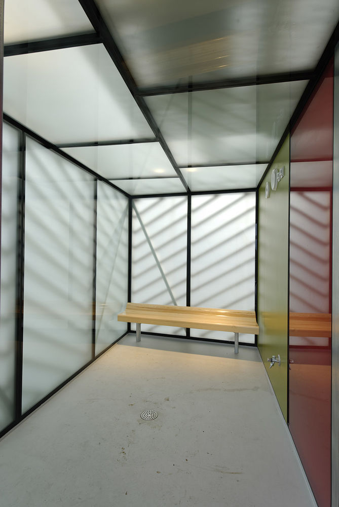
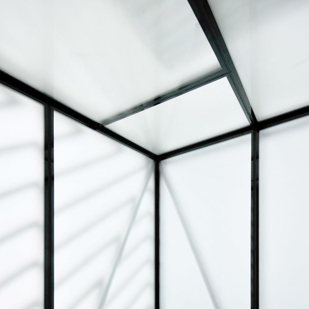
建筑整体采用预制抗压铝结构模块搭建而成,配以装在内侧的玻璃幕墙系统,室内墙面和天花均为平整而又清洁的玻璃材料。玻璃幕墙单元由磨砂玻璃和彩色玻璃组合而成,令建筑在环境里呈现出了丰富多变的透明性。
The vehicle for this study is built up as follows: A load-bearing, prefabricated, modular aluminium structure with a reversed facade glazing. I.e. a SG-facade system (“Structural Glazing”) is assembled with the outside facing inwards. Both walls and ceiling have this structure and the rooms appear inside with plane, hygienic glass surfaces. The glass units, which are composed of various combinations of frosted and coloured glass, give varying transparency and translucency to the side rooms and the surroundings.
▼建筑入口,entrance
▼内侧玻璃幕墙和彩色玻璃,SG-façade system and colored glass

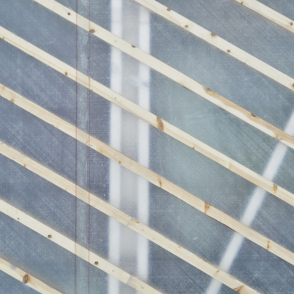
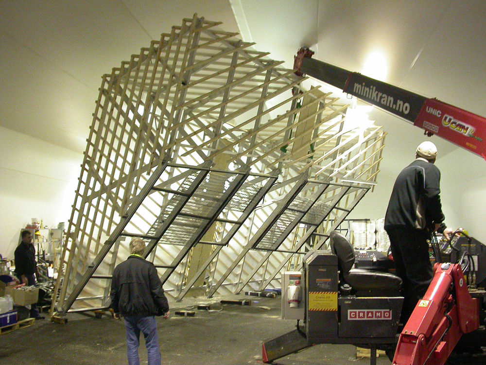
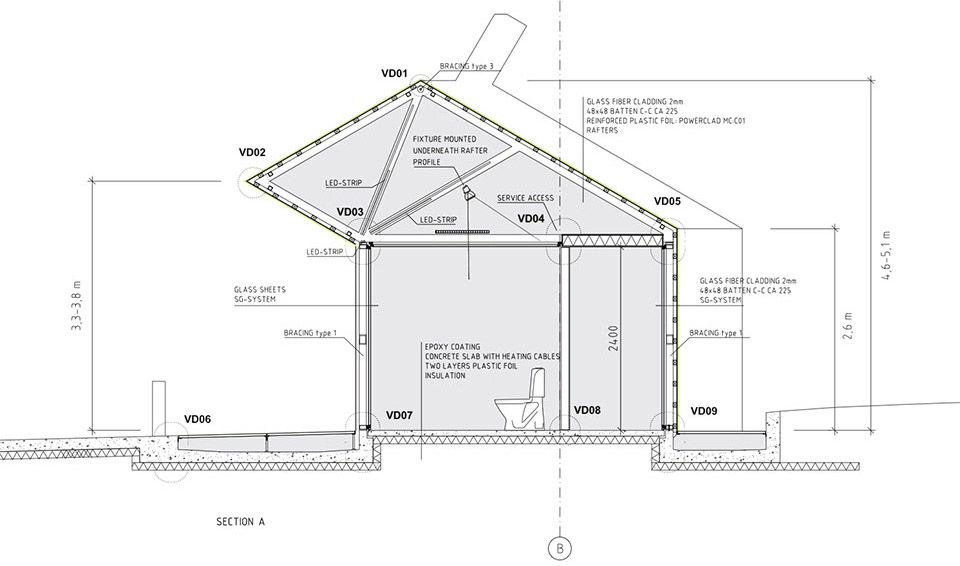
在铝结构的外侧覆盖有连续的高强度抗紫外线纤维玻璃膜,上部加以间隔250毫米的48×48毫米松木栅格固定。不同于覆盖在船体之类的连续光滑形体外,这层纤维玻璃膜被外侧的木结构像晾衣服一样挂在了铝制框架之外,可帮助建筑抵抗外部恶劣的气候环境。和铝结构一样,这套表皮系统也是在工厂定做,并被分成六部分运到基地进行安装。
项目的主要分包商为一个玻璃公司和一个造船公司。玻璃幕墙和纤维玻璃膜之间的空间被当做冷气阁楼,通风设备,技术设备和灯具都被设置于此。透过表皮,可以隐约看到建筑的结构和内部空间,因此项目在设计施工时的暂定名称为“虾”。 纤维玻璃技术在当地广为人知,主要用来修复穿上的裂缝。当把它用作建筑表皮的时候,不仅可以抵抗外界恶劣的天气,还能够起到维护作用。
On the outside of the supporting aluminium structure a lath work of 48×48 pine-wood, c/c approx. 250mm is mounted. The lath work makes the underlying structure for a seamless outer skin of reinforced UV-resistant polyester. The fibre glass skin is not cast against a smooth shape (e.g. as in the hull of a boat), but hung up on the timberwork as a wet cloth before hardening, making a slightly uneven, weatherproof surface. The fibreglass work was made – like the aluminium structure – inside a closed production hall before it was taken in six parts by truck to the site.
The main subcontractors for the house have been a glass contractor and a boat building company. All technical installations and lighting are positioned, half visible, in the zone between the glass and fibre glass. Over the flat glass ceiling this zone functions as a cold attic, which contains a ventilation aggregate, technical ducts and lighting. The working title for the project was “the shrimp” because the structure and internal organs of the house would be partially visible through the transparent layers of glass and fibre glass – as the visible organs of a live shrimp. Except for the weather shielding property, another quality of the skin is the maintenance benefits. The fibreglass technique is well known by inhabitants in the area, which is used for repairing their fishing boats. Cracks and dents from heavy use or vandalism can easily be fixed with local knowledge and “in stock” materials.
▼铝架外的松木条及半透明纤维玻璃膜,lath work out of the aluminium structure and the translucent fibreglass skin
▼表皮结构在工厂定制,the fibreglass work was done in a production hall
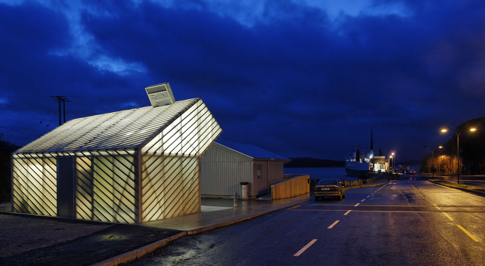
然而,气候和建筑维护并不是建筑师选择用纤维玻璃做表皮的所有原因。项目周边有许多以传统手段建造的房屋,也可以满足这些需求。建筑师之所以选择用半透明材料做建筑表皮,是因为建筑内的光可以透射而出,好像一个中式灯笼,照亮挪威的漫漫长夜,而这正是设计的初衷所在。同时,透过半透明的表皮可以看到建筑内外活动的人影,也是建筑迷人的因素之一。
It would not be correct to say that the harsh coastal climate and maintenance considerations are the only reason for the skin construction. There are other buildings nearby, built in a more conventional way, that quite well serve their purpose. The motivation for the transparent structure was also the intriguing architectural potential or possible effects of this building principle: That the house itself would serve as a light fixture in the long, dark Nordic winter – like a big Chinese lamp. Also fascinating was the possible “psychosocial” play that might unfold when the users notice movements and shadows of people inside the building or in the neighbouring rooms.
▼灯光透过表皮,建筑仿佛一个灯笼,the building looks like a Chinese lamp in the night
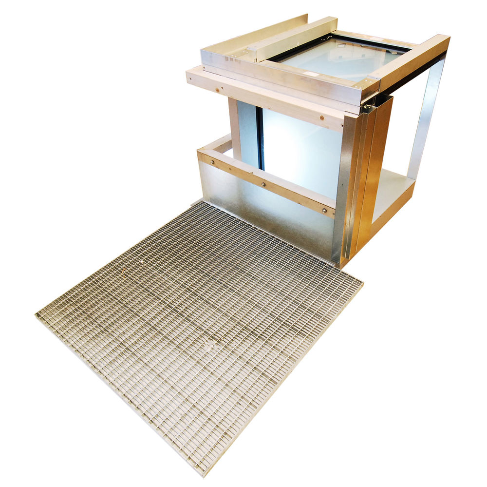
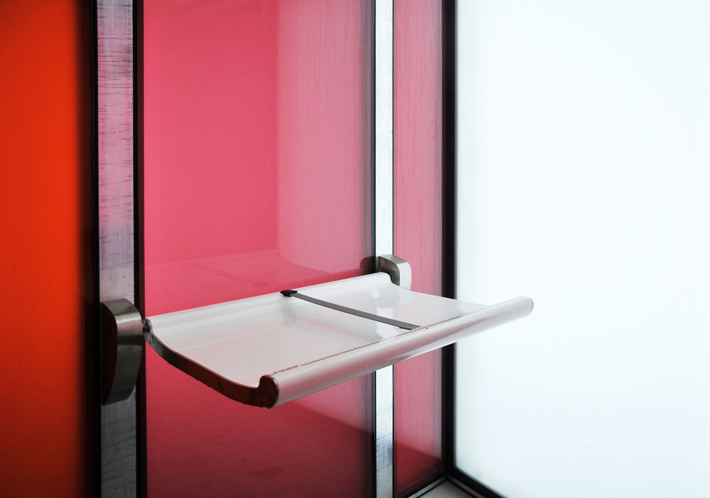
建筑虽小,但是其特殊的构造对细部由许多要求。建筑半透明的墙面落在由钢网制成的地坪上,内外地面没有高差,轮椅可以无障碍通过。钢网下方为通风系统的进风室,为室内和双层表皮之间补充新鲜空气。LED灯带被安装在在屋顶结构之上,透过玻璃幕墙发出朦胧的光,而卫生设施的上方则设有集中照明,以满足使用需要。颜色的对比被控制在了一定范围内,不会对人的视觉造成损伤。
The special construction method has provided a house with many demanding details. The building is universally accessible with wheelchair entrances at the same level as the outdoor area. A steel grid floor surrounds the entire building, so that the transparent walls can be traced all the way down to the ground. The space beneath the grid is also the inlet chamber for ventilation of both the rooms themselves and the double wall structure. The general lighting consists of linear LED lighting fixtures that are mounted on the ceiling trusses. There are also mounted down lights that provide concentrated light to the sanitary equipment in the rooms below. Colours and visual contrasts are adapted to the visually impaired.
▼钢网制成的地坪构件及室内细节,floor unit made by steel grid and interior detail
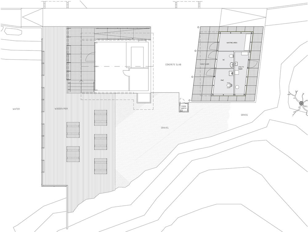
建筑形体的生成经过了如下的思考和几何推导: 1. 建筑的地面与外界路面平行,和相邻房屋成一定角度,以形成一个独立的通往南侧码头的通道 2. 出于经济和技术考虑,SG玻璃幕墙选用长方形单元 3. 建筑悬挑出的屋顶向相邻的建筑倾斜,形成了一个有遮挡的入口空间 4. 较为平缓的鞍型屋面的倾斜角度由建筑及悬挑的几何结构决定,为通风和管道提供了空间 尽管建筑从外面看来形状随意,仿佛是被风吹歪了,但其实它是由精密的内部系统支撑起来的。当然,几何方面的考量并不都如上述四点那般具有逻辑性和数学性,感官也是形体设计的重要因素,其雕塑般的形态为基地带来了更多活力。
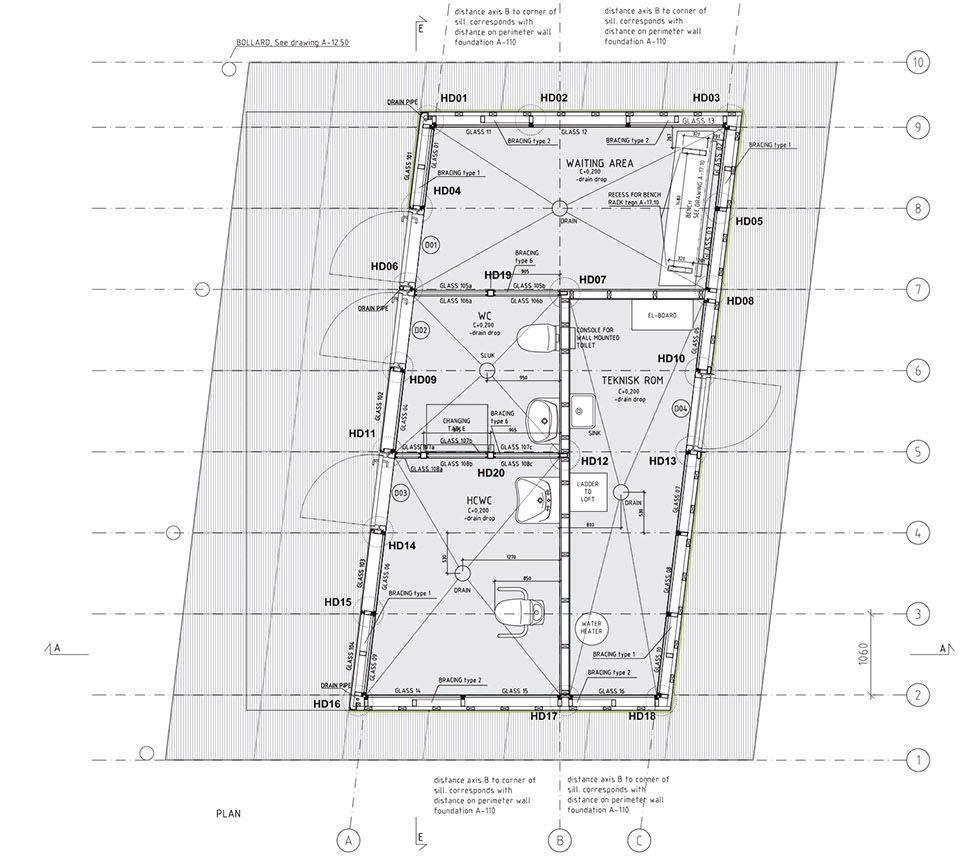
About the three dimensional form of the building one could say that it is the result of a sequence of geometrical considerations and decisions: 1. The parallelogram shaped floor plan, parallel to the road, and angled towards the next house to make a secluded outdoor passage to the southern quay area. 2. The economically and technically motivated vertical walls of rectangular SG- façade units. 3. The cantilevered roof overhang, covering the entrances and lining up with the next building to make the sheltered entrance area. 4. The tilted roof, as a geometrical result of the underlying geometry (a straight planar saddle roof on top of the rooms and overhang) gives a well-adapted room for ventilation unit, ducts etc. The result is a sculptural form with many internal dependencies – quite intricate, although it looks somewhat relaxed or random with its “wind queer” geometry. The geometrical considerations are of course not only logical or mathematical (as explained in the four points above), but also a sculptural conduct of a more intuitive interpretation of the site.
▼平面图,建筑一边与道路平行,另一边与相邻建筑成角度,plan showing that the building is parallel to the road and angled towards the next house
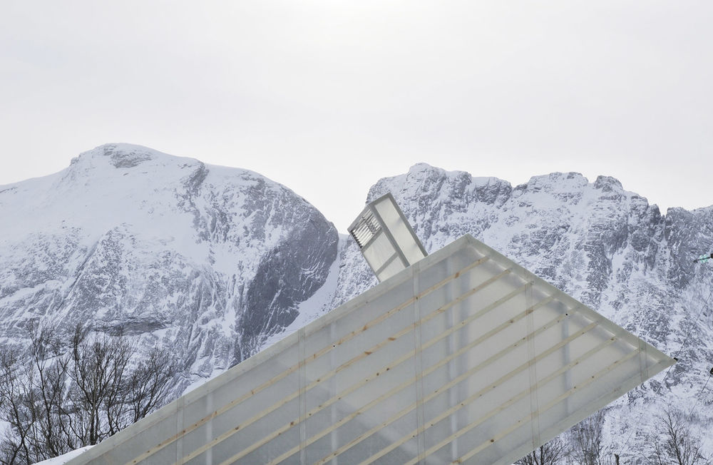
▼建筑形态与周边的关系,the building’s form is designed with consideration to the surroundings
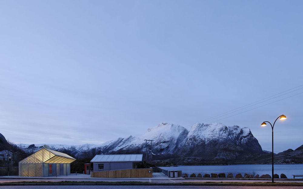
▼倾斜的屋顶,tilted roof
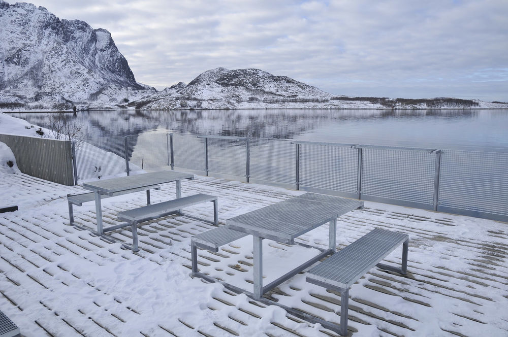
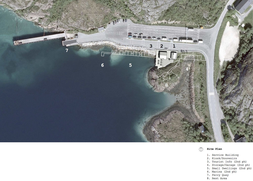
正如总平面所示,整个项目包括一个库房,一个信息亭,休息区和六个供游客和卡车司机使用的小住宅。到目前为止,服务亭和改造后的凉亭已经被投入运营。
As shown in the overall site plan, the project includes several new structures along the quay area – a storage building, an information pavilion, rest areas and six small dwellings for tourists and truck drivers. At this point the implemented parts are the service house and the renovated kiosk with outdoor area.
▼总平面图,site plan
▼平面图,plans
▼剖面图,section
▼墙体构造图,wall construction
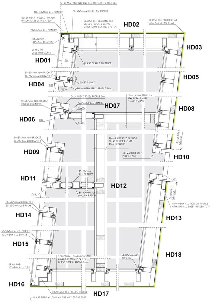
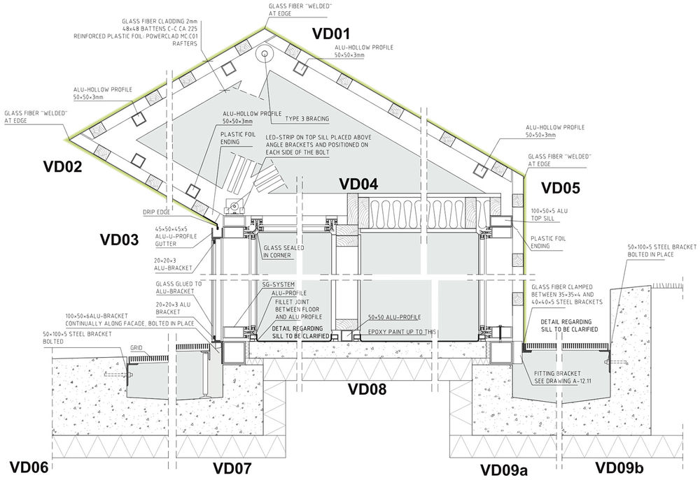
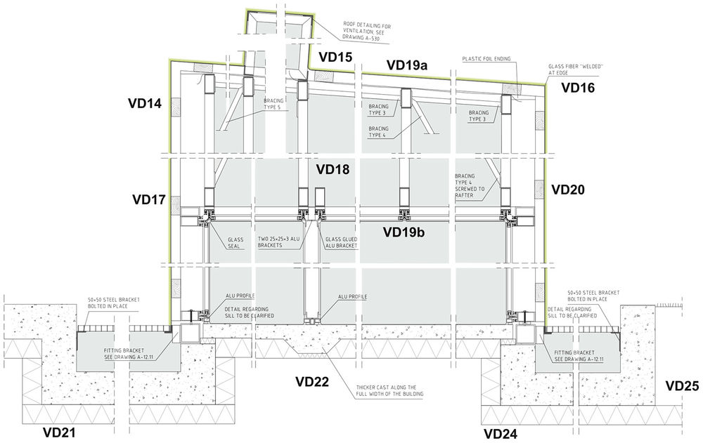
▼细部,details

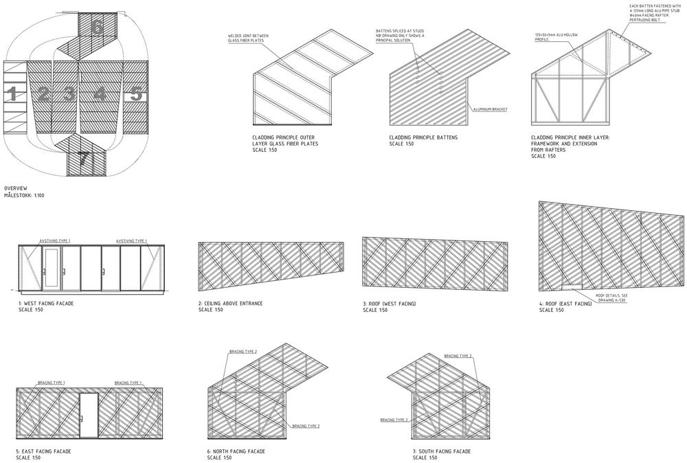
Project Data:
Architect: Carl-Viggo Hølmebakk, architect Manthey Kula (co-workers in preliminary phase)
Team: Carl-Viggo Hølmebakk (PL) Rickard Riesenfeld Beate Hølmebakk Per Tamsen
Consultants: Siv. ing. Finn-Erik Nilsen (structural calculations) Christopher Apeland AS (structural description) Aalerud Hamar (HVAC) IBR elprosjekt (electro)
Construction manager: Bygg Team Bodø v/ Rune A. Larsen
Client: Statens vegvesen, National Tourist Routes v/ Steinar Skaar
Performing contractor: Midt-Nord Prosjekt AS
Major subcontractors: Profilteam Hamar AS (glasing/ aluminum.) Hansvik Boat AS (GRP) YIC (ventilation, sanitary, electrical)
