新博物馆 | 桑那建筑的透明与轻盈

© Laurian Ghinitoiu
c.Laurian Ghinitoiu
Sanaa(Sejima 和 Nishiawa and Associates) 总部设在东京,由 Sejima 和 Ryue Nishiawa 于 1995 年成立。这两位建筑师在萨那项目上合作,同时运行他们自己的完善的个人实践,所有这些都被安置在同一栋建筑中。员工跨公司重叠,在基本开放的办公室里共享公共空间;一个无边界的工作环境,作为他们典型的透明建筑风格的隐喻。这种风格在一定程度上是对东京街道上发现的不透明建筑的一种反应,并导致人们将其与米斯·范德洛 (Mies Van Der Rohe) 的骨骼结构进行比较。
Based in Tokyo, SANAA (Sejima and Nishizawa and Associates) was established by Kazuyo Sejima and Ryue Nishizawa in 1995. These two architects work collaboratively on SANAA projects while concurrently running their own well-established individual practices, all housed within the same building. Staff members overlap across the firms, sharing communal spaces in the largely open-plan office; a borderless working environment which acts as a metaphor for their characteristically transparent architectural style. This style is, in part, a reaction against the opaque buildings found on the streets of Tokyo, and has led to comparisons being drawn with the skeletal structures of Mies van der Rohe.[2]Photography © Laurian Ghinitoiu
在获得新博物馆委员会时,萨那还有另外两个画廊项目正在进行:位于日本金泽的 21 世纪当代艺术博物馆和位于俄亥俄州托莱多的托莱多艺术博物馆的玻璃馆。后者是该公司在美国的第一个项目,它们在国际上的相对默默无闻与新博物馆 (New Museum) 宣传未被发现的艺术家的使命相一致。[3] 萨那在这些项目和后来的作品中获得了全球批评的赞誉,将于 2010 年获得普利茨克奖 (Pritzker Prize)。
At the time of being awarded the New Museum commission, SANAA had two other gallery projects underway: the 21st Century Museum of Contemporary Art in Kanazawa, Japan, and the Glass Pavilion at the Toledo Museum of Art in Toledo, Ohio. The latter was the firm’s first project in America, and their relative international obscurity was in keeping with New Museum’s mission to promote undiscovered artists.[3] Having received global critical acclaim for these projects and for later works, SANAA would go on to win the Pritzker Prize in 2010.
© Laurian Ghinitoiu
c.Laurian Ghinitoiu
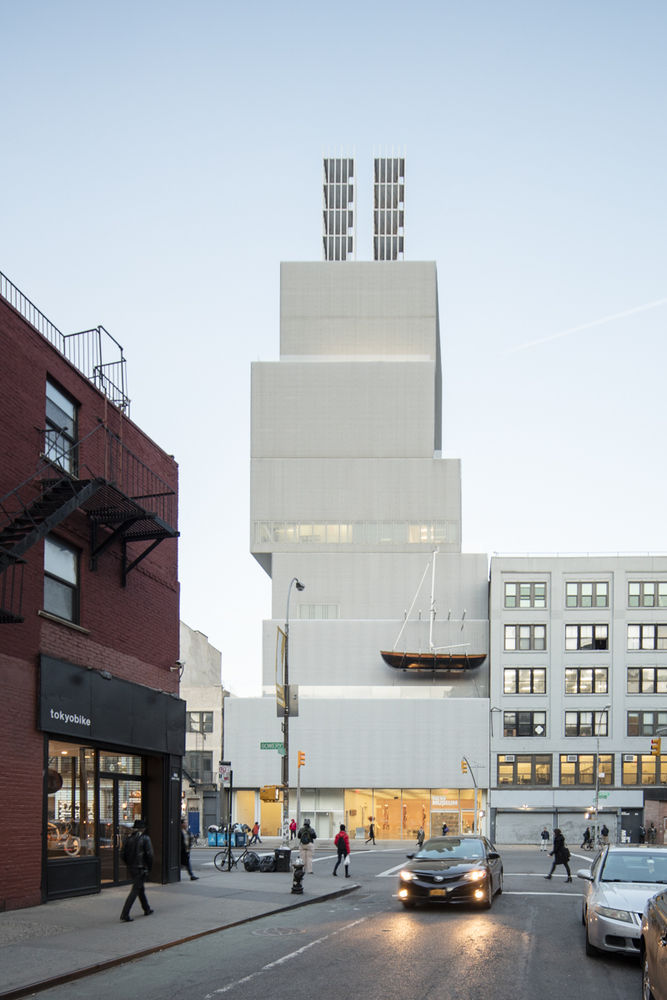
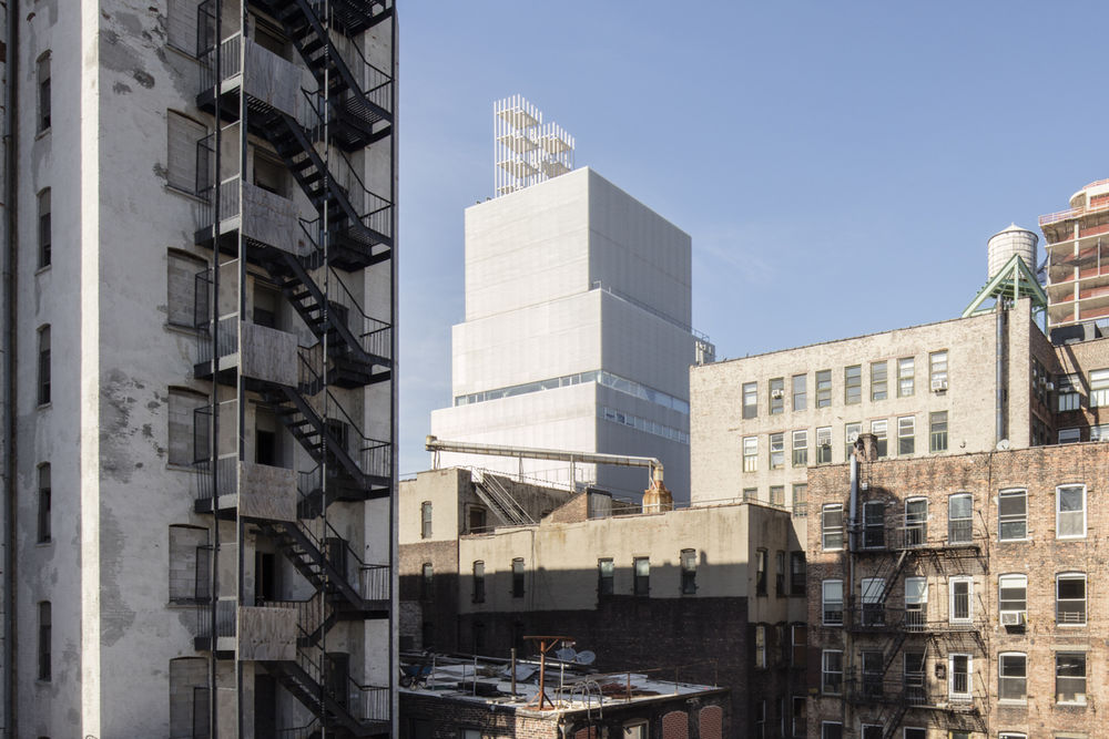
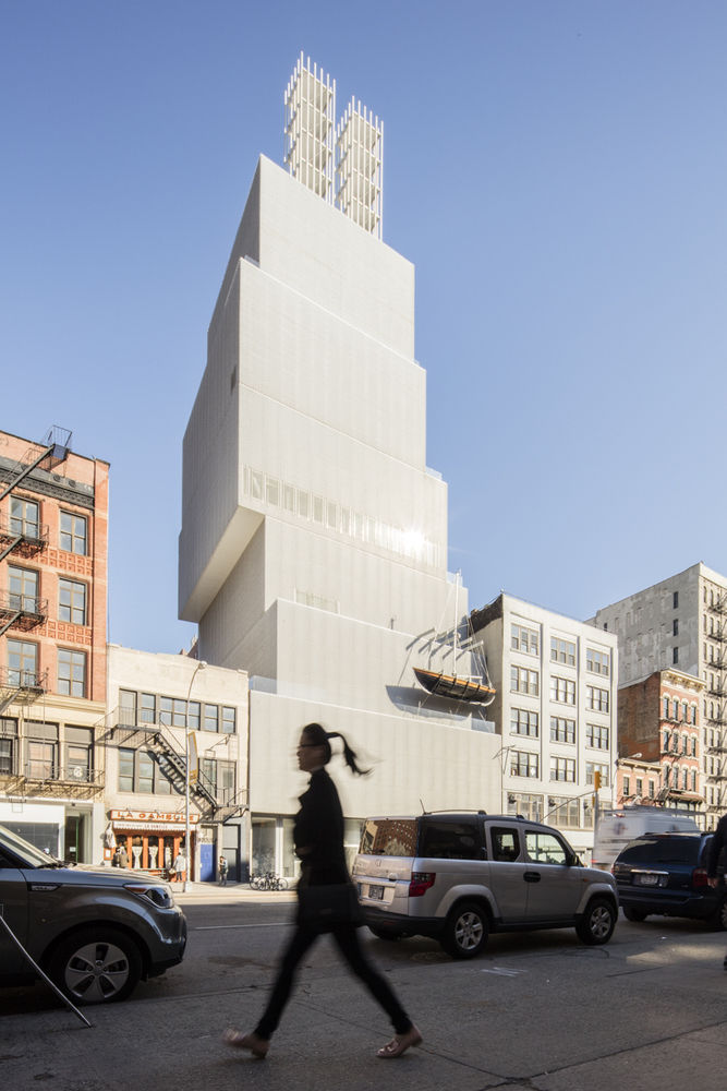
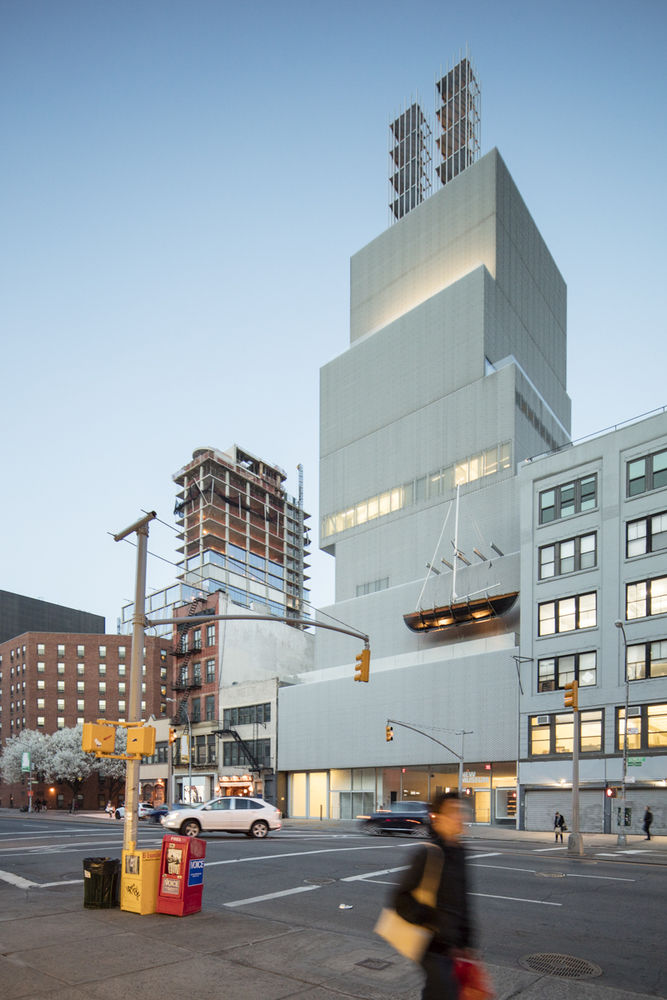
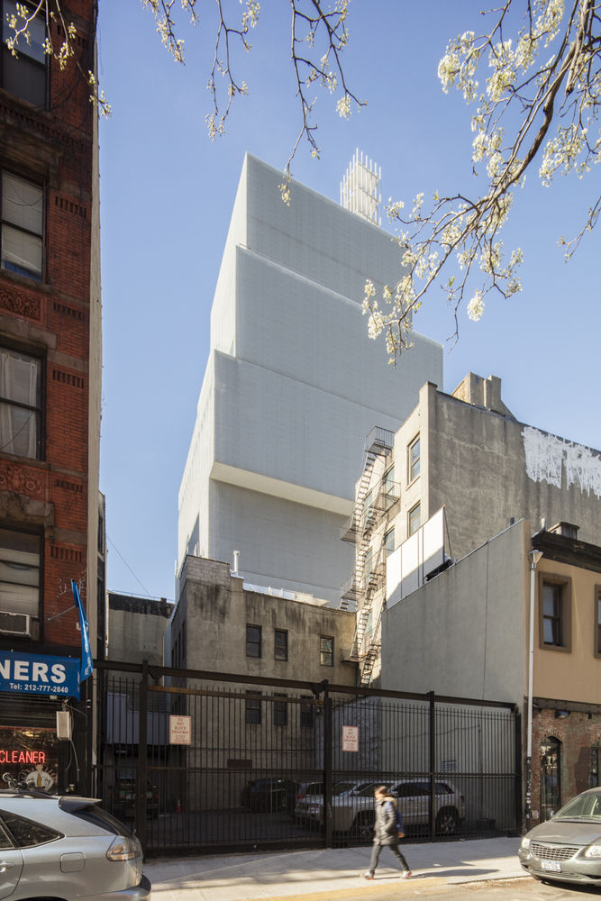
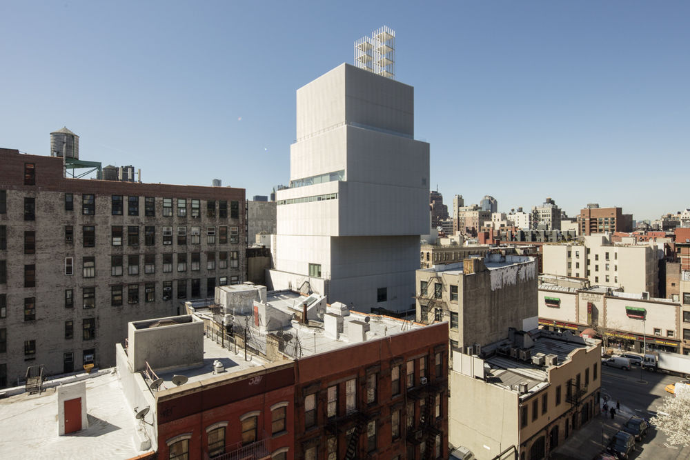
萨那的新博物馆设计包括七个不同比例的盒子,垂直堆放在一个中央核心周围。建筑师们避免使用分区封套所允许的最大面积,让自己有空间将这些盒子移出中心,并在体积之间创造动态的相互作用。[4] 这座建筑的独特规划旨在创造一个独特的建筑特征,以反映客户的实验哲学。[5]
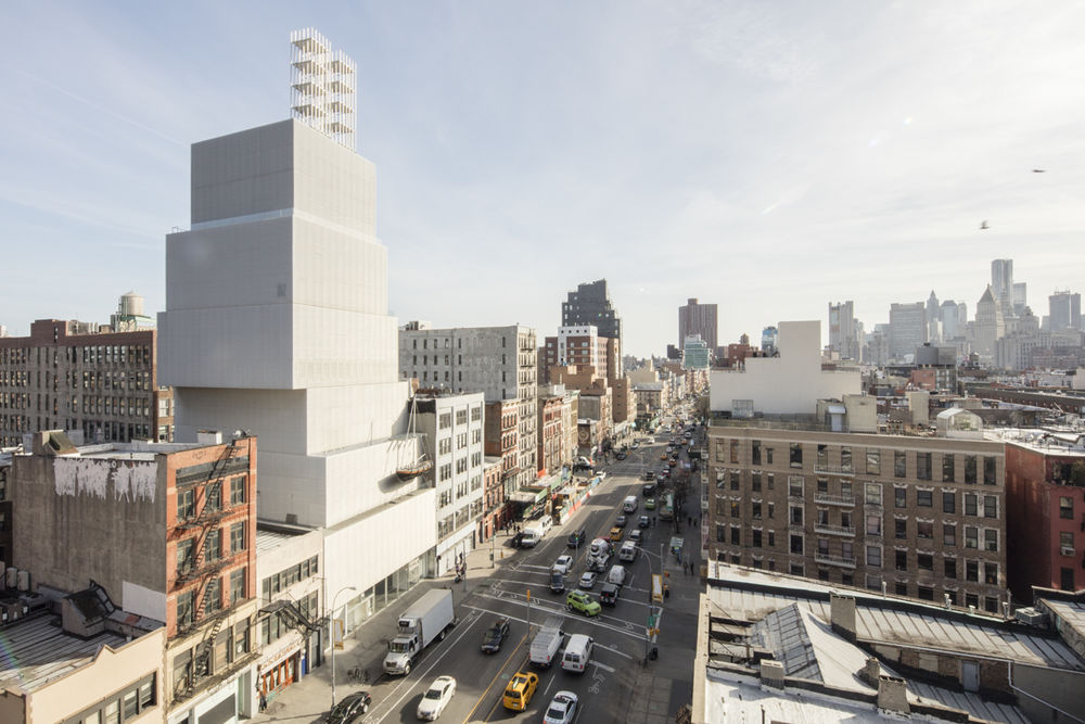
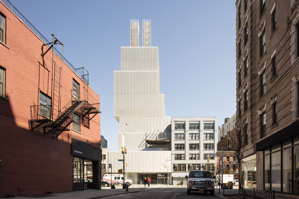
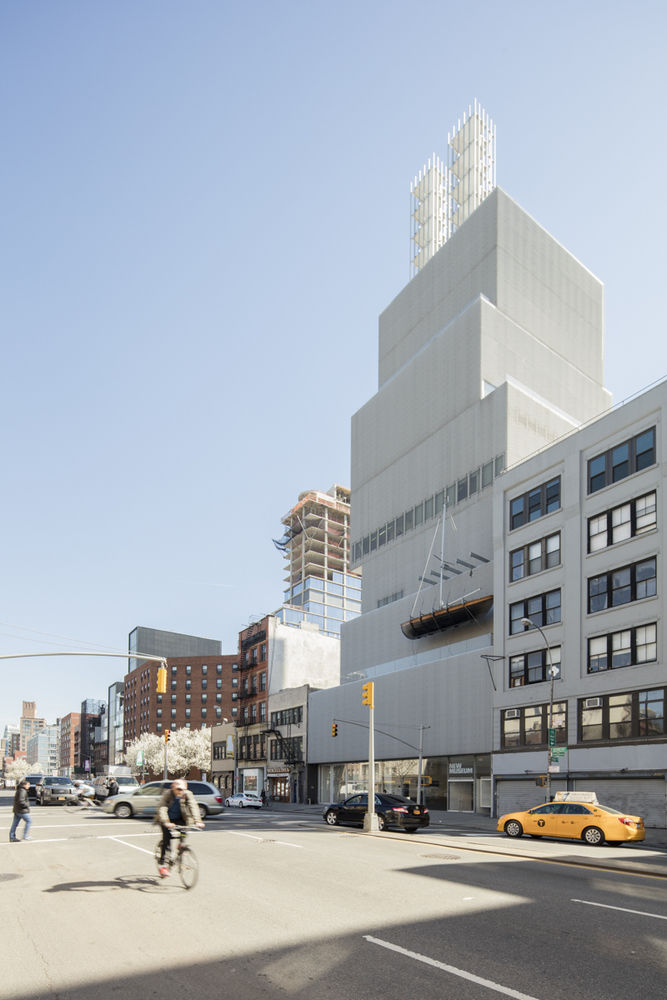
SANAA’s design for the New Museum comprises seven boxes of varying proportions, vertically stacked around a central core. The architects avoided using the maximum square footage permitted by the zoning envelope, affording themselves the space to shift these boxes off-center and create a dynamic interplay between the volumes.[4] The unique plan of the building was intended to create a distinct architectural identity that would reflect the experimental philosophy of the clients.[5]
博物馆的编程元素分布在其十篇故事中;容纳在盒子里的是画廊、办公室、活动空间、咖啡馆、剧院、教育中心和两个机械楼层。桑德拉的建筑典型地与程序产生对话,正如 Niizawa 总结的:“我们使用该函数来创建该建筑,但该建筑也会创建该函数。”这种互惠在新的博物馆中是显而易见的,在那里,第三和第四楼层之间的空气轴中的未使用的空间被转换为仅仅 5 英尺乘 8 英尺的微通道,但是天花板高度为 30-5 英尺。
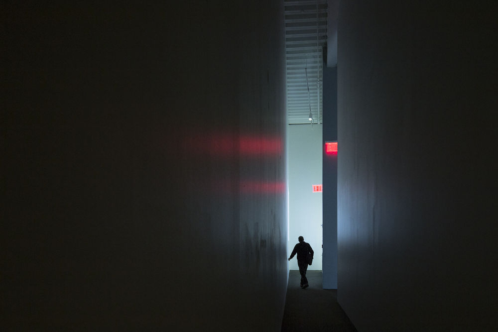
The programmatic elements of the museum are spread across its ten stories; housed within the boxes are galleries, offices, events spaces, a café, a theater, an education center, and two mechanical floors. SANAA’s architecture typically generates a dialogue with the program, as Nishizawa summarized: “We use the function to create the building, but also the building creates the function.”[6] This reciprocity is evident at the New Museum, where an unused space in the air shaft between the third and fourth floors was converted into a micro-gallery measuring just five feet by eight feet but with a ceiling height of thirty-five feet. © Laurian Ghinitoiu
c.Laurian Ghinitoiu
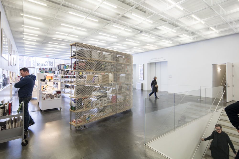
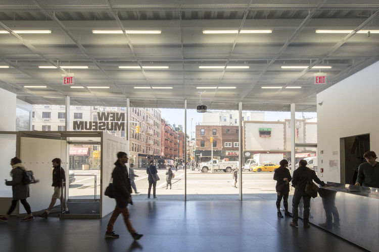
该项目的 Sanaa 的主要目标之一是创建一个平易近人和吸引人的博物馆。[7] 为了实现这一目标,他们在街道一级安装了一个玻璃墙,以物理方式灌输一种公开和透明的感觉。街和博物馆之间的边界被这个膜溶解,鼓励过路人进入。将混凝土人行道延续到博物馆的混凝土地板进一步增加了这种效果。墙壁的玻璃面板进入地板并延伸到天花板中,从而遮蔽它们的框架,并且避免了可能由这些边界产生的任何分裂感。
One of SANAA’s primary goals for the project was to create an approachable and inviting museum.[7] In order to achieve this, they installed a glass wall at street level to physically instill a sense of openness and transparency. The boundary between the street and the museum is dissolved by this membrane, encouraging passers-by to enter. The continuation of the concrete sidewalk to the concrete floor of the museum further adds to this effect. The glass panels of the wall are sunk into the floor and extend into the ceiling, thereby masking their frames and avoiding any sense of division which might be created by these borders.
© Laurian Ghinitoiu
c.Laurian Ghinitoiu
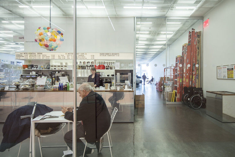
艺术装货间由玻璃墙暴露,揭示了博物馆的幕后活动,并暗示了机构本身的透明度。室内还设有玻璃墙,例如将一楼后面的画廊与大堂隔开,而咖啡厅则设在前厅。因此,博物馆的延伸范围超出了建筑物的范围,即使是在街上的人也能看到展出的艺术。
The art loading bay is exposed by the glass wall, revealing the back-of-house activity of the museum and implying transparency on the part of the institution itself. The interior also features glass walls, such as that which separates the gallery at the back of the first floor from the lobby and café at the front. Thus, the reach of the museum extends beyond the building, with the art on display visible even to those on the street.
建筑物的结构便利了玻璃墙的使用,该结构依靠钢桁架来承受箱体的荷载。桁架还允许画廊无柱存在,提供了一个通畅和高度适应性的展览空间。在某些地方,桁架暴露成装饰性的特征,对角线支柱平分窗户。在其他地方,桁架的位置小心,以避免遮住天窗。
The use of glass walls was facilitated by the structure of the building, which relies on steel trusses to bear the load of the boxes. The trusses also allow the galleries to exist column-free, providing an unobstructed and highly adaptable exhibition space. In certain places, the trusses are exposed to become decorative features, with diagonal struts bisecting the windows. Elsewhere, the trusses are carefully positioned to avoid obscuring the skylights.
© Laurian Ghinitoiu
c.Laurian Ghinitoiu
由于画廊的墙壁不承受负担,建筑师能够在墙壁和地板之间创造一个凹槽,从而避免了两者典型的不完美的相遇。这一建筑细节以前曾被萨那在金泽画廊使用。[8] 在新博物馆,这些漂浮的墙壁与整体结构所暗示的失重相呼应,而整体结构似乎悬浮在玻璃店面上。
Since the gallery walls are not load-bearing, the architects were able to create a recess between the walls and the floor which avoids the typically imperfect meeting of the two. This architectural detail had been previously employed by SANAA in their gallery at Kanazawa.[8] At the New Museum, these floating walls echo the weightlessness suggested by the overall structure, which seemingly levitates over its glass storefront.
最大限度地展览空间是一个关键的考虑,在新的设计,特别是考虑到狭窄的范围,新博物馆的前家。为了扩大画廊的规模,减少了流通空间;在三楼和四楼之间的楼梯只有三英尺宽,这是该市建筑条例允许的最低限度。在这里,狭窄的楼梯宽度和极高的天花板结合在一起,创造了一个戏剧性的空间体验。
Maximizing exhibition space was a key consideration in the new design, particularly given the cramped confines of the New Museum’s previous home. Circulation space was reduced to increase the size of the galleries; the staircase which runs between the third and fourth floors is just three feet wide, the minimum allowed by the city’s building regulations. Here, the narrow width of the staircase and the extreme height of the ceiling combine to create a dramatic spatial experience.
© Laurian Ghinitoiu
c.Laurian Ghinitoiu
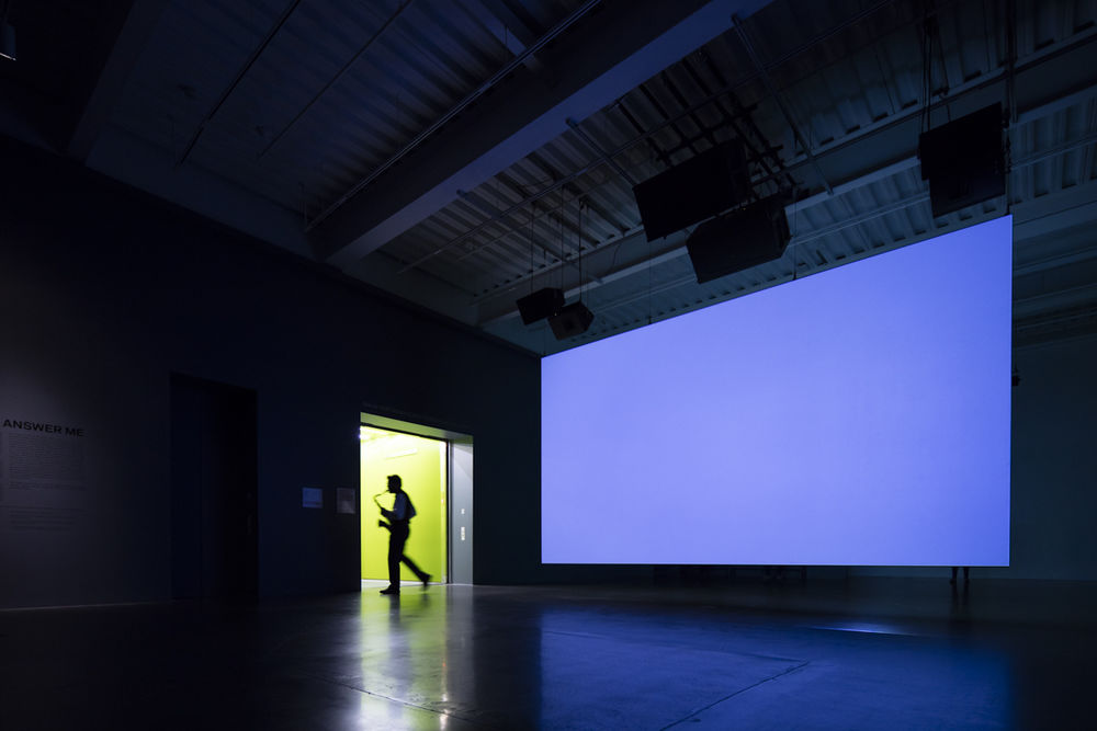
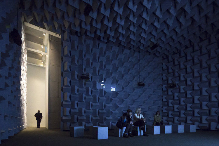
画廊几乎没有窗户;墙壁空间优先于开窗。转移建筑物的组件盒是一个解决方案,使自然光通过天窗进入画廊,由此产生的突出。到了晚上,画廊里的人工光线从天窗中溢出,通过纸片覆盖扩散开来,并轻轻地照亮建筑物。画廊的天花板结构被暴露出来,让艺术从上面悬挂起来,再一次提供了更大更灵活的展览空间。
The galleries are almost devoid of windows; wall space was prioritized over fenestration. The shifting of the building’s component boxes was a solution devised to allow natural light into the galleries through skylights in the resulting protrusions. At night, the artificial light produced inside the galleries spills out through the skylights, diffused by the scrim coverings and softly up-lighting the building. The ceiling structure of the galleries was left exposed to allow art to be hung from above, again providing greater and more flexible exhibition space. © Laurian Ghinitoiu
c.Laurian Ghinitoiu
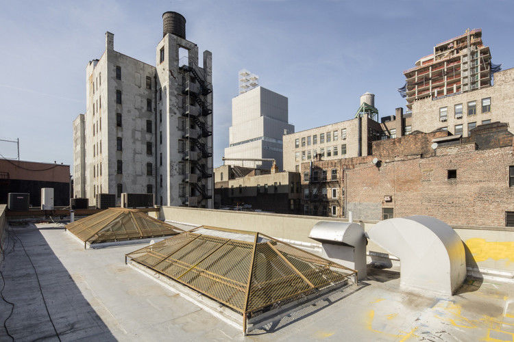
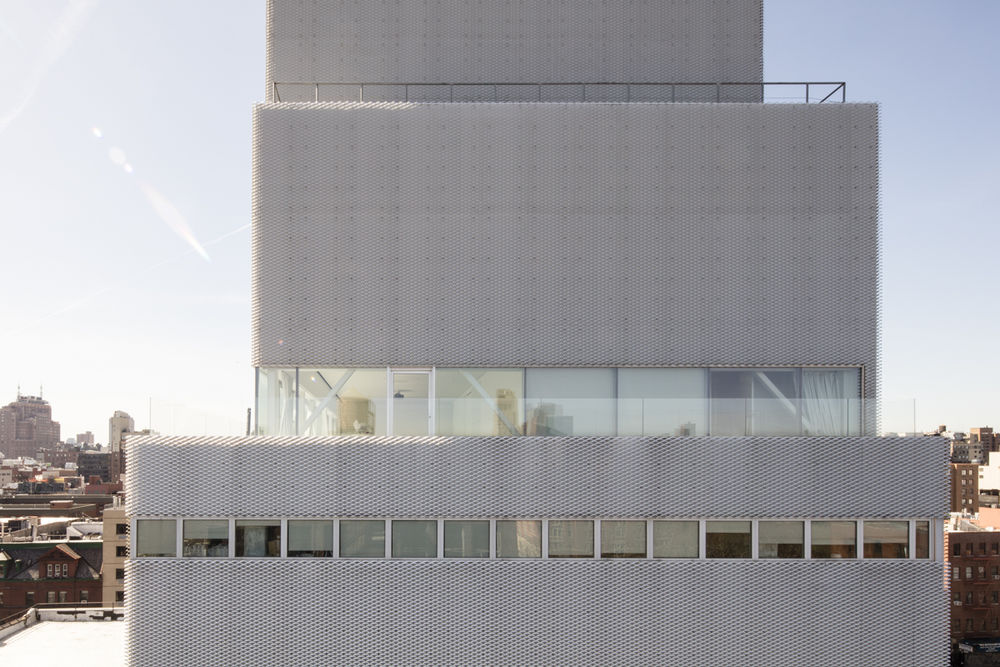
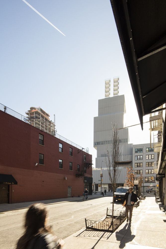
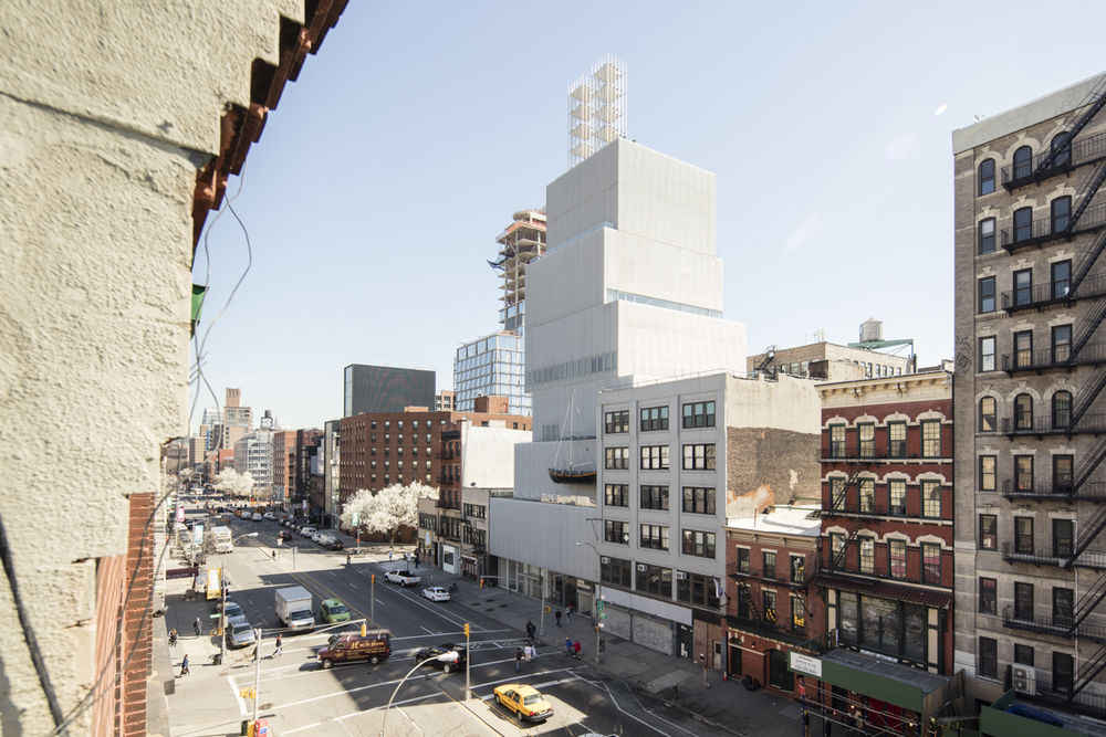
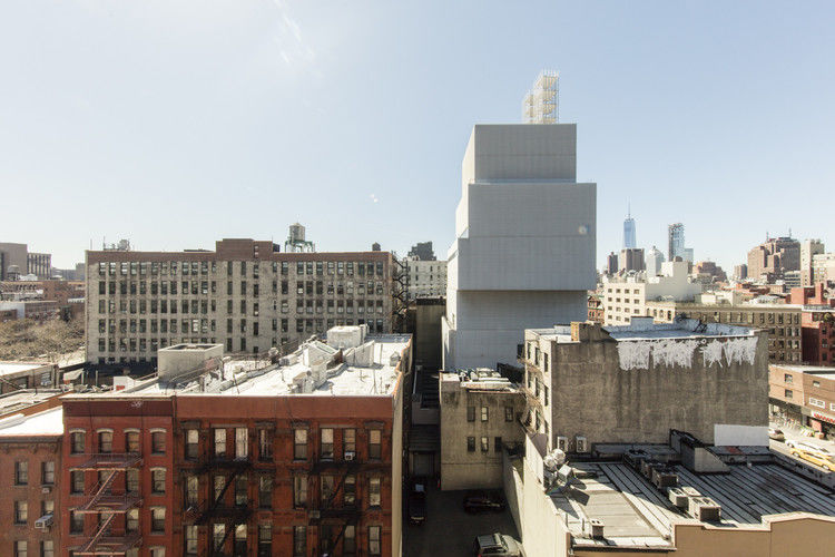
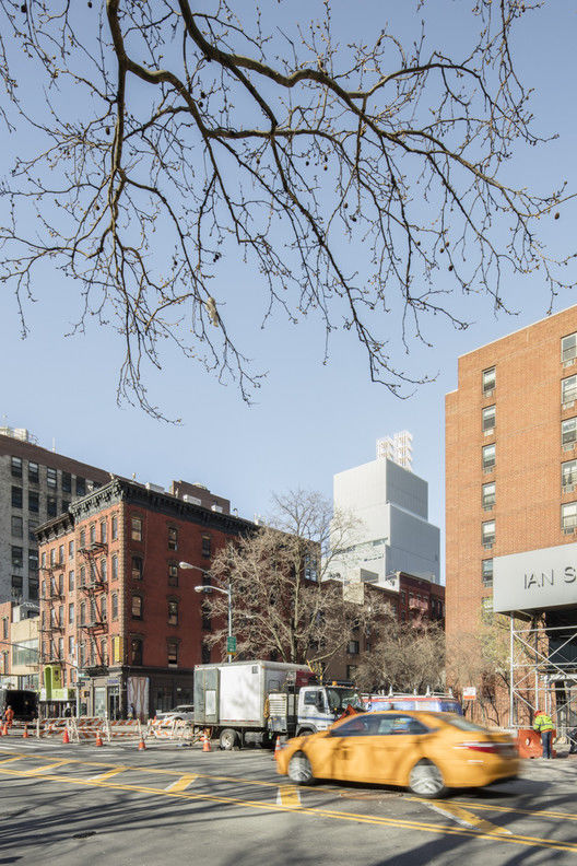
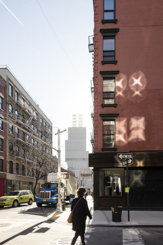
萨那的建筑项目一直致力于促进建筑与周围环境之间的关系,新博物馆也不例外。在最初的设计中,这座建筑比现在更宽更短。然而,在纽约待了一段时间后,建筑师们改进了建筑的组成,使其变得更苗条、更高,以响应城市的建筑景观。[9] 的确,由移动的结构箱形成的台阶,让人想起了代表纽约天际线的挫折摩天大楼。城市景观通过楼上的全景窗进入博物馆,这打断了游客的体验,将城市和博物馆联系在一起。
SANAA’s architectural projects consistently strive to foster a relationship between the building and its surroundings, and the New Museum is no exception. In the original designs, the building was broader and shorter than it stands now. After spending time in New York, however, the architects refined the composition of the building to become slimmer and taller in response to the architectural landscape of the city.[9] Indeed, the steps formed by the shifted structural boxes are reminiscent of the setback skyscrapers which typify the New York skyline. The cityscape is brought into the museum through panoramic windows on the upper floors, which interrupt the visitor experience to knit the city and the museum together.
Photography © Laurian Ghinitoiu
c.Laurian Ghinitoiu
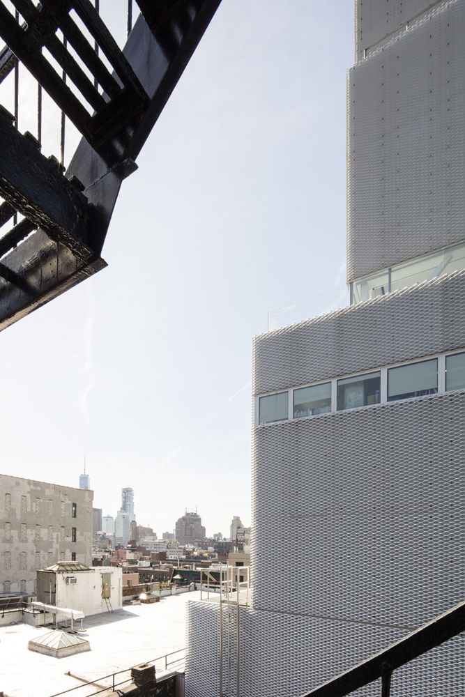
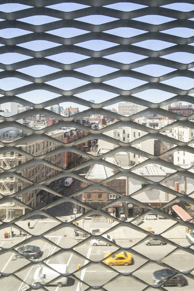
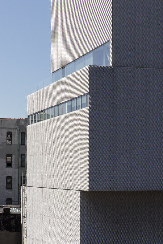
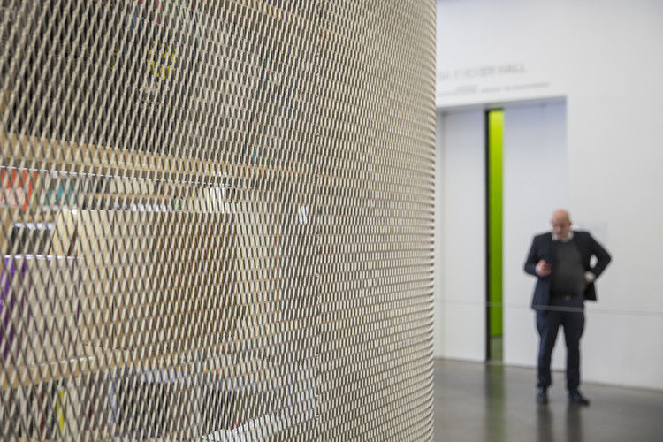
这座建筑还通过使用工业材料来反映其立面的建筑背景,反映了建筑师所说的鲍厄里建筑的“粗糙”。[10] 建筑外部覆盖了两层工业铝网,形成了一个闪闪发光、质地分明的外墙。虽然钢网在建筑中更常用,但选择铝作为一种更明亮、更半透明的材料,会给人一种轻盈的感觉。网眼使建筑物的边缘变软,使其溶入周围,增加了透明度。
The building also reflects its immediate built context through the use of industrial materials, mirroring what the architects described as the “roughness” of the Bowery.[10] The exterior is clad in two layers of industrial aluminum mesh, creating a shimmering, textured façade. Though steel mesh is more commonly used in construction, aluminum was chosen as a brighter and more translucent material which would lend a sense of lightness. The mesh softens the edges of the building, allowing it to melt into its surroundings and adding to its transparency.
© Laurian Ghinitoiu
c.Laurian Ghinitoiu
2007 年底,当新博物馆开业时,它因其设计的极简主义而受到建筑媒体的赞扬。这座新建筑无疑成功地提升了新博物馆的形象,在新博物馆开业后的头两个月里,新博物馆就接待了 10 万名游客。然而,建筑师们并没有完全逃脱批评,有几位评论员指出,天窗提供的自然光是微不足道的,无论如何,天窗都是被荧光条形照明所压倒的。
When the New Museum opened its doors at the end of 2007, it was praised by the architectural press for the striking minimalism of its design. The new building was certainly successful in raising the profile of the New Museum, which welcomed 100,000 visitors through its doors within the first two months of opening. The architects did not completely escape criticism, however, with several commentators noting the negligible amount of natural light provided by the skylights, which is in any case overpowered by the fluorescent strip lighting.[11]© Laurian Ghinitoiu
c.Laurian Ghinitoiu

考虑到这个社区的历史,在鲍瑞河上建造新博物馆的决定是一个非传统的决定。在整个 70 年代,它一直是一个臭名昭著的吸毒热点,30 年后,它仍然被摧毁。然而,近几年来,鲍瑞博物馆经历了一段复兴时期,博物馆因此获得了很大的荣誉。这条街现在拥有一家精品酒店、一家有机超市,以及各种各样的画廊和艺术空间。[12] 新博物馆,无论是在建筑方面,还是在它所居住的机构上,都是艺术和建筑对社会所具有的变革力量的象征。
The decision to construct the New Museum on the Bowery was an unconventional one, given the history of the neighborhood. It had been an infamous hotspot for drug use throughout the seventies and was still run-down thirty years later. In recent years, however, the Bowery has enjoyed a period of regeneration for which the museum can take a great deal of credit. The street now boasts a boutique hotel, an organic supermarket, and a diverse collection of galleries and art spaces.[12] The New Museum, both in terms of the building and the institution it houses, stands as a symbol of the transformative power that both art and architecture can have upon society. © Laurian Ghinitoiu c.Laurian Ghinitoiu
[1]“新博物馆:关于”。2016 年 6 月 20 日访问。[Access][2]Guzmingn,Kristine.“重新阐释传统美学价值。”在房子里:KazuyoSejimaRyueNiizizawa,Sanaa,Ed.Agusti,NPE,RezRubio。LEN:MUSAC,2007。P167。[3]Phillips,Lisa.移位“过去的未来。”:Sanaa 和新博物馆,Eds.JosephGrima 和 KarenWong.拉尔斯·姆霍勒,2008 年。P7。[4] 同上。P9。[5]Grima,Joseph.移位的“采访 KazuyoSejima 和 RyueNiShizawa。”:Sanaa 和新博物馆,Eds.JosephGrima 和 KarenWong.拉尔斯·姆霍勒,2008 年。P26。[6]Rubio,AugusternPerez.“桑德拉在家里的感觉”.房屋:KazuyoSejimaRyueNiizizawa,Sanaa,Ed.Agusti,NPE,RezRubio。LEN:MUSAC,2007。P15。[7] 同上。格里马。P36。[8]Elding,Jonas 等,后台,值班:Sanaa 和新博物馆,EDS.JosephGrima 和 KarenWong。拉尔斯·姆霍勒,2008 年。P77。[9] 同上。格里马。P26。[10] 同上。P28。[11] 填充物,马丁。鲍里的奇迹。《纽约时报》,2008 年 1 月 17 日。2016 年 6 月 20 日访问。[访问][12] 同上。菲利普斯。P11
[1] “New Museum: About”. Accessed 20 June, 2016. [access][2] Guzmán, Kristine. “Reinterpreting traditional aesthetic values.” In Houses: Kazuyo Sejima + Ryue Nishizawa, SANAA, ed. Agustín Pérez Rubio. León: MUSAC, 2007. p167.[3] Phillips, Lisa. “Past Present Future.” In Shift: SANAA and the New Museum, eds. Joseph Grima and Karen Wong. Baden: Lars Müller, 2008. p7.[4] Ibid. p9.[5] Grima, Joseph. “Interview with Kazuyo Sejima and Ryue Nishizawa.” In Shift: SANAA and the New Museum, eds. Joseph Grima and Karen Wong. Baden: Lars Müller, 2008. p26.[6] Rubio, Augustín Perez. “Feeling at home with SANAA”. Houses: Kazuyo Sejima + Ryue Nishizawa, SANAA, ed. Agustín Pérez Rubio. León: MUSAC, 2007. p15.[7] Ibid. Grima. p36.[8] Elding, Jonas et al. “Backstage.” In Shift: SANAA and the New Museum, eds. Joseph Grima and Karen Wong. Baden: Lars Müller, 2008. p77.[9] Ibid. Grima. p26.[10] Ibid. p28.[11] Filler, Martin. “Miracle on the Bowery.” New York Times, 17 January, 2008. Accessed 20 June, 2016. [access][12] Ibid. Phillips. p11.
建筑师萨那地点 235Bowery,纽约 10002,美国建筑师,主管 Kazuyo Sejima,Ryue Nishiawa(萨那),记录 Gensler 建筑师地区 58700.0 英尺 2 项目年的建筑师 2007 年 Laurian Ghinitoiu 类别画廊
Architects SANAA
Location: 235 Bowery, New York, NY 10002, United States
Architects in Charge: Kazuyo Sejima, Ryue Nishizawa (SANAA)Architect of Record: Gensler Architects
Area: 58700.0 ft2Project Year: 2007
Photographs: Laurian Ghinitoiu
Category: Gallery
新艺术博物馆/桑德拉
New Art Museum / SANAA
