该项目旨在对福拉尔贝格州Bütze-Wolfurt村镇的小学进行扩建,同时将其与相邻的幼儿园和日托中心整合起来。
The rural market town Bütze-Wolfurt in the Bregenz district of Vorarlberg wanted to enlarge their primary school and integrate the neighboring kindergarten and day care center.
▼从操场望向建筑,view to the school building from the sports field
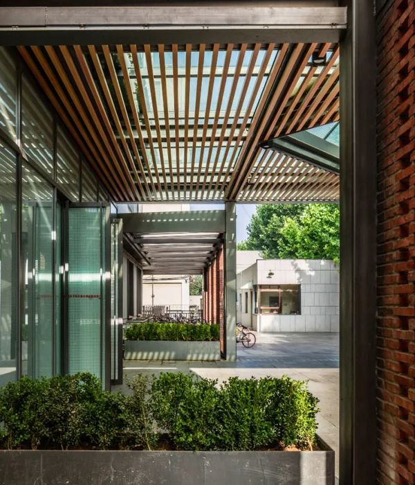
场地中新建了一座建筑,并在其外侧设置了凉廊,容纳了以木板条和镀锌钢制成的楼梯、阳台以及箱状天花板,与衔接细腻的主立面在观感上形成对比,创造出一个更加亲切友好的界面。这些“阳台”还担任着紧急通道的作用,与此同时,又好像“鱼鳃”一般,呼吸着来自周围绿地、雪橇山坡和果园的清新空气。
▼外侧凉廊,view to the pergola
The pergolas at the ends of the new building, with their wood slats and galvanized steel stairways, balconies, and coffered ceilings, are important design elements, which – in contrast to the subtle articulation of the main façade – form a “second, more intimate face” to public space. The “verandas” also serve as emergency escape routes and act like “gills” to the lush green fields, tobogganing hills, and orchards.
▼冬天的校园,school campus in winter
▼入口立面,entrance facade
▼凉廊与衔接细腻的主立面在观感上形成对比,the pergolas are in contrast to the subtle articulation of the main façade
建造于1960年代的既有三层建筑得到了翻新,并与新的双层建筑连接起来。幼儿园位于新楼,小学则分布在新楼和旧楼内,二者共享同一个入口区域,楼层平面也分别在水平和垂直方向上形成相互交错的关系。幼儿园和小学被共同构想为一个连续且统一的空间,带来共享式的学习景观,每个楼层都拥其有自身独特的空间氛围。
The refurbished three-story building from the 1960s docks perpendicularly onto the two-story new building. The kindergarten is located in the new building, the primary school in both the existing building and the new. They share a common entrance area. The floor plans of the kindergarten and the primary school interlock vertically and horizontally. Together they are conceived as a single spatial continuum, a shared learning landscape with diverse spatial atmospheres across all floors.
▼平面模型,model-plan
旧建筑的首层还包含2间日托室和3间幼儿园教室。扩建的新楼二层设有14间教室和12间小组活动室,地下层包含一个具有排球场高度的体育馆。旧楼内的楼梯被移动到了新旧建筑衔接的位置,可以直接通往体育馆内部。
Two day care and three kindergarten rooms are situated on the ground floor of the existing building. The two-story extension – with a total of 14 classrooms and 12 group rooms on the first floor and the spacious, volleyball-height gymnasium in the basement – is accessed via a staircase in the old building, which was shifted toward the midpoint of the complex.
▼从走廊望向体育馆,view to the gymnasium from the corridor
▼从走廊望向小组活动室,view to the group room from the corridor
楼层平面主要由3个部分构成:核心部分是蜿蜒的公共区域,孩子们可以从这里直接通往阳台,或在宽敞而开放的空间里自由又安全地奔跑和玩耍。“庭院”中设有固定的长椅,屋顶上开有大尺寸的天窗,带来休息和安静学习的空间。第2个部分是一系列方盒子空间,其墙面上设有大型内窗,主要用于小组活动。第3个部分由面向户外的大教室构成,窗台的高度恰好适合小学生们就座,从而有效地避免了传统学校走廊的冗长和闭塞感。
▼轴测图,axon
The floor plan consists of three layers: At the core are the meandering communal areas from where the children have direct access to the verandas. They are generously designed, broad spaces, which can be used for a diverse range of functions. There is sufficient room for the children to run around and play safely without – literally – anything “standing in their way”. “Courtyards” with built-in benches, roofed by large skylights, invite one to rest, cuddle up, or to study in peace. Square rooms with big inner windows for small groups form the second layer. And the third layer in succession is made up of the bigger classrooms with windows to the outside, whose sills have been fitted to the seating height of primary school pupils. The classic long corridors with “dead ends” have consciously been avoided in this learning landscape.
▼公共区域,the communal area
▼被天窗照亮的座位空间,seating area illuminated by skylights
▼走廊,corridor
小学的三层设有教师室、职工厨房、医务室、主任办公室、秘书室和各类工作坊、体操室以及多功能室等。大量的斜屋顶天窗和窗户使学校的每个房间都洒满了光线。光与影的互动为学习、玩耍和休息的空间营造出各不相同的氛围。
On the second floor of the primary school are the teacher rooms, the staff kitchen, a doctor’s room, the director’s office, the secretary’s room, textile and other workshops, and a gymnastics and multi-purpose room. All rooms are flooded by sunlight via the numerous pitched skylights and windows. The interplay of light and shadow nuances the different ambiences of the spaces for learning, playing, and relaxing.
▼厨房,kitchen
由细刨花制成的白色清漆天花板保证了舒适的声学效果,为孩子们带来健康的环境。室内主要的纺织品均以浅色为主,凸显出孩子们在空间中的主角地位。
The white varnished ceiling panels made of wood wool ensure pleasant acoustics and a healthy environment for the little ones. The accentuating textiles are kept in reduced colors – the true color is added by the children themselves.
▼教室,classroom
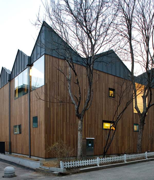
可移动的架子和滚动式的置物箱令空间的布局更加灵活和个性化。外立面设计采用了垂直铺设的云杉木板,并装饰以全长的带状窗户,呼应了福拉尔贝格当地的传统建筑特征。
Mobile shelves and rolling containers allow flexible and individual arrangements of the spaces. The outer façade design with vertical preweathered spruce and bands of windows along the complete length of the building are inspired by local building traditions in Vorarlberg.
▼可移动家具,mobile furniture pieces
▼室外凉廊空间,the pergola space
▼建筑外观,exterior view
▼夜景,night view
▼手绘,sketch
▼总平面图,site plan
▼平面图,floor plans
▼剖面图,section
PROJECT DETAILS
Commission Type: EU-wide competition with prior selection procedure, Partly General-planner
Client: Municipality of Wolfurt
GFA: 7.204 m2
Energy Efficiency: Passive House Standard
Team: Marlies Grammanitsch, Simon Gysel, Barbara Roller, Christian Rübenacker, Jana Sack, Michael Salvi, Andres Schenker, Pia Schmidt, Tina Tobisch, Thomas Weber
COOPERATION
Statics: Hämmerle-Huster Statik
Fire Safety: IMS-Brandschutz
Building Physics: IBO – Österreichisches Institut für Bauen und Ökologie
Building Services: teamgmi Ingenieurbüro
Electrical Planning: Ingenieurbüro Hiebeler + Mathis
Light Design: Designbüro Christian Ploderer
Landscape Design: DnD Landschaftsplanung
{{item.text_origin}}


