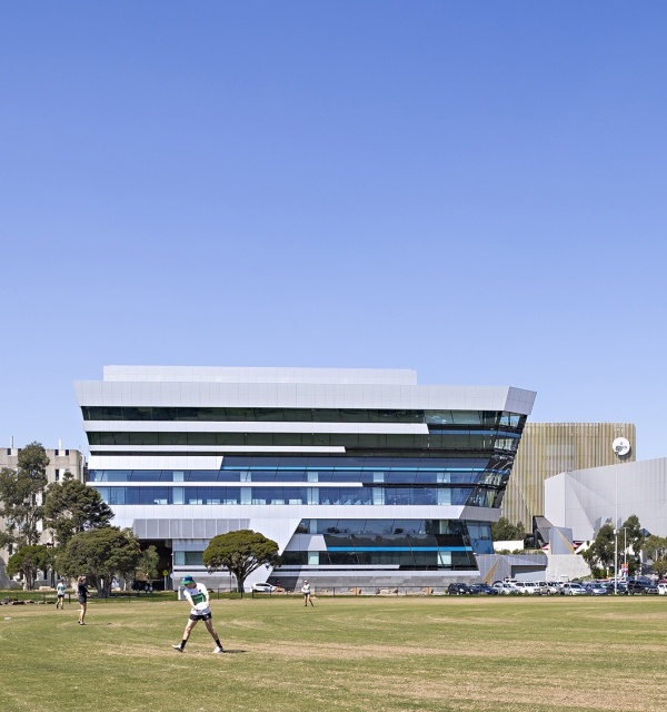
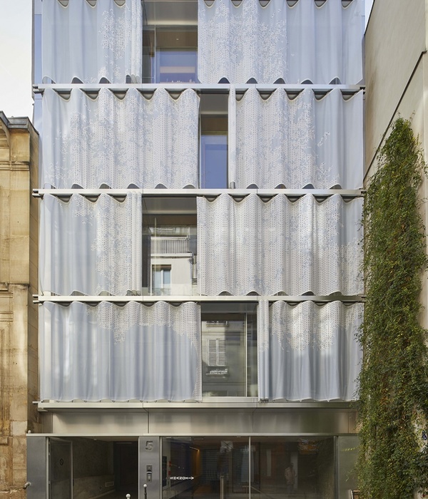
原有的建筑呈现出八十年代办公大楼的典型特征:与土地不甚和谐的关系,对标准层和窗户的一味重复,以及一种以自我为中心的单调而光华的立面。这座建筑希望成为一栋大厦,但它并非一栋大厦。它的高度不足以使其与周围的大厦竞争。它地处拉德芳斯的边缘地带,使其自身被归为“城市中心建筑”的范畴,因而,它不得不放弃“遗世独立”的理想。本项目试图将“Ampère e+”办公楼重新融入库尔布瓦的城市系统当中,并将环绕在其周围的道路改变为城市的林荫大道。另外一个任务则是重塑并组织现有建筑的外观,使其谨慎且合理地融入其所在的城市肌理当中。
The present building is showing off a typical facade of the eighties office towers’ architecture, with a less satisfying relationship with the soil, a heightened repeat of a floor standard, of a window type, with a simple and smooth façade thus a kind of autism to its own context. The building wanted to be a tower, but it’s not. Its small length didn’t allow it to compete with its close sisters. Its location, on the fringes of La Defense’s slab, makes it belong more to the “domestic” city and its codes. Thus, he should renounce to his solitary object status. The project is trying to rectify those miscommunications by making “Ampère e+” belong to the urban system of Courbevoie’s city, by supporting the transfer of the circular boulevard into an urban boulevard. Our task was also to shape and rank the present building, to make it comprehensible and careful to its urban context.
▼建筑外观,exterior view
确立建筑在城市中的地位 | Entrench the building in the city
建筑师对建筑的楼层和连接城市的入口和路径进行了重新设计。被群楼包围的建筑需要强调出其自身的特质,尤其是首层平面的重新规划,以及首层和负一层体量之间的调整与平衡。建筑的主入口也进行了改动。建筑师首先在一层打造了一个补充性的空间,基于场地中既有的体量,重建了等腰直角三角形的基础平面。这一做法为首层空间赋予了统一性,同时消除了方形体量带来的内向感,使建筑在其环境中显得格外耀眼夺目。
The building hold to the floor has been redesigned, as well as every access on the city. Lost amid towers, the building had to reinforce itself, mainly in its construction with a new planning of the ground floor, and a rebalance of the volumes between the ground floor and the minus one floor. The main entrance was also reviewed. The project begins with the creation of a complementary volume in the ground floor. It’s coming to rebuild the unitary shape of isosceles right-angled triangle, which is at the basis of the composition of the volumes on the plot. This modest volume allows to unite the ground floor and cancel the introversion created by the inside corner of the square building. The building is shining on its environment.
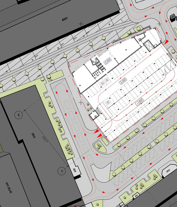
▼基于场地中既有的体量,等腰直角三角形的基础平面得到了重建,the unitary shape of isosceles right-angled triangle was rebuilt
▼建筑近景,a close view of the building
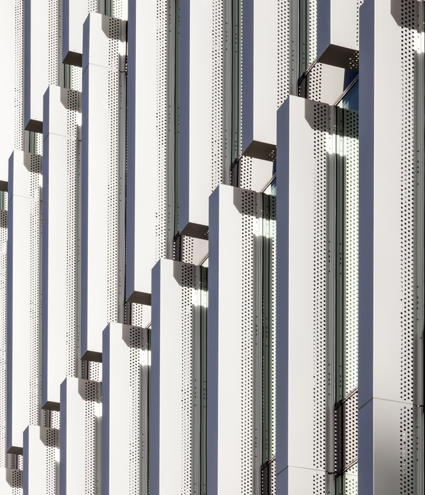
▼立面细部,detail of the facade
原先建筑的入口在街道上不可见,看上去仿佛很难接近。通过将入口位置调整至北侧的Henri Regnault大街,新建筑以一种友好的姿态连接了公共空间,从而重新融入了城市生活。出于同样的目的,经过翻新的绿化空间重新显现在街道,同时被赋予了全新的功能。在北侧,它们与入口共同延伸至集会空间、咖啡厅和户外平台所在的地下层。在东侧,精心塑造的地势将场地和环形林荫道统一在同一个水平面上。东立面不再是建筑的背面,而是与环形道路共同担负起连接城市的作用。
The present entrance of the building is invisible from the street, it appears unreachable. A reversal of the entrance was prescribed. The new volume is welcoming a totally rethought entrance, and repositioned on the Henri Regnault street’s side to the North. The entrance is staged on public space and the building has a recovery of city life. In the same « city life » goal, green and plant spaces are refurbished to be visible from the street. Their uses are redefined. To the North, they accompany the entrance expansion to the minor level where the meeting pole, the cafeteria and the terrace are situated. In the east, a meticulous work on the topography allows to almost reset on an equal footing the plot and the circular boulevard. The east façade is no longer a back façade, it’s maintaining again functional and urban relationships, with a circular boulevard currently mutating.
▼入口位置的调整使新建筑以一种友好的姿态连接了公共空间,the entrance was repositioned and staged on public space and the building has a recovery of city life
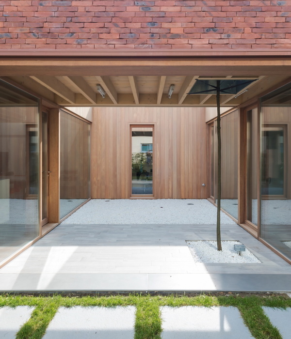
▼经过翻新的绿化空间与入口共同延伸至集会空间、咖啡厅和户外平台所在的地下层,the green and plant spaces accompany the entrance expansion to the minor level where the meeting pole, the cafeteria and the terrace are situated
改变尺度 | Changing scale
首层立面进行了缩进,以定义出“抬升”的体量,也就是建筑的构架。建筑师根据明确的水平秩序重新组织了这一构架,将其拆解为三个层级,而每个层级又分为三小层。这一做法消除了每个楼层单调堆叠的感觉,从而令建筑的尺度发生了改变,最终使建筑整体得到了重新组织、激活、分层和强化。
The ground-floor facade is indented to make the bearer structure reappearing and to identify an “arisen” volume, which means the building frame. We have chosen to organize this frame according to an explicit horizontal order, that is disassembling it into three layers superimposed with 3 levels. This order cancels the sensation of an interminable stack of levels, its scale is changing. We have made the choice of this reorganization, to boost the building, to stratify it, to enhance it.
▼建筑的构架被拆解为三个层级,而每个层级又分为三小层,the building frame was disassembled into three layers superimposed with 3 levels
▼室内空间,interior
▼公共空间,public area
▼办公空间,office area
▼交通空间,circulation
挖掘 | Dig in
与传统的办公楼不同,建筑师为该项目赋予了独特的功能空间:三个挖掘于建筑立面上的盒体空间,即三个纵向并置的“空中花园”。一方面,它们使建筑的城市尺度得到了重新定义;另一方面,它们也在建筑内部形成一种中间尺度。这些花园成为了建筑与城市的互动关系的象征。
Often isolated from the traditional office buildings typology, we have chosen to put in roughness, adopted spaces, that could lead other uses. It comes to be three dug boxes in the horizontal order settled down. They’re welcoming three hanging gardens that are on one hand, redefining the urban scale of the building, and on the other hand, introducing an intermediary scale in the building itself. The hanging gardens are becoming a symbol of the urban commitment of the building.
▼三个挖掘于建筑立面上的盒体空间形成三个纵向并置的“空中花园”,three dug boxes in the horizontal order become three hanging gardens
▼“空中花园”细部,detail of the hanging gardens
双层高的室内“休息空间”面向这些空中花园,为建筑深处的空间赋予了友好而亲切的透明感觉。这些“掘入”建筑内部的空间为大楼赋予了功能的多样性以及全新的时空尺度。它们就像是带有阴影的泡泡一样,使被荫蔽的外部空间和敞开的内部空间形成对比。
Interior double-height “lounges”, facing each of those hanging gardens and all possible associated uses, allow to make a welcomed transparency in the depth of the building and the plot. The play made here on the insertion of roughness allows to organize the building “Ampère e+” by offering it diverse uses and new timescales. The creation of those hanging gardens, such as little shadowed bubbles, has allowed to make a contrast between the outside area (shadowed one) and the openly inside areas.
▼双层高的室内“休息空间”面向这些空中花园,interior double-height “lounges” face each of those hanging gardens
动态策略 | Strategy in motion
三个空中花园彼此存在些许差异,强调了它们自身在水平层面上的独立性。这一“动态策略”呼应了环形道路充满活力的特征,同时与Belfort大街和Carnot大街形成了微妙的关联。
The hanging gardens are showing a little time difference between themselves, emphasizing the autonomy of the three horizontal strata. This « strategy in motion » is dealing with the vibrant nature of the Circular Boulevard, and makes a subtle signal on the adjacent Belfort and Carnot’s streets.
▼休息室,lounges
新的视野:与天空的衔接 | A sequence with the sky, a new relationship with the horizon
通过新设计的天窗,屋顶重新定义了建筑、天空以及地平线的关系,成为一个独一无二的场所。建筑与地面的关系一直延伸到了屋顶,成为建筑的“收尾”。尽管与周围大厦相比建筑并不高,但屋顶平台依然能够将Montmorency国家森林的美景尽收眼底。这一地理位置促进了露台和开放花园的形成。建筑的第9层被设计为一个夹层,与露台和开放花园在同一平面,意在让周围的高楼大厦也能欣赏到建筑的屋顶空间。除此之外,用于建筑正常运行的技术设备均集中隐藏在在建筑的南侧外墙内部。
We have chosen to take the rooftop, to requalify the relationship between the building, the sky and the horizon, to replace it in its skyline and to use this place as a unique one. The work on the building relationship with the ground is extended with the roof, to “finish” the building. Beside the building’ small length (in relation with the surrounding towers), the terrace has a noticeable panorama on the Montmorency’s state-forest (North/East). This location allows the creation of a terrace/opened garden. Thus, the project provides the design of a mezzanine on the ninth floor, on the same level as the terrace/opened garden. This design, and its purpose, is responsible of a long-term and qualitative treatment of the visible roof from the surrounding towers. Furthermore, the technical equipment that’s needed for the functioning of the building are gathered in a technical enclosure, hedged by a privacy protection on the south side.
▼建筑与地面的关系一直延伸到了屋顶,the work on the building relationship with the ground is extended with the roof
▼屋顶露台,rooftop terrace
▼设计示意图,design diagram
▼场地平面图,site plan
▼花园层平面图,garden level plan
▼首层平面图,ground floor plan
▼二层平面图,first floor plan
▼三层平面图,second floor plan
▼顶层平面图,tenth floor plan
▼剖面图,section
Project Name
Ampère e+: Refurbishment of Sogeprom Headquarters / Ateliers 2/3/4/
Architect or Architecture Firm
Ateliers 2/3/4/
Office Website
Completion Year
2017
Built Area (m2 or sqft).
15000m²
Project Location
Courbevoie, La Défense, France (34-40 rue Henri Regnault, Courbevoie)
Photographer
OTHER TECHNICAL INFO
2/3/4/ team: Jean Mas, Architect Partner, Fabienne Garrigues, Réda Mazouz and Agate Mordka (project directors), Manuel Afsar, Orion Anglade, Gabriel Garcia, Alice Heaney, Olivier Jacques, Adrien Petit.
Engeering: INEX / SCYNA4 / ARCORA / ETAMINE / PEUTZ / GVI / Infra Services
Client: SOGEPROM / Investor: PRIMONIAL
Constructor: SICRA / Goyer / Tenzini
MANUFACTURERS / PRODUCTS
Artemide/Mercury: The suspended luminaire for the lobby
Marazzi: porcelain stoneware Pietra di Vals for the exterior ground floor
Desso: carpet in the meeting rooms of the ground floor
{{item.text_origin}}

