Fulton豪华商务酒店,墨西哥 / Blending Dots
如何将一栋只有7层楼的废弃办公楼改造成酒店,同时不削弱其存在感,让来访者不会被周围强烈的对比吸引所有的目光? 这是该项目需要解决的最重要的挑战之一。
How to adapt an abandoned office building with just 7 floors for a hotel in an area of high-ranking contemporary buildings without detracting from it presence and without being absorbed by the comparison that surrounds it? This was one of the most important challenges to be addressed in this project.
▼夜间街景,street view at night © Aveh Studio
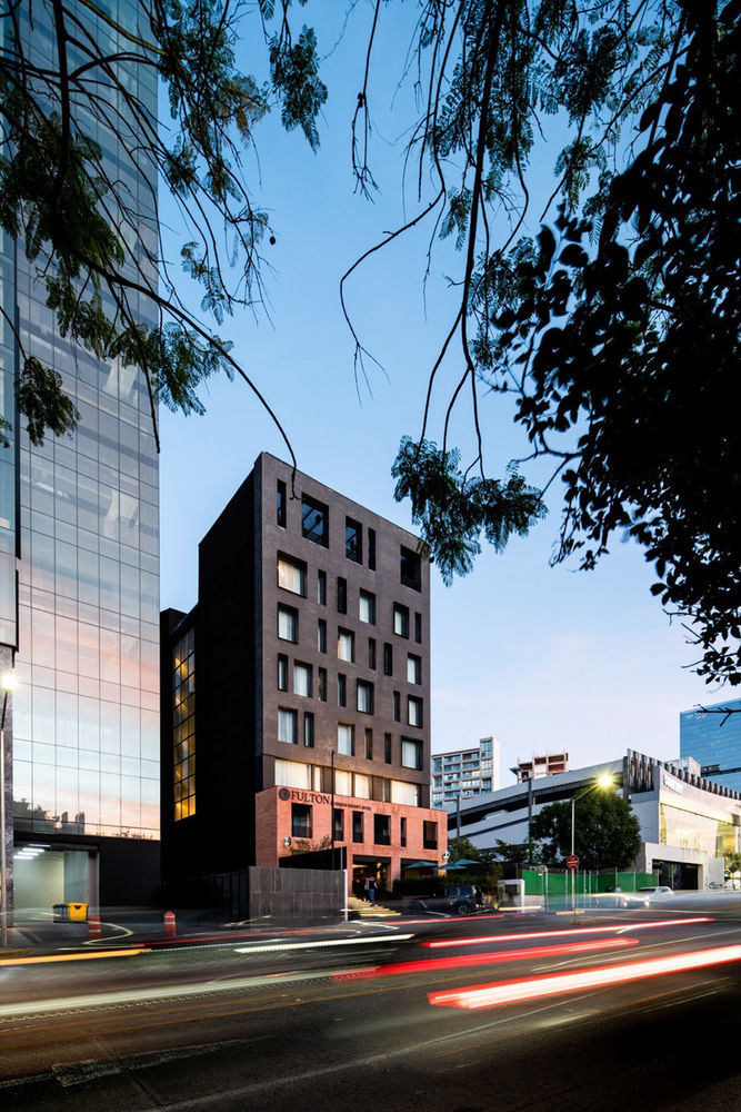
场地周围的建筑以钢化玻璃墙、干净整洁的饰面以及穿孔钢立面和铝格为特色,如果设计必须遵循这种建筑的刻板印象,那么我们选择将该项目打造为人们心中的“那个古怪而舒适的角落小酒店”。这就是我们面对以上问题的立场。
▼改造前,before renovation © Blending Dots
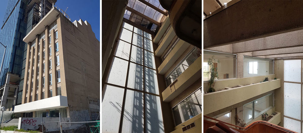
What if in You have to follow the stereotypes marked around the site (tempered glass walls and clean and neat finishes, perforated steel facades and aluminum lattices) we opted for for designing “that quaint and cozy little hotel in the corner”? That was our stance to be able to tackle this problem.
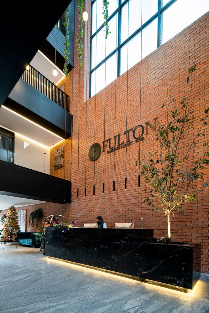
▼前台接待,reception © Aveh Studio
▼通高中庭,free height atrium © Aveh Studio
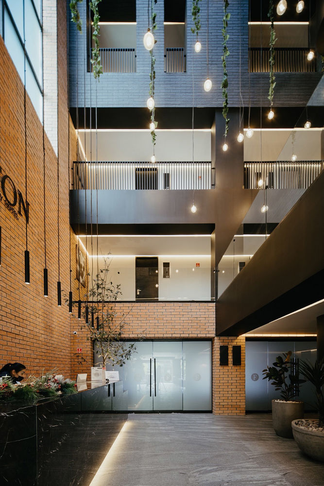

从这个意义上来讲,设计旨在100%尊重原有的建筑结构,并专注于与周围环境的对比。立面上,一系列随机分布的开窗和框架,材料的重量感,与周围建筑的轻盈形成对比,这种对比在室内接待空间中进一步凸显了出来,温暖的氛围在中庭壮观的通高空间中自由流动。
In this sense, we seek to respect 100% the structure and focus on designing inversely to what is proposed to our surroundings, proposing a sequence of openings and frames randomly distributed solids on the façade, heaviness in its proposal of materials, in contrast to the lightness of our neighbors, which is repeated in the free height of reception inside, warmth instead of coldness.
▼仰视天窗,looking up to the skylight © Aveh Studio
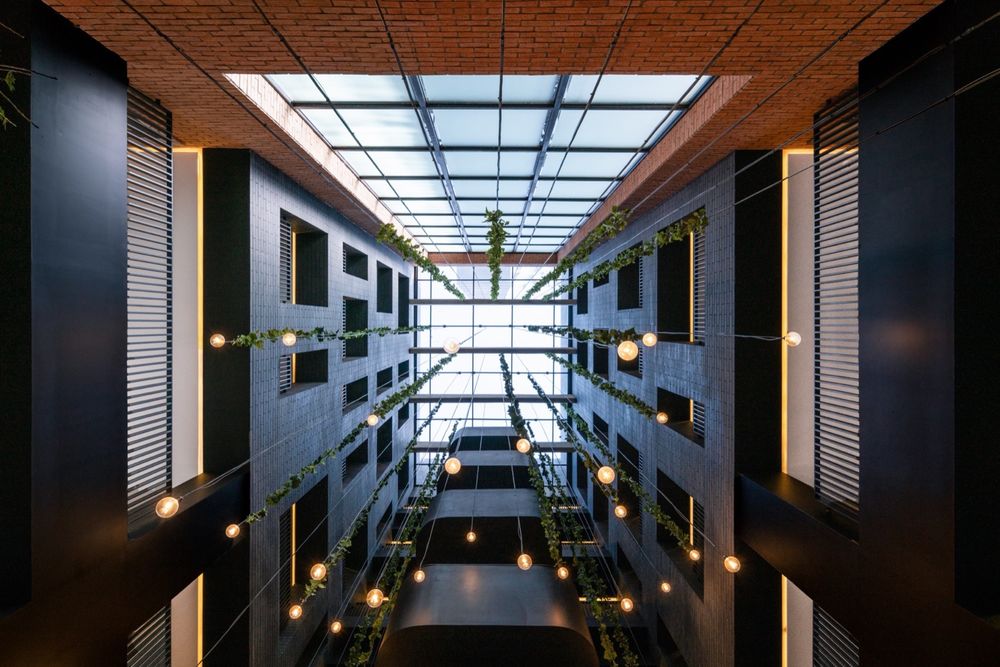
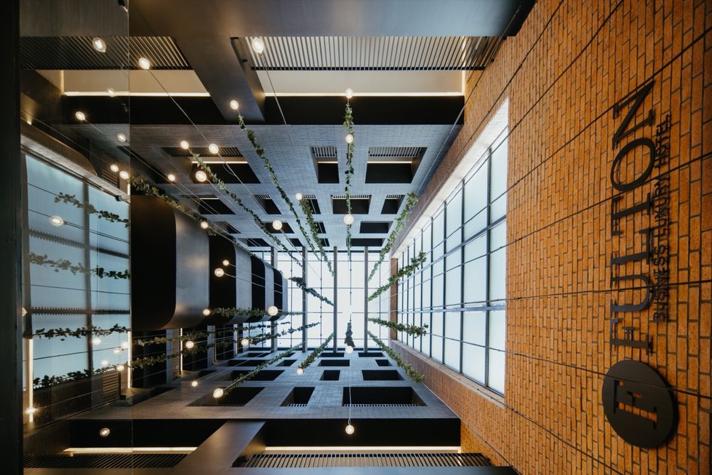
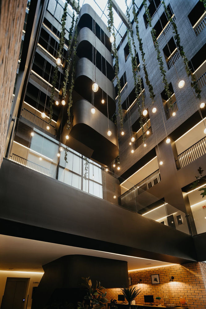
竖向交通核心是设计中一个非常重要的元素,设计以原始楼梯为起点,采用优雅的黑色饰面对建筑空间进行了修复,并将这种色彩与肌理从底部一直延续要顶层空间中。
▼楼梯原状,original view of the staircase © Blending Dots
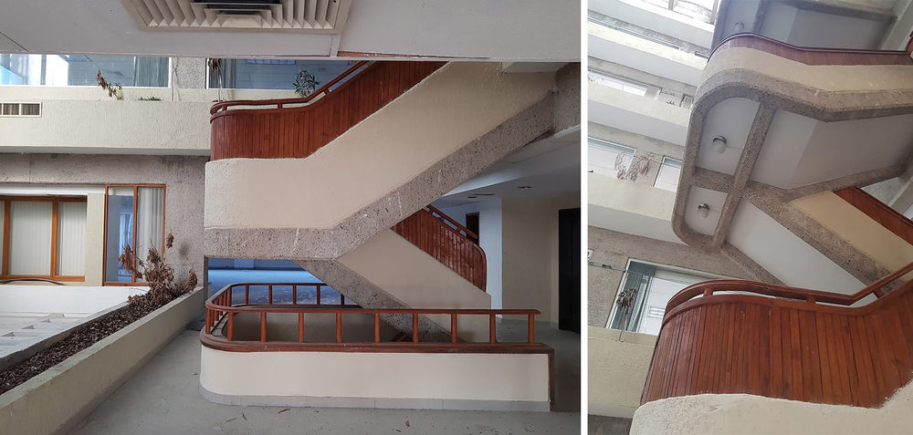
The core of vertical circulations serves as an extremely important element since that it was rehabilitated taking the original staircase as a starting point, dressing it elegantly with a dark skin and taking over the headroom that houses it.
▼改造后的竖向交通核心,
vertical circulation after renovation © Aveh Studio

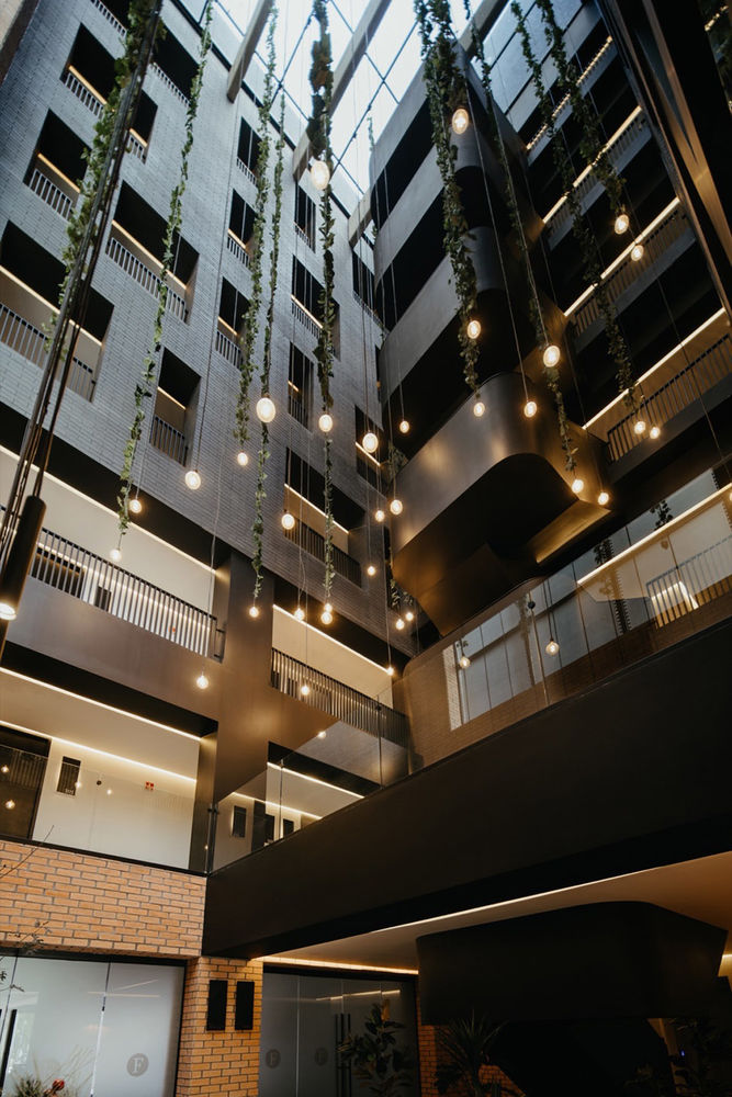
▼优雅的黑色饰面,elegant black finishing © Aveh Studio
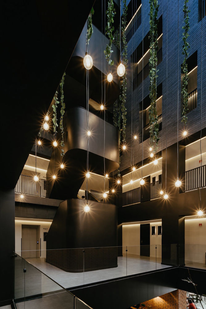
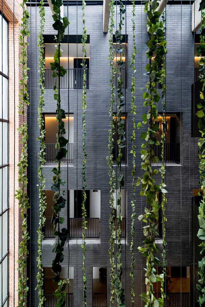
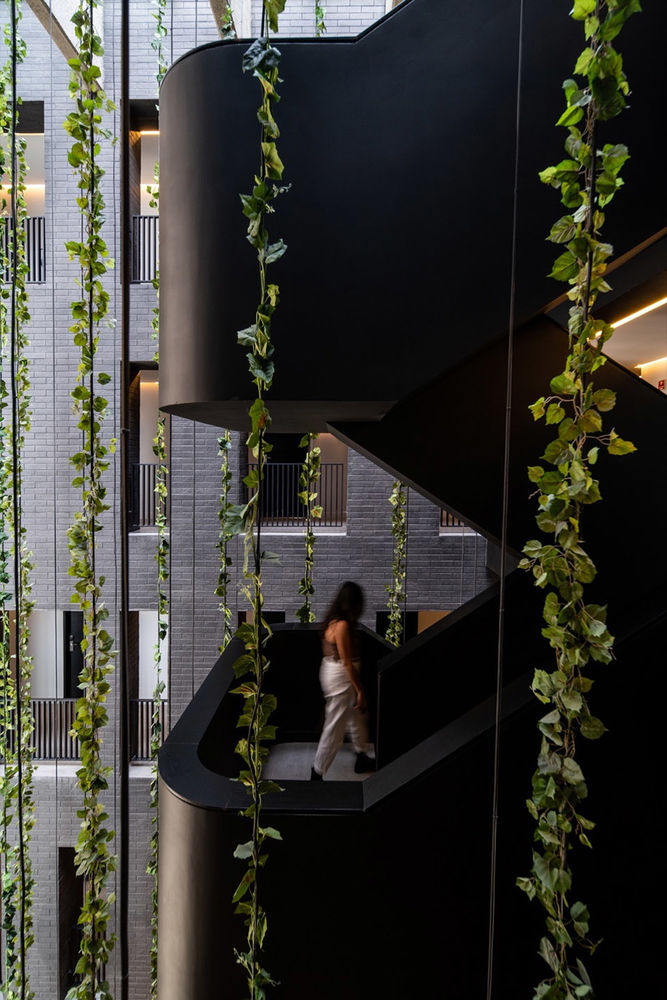
悬垂的藤蔓植物沿着吊灯的电线,从顶部延伸到大厅区域,给交通空间带来活力,而丝线最底端的吊灯则照亮了整个空间。
Cables with vines that run down from the highest part to the area of lobby give life to the circulation spaces and at the same time end in spotlights that They light up the space.
▼绿植与吊灯,plant and lamps © Aveh Studio
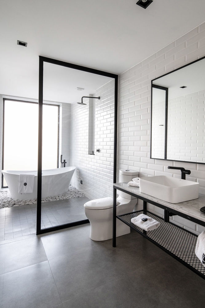
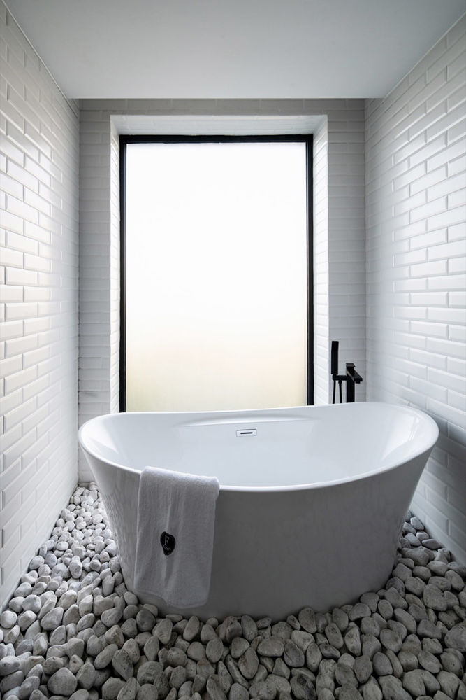
浴室的设计与干净、精致的饰面形成对比,浴室内皮革衬里与建筑外观中深色的砖材肌理形成呼应,同时也回应了空间的功能。
The design of the bathrooms contrasts with clean and fine finishes, you could say the leather lining the bathrooms is interpreted as the immediate negative to the dark brick of the exterior and this responds to the use of space.
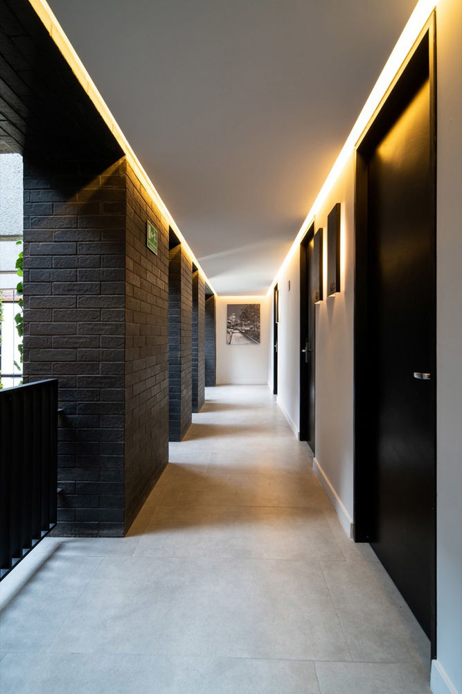
▼走廊,corridor © Aveh Studio
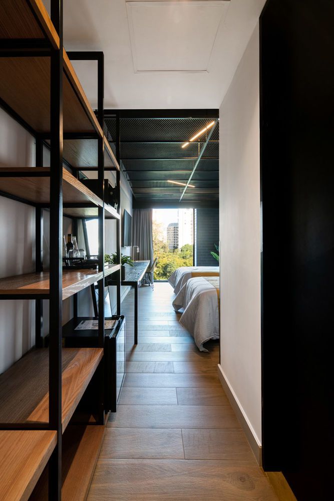
▼客房玄关,entrance of the guest room © Aveh Studio
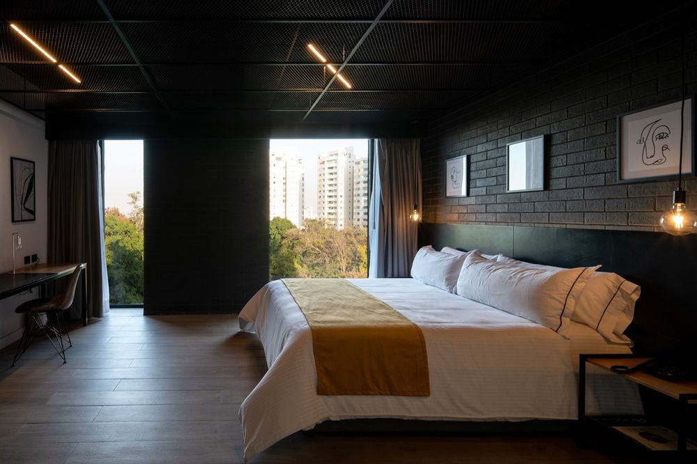
▼客房,guest room © Aveh Studio

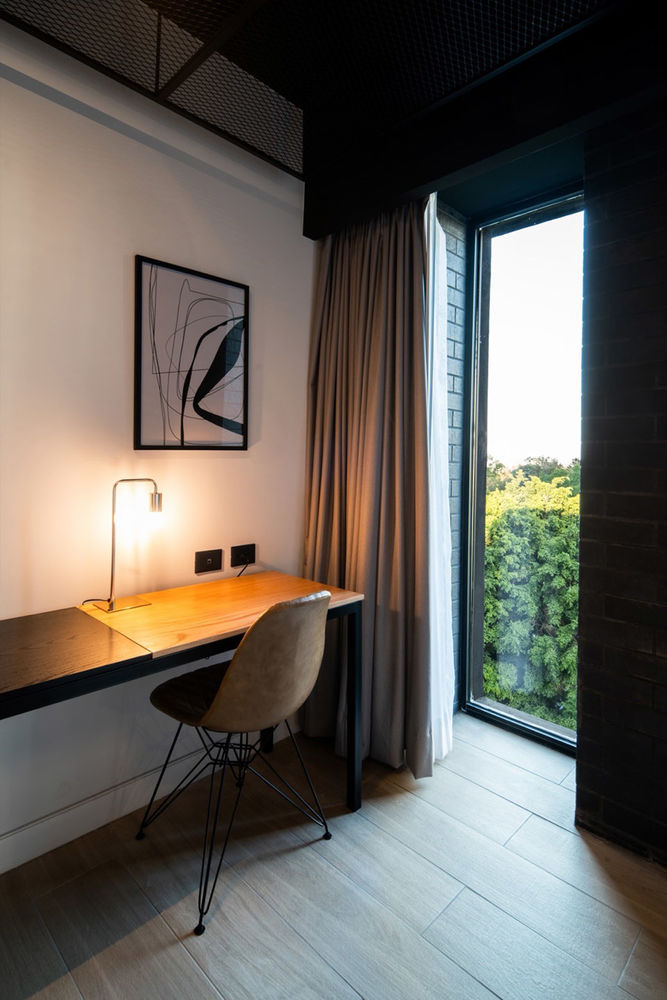
▼客房细部,details of the guest room © Aveh Studio
▼浴室,bathroom © Aveh Studio
简而言之,Fulton酒店的设计具有强烈的独特性,它与周围的建筑环境形成鲜明的对比,以不落俗套的方式重新诠释了周围的建筑语言,这种策略使本项目从环境中脱颖而出,并以桀骜不驯的姿态回应了周围的环境背景。
In short, it could be said that the Fulton Hotel is designed with uniqueness since It invariably contrasts with the surrounding proposals and is rebellious to continue with these stereotypes, which makes it unique in its immediate environment and characterizes it for the antagonistic way of responding to their context.
▼一层平面图,1st floor plan © Blending Dots

▼二层平面图,2nd floor plan © Blending Dots
▼三层~五层平面图,3rd~5th floor plan © Blending Dots
▼六层平面图,6th floor plan © Blending Dots

▼七层平面图,7th floor plan © Blending Dots

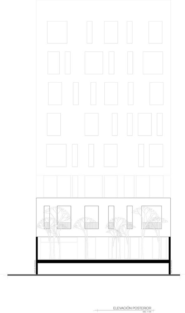
▼立面图,elevations © Blending Dots

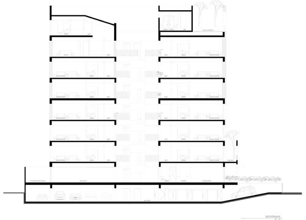
▼剖面图,section © Blending Dots
Technical File Of The Project
Office: Blending Dots
Authors: Arq. Luis Ivan Guerrero Villa / Arq. Emmanuel Javier Trinidad
Social Media
Ig:
Fb:
Project Name: Fulton Business Luxury Hotel
Location: Av. De Las Americas 1450, Country Club, Guadalajara, Jal.
Year Built: 2022
Construction Area: 3,450.00 M2
Collaborations:
Arq. Rogelio Arturo Castillo Prieto
Photographer: Aveh Studio
Social Media
Ig:


