喜燃南京体验店 | 情报局主题的室内空间设计
- 项目名称:H.E.A.T 喜燃南京体验店
- 空间设计:xiao-wen Chen,Zhang Yixuan
- 项目经理:陈常CC,尤东芝
- 设计总监:郑铮
- 项目客户:H.E.A.T喜燃
- 空间摄影:黄早慧
点击蓝字“知行 Design 中华优秀作品第一发布平台!
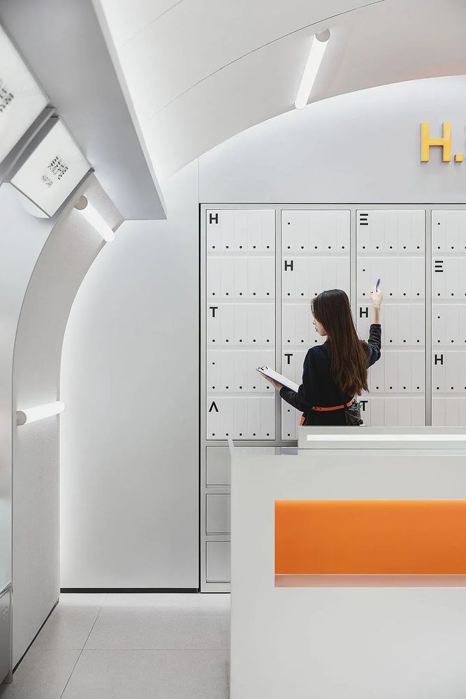
H.E.A.T 喜燃南京地标店于 2020 年 12 月开业,作为一家美妆国货集合店入驻南京德基广场。立品团队为其进行空间体验设计及门店品牌视觉输出。
H.E.A.T Xiyan Nanjing Local Standard Store opened in December 2020, as a beauty makeup collection store in Nanjing Deji Square. Lipin team carried out space experience design and store brand visual output for them.
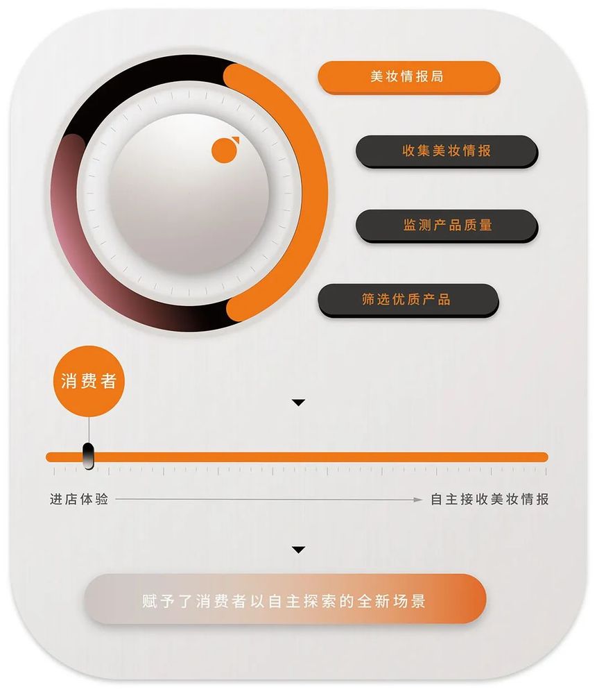
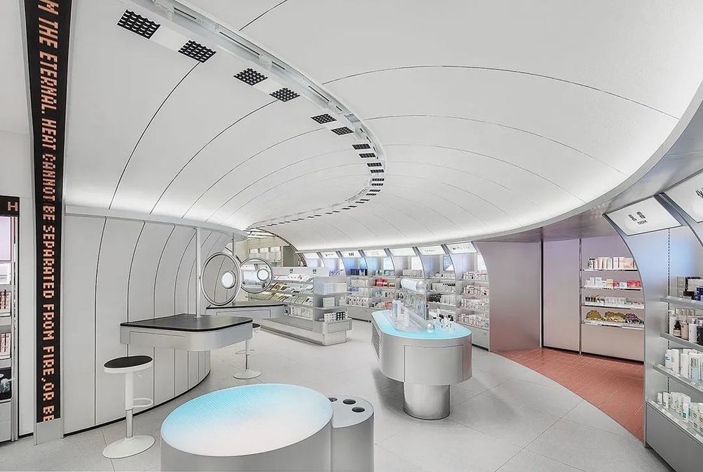
该项目围绕“美妆情报局”的概念展开设计,将喜燃比喻为专门收集前沿美妆情报的精密组织,并将经过监测和筛选过的优质产品呈现给消费者;消费者通过进店体验,自主接收和取用所需的美妆情报。承载销售功能之外,整个空间赋予了消费者以自主探索的全新场景。
The project is designed around the concept of "Beauty Make-Up Intelligence Agency", which compares Xi-Ran to a sophisticated organization that specializes in collecting cutting-edge beauty makeup information, and presents quality products to consumers after monitoring and screening. Consumers can receive and use the required beauty information independently through the experience of entering the store. In addition to carrying the sales function, the whole space gives consumers a new scene to explore independently.
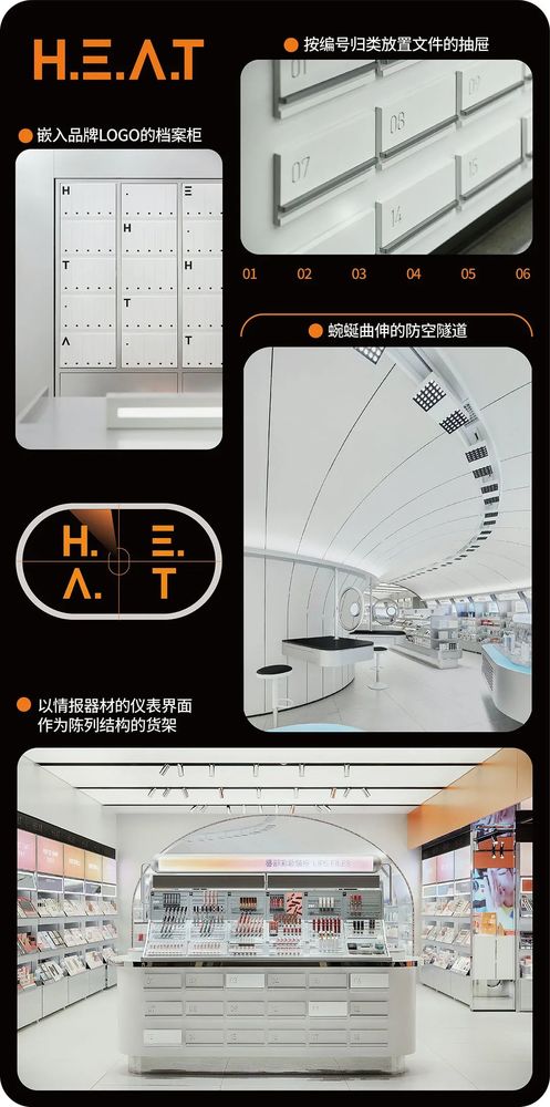
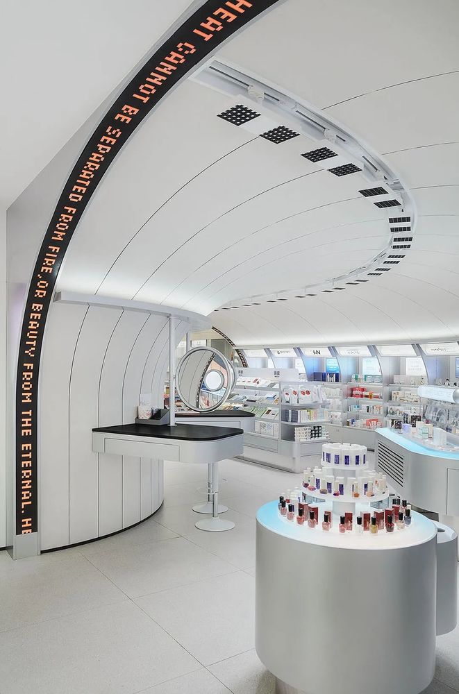
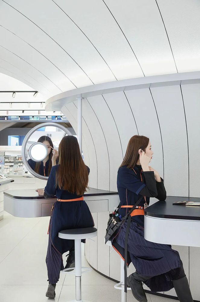
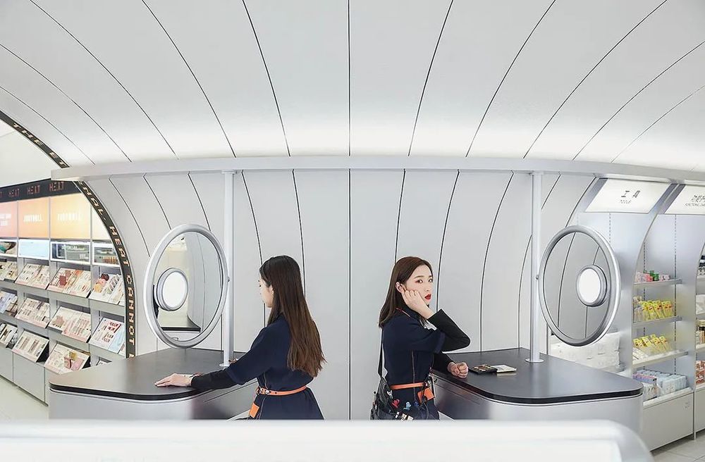
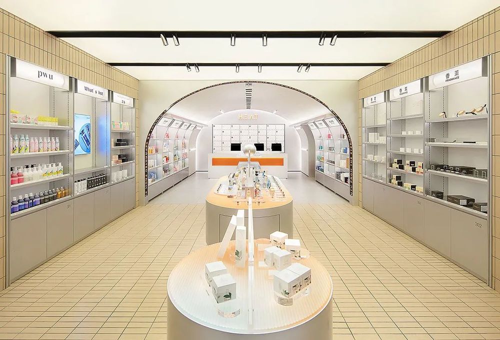
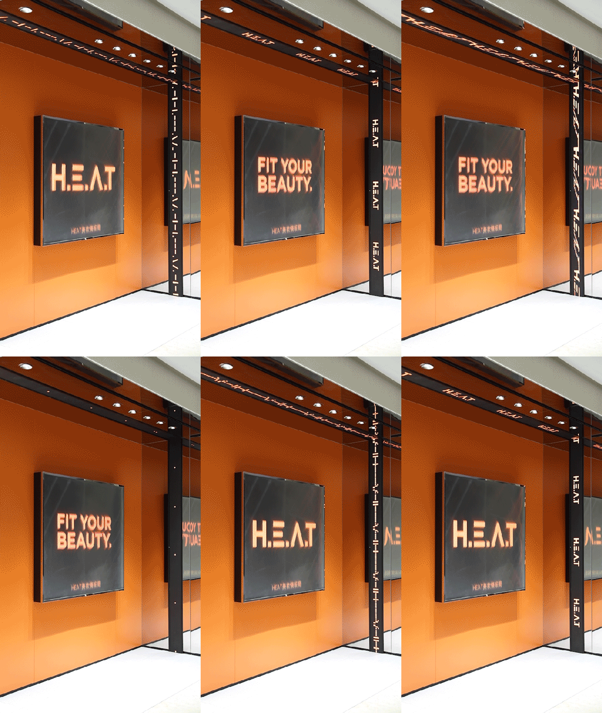
复古感的电子屏操作台、点阵代码、情报档案、防空隧道……整个空间大量从“情报局”中摄取素材——通过对“情报局”概念的转译和重构,空间将喜燃的创新商业模式和消费者的购买过程具象化。
Electronic screens, dot matrix codes, intelligence files, air defense tunnels... The whole space takes a lot of material from the "intelligence" -- through the translation and reconstruction of the "intelligence" concept, the space embodies the innovative business model of burning and the purchasing process of consumers.

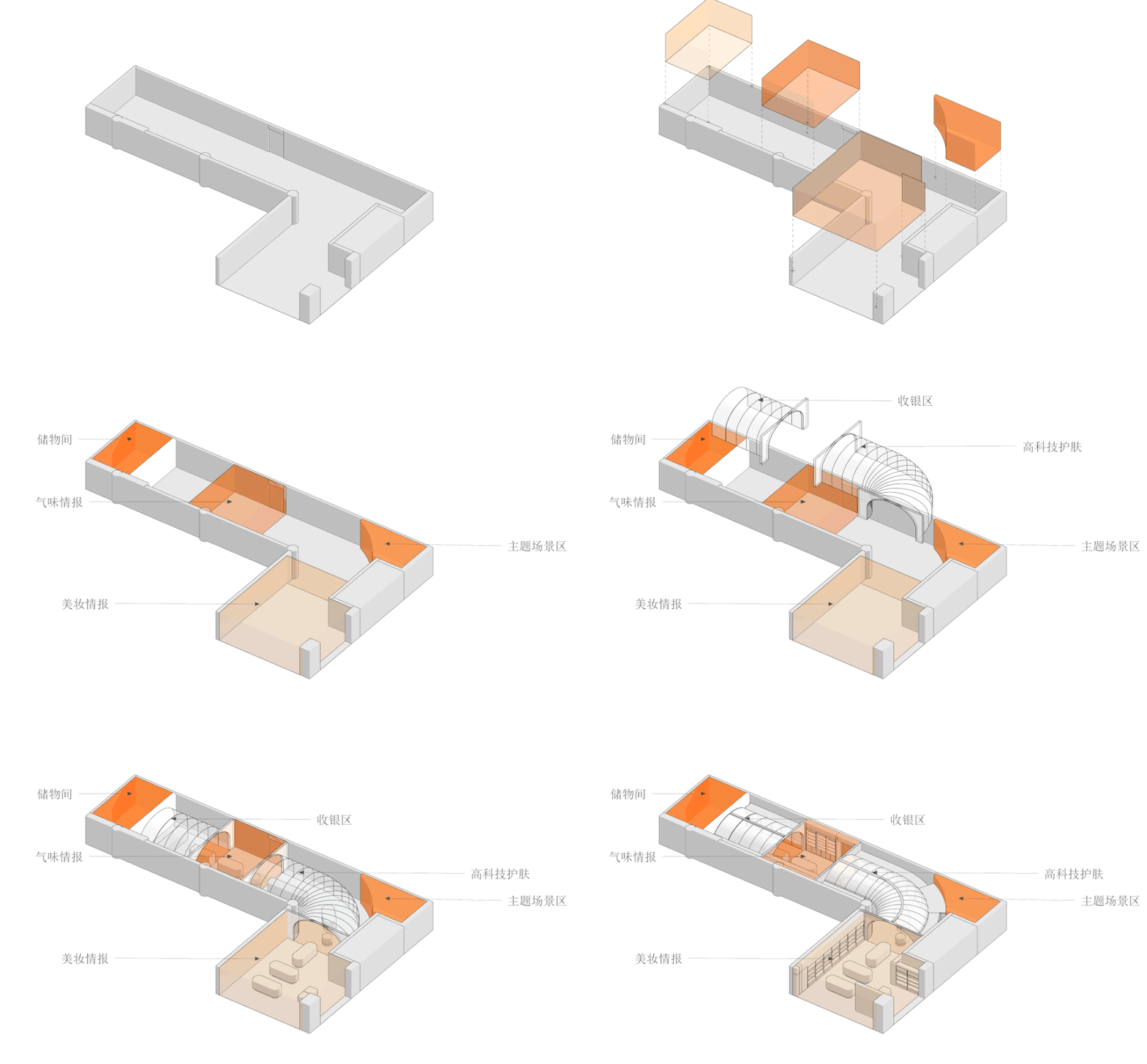
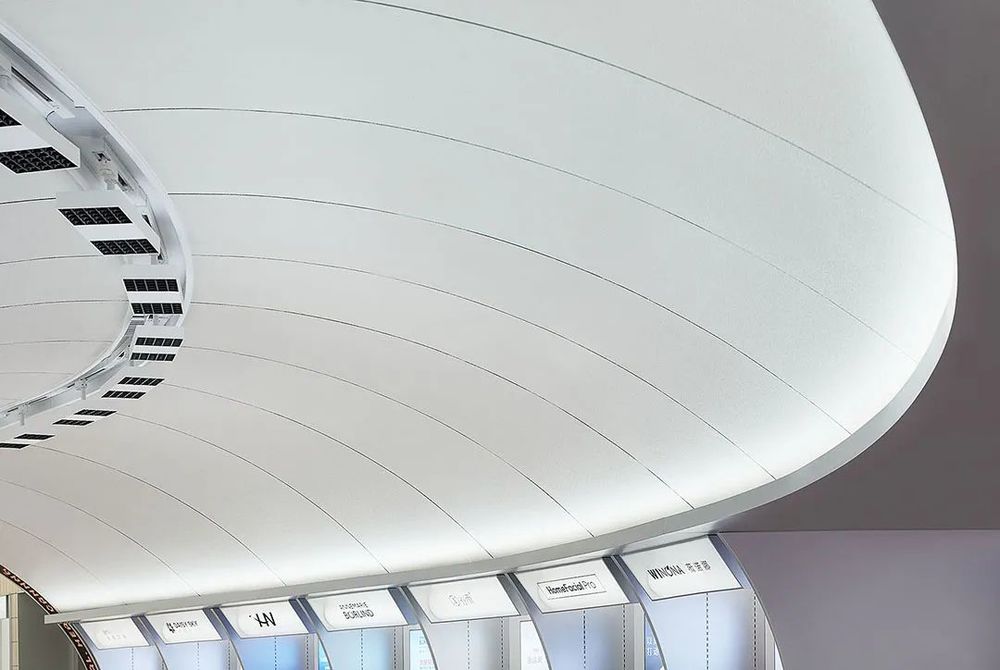
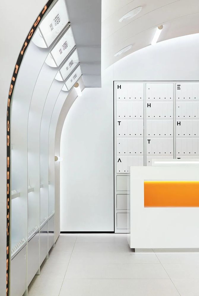
项目原空间呈深邃的 L 型,空间末端的零售功能相对消极,不利于消费者深入地探索。结合“情报局”概念,设计团队选择置入拱形隧道,串联各个区块,让消费者的自发探索和购买结账成为一套自然形成的体验。
The original space of the project is a deep L-shape, and the retail function at the end of the space is relatively negative, which is not conducive to consumers’ in-depth exploration. Combining the concept of "intelligence", the design team chose to place an arched tunnel that connects the blocks, making the spontaneous exploration and purchase and checkout of consumers a natural experience.
数字屏幕带依附着隧道的拱顶,由天花板延申至墙面的曲线纹路强化了这一空间秩序。
The digital screen belt is attached to the vault of the tunnel, and the curved lines extending from the ceiling to the wall reinforce this spatial order.
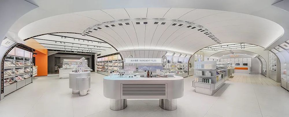
功能区域对应消费者体验流程
从彩妆到护肤,由表及里,层层深入
Functional areas correspond to the consumer experience process
From makeup to skin care, from the outside to the inside, layers of depth

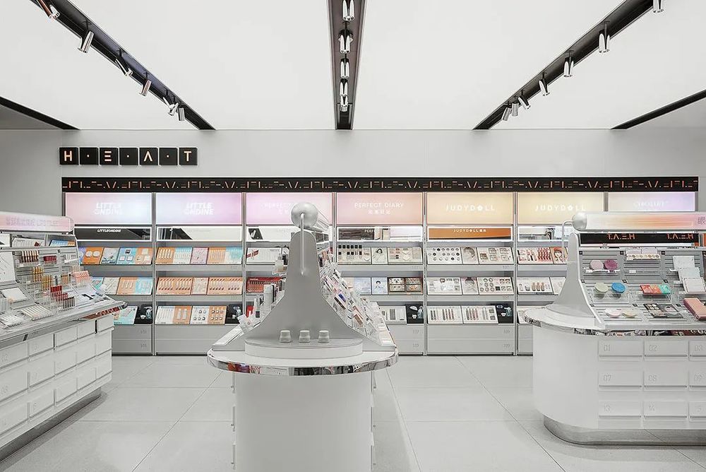
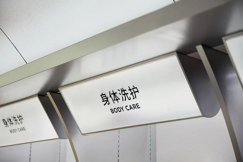
作为人们工作和社交的必备,彩妆区域被设置于店门口,以保证更大范围的人流接触。同时,设计团队结合使用背柜和中岛,使得顾客针对某品类或是某品牌的消费路径更加清晰而轻松。



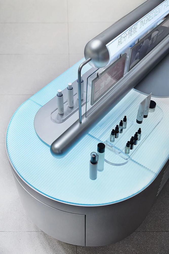
护肤区的主题岛台通过规整的陈列道具,渲染专业化的实验场景,增加消费者对产品成分的信任感。
The theme island in the skincare area is arranged with props to render professional experiment scenes and increase consumers’ trust in product ingredients.
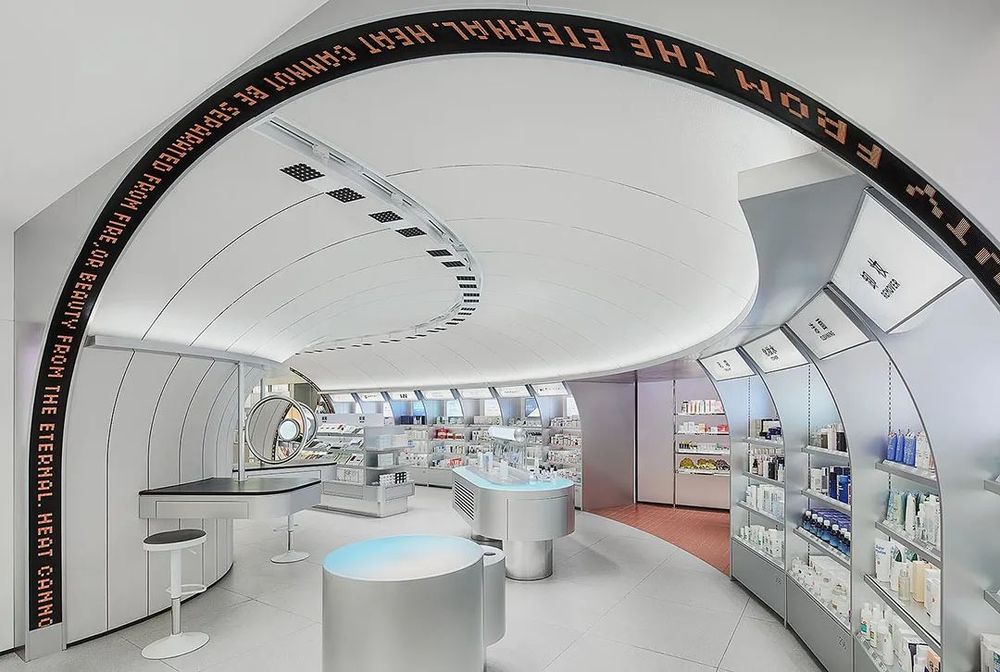

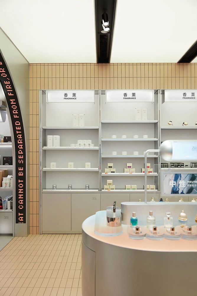
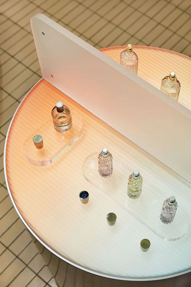
气味情报局营造自然的氛围,为消费者提供自由放松的试香体验。
Odor Intelligence creates a natural atmosphere and provides consumers with a free and relaxed taste experience.

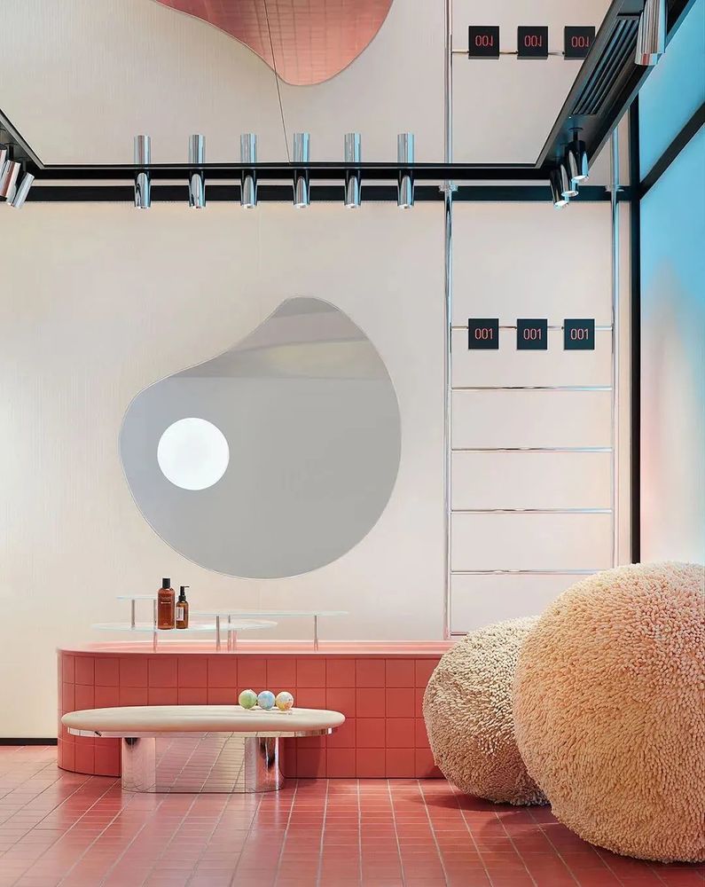
原先隐蔽的拐角区域被改造为主题体验区,根据喜燃的选品策略定期进行主题区域设计。目前该区域作为浴室主题区,使用复古红色防滑地砖、大浴球、浴缸和花洒等一系列道具,模拟浴室环境。浴室主题区同时也是店内最大的商业绿洲点,可以让逛累了的顾客在此稍作休息。
The previously hidden corner area has been transformed into a themed experience area, which is regularly designed according to the strategy of choosing products. At present, this area serves as the bathroom theme area, using a series of props such as retro red non-slip floor tiles, big bath ball, bathtub and shower to simulate the bathroom environment. The bathroom-themed area is also the store’s largest commercial oasis, a place for tired customers to take a break.
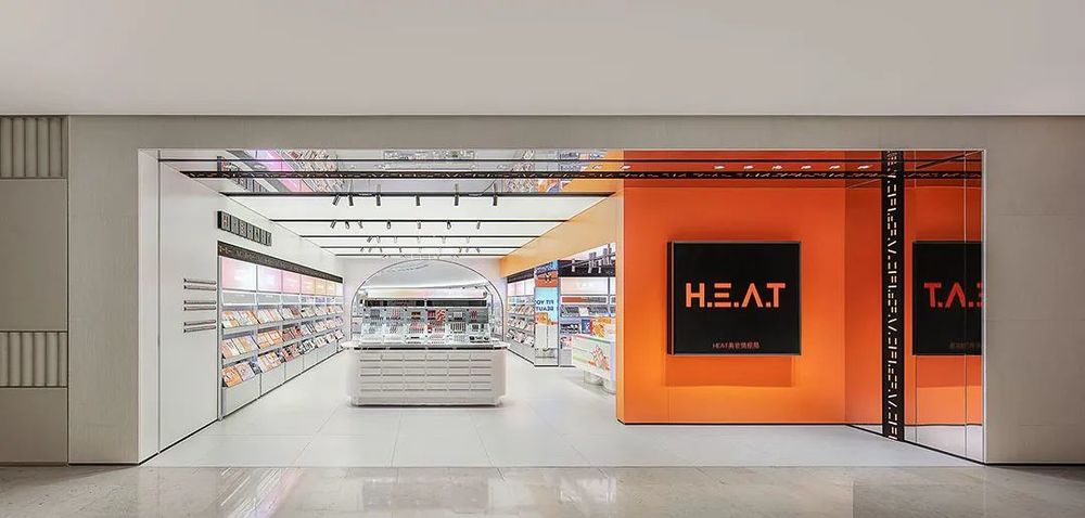
店面门头处利用镜面不锈钢,本身便足够吸睛的品牌色橙色在镜面的作用下,更加放大了自身的优势。
Store door using mirror stainless steel, itself is enough to attract the eye of the brand color orange under the effect of the mirror, more magnify their own advantages.
整个空间灵活运用了多种材料,不同材料的拼接与重组,在整体空间和需要重点表达的区域之间形成丰富的层次感,控制了顾客整体进店体验的节奏变化。
The whole space flexibly uses a variety of materials, and the splicing and reorganization of different materials forms a rich sense of hierarchy between the whole space and the areas that need to be expressed, which controls the rhythm change of the overall customer experience.


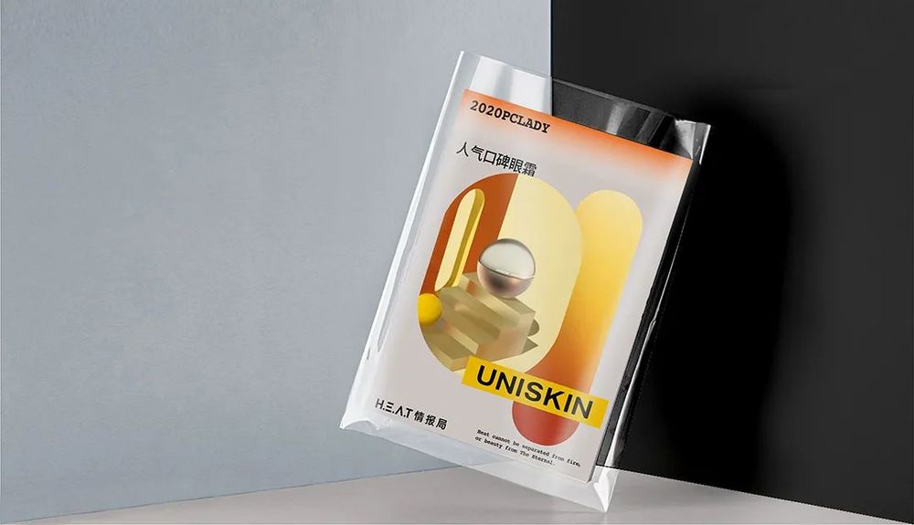
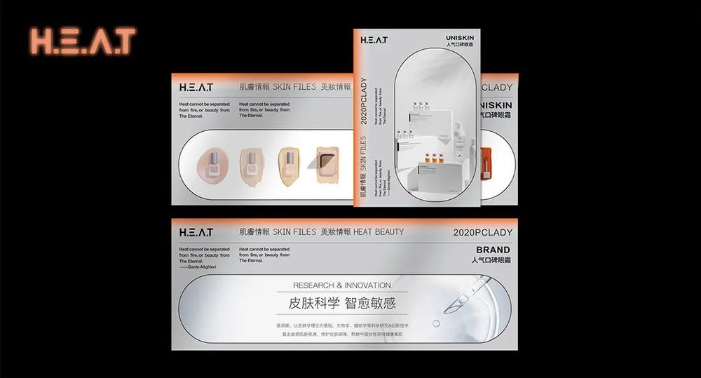
产品海报和宣传单张同样围绕”情报局“的概念设计。通过将纸质物料进⾏密封包装来呼应“重要情报”的私密性质,从⽽丰富 H.E.A.T 的主题化空间体验。
Product posters and leaflets are also designed around the concept of "intelligence". The private nature of the "important information" is echoed by the sealed packaging of paper materials, thus enriching the thematic space experience of H.E.A.T.
项目名称|H.E.A.T 喜燃南京体验店
The project name | H.E.A.T xi experience store in nanjing
空间设计|陈晓雯、张一璇
Space design | xiao-wen Chen, Zhang Yixuan
装置设计|曾敏冬、李因杰、陈李伟
Device design | Mr Michael winter, the recipient jie, Chen Liwei
视觉设计|纪喆铭、冯嘉荣
The visual design | 纪喆 inscription, Feng Jiarong
项目经理|陈常 CC、尤东芝
Project manager | Chen often CC, especially Toshiba
设计总监|郑铮 Zen
Design director | Zheng Zheng Zen
项目客户|H.E.A.T 喜燃
Project customer | H.E.A.T xi
空间摄影|黄早慧
Space photography | yellow precocious

郑铮
立品设计创始人、设计总监
毕业于英国伦敦艺术大学中央圣马丁学院,获产品设计荣誉学士学位。毕业后曾于伦敦从事产品设计、品牌设计、市场推广等不同职能的工作,回国后于 2010 年创立 Leaping Creative 立品设计,商业设计作品获多项国内外知名大奖,2017 年获评“40under40 中国设计杰出青年”。

Leaping Creative 立品设计是一家品牌体验设计公司,为不同行业的品牌提供形象策略和体验设计服务。团队由来自商业调研分析、品牌视觉传达、空间体验塑造、互动装置及材料研究等各个领域的优秀设计师构成,擅长运用跨界设计思维与跨领域设计手段,提供高质量的专业设计服务,为品牌构建独特体验。
内容策划 /Presented
策划 Producer:知行
排版 Editor:Tan
校对 Proof:Tan
图片版权 Copyright:原作者
知停而行


