Lagranja Design has renovated and converted the former courts of l'Hospitalet to create the new Planeta Training Centre. It is a central building comprising 10,800 square metres that the city council handed over to the business group last year, located in the centre of the city and close to several cultural and business activity hubs. The studio’s aim, in addition to converting the building for new use, is to provide the city with a new cultural facility.
The project has taken into account this situation as well as the need to create a space that, in addition to its educational work, can become a cultural facility for the city. In the words of Gerard Sanmartí, the project is based on "stripping the building, connecting it with the young people that will use it and make it available to the public".
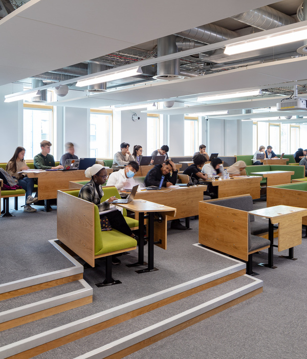
The renovation of this public building has transformed it into a modern, functional educational centre and, in particular, one that is connected to its immediate surroundings. The Campus Planeta will host several thousand students distributed across 15 classrooms and studios. The lecture hall has the capacity to accommodate about 450 students. The students will share the facilities with a staff of 250 people, made up of educational staff and the office staff located on the upper floors.
Permeable building, open to the public To achieve this goal, three key actions have been carried out. First, converting the first floor into a cafeteria with a terrace visible from the street. Second, and more important, building a large sloping auditorium in the basement that can accommodate both events for the educational centre and others related to the cultural activity of L'Hospitalet.
Although the biggest impact on the city will almost certainly be the one resulting from the work on the facade, which needed to be updated with a more modern appearance. The sides have been stripped of unnecessary elements and painted dark grey to make them uniform. The front facade has been covered with white micro-perforated sheet metal with added low lighting to illuminate the building. This metallic skin give its a technological appearance. Because "we want it to be a permeable building that connects with the city, both in the infrastructure itself and in the activities it hosts", according to Gerard Sanmartí of the LaGranja Design studio.
On the ground floor, there is a reception area with a large wooden counter made specifically for the project. The original exposed slabs have been left, as in all the building’s spaces for public use, and they have been painted intense colours, different on each floor. Large circular metal lamps of the same colour designed by Lagranja Design have been arranged following the grid created by the floor slabs.
Key facilities: Library and auditorium On this same floor is the library, which is open not only to students, but also to the residents of L'Hospitalet, as there is direct access from the street. In the library there is a more informal reading room with armchairs which can be closed to host talks, presentations and small events. This floor also houses six meeting rooms and three large classrooms for professional training. These are versatile spaces which can host practical workshops as well as traditional master classes.
Next to the reception a circular staircase has been created that leads to the auditorium, one of the facilities that will also be available for different cultural events in the city. It is a sloping auditorium that occupies the two lower floors. Access is through a large lobby with an office that students can use on a daily basis.
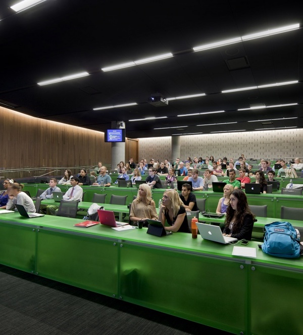
Access to the auditorium is through two side corridors, which consist of two levels, and through which the seating area can be reached. Like the rest of the building’s unique spaces, in the auditorium the original floor is visible and has been painted blue along with all the installations including the walls up to a metre high. On the floor slabs, white acoustic panels have been placed between which the lighting has been installed. From a metre high it has been covered with felt that joins the carpet of the same colour. The pillars have left in exposed concrete. Haworth armchairs complete this cosy and functional space. Next to the auditorium there will be sets and editing and production rooms which will be used by audiovisual students, in addition to providing support for the different events.
Cafeteria and offices On the first and second floors, most of the classrooms are located in the exterior area to receive natural light. On both floors, the central core houses the faculty and staff offices of the different training areas. To differentiate one space from another, the offices and rooms for the staff have smaller enclosures, differentiated by different patterns and colours. On this floor is the cafeteria and the terrace, facilities that can also be enjoyed by the residents of L'Hospitalet.
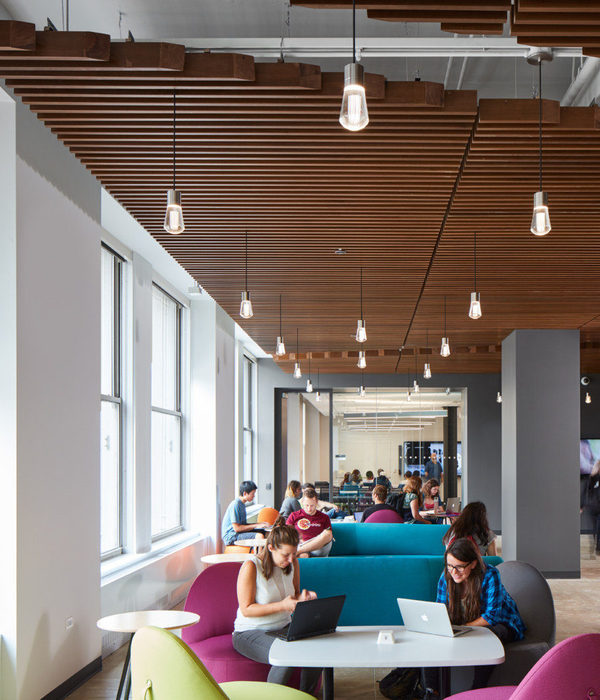
The space is closed off with wooden shelves that act as a bar or high tables and that provide the space with privacy. As in the rest of the building’s service spaces, the roof slabs are exposed, in this case painted green and large metal lamps of the same colour hang from it. The cafeteria and terrace can be accessed through existing emergency stairs. The lifts, facilities and bathrooms are located at the opposite end of the building, and these have been painted dark grey on all the floors to identify the area. The fourth and fifth floors will host the offices of the publisher’s different online training brands, such as CEAC, ESdesign, Uniba and OBS.
Spectacular single piece: Eye lamp Another of the original elements that has been preserved is the exposed concrete staircase that has merely been restored. In the centre, one of the pieces created specifically for this project by Lagranja stands out: the Eye lamp, a spectacular luminaire 22 metres high composed of seven large spheres. Regarding the office furniture, Haworth chairs and seating have been used in the classrooms and the auditorium. In the cafeteria and library there are pieces of furniture from Lagranja Collection (Lagranja Design’s furniture brand), Normann Copenhagen, Hay, Muuto and Santa & Cole as well as pieces from Fermob and Vondom in the cafeteria terrace. Regarding the lighting, pieces by Simon Lighting, Lamp Lighting and Lagranja Design have been used.
According to the founders of Lagranja Design: "We have tried to create an honest project. The original structure is visible in many parts of the building, while it has been transformed through the use of colour. In the same way, the facade has been modernized, adapting it to the new uses of the building”.
{{item.text_origin}}

