CAMPECHE 239 B was the recovery, rehabilitation and recycling of a house cataloged of the XX century in the heart of the Countess, to adapt it to the current needs but understanding the importance of conserving the patrimony, the project starting from conserving the first quadrant of the house , which included the rehabilitation of the facade and the incorporation of a new element that is not visible at first sight. The new element that is incorporated into the original house is composed of a building of 9 apartments, which are designed to allow users an excellent view without losing their privacy with the surrounding buildings.
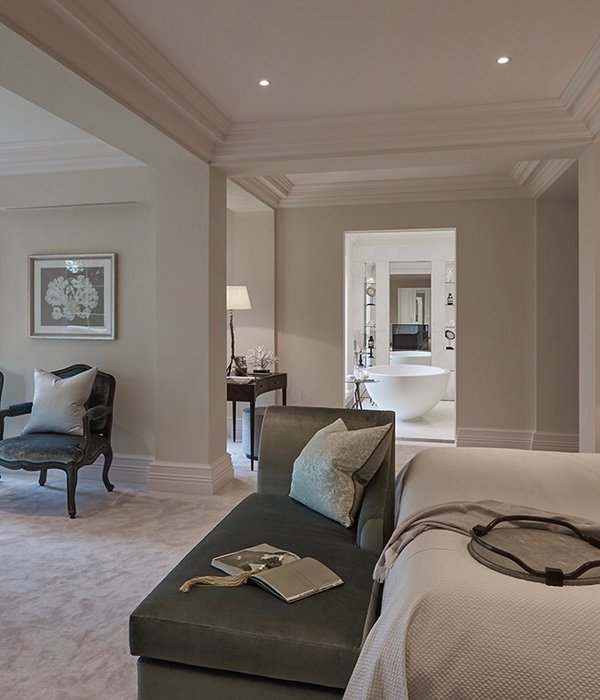
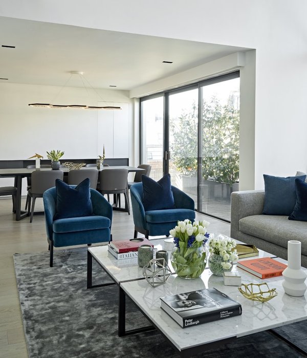
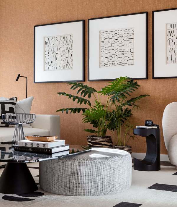
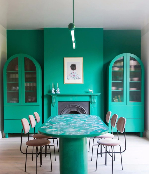
To finish with the integration towards the contemporary Almazán and Associated Architects made agreements with the offices: Mecate studio, Deco 29, NOMAH and Astilla to collaborate with the interior design.
The house was built in the early 1900s, was later converted into a neighborhood until after years of deterioration was acquired by the current owners, which took the mission to restore it and make the most of the potential of the property.
The project was designed respecting the facades both frontal and lateral, which are protected by the National Institute of Fine Arts, and seek to adapt the interior spaces to generate amplitude while modernizing them, seeking to respond to the current needs of their futures users
The project proposes to add two levels that are adapted and tucked respecting the old building and the INBA requirements. The program of these two levels accommodates the resulting form between these remembrances and the original patios of the house; allowing us to generate contemporary apartments with large green roofs and terraces; all this without affecting the visual of the house or the light inputs of the apartments below.
The materials that were used seek to respond to factors of resistance and quality at the same time as giving an aesthetic and timeless result. The same materials work as a fact of the past of the house at the same time that they give a contemporary and fresh feeling to the building.
Indoors it was decided to leave most of the vertical and horizontal elements in white, this with the aim of achieving the greatest luminosity within the spaces, however, they left apparent details such as partition walls of the original construction, concrete slabs and steel structure; As finishing touches and / or distinctive touches of each of the departments again seeking to emphasize the history of the building. In addition, large pergolados and louvers were used to identify the vertical and horizontal circulations.
{{item.text_origin}}

