Architects:David Guerra
Area :675 m²
Photographs :Jomar Bragança
Manufacturers : Indusparquet, Neolith, Insight, AM Galeria, Accervo Design, Belissimo, Bellar, Deca, Franccino, Galeria Celma Albuquerque, Galeria Orlando Lemos, Líder Interiores, Marie Camille;, Mharmaros, Micheliny Martins, Oseias, Patrik Cizilio Madeiras, Pedras Vitoria, Preall, Prodomo, +5Refrigeração Três Irmãos, São Romão, Terracor, iluminar, kitchens-5Indusparquet
Lead Architect :David Guerra
Team : Nínive Resende, Jefferson Gurgel, Bernardo Hauck, Gleisson Gurgel
Landscape : Felipe Fontes
City : Passos
Country : Brazil
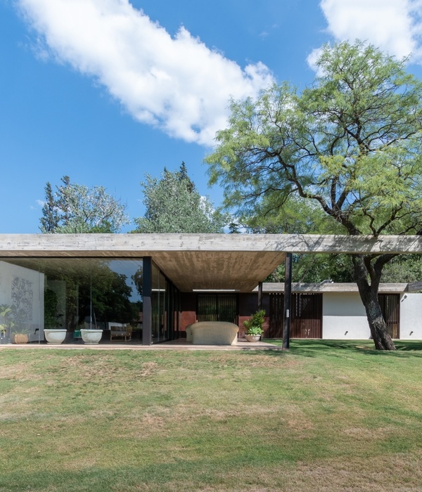
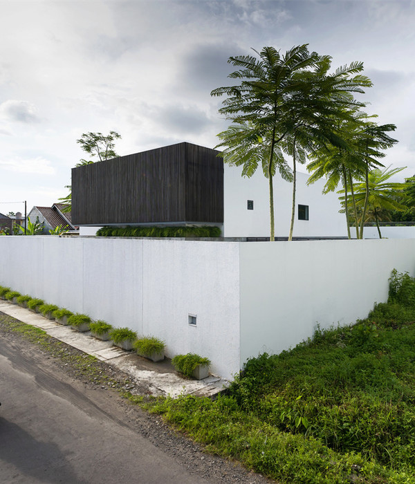
Located in the southwest part of the state, this residence was conceived, not just architecturally but also in its interior design, to become an oasis in a continental region, with high temperatures and low humidity. Like an oasis, a refuge, it became essential the presence of many trees and gardens, surrounding the house located in a suburb with few trees and lots of modernist architecture.
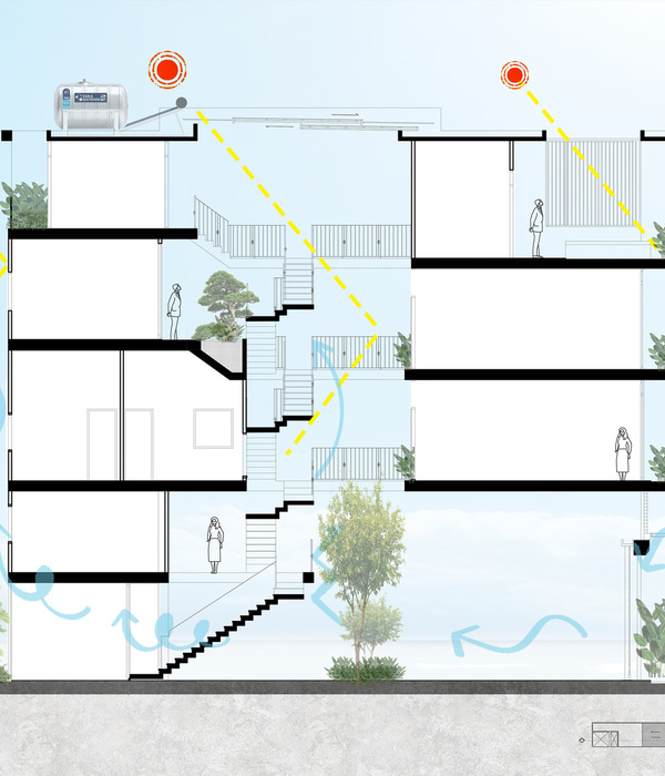
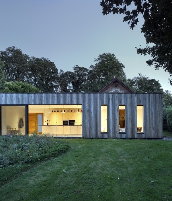
Solutions to lightning and ventilation were essential to bring the necessary freshness to a warm region. A large garden was conceived on the four sides of the terrain, designed by Felipe Fontes, combined with a winter garden in the center. The result is a courtyard aspect right in the middle of the residence, inspired by buildings that would rely on a more natural solution than air conditioning. This space becomes not just a place of reunion, but also a focal point, that enables heat exchange with the exterior.
A house with an open concept and integrated spaces requires solutions for privacy. The woodwork of sliding doors allows integration as well as limitation of the common spaces, looking for the simultaneity of activities so much for receiving guests, but also on the aspects of private life. The home office can be brought to join the living room, allowing amplification of space, natural lighting to come in, and the expansion of crossed ventilation. All spaces aim for convergence and integration.
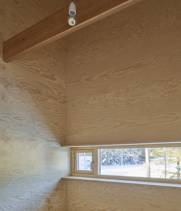
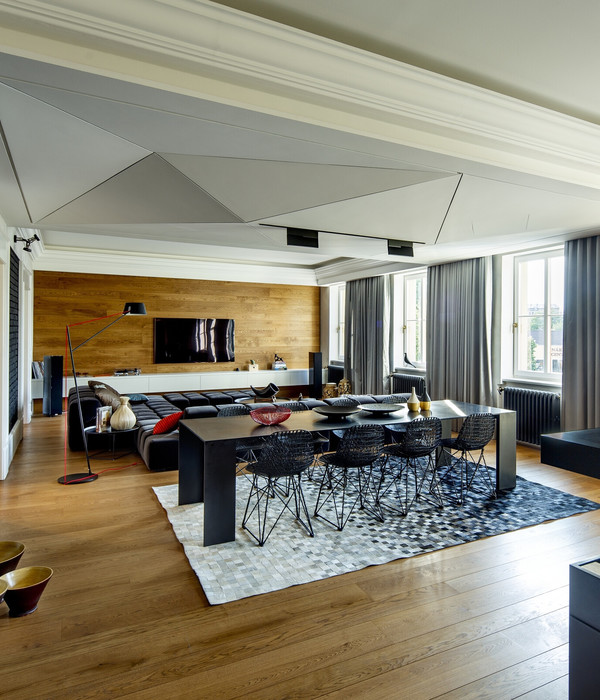
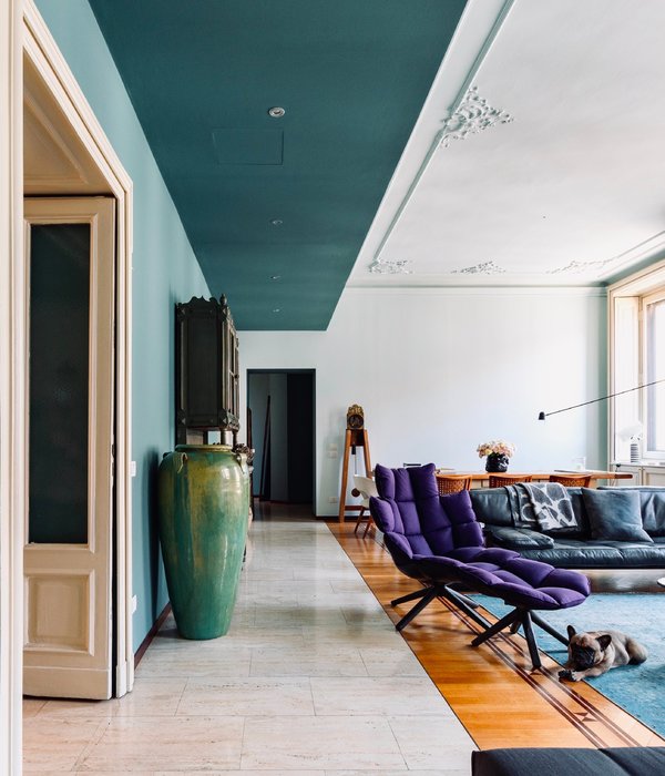
The materials reflect the environment and the natural context: floors, decks, ceilings, panels, all in “freijó” wood. Besides, the use of cement, bricks, and stone help to complement this composition. When it comes to colors, the goal was to transform the space, filling it with life and affection, from pink to caramel, from brown to green, from blue to yellow, on the walls and on furniture, carpets, and artwork.
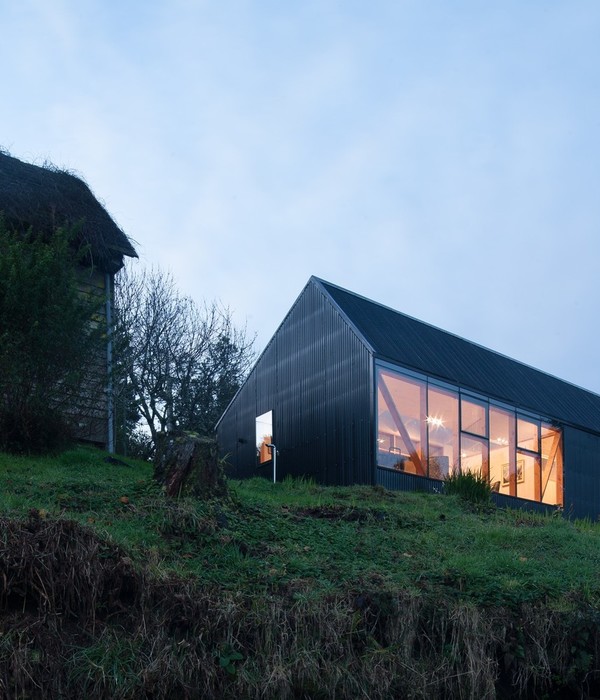
The roof was chosen looking to distance the architecture from regular solutions like, for example, concrete slabs, bringing the richness of tradition, reminding of older roofing solutions. At the same time, the use of orthogonal details tries to break the singularity of meaning, creating an interesting dialogue between modern and traditional. The most preponderant element is the remembrance of affective memory, priority, and the main philosophy of all designs made by the office.
Furniture, carpets, and objects had a close curatorship and supervision of the architect himself, combined with an auspicious look and accurate taste of the owners, who very well understood the necessity of a matched solution in interior design when compared to architectural ones. Therefore, the result was a house well built, with harmonious solutions on furniture, objects, and artwork.
▼项目更多图片
{{item.text_origin}}

