nihil estudio was tasked to design a new and larger space to accommodate the growing team at Studio 73, a computer consultancy located in Valencia, Spain.
The new space for offices for a computer consultancy company is a 360-degree project which comes from the clients’ need to find a new and larger workplace compared to the previous one. A place where they can develop their growing work at full capacity and also show the market the way they see and understand the world.
As for the project, the team worked from a design perspective which is very far removed from the conventional and traditional office concept. Assuming the changes in labour patterns of the last decade, the space in offices must join work, leisure and the welfare of their users. Moreover, the different spaces of these new offices are meant to reflect their workers’ personality.
The project is conceived through a branding strategy so as to carry out the renovation of their brand identity which includes a new corporative manual and a new visual identity with different graphic features.
The new Pop culture references are the basis to start developing the brand concept: TV series/streaming platforms, film icons and references to the gaming world coexist in the memories of the different generations which make up the company. Taking these elements to the material plane provides the enterprise with a unique identity and a very particular personality.
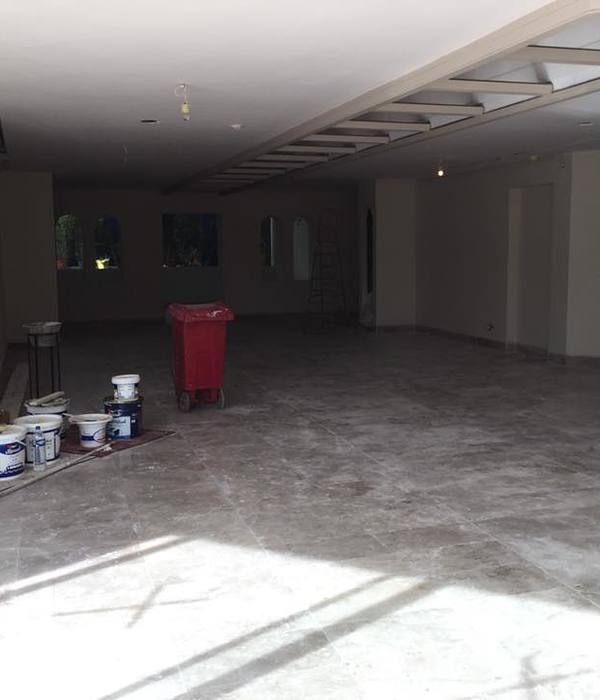
The interior design project starts from a ground floor on a trapezoidal plan, full of pillars with an undefined reticle between them. The studio opts to avoid these architectural elements and appropriates the space. The execution of their proposal consists of enhancing open spaces thanks to a design with soft and round shapes with corners and geometries which are pleasant to look at. By doing this they aim to change the existing space with consistency, rearranging the areas based on their needs and uses, creating vanishing lines calling the visitor or user’s attention and therefore making the pillars go unperceived.
The studio is aware of the current labour paradigm shifts and the changes in the workflow; collaborative spaces are now more relevant and the working environment becomes “democratised” so workers have the possibility to choose where and how to work depending on the kind of activity they are going to carry out. For this reason, and based on the humanisation of the space, the team plans an open working area that consists of a series of bench desks which create a new working environment, thus creating synergy between the workers, leisure and common areas, and spaces for small or informal meetings where the employees can talk placidly.
As for furniture, chosen firms are in charge of completing the global design proposal by selecting the finish and upholstery for the elements so that they can blend with the projected space with harmony and homogeneity.
Given the features of the space, it was very important to work on the entrance and make the most of natural light. For this reason, it is played with divisions, alternating panels with glass doors. They worked on how they could project the wooden cube and its openings, which is positioned to face the façade and the inner court, thus making the light get in transversely.
Design: nihil estudio
Photography: courtesy of nihil estudio
13 Images | expand for additional detail
{{item.text_origin}}

