Designed by OKHA Studio, this contemporary fusion restaurant set along the picturesque coastline of the Atlantic seaboard in Cape Town, draws inspiration from the bold and graphic language of Turkish and Moorish design as well as a taught Eurocentric classicism. These diverse and opposing aesthetics come together to create a balanced and synergetic fusion.
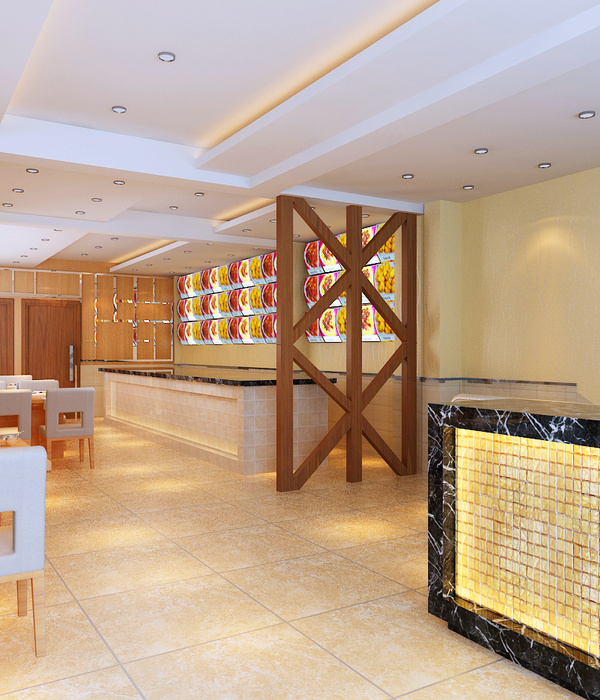
The central open plan floor space is allocated to banquette and table seating and includes the implementation of a full height slatted timber screen to demarcate seating areas and provide both privacy and filtered views.
The slatted timber screen divides the open plan space and creates intimate seating settings whilst giving a sense of visual connection and transparency to the room.
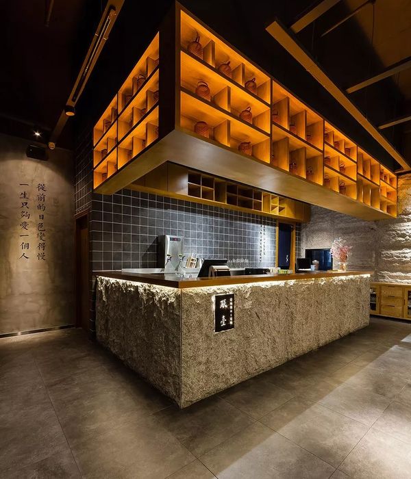
The extreme proportions of the Neolith clad bar and its minimalist design, give the zone a dramatic and somewhat theatrical tone. The Bar display utilizes dark stained, slatted timber sliding panels and LED strip lighting to accentuate the horizontal perspective.
Interior architecture forms are kept simple and rigorous to allow the various abstracted surface patterning to take centre stage. Patterning is allocated to clearly demarcated zones, the shift in surface values is crisp and outlined.
The monochromatic, graphic geometry of the Moroccan tiles is echoed in the over-sized herringbone parquet flooring. Diagonal slats of differing stains create large abstract gestures across the floor area.
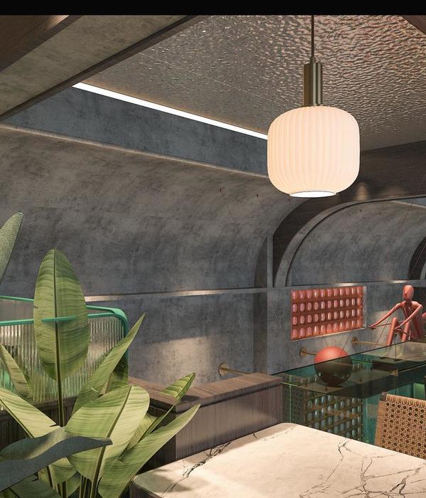
The material and tonal palette is kept precise, reduced and controlled with a single block colour punctuating the almost monochromatic interior.
The bold use of colour showcases both the black and white graphics and the bespoke furniture custom designed for the restaurant. The restaurant also features several bespoke lighting and mirror designs crafted by local artisans. The brass fittings bring additional warmth and ambiance to the interior.
The large rectilinear space was divided into service and client zones. The front of house and back of house kitchen are located at the rear; whereby the front of house kitchen opens out onto the main seating area and allows patrons to observe food display and preparation.
The restroom zone is marked by a shift in colour and materials. Desaturated shades of blue with black and white veined granite, timber slatted ceiling and multiple mirror reflections create a shift in visual dynamics. Here again, brass and copper elements feature.
During the long days of the extensive Cape Town summer months the restaurant extends out onto a generous port facing terrace, an ideal environment for patrons to savour the local varieties of South Africa’s fine wines.
{{item.text_origin}}

