- 项目名称:原世博会案例联合馆3顶层空间改造设计
- 项目地点:中国,上海
- 项目业主:上海易成实业投资有限公司
- 项目面积:1,670 平方米
- 主持建筑师:钟凌
- 设计团队:胡颖祺,施望刚,许可
- 结构设计:袁鑫
- 摄影:吴清山,姜山英
杜兹设计近期完成了位于黄浦区的一处办公空间的设计。项目所在地为世博浦西片区城市最佳实践区板块南区,紧邻黄浦江和当代艺术博物馆,周边景观和文化资源丰富。设计重新定义了室内功能,将其设计成为既能满足两家不同领域企业的独立办公,同时又能够对外开放,集会议、展览、秀场、路演、酒会等多功能一体的复合展厅。
项目位于一栋保留老厂房骨架的现代建筑(原世博会案例联合馆3)的顶层,带有一个超大的露台。室内32米的大进深和仅3.5米的净高给想要寻求空间突破的设计师带来了一定的难度:如何在相对局限的条件下满足两家公司日常办公的功能需求,同时还要赋予这个空间积极的功能,打造出一个博物馆级别的多功能展厅。
Recently, DUTS Design completed a new working space design in Huangpu District. This project locates in the southern part of the Urban Best Practice Area, pervious Expo field of the Puxi, next to Huangpu River and Power Station of Art Museum. The landscape and cultural resources surrounding this area are abundant. This design redefines the interior functionality. It is a multiuse space that contains the capacity of conferences, exhibitions, shows, roadshows and parties. This space is also pointing to meet various requests from two companies that come from different fields of enterprises.
The building is formerly the World Expo Joint Pavilion No. 3 that retains the structure of the old factory. With an oversized terrace, the project is located on the top floor of this modern building. The interior depth is 32 meters, but the height is only 3.5 meter. It creates a test for the designer who wanted to break this boundary. To meet the functional needs of daily work between the two companies under relatively limited conditions was a challenge, too. In the end, the designers provide a space that has positive functions and additionally matches a “museum-level” multi-purpose exhibition hall.
▼办公暨多功能展厅空间概览,overview of the working space that can be used as a multi-purpose exhibition hall
建筑改为办公出租后仍保留了西侧的垂直客梯和东侧的自动扶梯。经过设计师反复推敲和论证,最终选定了更靠近路口且方便易达的垂直客梯作为上到四楼的主要方式。设计以白色舱体”的电梯厅为起点,强化横向立面的延伸。贯穿南北的“反引力”会议厅和茶室将空间分为两个独立的区域,同时利用环绕走道打造出回廊式的多功能展厅。
The elevator on the west side and the escalator on the east side were still be retained after the area has been changed to office usage. After many deliberations, the designer finally figured the elevator is more accessible and closer to the intersection. It becomes the primary entry to the fourth floor. The design starts with the white elevator hall that increases the extension of horizontal façade. The “anti-gravity” conference room and tea room divided the area into two individual spaces. It also creates an encircling walkway that can be used as a multi-functional exhibition hall.
▼空间生成分析,the generation process
基础空间的中心扣除结构和机电风管后实际净高只有常规的3.5米,加上较大的进深,整体略显昏暗和压抑。设计师将最大的会议室设置在此,整体抬高与地面相脱离,抬高的平台向三个方向延伸并出挑达 3.6米。立面上利用楔形视觉误差,巧妙的将钢梁藏身于结构之内,所见之处只有不到一公分的厚度。尽管整个会议室体积感很强,但它的质量感却因此被大大削弱,传递出一种视觉上的“轻”。在顶面和地面限定下,形成一种戏剧性的“反引力”效果。同时,抬高并延伸出来的平台亦可以作为舞台和展台使用,在未来的运用中可随时增添内容,会议室周围留出环绕走道自然形成了回廊式的展示空间,营造出一个充满创造力的复合场所。
▼复合型多功能空间展示模式,display mode of the space
▼复合型多功能空间演讲模式,lecture mode of the space
After deducting the structure and the electromechanical air duct, the net height of the central area is only 3.5 meters. The designer places the largest conference room in this area. This room is separated from the ground with an elevated platform that extended 3.6 meters in three directions. The wedge façade creates an illusion to hide the steel structure inside of the construction. Although the conference room is gigantic, it generates a moderate and light appearance.Under the definition of the top surface and the ground, a dramatic “anti-gravity” effect is formed. At the same time, the extension space on the platform can be developed as a stage or showcase area. This walkway surrounding the conference room has unlimited scenarios that can be used as a multi-function scene.
▼“反引力”会议室正面,整体抬高与地面相脱离并设置平台,the front view of the antigravity meeting room, the room is separated from the ground with an elevated platform
▼“反引力”会议室侧面,立面上利用楔形视觉误差,传递出一种视觉上的“轻”,the side view of the antigravity meeting room, the wedge façade creates an illusion to generate a moderate and light appearance
▼会议室外围抬高且宽阔的平面亦可作为展台灵活布置,the extension space on the platform can be developed as a stage or showcase area
▼从平台看往小会议室,viewing the small meeting room from the platform
▼从平台看往水吧区,viewing the bar area from the platform
中心区的大会议室正对北侧的露台,吊顶从会议室顶部一直延伸至室外形成雨蓬,立面上用同样的手法,使出挑达11米的雨蓬看上去轻薄如纸。在雨蓬的下方设有茶室,设计师希望茶室看起来与雨蓬非常接近但实际上又没有互相接触,因此将雨蓬的中间挖空,悬臂雨蓬夸张的出挑深度轻盈地遮蔽在茶室的上方,希望它们在保持这种张力的情况下进行对话。
▼出挑深远的雨蓬和其下方的茶室外观,the outside awning and the tea room under this area
▼雨蓬和其下方的茶室,将雨蓬的中间挖空,悬臂雨蓬夸张的出挑深度轻盈地遮蔽在茶室的上方,the awning and the tea room under this area, the cantilevered awning is exaggerated and lightly shades the tea room
The central conference room faces the north side of terrace. The ceiling extends from the top of the conference room to the outside awning. The same method that used on the façade makes the awning that is more than 11 meters looks as light as a paper. The tea room locates under this area. The designer wants to create an indirect connection between those two elements. In order to demonstrate this effect, the cantilevered awning is exaggerated and lightly shades the tea room.
▼雨篷和茶室外观夜景,出挑达11米的雨蓬看上去轻薄如纸,night view of the awning and the tea room under this area, the awning that is more than 11 meters looks as light as a paper
▼茶室的玻璃可以开合,the glass facade of the tea room can be opened or closed
▼雨蓬和茶室的对话关系,the communication between the awning and the tea room
由于室内受纵向条件的限制,因此强调横向立面的延伸,扩大空间的深度与广度,成为设计的基本原则。项目南临黄浦江,但受原有扶梯和机房的限制,实际拥有一线江景的面并不多,我们在这里布置了必要的前台、接待区和办公室,仍保留了一跨的开间,结合壁龛和门洞营造出一个内凹和穿透的盒子,江景资源亦得以用“镂空”的方式被引入前厅。前厅左右两侧的墙体以黑色钢板包裹,内凹的截面为温暖的木色,一冷一暖相互平衡又表现出与周边白色空间的强烈对比。凹凸错落的壁龛,打破了单面展示墙的乏味感,对于立面的延伸和空间的收放变化起到了积极的作用。
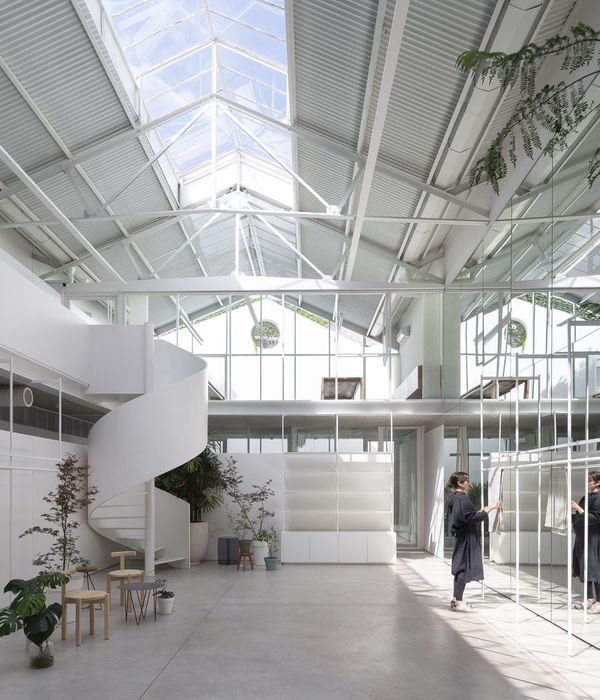
路易斯·康:“设计空间就是设计光亮”。设计师在设计中利用了顶层的优势,将局部屋面打开,最大化的把阳光引入室内。当阳光穿透天窗,光线形成的虚影赫然投射在地面上,随着时间的推移,整个区域呈现出不同的光影氛围,让原本封闭的空间具有了延展性。原设计方案中天窗下方还设有一部通往屋顶露台的楼梯,经多次和物业协商后最终未能实现,留下了一些遗憾。
▼明亮的前厅空间,局部设置天窗采光,结合壁龛和门洞营造出一个内凹和穿透的盒子,the bright lobby area with skylight window to introduce natural light into the room, the niche and door create a recessed space
The longitudinal conditions limit the interior; therefore, emphasizes the extension of the lateral façade and expands the depth and breadth of the space became the principle of this design. Although the project is located on the south of Huangpu River, there are not many front-facing river views because the restricts by original escalators and facilities rooms. The conditions of longitudinal floorplan limit the interior design. The principle of this design became emphasizing the depth and breadth to extend the lateral façade. Because the restricts by original escalators and facilities rooms, there are not many front-facing river views even the project locates in the south of Huangpu River. We plan our front desk, reception area, and offices near the entry. The niche and door create a recessed space, and river view can be seen through this “box”. The walls on the left and right sides of the front hall are covered with black steel plates. We use warm wooden plates to surround the inner face of this box. The balance between cold and warm represent the strong contrast with those white space around this area. The staggered wall niches break the monotonous environment. It riches the design of the façade.
“The sun never knew how great it was until it hit the side of a building.” by Louis Kahn. The designer takes the advantages of the rooftop and places skylight windows to introduce natural lighting into the room. When sunlight penetrates through the skylight windows, the shadows reflect on the floor creates various patterns by different time of the day. In the original design, there was a staircase leading to the roof terrace under the skylight window, but the plan got canceled due to multiple reasons.
▼室内空间局部,前厅两侧的墙体以黑色钢板包裹,凹凸错落的壁龛打破了单面展示墙的乏味感,partial interior space, the walls on the side of the front hall are covered with black steel plates, and the staggered wall niches break the monotonous environment
抛开一切华而不实的装饰,保留建筑最本真的空间属性。整个空间选用了水泥砖、钢板、原木这几种最基本的材料,追求美感与质朴的平衡。黑与白作为空间色彩的主色,让空间倾向冷静与理性,同时有效的包容了后期软装色彩介入后因不同彩度、明度和饱和度而产生的无序和纷杂感。让身处其间的人,能够以沉静务实的心来面对所做的事。
This design puts aside all the unnecessary decorations to represent the most authentic characteristics of this space. The whole area uses many basic materials such as cement brick, steel plate and wood. The color of black and white represent calm and rational. These are also the two primary colors in this space. At the same time, these colors can merge perfectly with other interior ingredients that have various chroma, brightness and saturation. The complete balance between beauty and simplicity is the ultimate goal, so people can feel pragmatic peace that created from the components in this space.
▼简洁的迎宾空间,使用黑与白作为空间色彩的主色,局部以木材点缀,the simple reception area with the color of black and white as primary colors and the wood as the addition
▼项目区位图,the site location
▼平面图,floor plan
项目名称:原世博会案例联合馆3顶层空间改造设计 设计方:杜兹设计 项目地点 :中国、上海 项目设计 & 完成年份:2017.12-2019.4 项目业主 :上海易成实业投资有限公司 项目面积 :1,670 平方米 主持建筑师 :钟凌 设计团队:胡颖祺、施望刚、许可 现场项目经理:张文杰 结构设计:袁鑫 摄影 :吴清山、姜山英
Location: Shanghai, China Client: Yi Cheng Industrial Investment Co. Ltd., Shanghai Area: 1,670 sqm Lead Architect: Ling Zhong Design team: Yingqi Hu, Wanggang Shi, Ke Xu Project Manager: Wenjie Zhang Construction team: Xing Yuan Photography: Qingshan Wu, Sanying Jiang
{{item.text_origin}}

