The new library of Chengdu University was completed in the spring of 2019. The building has become the Internet celebrity of the campus since the light was on, which was unexpected. In fact, this is not the original intention of the architect's design, its attention may be due to its unusual colors.
Because the new library is large in size and like most domestic university libraries, it is in the prominent position of the North Campus Planning of Chengdu University. Therefore, at the beginning of the design, more consideration is not its image, because in any case, in this particular space environment, it will inevitably stand out straightforwardly.
In line with the North high, South low, East and West gentle terrain, the library ground building is lightly located on the south side of the earth-covered dome, the lower part of the transition with the site elevation forms a concise and accessible spatial relationship.
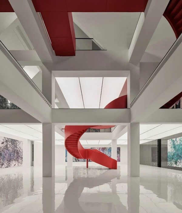
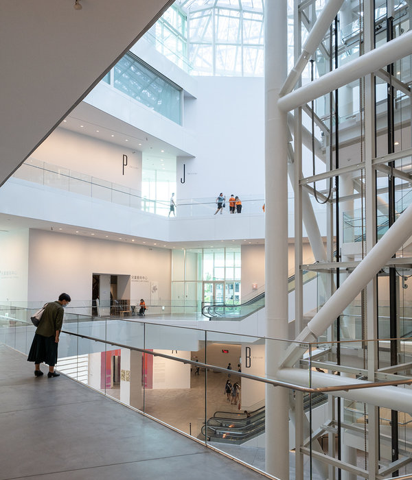
The plane is concise and efficient, and the "Dou" shaped atrium is accessible from top to bottom in all directions. Vertical and horizontal traffic is set inside to form a centripetal space converging inward around the atrium. The "sandwich" shaped atrium is suspended in the air in large quantities, making the best use of natural light.
Lighter weight, more concise and accessible, more open and transparent is the original intention of the design. We do not want to build a strong, solid and huge school spiritual fortress.
Through CFD airflow simulation and natural lighting analysis, the section design fully considers the characteristics of the dominant wind direction and the long transitional season in Chengdu area. According to the analysis results, the round atrium space obtains natural lighting and good ventilation by using skylight and side atrium opening, which can reduce energy consumption. Interior space highlights communication and publicity, and integrates many communication experience spaces.
Lightweight external maintenance system is the remarkable feature of the library. Parametric plate and glaze design is conducive to shading and restraining glare, to achieve the soft effect of indoor light diffuse, reading environment is clear and pleasant.
The exterior maintenance structure of the building is designed with a step-by-step curtain wall system from top to bottom. The supporting frame is steel rectangular tube keel + aluminium alloy transfer accessories. The exterior facade material is made of three groups of ceramic sheets + three groups of glazed hollow glass, which embodies the design idea of green, low carbon and lightweight.
After the completion of the library, the bright orange color and patch texture appear in the current spacious campus and community background, especially in the flat night sky, such as Chinese lanterns, transparent, eye-catching. As a place of expression, the design strategy of opening and sharing of new libraries stimulates the desire of communication, sharing and dissemination.
The design of the facade is concise and the intention is obvious. The orange-red porcelain plate and the glazed glass have modernity. Its distinct jumping pixel patches endow the library with the characteristics of the information age. Highly finished building skin expresses the basic aesthetic needs of this era.
Some critics say that the front of the inverted trapezoid of the museum seems to have resonance with the golden mask image of Jinsha ancient Shu at some dusk time. Architecture conveys some feelings as a medium. Anyway, as Hayek said, "the world is made up of knowledge and information held by human beings. The greatest wisdom of human beings is to find and discover an order in which local knowledge and information can be freely collaborated and expanded for all." The architect's initial wish is that libraries, as storage containers and interactive places of knowledge and information, will be loved by more users and benefit more learners.
{{item.text_origin}}


