高质量城市社区A high-quality urban building block
该大楼设计聚焦在与环境的协同发展。在这一宗旨的指引下,透过建筑深邃的网格立面,永恒、优雅和品质卓越的特性由外逐渐渗透至内部环境。建筑与多边形场地形状充分适应,其姿态、位置和外部造型无不展现出该建筑在公共领域的重要地位。建筑覆盖整个街区场地,清晰的外形与周围环境相匹配,透露出与城市相融的和谐之感。Rochusmarkt广场的公共空间延续到建筑之中,坐落在底层的商业区将广场与另一端的Grete-Jost- Park相连。商业区与邮局的出入口分设与立面形态之上,人来人往,建筑与城市建立了趣味性的对话。
One focus for the architects was the contextual development of the design. This enabled them to create elegant, timeless and high-quality architecture whose convincing sense of composure is transported from the façade grid deep within the interior. The building volume adapts to the polygonal form of the site and both its urban stance and its sculptural expression do justice to its role as an important institution in the public realm. The ensemble is an urban building block which slips harmoniously and with a clear sense of proportion into its surroundings and becomes part of the urban environment: The open square of the Rochusmarkt continues within the building in the form of a shopping mall and then as a public passage leading to Grete-Jost- Park. The entrances to the post office and the mall combine with the façade to establish a dialogue with the city.
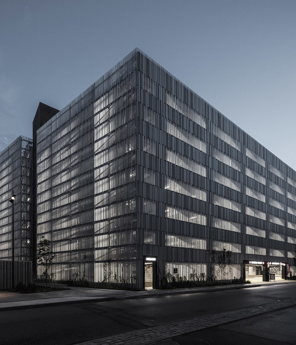
▼建筑立面,the facade
原本空白的场地由于新大楼的嵌入而完善了城市肌理,重塑了间断的城市风景。位于原场地处的老建筑,也在新的项目中得到保留。富有质感的建筑材料搭配沉着冷静的立面形态,Rochusmarkt社区在建筑的映衬下显得平静而富有力量。
By occupying a previously empty plot the building fills a gap in the cityscape and becomes a natural part of the urban fabric. The historically protected existing building was integrated into the new ensemble. With its haptic materiality and calmly nuanced façade solution, the new ensemble provides a serene yet strong background to the life of the Rochusmarkt.
▼行人与建筑立面形成趣味性关系,the interaction between people and the architecture
社会和生态特质Social and ecological qualities
为确保建筑的持久性,其空间结构采取了多种使用和组成形式。该项目以保留原有建筑为设计初衷,将新建部分以极高的灵活性和与基础设施极高的适应性,来满足可能多变的未来发展需求。除了灵活的内部组织之外,建筑形象鲜明的外立面更为其自身带来了连续和永续之感,强调了建筑的可持续性。建筑立面由正交和圆锥截面的预制混凝土构件搭建而成,这些构件不断重复和变形,最终形成了极具动感的外立面形态。建筑内部办公区域透过外立面的网格,与城市风景形成对视关系。通过参数化设计,立面形态与建筑功能合二为一。该建筑将可持续性与持久的灵活性相关联,其以高生态质量和建筑持久性为主导的设计宗旨符合DGNB/ÖGNI标准。该全新的邮局大楼有望获得其生态领域的金奖认证,并由此巩固其作为奥地利地标性建筑的地位。
▼连续动感的外立面,the continuous and dynamic facade
The spatial structure of the building can be read and used in a number of ways with a view to ensuring its long-term operation. From the starting point of the historically protected existing building, the new spaces have been designed to permit a range of alternative uses and extensive adaptations to the building services infrastructure. Despite this flexible internal organisation the powerful image of the façade lends the building a sense of continuity and timelessness – and hence sustainability. The development of the prefabricated concrete elements from orthogonal to conic cross-sections is a simple device for creating a dynamic façade structure which, based on repetition and variation and strengthened by perforation, offers unique views from every office. It is in these parametric elements that the design and the function of the building become one. Alongside the social sustainability associated with this long-term flexibility, the high ecological quality of the lifecycle-oriented design also meets DGNB/ÖGNI criteria. The new post office headquarters is expected to be awarded gold certification, which would ensure its position as a landmark project across Austria.
▼办公室透过立面与城市风景对视,the view through the grid facade
商业区设计The design of the mall
三层高的商业中心以从Rochusmarkt到Grete-Jost-Park的出入口通道为中心轴线,并在内部形成中庭,营造了宽敞明亮的购物环境。其中有5000平方米的零售商店位于新建的建筑部分。而商城与老建筑的交叠部分则在几层之上的明亮空间里。商城内部的展示橱窗采用了同一的设计语言,自然光透过两个椭圆形的巨大天窗,将内部空间点亮。形式动感的中庭为建筑营造了一个独特的空间,也为商城从地下层到二层的各层空间建立了良好关系。该区域氛围极其精妙。行人开启优雅的大门,在明亮的水磨石地板和明亮的天花板之间感受不一样的购物体验。布有条状人工照明的扶梯,将来访者层层送入接近椭圆形天窗的楼层,强化了人在空间中的穿越之感。
▼商业区轴线,the commercial space
The mall was conceived as a generous, three-storey and centrally-lit galleried space that stretches from the entrance on Rochusmarkt to the rear of the building on Grete-Jost-Park. The retail areas of the mall occupy around 5000 m2 of the newly built part of the complex while the interface with the original building in Rasumofskygasse is formed by a light-filled volume rising over several storeys. The uniformly designed display windows are naturally lit via two large, oval skylights. The dynamic form of the galleries creates a space that lends the complex its identity and establishes a spatial relationship within the mall from the basement to the second-storey courtyards. The ambience is disctinctly refined. The elegant glazed portals are enhanced by the light terrazzo flooring and the sweep of the white, illuminated ceiling. The balustrades to the oval galleries and skylights are accentuated by strips of artificial lighting and a dark wooden handrail.
▼两个椭圆形的巨大天窗将商业区内部空间点亮,the uniformly designed display windows are naturally lit via two large, oval skylights
丰富的交流空间Ample space for communication
Rasumofskygasse 29是场地中的原有建筑,由于其特殊的技术性特征和源自1920年代的装饰艺术立面,让决策者最终决定对它进行保留和保护。在新大楼设计中,这一历史建筑部分被重修并改造为灵活的办公区域,满足各种形式的办公需求。新老建筑的结合部分为建筑内部营造了明亮的中庭,是雇员会面交谈的最优之选。此次竞标评选委员会对这一中央交通空间和邮局主入口的设计给予了很高的评价。新建部分与被保留下来的历史部分共同组成了亲密又庄重的综合体。
▼新旧建筑的关系,the connection of the old and the new architecture
A part of the existing building (Rasumofskygasse 29) is historically protected due to both its Art déco 1920s façade and a number of special technical features. This part was refurbished and converted into an office landscape which is tailored to support activity-based work and flexible occupation. At the interface between new and old the architects are creating a joint in the form of a multi-storey, light-flooded atrium for meeting and communication. The competition jury was especially positive in its evaluation of this internal circulation space for the office areas and of the main entrance to the post office. Together, the new building and this preserved, historically valuable element form a compact and self-assured ensemble.
▼新老建筑交汇处营造了明亮的中庭,at the interface between new and old the architects are creating a joint in the form of a multi-storey, light-flooded atrium
▼中庭沐浴在充足的阳光下,the atrium enjoys the natural light
▼中庭与办公室的对视,the view connection of atrium and the offices
内外一体化Interior and exterior from a single hand
带着对设计师的充分信任,Post AG集团同时委任建筑设计师对大楼的内部办公区域进行设计与改造。新总部大楼的平面布局不仅对办公区域有明确的要求,其对社交空间与会面空间的需求也是Post AG集团十分看重的。因此,该大楼设计以当代开放性办公区域为设计理念,在保障雇员办公环境不受侵扰的同时,营造多种内部社交环境。
Post AG demonstrated its enormous faith in the ability of the architects by also inviting them to design the office areas. The brief for the layout of the new corporate headquarters required the creation of not only working spaces but also social spaces with extensive room for communication. Hence, the project opted for an open, contemporary office concept which encourages communicative exchange between employees while also offering space for individual work.
▼办公区入口,entrance of the office
全新的办公环境New worlds of work
该邮局办公大楼引进一种全新的共享办公体验,即雇员可自由组织自己的工作区域。与通常固定区域办公不同的是,员工可以根据当下的工作内容和合作团队,自行安排自己的办公区域。因此该大楼除设立“桌面清理”准则之外,还需要设计师为不同形式的办公和团队合作营造多种多样的办公环境。从开放的交流空间到独立的小型办公空间,该办公区将灵活性和多样性展现的淋漓尽致。除此之外,设计师也十分重视内部设计与整体建筑设计理念的匹配。建筑内的空间组织创造了清晰的内部分区,这些区域除具备各自的独特品质和特性外,又与其他区域一同营造了优雅大气的整体环境。是更加广泛意义上建筑设计理念的体现。透过这一理念,室内设计不再是强加入建筑之中的一部分,而是作为建筑整体之中一个连贯的组成成分。
The post office is introducing a desk sharing strategy which allows employees to determine their own working environment. Rather than having a fixed workplace, employees choose – on a day-by-day basis – the team around them or the surroundings appropriate to the task in hand. This requires both a “clean desk policy” and the provision of a range of spaces that respond to a variety of needs, from individual work to dynamic group activity. This resulted in the development of a series of highly differing zones which cover the spectrum from open communication areas to private spaces and whose flexibility permits a wide variety of spatial situations. At the same time, great attention was paid to ensuring that the design was in harmony with the overall architectural concept: The organisation of the internal spaces creates clearly differing areas which have their own atmospheric quality but which, as dignified and sustainable “settings” for everyday activities, are part of the broader architectural idea. In this way, the interior design is seen not as a series of elements imposed from outside but as an integrated and coherent part of the building.
▼灵活多样的办公空间,the flexible working spaces
▼模型图,model
▼底层平面 ,the ground floor
▼四层平面,the forth floor
▼七层平面,the seventh floor
{{item.text_origin}}

