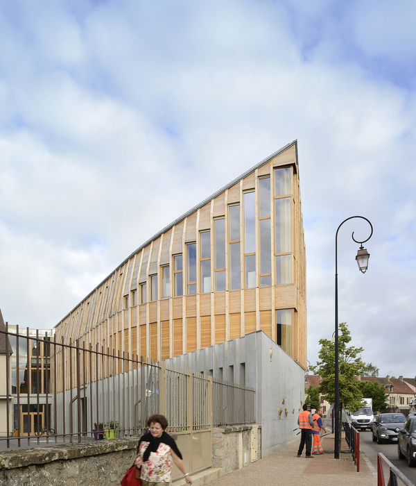
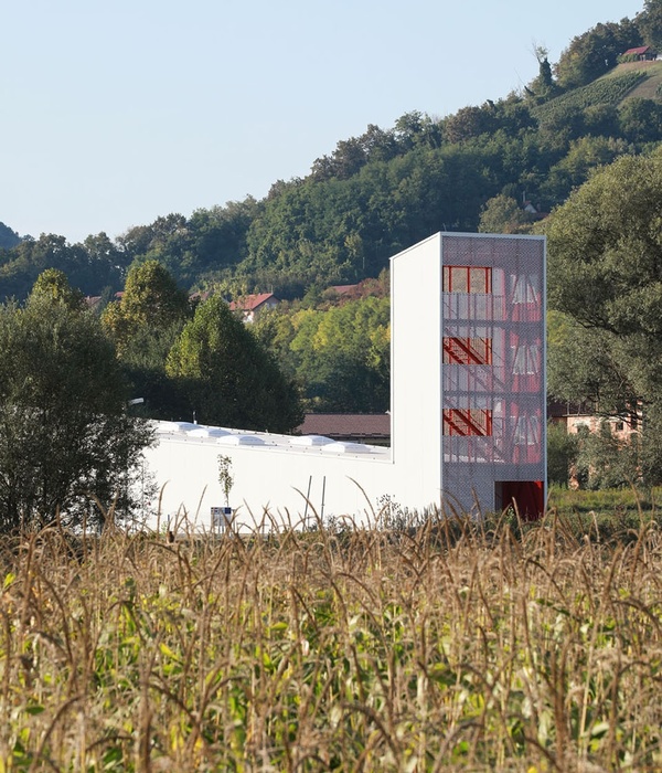
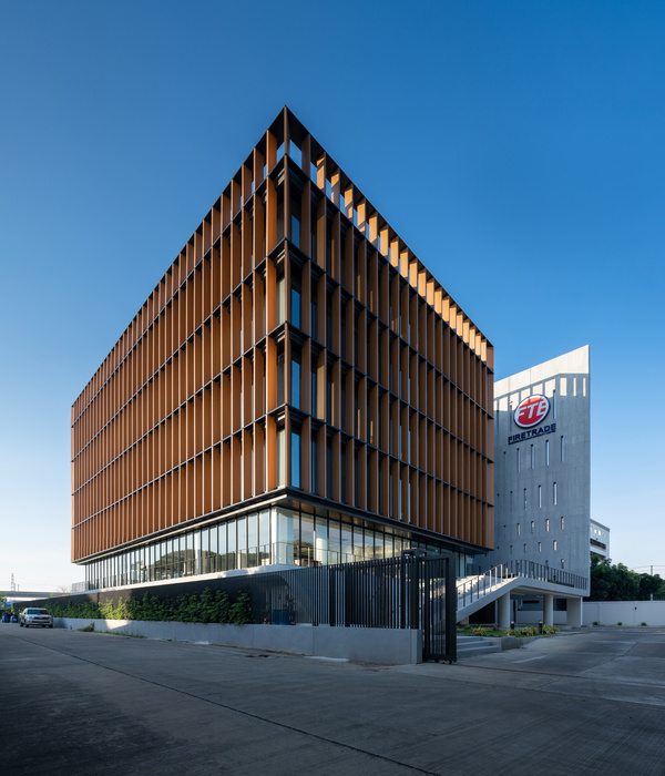
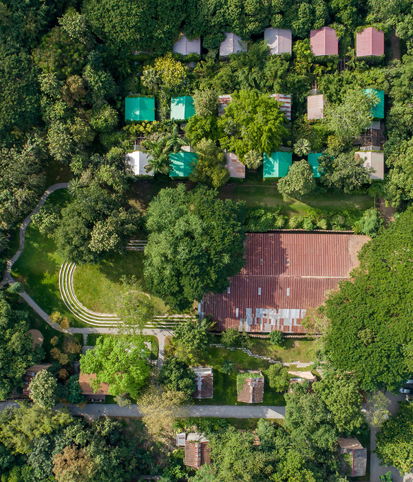
Our project is composed of large-scale planes installed within the city. The architectural design takes its imprint from the universe of graphic design and from the objects and supports that have always invested this art form and continue to do so today: the poster – the sheet of paper – the page – the screen – the billboard.
These large planes are made of stone and compose the walls and roofs. They are rendered abstract by their thinness with 12cm thick panels: stone siding with an aluminium honeycomb core. This rigid material gives the stone its finesse.
These juxtaposed or superimposed planes are close to or distanced from one another. Between them relarge areas of glass, vast surfaces that can be closed off with curtains. In this way, one can see the interior of the space from the exterior.
Stone and glass compose simple or complex wholes to respond to the different roles of the street façades: – on the corners, they compose a serial grouping that marks the public expression of the edifice through its monumentality. – on the station alley side, they are simply juxtaposed redans or projections. – on the bank side, these stone sections are mobile and make it possible to open the exhibition hall to the exterior in continuity with the courtyard and so with the city. – three foils that are higher than the others offer their surfaces up to monumental installations in strategic articulations: at the exit of the station,the city entrance on the rue de Verdun, and in the centre of the «SIGNE» facing the Place des Arts.
Minimalist graphic design as an epidermis of the architecture The graphic intervention in its minimalism deliberately adheres to the architecture, appearing on the walls like a watermark, marking its surface.
Two screens of regular, orthogonal dots graphically structure the stone sheets of the Centre.
From above, a screen of metal dots on the monumental scale of the building comes down to the height of a person, connecting with a screen of smaller, screen-printed dots.
In its upper part, the screen can function as a picture rail or cyma to receive signs and images in any format.
The free wall spaces offer their screened surfaces to the invitees of special events, proposing that artists such as typographers, poster artists, graphic designers and illustrators make use of these surfaces.
The screened surfaces of the stone offer multiple uses, lending support to events, signs and drawn, still or projected images. These “visual” usages are guarantees for the capacity of the architecture to incarnate and transmit the essence and topicality of the place, its legitimacy and boldness.
They thus make it possible to renew and bring up to date all writings and movements, from heritage works to contemporary graphic design.
Product Description. Facade materials: The stone "leaves" are made of a 120 mm siding complex consisting of a 5mm natural stone facing, glued to an aluminum honeycomb through glass fibers impregnated with epoxy resin. The complex comprises, on its rear face, inserts embedded in the resin enabling the fixing of reinforcements made of Z-folded sheet. Type of stone: Limestone Moka cream Dimensions: 120 x 240 cm Exterior: steel joinery Interior: structural walls and raw concrete floor.
{{item.text_origin}}

