德国乌尔姆校园体育馆 | “堆叠”的活力空间
© Zooey Braun
佐伊·布劳恩(Zooey Braun)
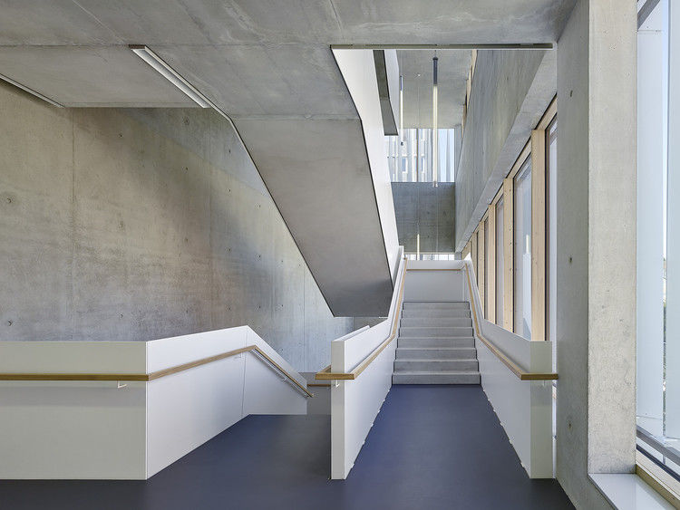
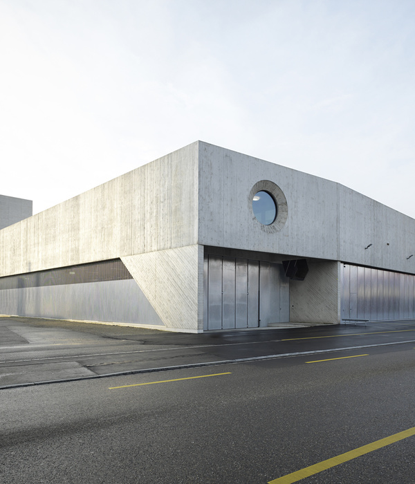
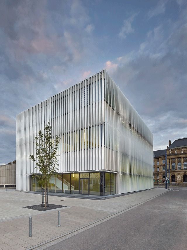
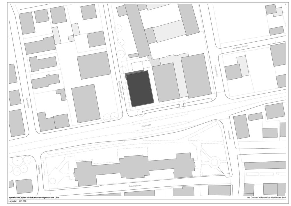
架构师提供的文本描述。由于在城市规划中享有盛名的整合,体育场馆在学校校园中形成了一个前奏或终结点。一个重要的设计标准是,建筑与邻里的和谐结合-根据建筑的尺寸以及周围正面材料所激发的色彩解释。
Text description provided by the architects. Due to the prestigious integration into the urban planning, the sports hall forms a prelude or final point in the school campus. An important design criterion was the harmonic integration of the building into the neighborhood – according to the dimensions as well as the color interpretation inspired by the surrounding facade materials.
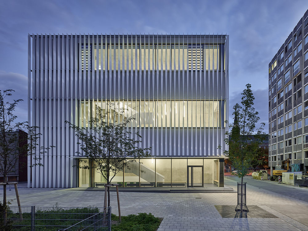
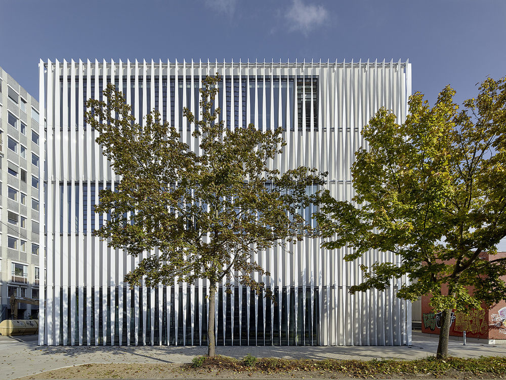
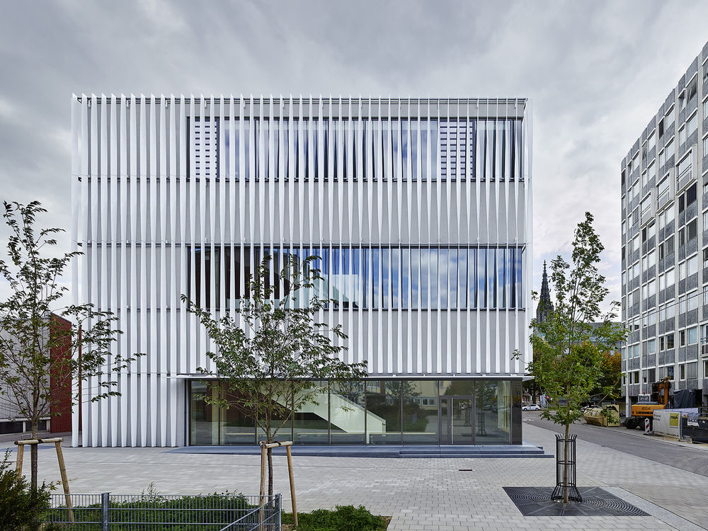
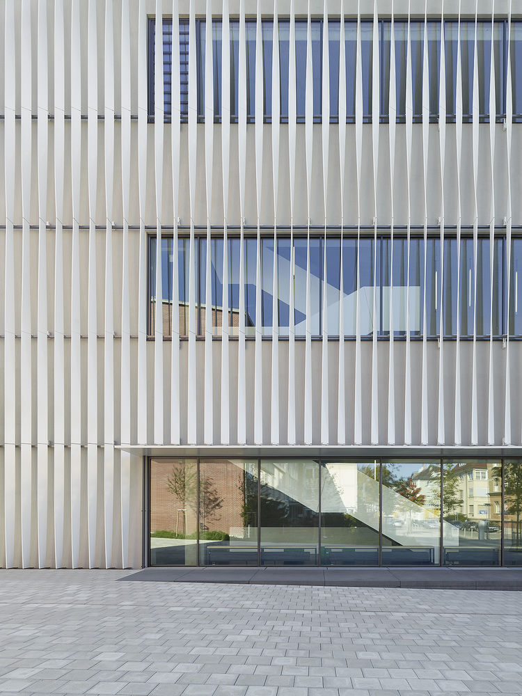
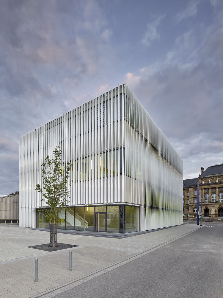
为此,这座18米高的立方体建筑被明亮的白色发亮的铝制立式翅片所覆盖,并略有旋转。特别是232带对后面的房间起到了防晒的作用,但通过不同的光线旋转,鳍也有选择地将光引导到内部空间。视使用情况而定,外观从大到近,从光到光,都是开放的。有针对性的洞察力在健身房领域提供与内部的关系,并使建筑透明。从透视和光的入射情况看,外观从块状的、封闭的到光的开口。壳体的渗透性变化,建筑物的密实度溶解。
For that, the 18 m high cubic building is covered by a structure of brilliant white shiny aluminum fins in vertical order and slightly rotated. Particularly the 232 belts serve as sun protection for the rooms behind, but by the different light rotation of the fins also selectively directs the light into the inner space. Depending on the usage, the facade appears from massive and closed to light and open. Focused insights in the gym area provide relations to the interior and make the building transparent. According to the perspective and the incidence of light, the facade appears from massive and closed to light an open. The permeability of the shell varies and the compactness of the building dissolves.
© Zooey Braun
佐伊·布劳恩(Zooey Braun)
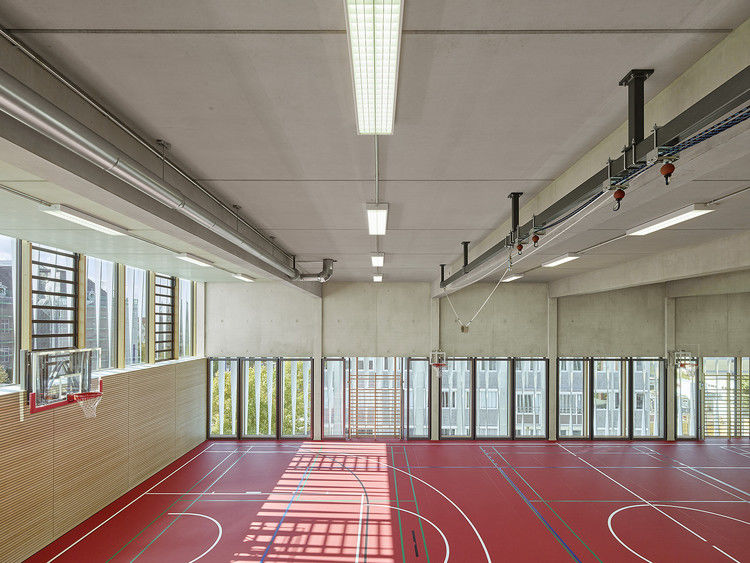
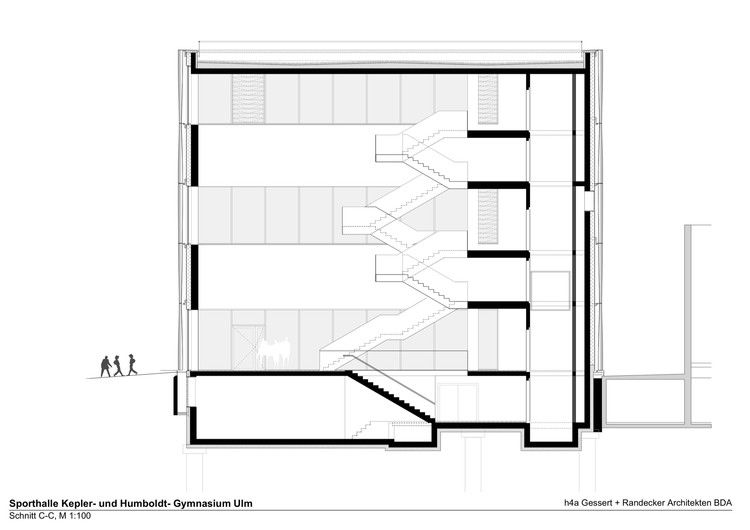
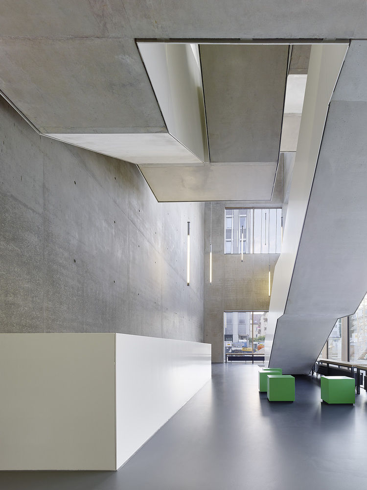
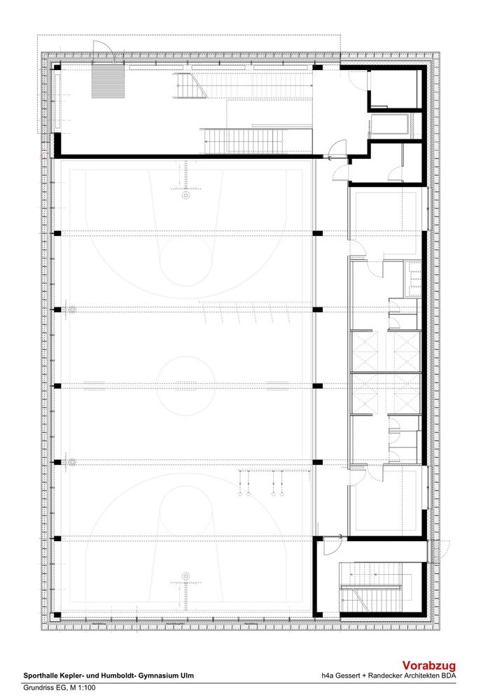
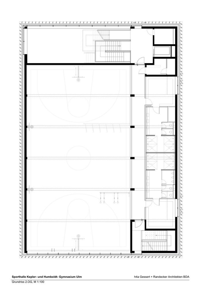
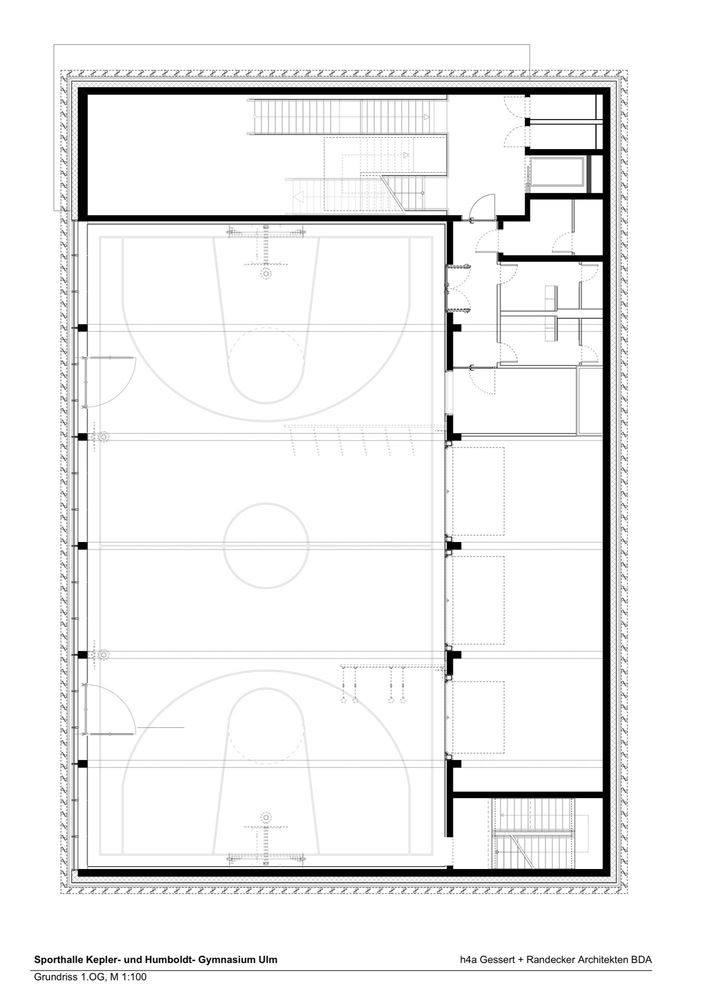
三个单独的体育馆互相“堆叠”在一起,使最下面的体育馆在一半的地面上被降低,与相邻的体育馆相同的水平。三层楼高的运动场可以通过重叠空域的楼梯雕塑到达,引导运动员到更衣室和上层的健身房。体育馆半层的展览馆可以从空域看到运动场上的运动喧嚣。
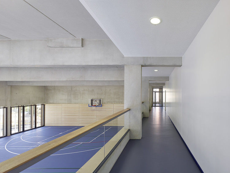
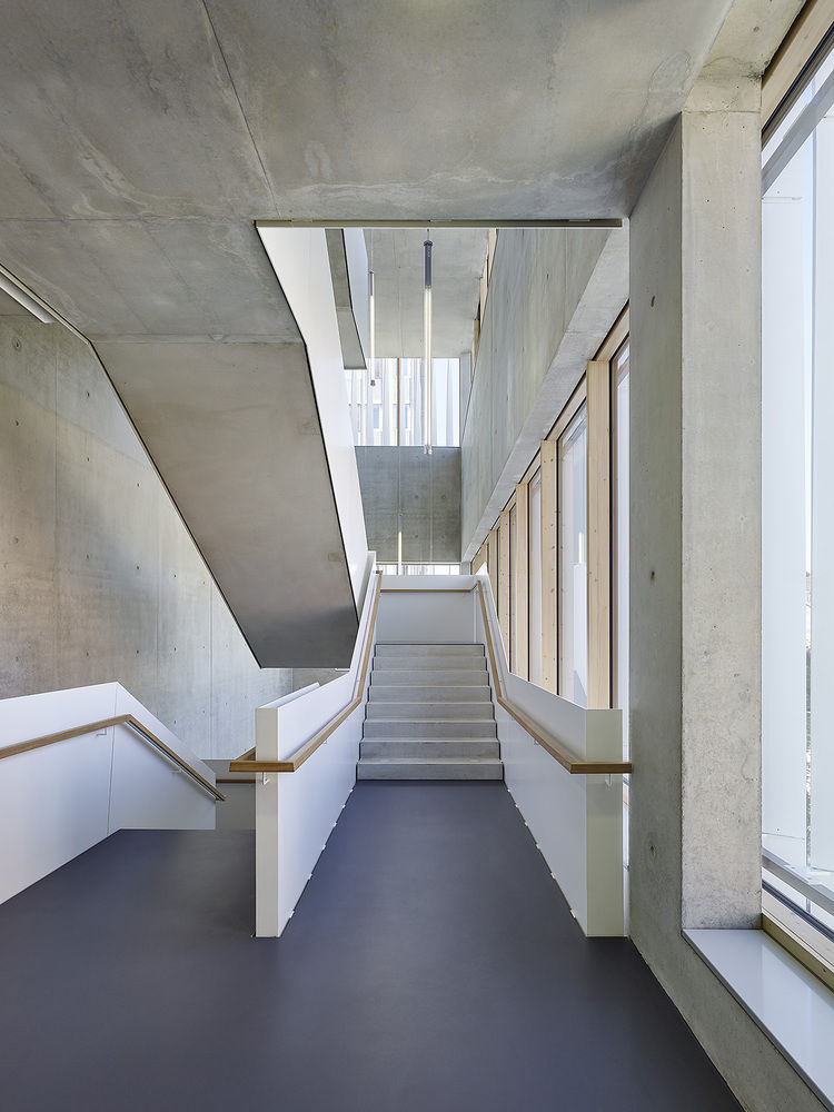
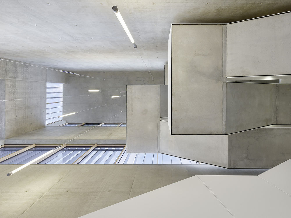
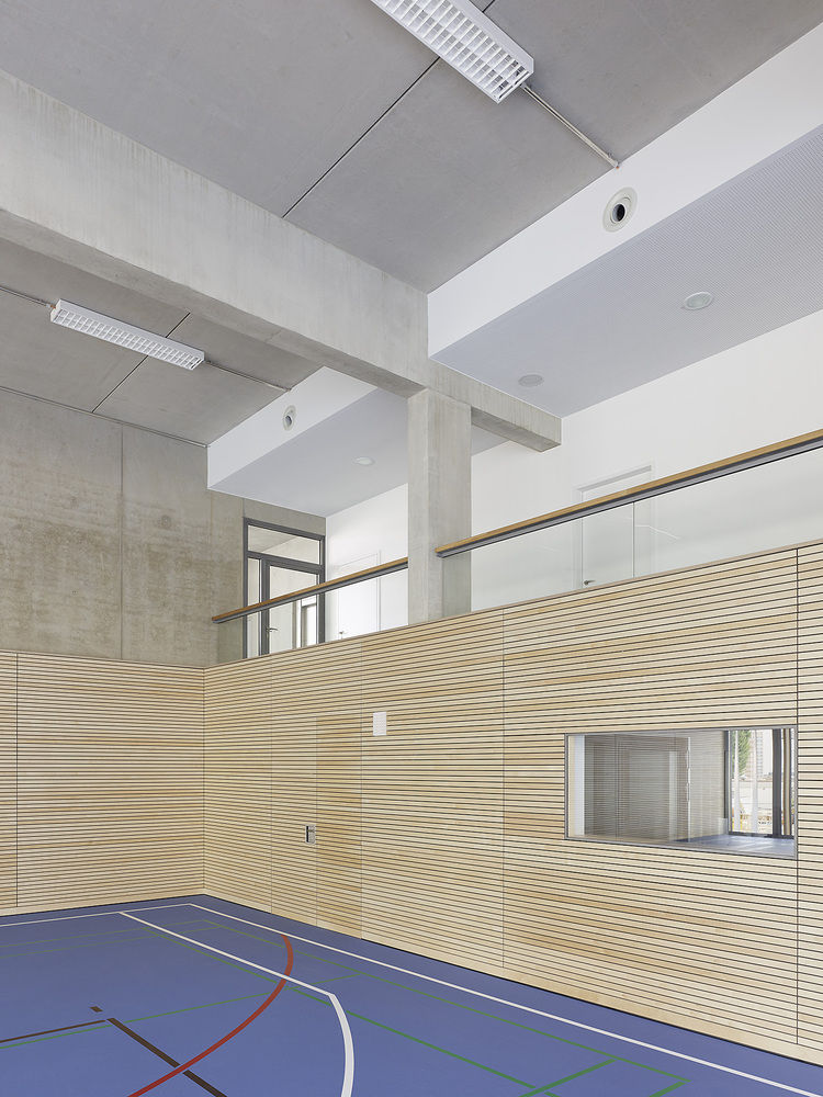
Three single gyms are “stacked“ about each other, whereby the undermost gym is lowered in the ground halfway, on the same level as the adjacent consisting gym. The three-story sports hall is accessible by a stairway sculpture in the overlapping airspace, guiding the athletes to the changing rooms and the gym areas in the upper floors. Galleries on the gyms’ half level enable the view from the airspace to the athletic hustle in the sports field.
© Zooey Braun
佐伊·布劳恩(Zooey Braun)
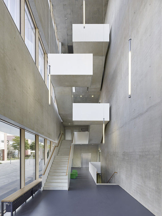
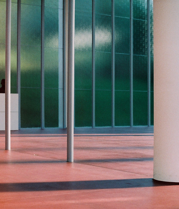
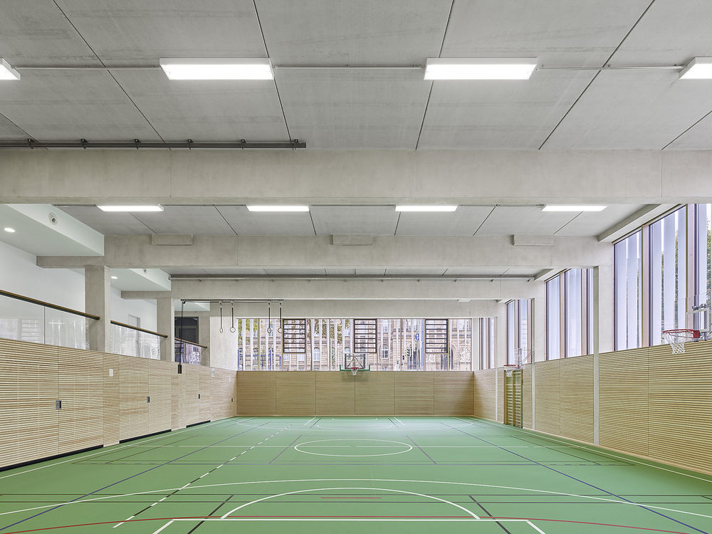
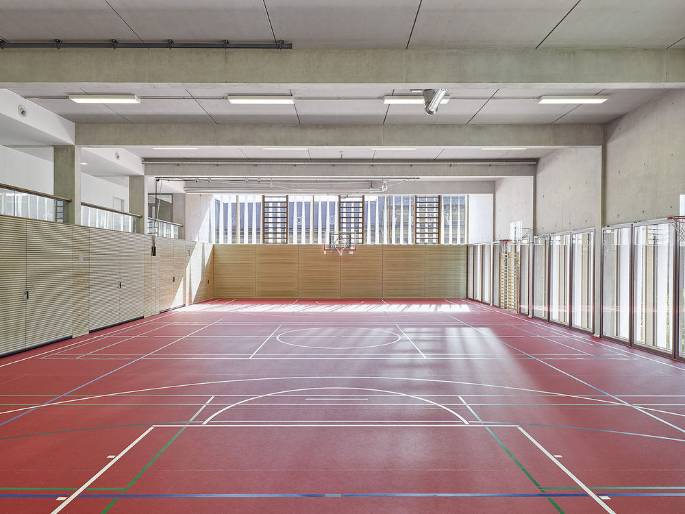
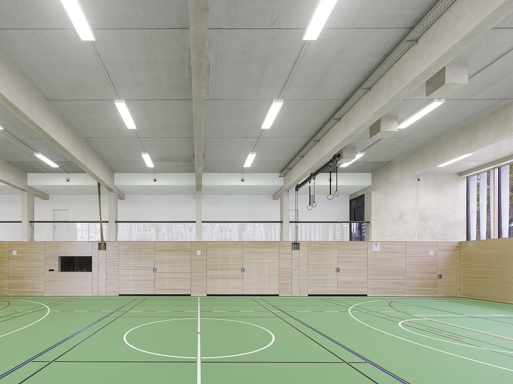
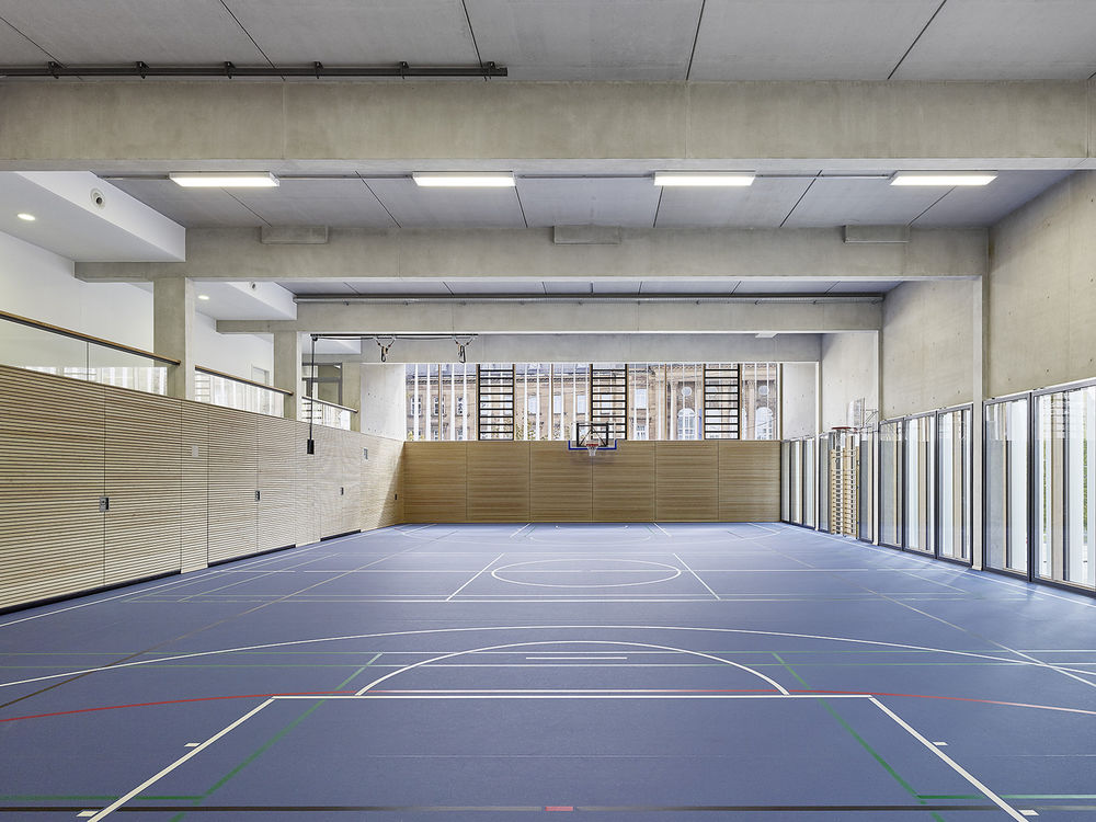
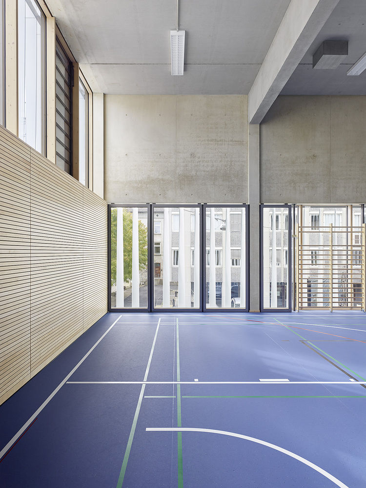
此外,室内设计非常宽敞和健壮。清晰性、开放性、适用性和功能性标志着这个体系结构。使用的材料是温和,平静,谨慎和高质量的暴露混凝土,白色漆面,木窗和墙板。室内和地板的颜色概念因层数和支撑方向的不同而不同。
Also the interior design is very spacious and robust. Clarity, openness, suitability and functionality mark this architecture. The used materials are modest, calm, cautious and of high quality – exposed concrete, white lacquered surfaces, wooden windows and wall panels. Color concepts for the interior and floor covering differ by storeys and support orientation.
© Zooey Braun
佐伊·布劳恩(Zooey Braun)



Architects h4a Architekten
Location Karl-Schefold-Straße 16, 89073 Ulm, Germany
Category Gymnasium
Area 3175.0 m2
Project Year 2015
Photographs Zooey Braun
Manufacturers Loading...

