照片 © Sergio GRAZIA
照片 © Sergio GRAZIA
照片 © Sergio GRAZIA
照片 © Sergio GRAZIA
照片 © Sergio GRAZIA
照片 © Sergio GRAZIA
照片 © Sergio GRAZIA
照片 © Sergio GRAZIA
照片 © Sergio GRAZIA
照片 © Sergio GRAZIA
照片 © Sergio GRAZIA
照片 © Sergio GRAZIA
照片 © Sergio GRAZIA
照片 © Sergio GRAZIA
照片 © Sergio GRAZIA
照片 © Sergio GRAZIA
照片 © Sergio GRAZIA
照片 © Sergio GRAZIA
照片 © Sergio GRAZIA
Metro plan
图纸 © AZC
Elevator detail
图纸 © AZC
Tile detail
图纸 © AZC
Light detail
图纸 © AZC
Mairie de Saint Ouen station - cut detail
图纸 © AZC
Mairie de Saint Ouen station
图纸 © AZC
Pont Cardinet station - cut detail
图纸 © AZC
Porte de Clichy station - cut detail
图纸 © AZC
Porte de Clichy station
图纸 © AZC
建筑师:Atelier Zündel Cristea
位置:Paris, 法國
年份:2021
客户:RATP
Architect associate:ARCHITRAM
Economist:BMF
Light designer:Aartill
Ingeneering:Systra
Pont Cardinet (4000 m²), Porte de Clichy (9000 m²), Saint-Ouen (5000 m²), Mairie de Saint-Ouen (7000 m²). Complete mission Size 25.000 m² / 68.5 M€
The main objective of the northern extension of line 14 was to relieve the saturation of line 13. It comprises 4 stations, Pont Cardinet, Porte de Clichy, St Ouen, Mairie de St Ouen and 5.8km of tunnel track. It serves the Clichy-Batignolles urban development zone, the town of Clichy and the town of St Ouen, i.e. an additional 96,000 inhabitants. The Porte de Clichy station, located at the foot of the new Paris law courts, is emblematic of this extension and provides connections with the RER C and line 13. The 4-station project was built in a dense urban environment. The presence of existing structures, both on the outskirts and above, required a shared design and activity of the construction sites.
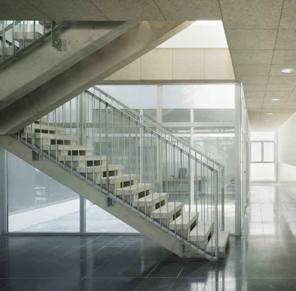
The stations are designed as large volumes crossed by their structures and free of cladding. The layout of the halls allows the public to feel the sense of walking towards the metro trains, despite the spectacular scale of the spaces. All the elements of the metro contribute to highlighting the central nave, which responds to the symmetry of the incoming/outgoing flows of passengers. Floors and walls have been designed for intensive use and easy maintenance. Some of the themes of the historic 14, such as the distribution of the platforms by a "spider" system, the staging of the direct and indirect lighting lines and the renewal of the arches for the landing doors, are found in the new project as input data. The project meets the RATP's objectives: efficiency, modernity, and scalability. Ease of use, compliance with standards, and the feeling of safety felt by passengers during their journey, are elements that cut across all four stations. All the attention is focused on the human being as a passenger and maintainer of the structure. The "metropolitan identity" - bevelled tiles and arches - is taken up. Distributed in small touches throughout the monumental space, the texture of the materials is highlighted by the disciplined geometry of the forms and the contrasts between concrete, earthenware, and stainless steel. Stripped and detailed, the materiality of the walls is a white screen which shows the moving silhouettes.
The structural principle is based on vertical moulded walls, stabilised by buttresses and horizontal slabs. The walls were poured first, then the earth was dug to create volumes 30m high, 130m long and about 22m wide. The great depth, the main constraint of the project, was structuring for the positioning of the vertical circulations. Relatively bare, the large spaces were organised and designed on rational principles of simplicity and robustness.
{{item.text_origin}}

