Moguer Gate 公交站台 | 功能多样,舒适便捷
像其他许多长途汽车站和火车站一样, Moguer Gate是一座城市留给游客的第一印象。由于坐落在露天会场上,它也自然成为了展会期间市政厅展位的立面。游客在此候车期间,大门既为人们抵御了恶劣天气,也为初来乍到的旅行者提供了短暂休憩的舒适和基本的城市游览信息。
Moguer Gate is the very first impression that visitors get from the city, like many other coach and train stations. Due to its location on the fairgrounds, it is also the facade of the town hall’s stall during the fair, which is a significative element that will take part of the archetypal imaginary for the next generations. The gate works as a protective element against the inclement weather during the waiting time and, at the same time, it provides comfort and information to the travellers.
▼Moguer Gate概貌,overview
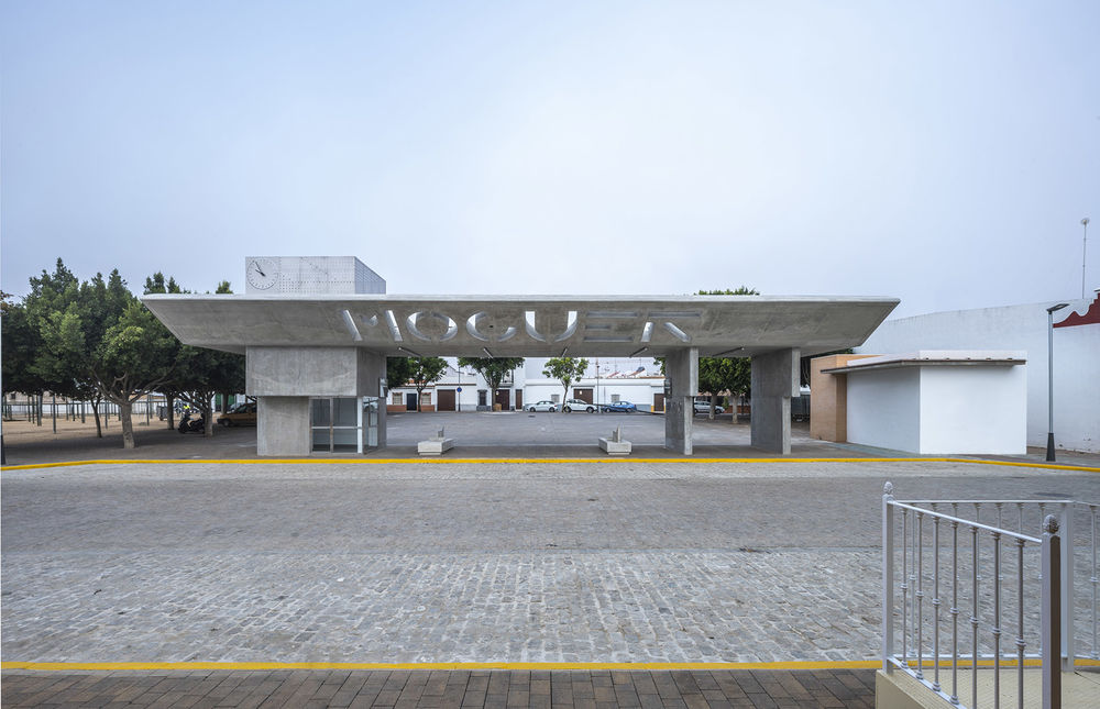
▼同时作为会场入口大门和车站站台的Moguer Gate,Moguer Gate acts as the entrance Gate of the conference hall and the platform of the station
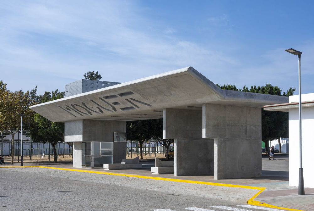
站台的正式名称基于二十世纪初在韦尔瓦省建造的、写有本地方言的檐篷,象征着对乘客的迎接和欢送。这些檐篷由与火车站相连的水平面和向交通区域开放的倾斜平面组成。也正是这些既有的构造,才使得站台有了现在的模样。
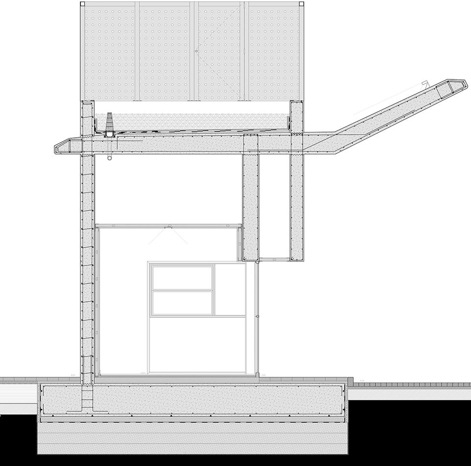
The formal isation of the halt is based on the vernacular canopies built in the province of Huelva at the beginning of the twentieth century and symbolise the welcome and farewell of passengers. These canopies would consist of a horizontal plane that connects with the train station and an inclined plane that opens towards the traffic area. Indeed, it is this idea that gives the shape to the main section developed in the project.
▼从展会场地内部看向大门,view from the inside of the exhibition site to the gate
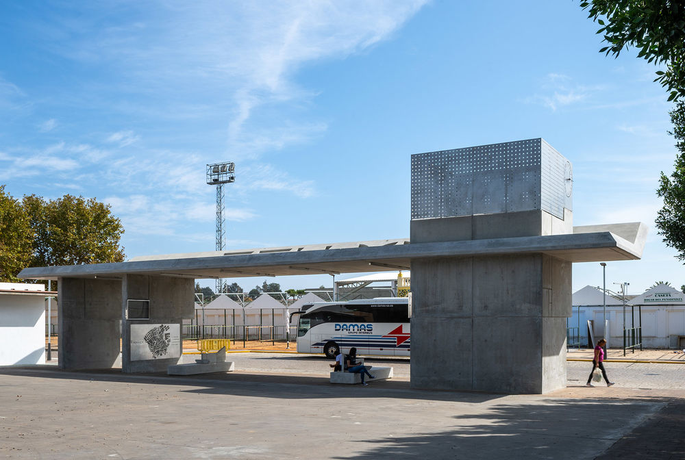
▼Moguer Gate侧面视角,side view of the Moguer Gate
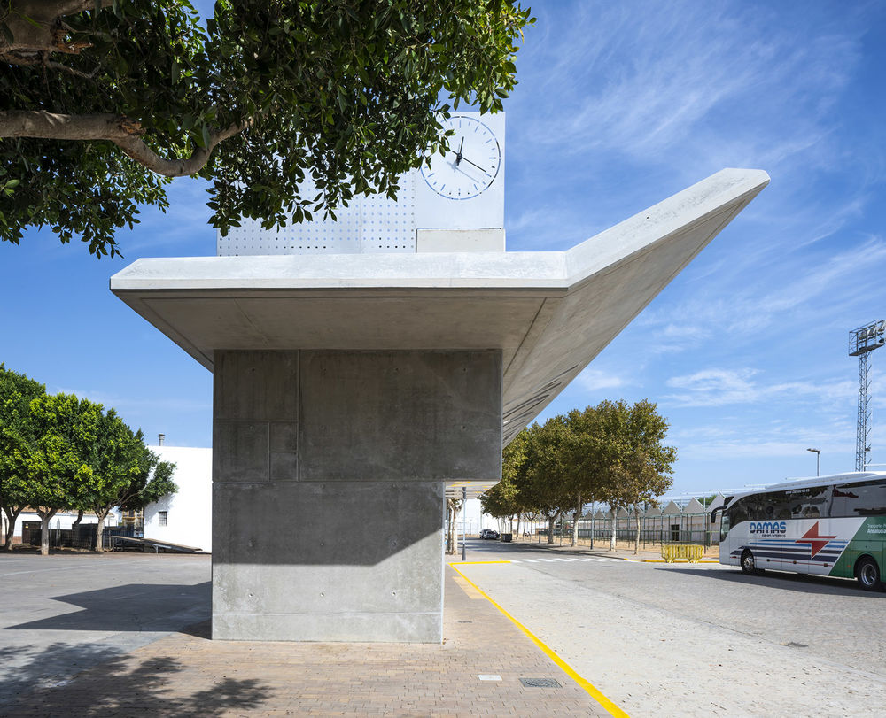
站台的设计从两个做成平面图形式的、黄金比例的矩形开始,每个矩形分别为7.5 x 12.13米。从平面图和立面图上发展而来的其他元素也都遵循了相同的黄金比例。选用的材料是完美呈现该项目的关键:裸露的混凝土和不锈钢。这些材料不仅所需的维护成本低,且能突出项目的设计理念。整个空间在被打造成坚固的功能性雕塑的同时依然保持美观。因此,该站台很可能会变成一个向乘客预先展示城市美好的地标性建筑。对细节的关注、体量的纤细轻盈、若有似无的极简主义,惊喜、光影、诗歌……所有这些美好的元素都可以在Moguer城市中找到,也正是如此,它们都以不同的形式出现在Moguer Gate上。
▼站台内的墙壁上有做成平面图形式的两个金色矩形,the walls inside the platform have two golden rectangles in the form of plans
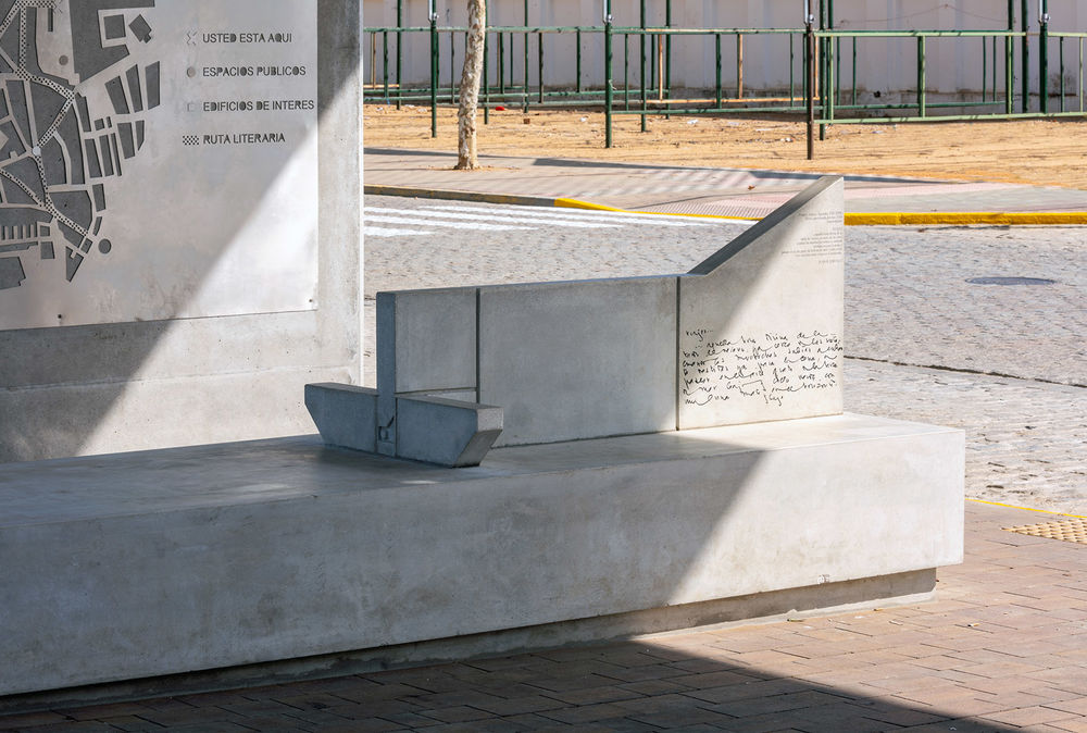
▼游客正在仔细观看平面图,the visitor is poring over the plan

The design begins with two golden rectangles in plan, 7.5 x 12.13 metres each. The rest of the elements develop from them both in plan and elevation, following the same golden ratio. The materials used are key to articulate the project: exposed concrete and stainless steel, which require low maintenance and provide an emphatic image to the concept. Space is treated under the premise to turn it into a robust functional sculpture, and, above all, beautiful. It is, therefore, capable of being transformed into a landmark that anticipates to the passengers what they are going to find through their visit to the city. The attention to the detail, the slenderness, the lightness, the purposed/unpursued minimalism, the surprise, the light and shadows, the poetry… All of these can be found in Moguer and they are, therefore, represented on its Gate.
▼裸露的混凝土和不锈钢不仅所需的维护成本低,且能突出项目的设计理念,exposed concrete and stainless steel not only require low maintenance costs, but also highlight the design concept of the project

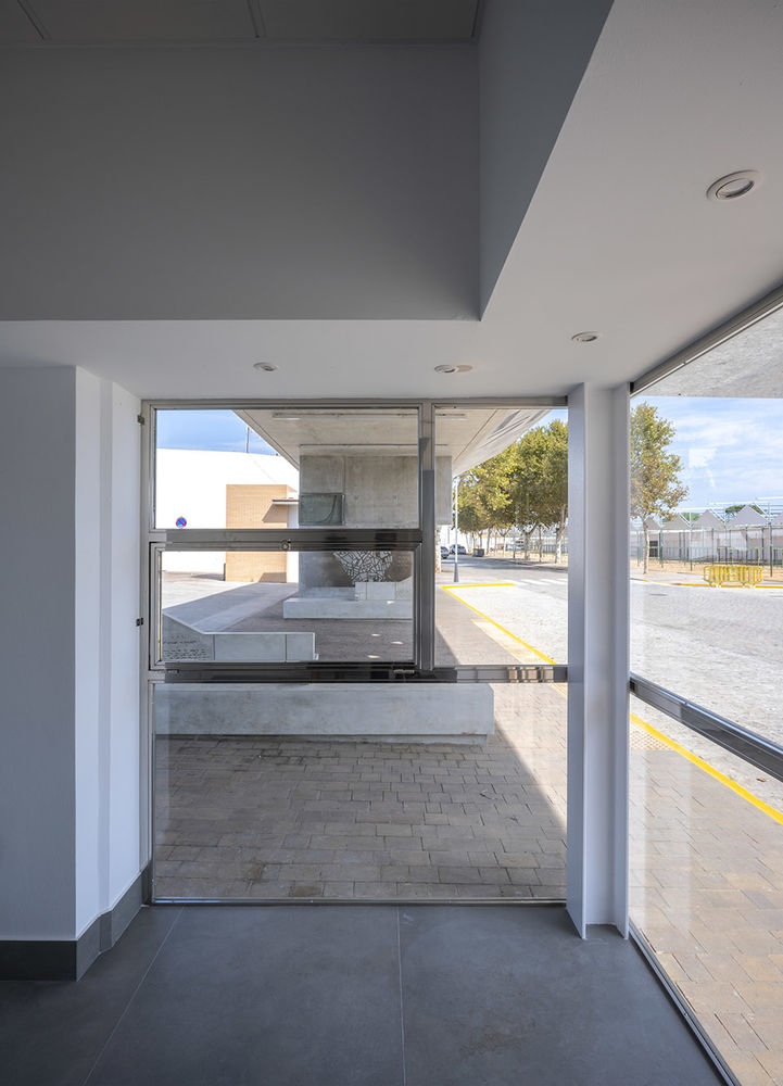
▼室内等候区域,the indoor waiting room
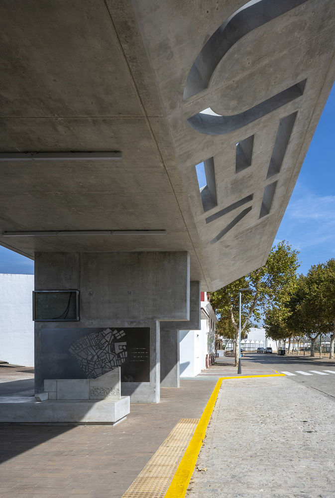
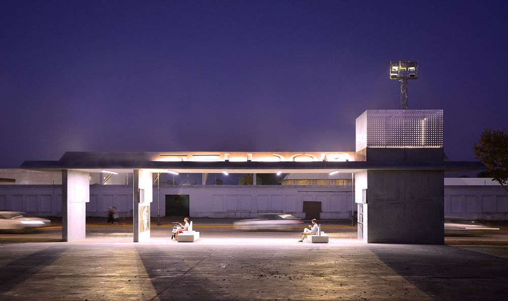
另一方面,城市名称也是该项目的重要组成部分。MOGUER一词的每个字母在混凝土悬臂上以镂空的形式呈现,使得光影于此交叠变幻。白天,阳光透过字母,在地面上映照出城市名字的阴影。夜晚,在灯光的作用下也可产生类似的效果。
▼光影示意图,diagram
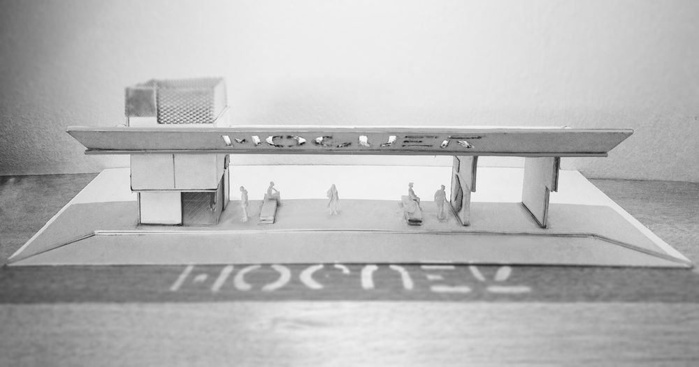
▼混凝土悬臂细部,details

On the other hand, the name of the city is an essential part of the scheme. Each letter of the word MOGUER is ruptured on the concrete cantilever, creating consequently a game of lights and shadows over the movement plane. During the day, the sunlight goes through the letters and makes up the name on the ground. A similar effect is achieved during the night with specific luminaires.
▼MOGUER一词的每个字母在混凝土悬臂上以镂空的形式呈现,each letter of the word MOGUER is ruptured on the concrete cantilever
▼夜晚,在灯光的作用下也可产生与白天类似的效果,night, in the role of light can also produce a similar effect
Moguer Gate是展会场地更新计划的第一项。该土地在一年中都被用作停车场,因此可以在博览会期间布置展位。指定的人行道还为该具有双重功能的站台带来了一定的灵活性:四个彩色条带不仅可以用来划分区域,还能标记街道和指示游人。最后,考虑到残疾人的舒适性和移动便捷程度,无障碍环境的构建已成为该项目的关键部分:站台里提供了内容丰富的盲文信息栏,还有专门改制的长凳以及一些来自Juan Ramón Jiménez的诗歌。
Moguer Gate is the first intervention of the planning update of the fairgrounds. The land is used as a parking lot during the year, allowing this way the installation of stalls during the fair. The pavement specified also provides some flexibility for this dual function, as it has four chromatic strips that organise the area, marking the streets and orientating the user. To finalise, accessibility has been a key part of the scheme, considering the comfort and mobility of disabled people. The halt has an informative area plan in Braille and exclusively adapted benches with some verses from Juan Ramón Jiménez.
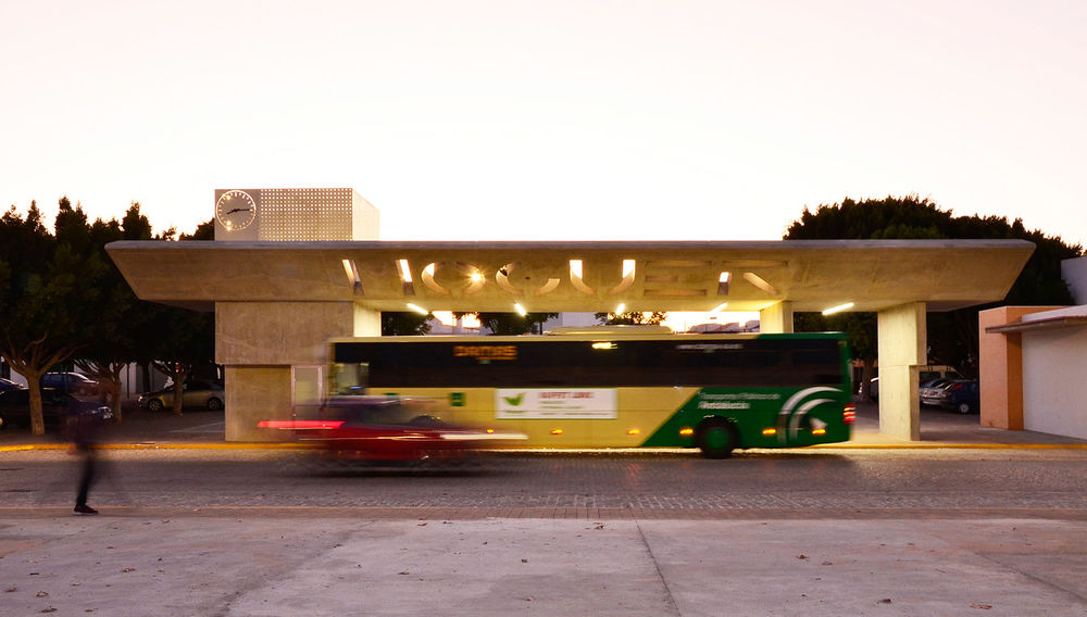
▼傍晚时分的站台,the gate at evening
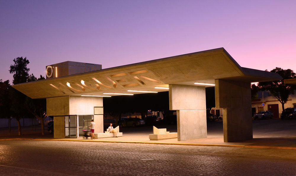
▼夜幕下的站台,the gate at night
▼选址平面,site plan
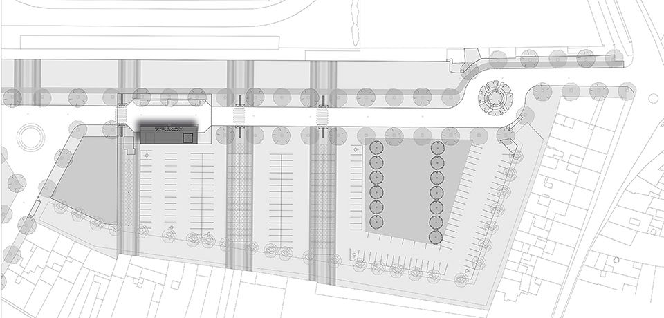
▼平面图,plan
▼剖面图,section
