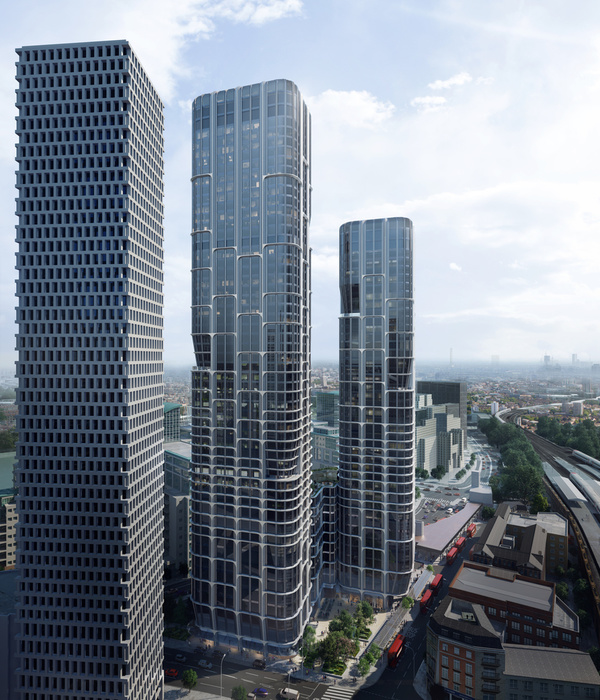
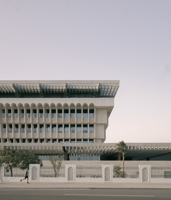
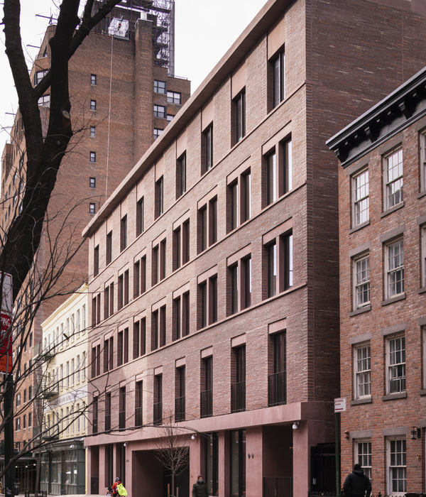
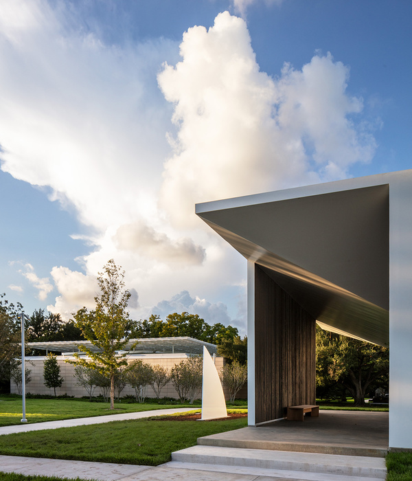
In 2006, Kokkolan Teollisuuskylä Oy, an enterprise owning and governing premises within the town of Kokkola, commissioned a draft phase design for a new building along the new Satamatie, acting as a gateway to the large-scale industry and harbour area. The working title for the project was “Port Tower”. The building would host business premises for local enterprises as well as occupational health care, training, and catering services. Additionally, information, security, and monitoring services of the whole area and services for cargo transport operation would be centralized in the building. As the name “Port Tower” suggests, the building was intended as a landmark and a gateway for the area.
The building site is located in the intersection between the roads leading to the inner harbour and the large-scale industry area. The truck traffic in need of monitoring and security services has been directed to pass by the lot that also hosts parking space for cargo transport.
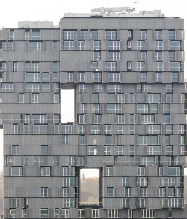
The building volume consists of a four storey horizontal part where diverse services and flexible and convertible business premises are located, and a nine storey tower, on top of which are located the training premises and a Visit Center with its conference rooms and sauna facilities. The clearly perceivable figure of the building and the openings blurring the scale of the façades are ways to emphasize the building’s status as a landmark.
Demanding climate conditions in the proximity of the large-scale industrial area and the shore as well as participation of the close-by Boliden zinc factory in the project led to the selection of pre-patinated zinc as façade material. Whole external envelope with its battens is covered with sheet metal refined in Germany from zinc shipped from Kokkola, and later rolled in Finland into flute shape.
The concrete walls and columns left visible of the building’s framework have been fair-face casted in situ. On top of the smooth grey concrete surfaces and dark zinc plate walls, the interior is determined by white lattice ceilings, light granite floors in the foyers, and colored accents in partition walls here and there.
Starting point for the interior design has been creating a cosy atmosphere and contrasts between materials and colors. Colors have been used deliberately but daringly. Bright highlighting colors in dividing walls and furniture bring joy and lightness to the interior, counter-balancing the landmark appearance of the exterior. In the Visit Center and training premises of the upper floors warm wooden surfaces have been used instead of colors to create a pleasant atmosphere. Visually light and sculptural furnishing has been chosen to balance the linearity of the fixed furniture and architecture. Interior design was done by Studio Järvi & Ruoho in close collaboration with Arkkitehtitoimisto Antti Luutonen.
A landmark should originate from the genius loci, landscape, urban environment and other external circumstances, but also from local culture and interaction. In a similar vein to industrial construction, rational functional concept has given Port Tower a memorable character that has been emphasized by architectural means.
{{item.text_origin}}

