上海甘泉外国语中学屋顶改造 | 创新立方体与森林共舞
架构师提供的文本描述。该案件位于上海市甘泉外国语中学屋顶之一。这是对原平坡屋顶的再改造,是从设计师的角度对学校空间改造的一种创新尝试,在这种改造中,所有的空间都不同于传统的教室,以体现甘泉学派聪明的创新文化和精神。
Text description provided by the architects. The case is located on one of the roof top of Shanghai Ganquan Foreign Languages Middle School. It’s a re-transformation case against the original flat-to-slope roof. This is from the designers’ perspective, an innovative attempt on school space transformation, in which all space is different from the conventional classroom, so as to express the Ganquan School’s smart innovation culture and spirit.
© Wenjie Hu
胡文杰
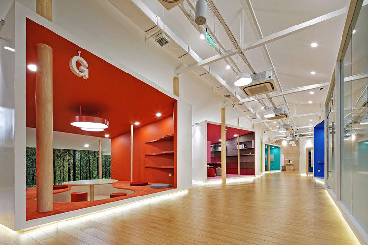
同时,为了最大限度地发挥智能创新功能,空间设计主要集中在主要用户 (学生) 上。
我们遵循“隐性教育”的设计理念 (即儿童的心理、行为)。
Meanwhile, in order to maximize the smart innovative function , the space design is mainly focus on the main users (students). We follow the design concept of the "hidden education" (ie, children’s psychology, behavior & cognitive science etc.) and emphasize this point on all the design elements, thus to create the most appropriate smart innovative environment.
Floor plan
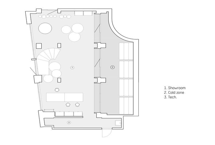
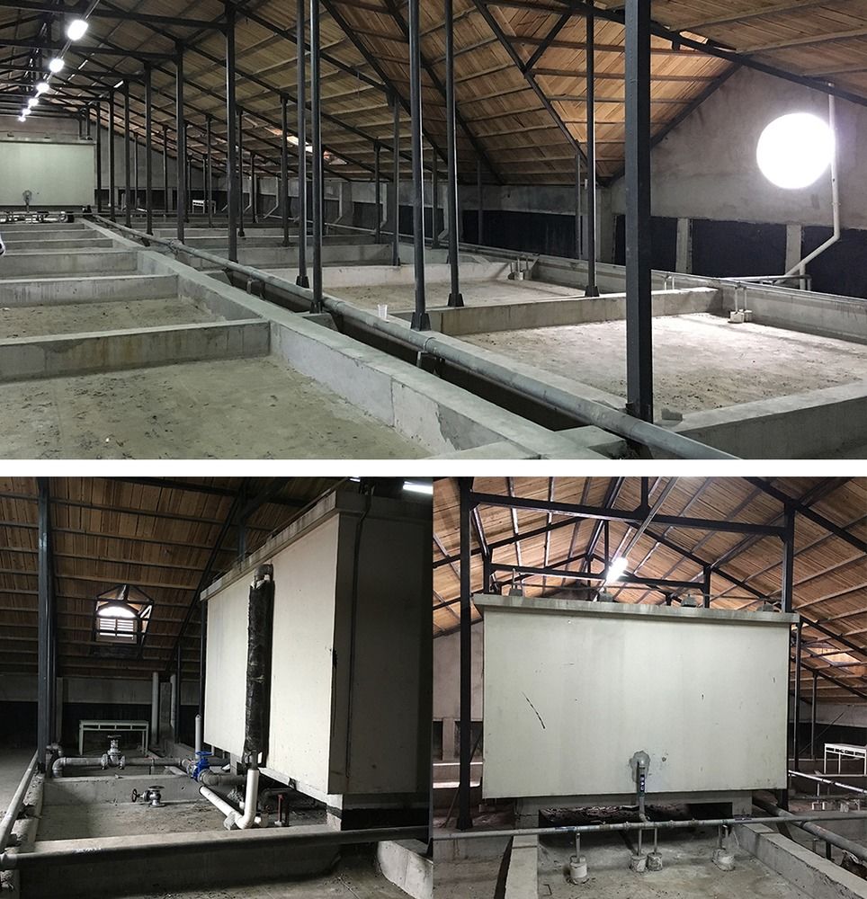
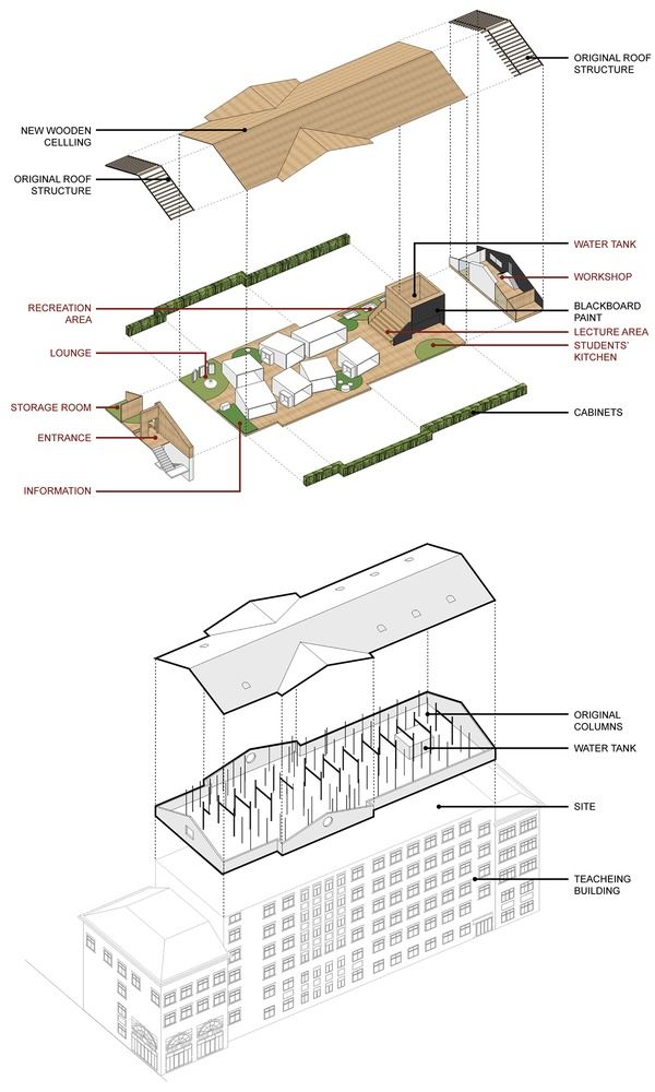
改造背景作为平坡屋面工程后的闲置空间,存在着梁柱不敏感、管道错位、照明、水箱等一系列问题。
Transformation Background
As an idle space after the flat-to-slope roof project, there are series of issues on beams’ and columns’ insensitivity, pipeline staggering, illumination, water tank and etc.
© Wenjie Hu
胡文杰

设计理念为学生创造了一个新的体验性和智能的创新空间,我们发现密集的柱子是设计过程中最大的问题。另一方面,我们会利用它们吗?因此,我们的设计师开始了逆向思维,从而催生了我们的主要设计建议“森林中的创新立方体”。
Design Concept
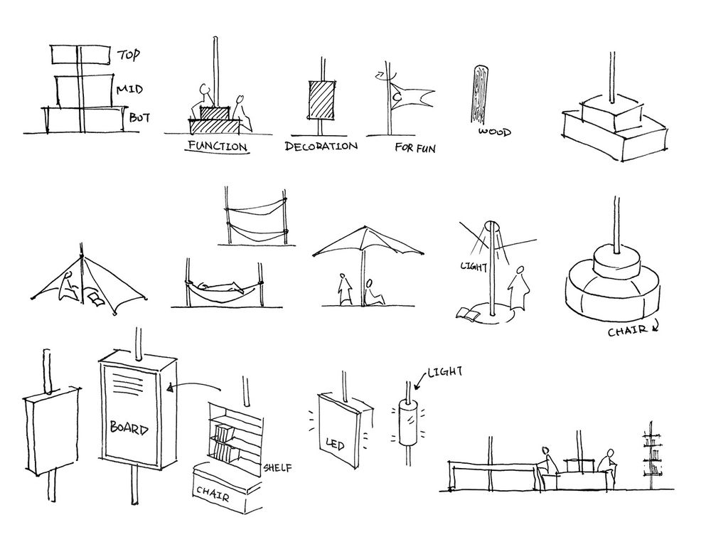
To create a new experiential and smart innovation space for students, we found the dense columns to be the biggest issue during the design. While on the other hand, would we take advantage of them? So our designers start reverse thinking and thus lead birth to our main design concpt of "Innovation Cubes in the Forest."
Concept figure
概念图
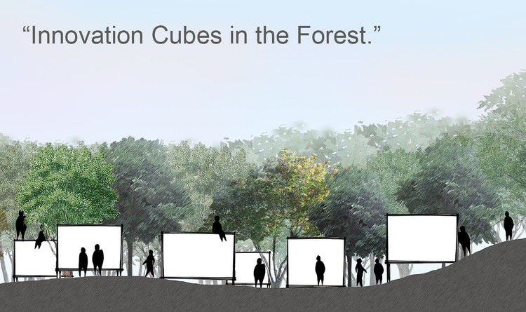
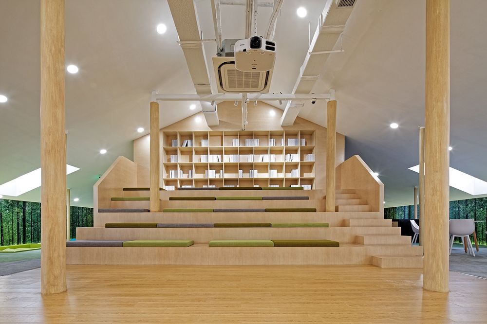
密集的柱子看起来就像森林里的树。我们巧妙地将它们与房间、家具和所有公共空间结合起来,以创造一个有趣的绿色学习空间,丰富的体验。这一设计理念也反映了人与自然的和谐。
Dense columns seem just like trees in the forest. We cleverly combined them with the room, the furniture and all the public spaces in order to create an interesting green learning space with rich experiences. This design concept also reflects the harmony between human being and the nature.
© Wenjie Hu
胡文杰
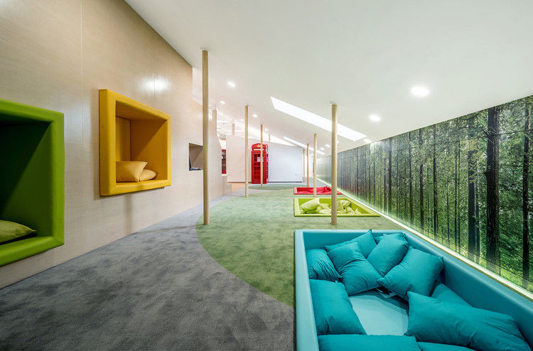
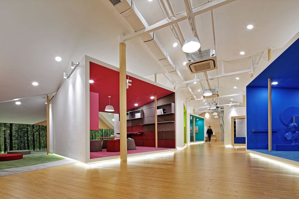
由于柱和立方体太多,传统的水平和垂直排列会导致内部空间的低效利用,因此,我们旋转每一组立方体,调整柱与立方体之间的距离和立方体间的角度,以最大限度地利用可用空间,同时兼顾空间的整体美观。
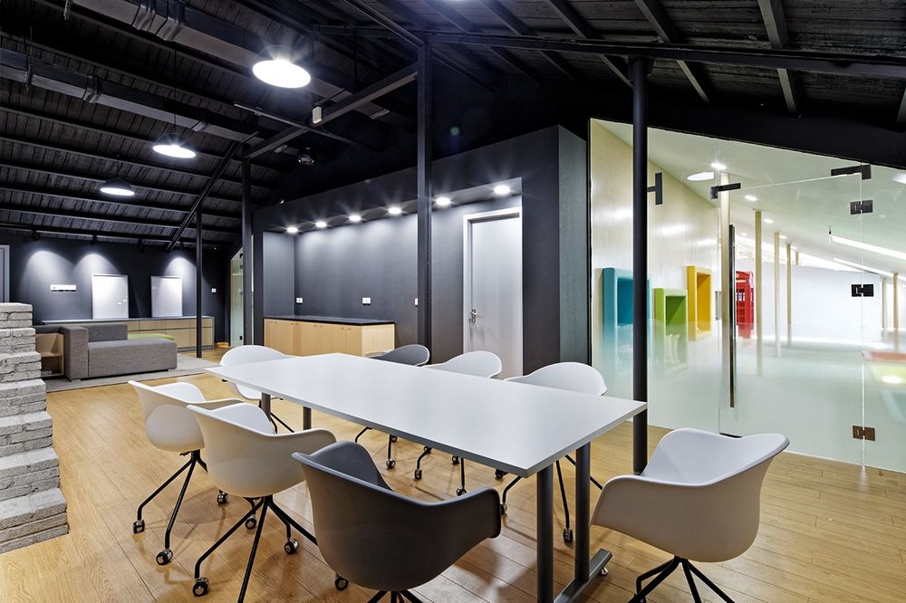
Columns and “Cubes”As there are too many columns, the traditional horizontal and vertical arrangement would lead to inefficient use of internal space, so we rotate each group of cube and adjust the distance between the columns and the cubes and the angle between cubes so as to maximize the available room meanwhile taking care of the overall aesthetics of the space.
© Wenjie Hu
胡文杰
柱和家具我们试图探索柱和家具之间的更自然的组合:柱柱从桌子上生长出来的是,家具变得更加迷人,旋转轴线,而悬挂在两个相邻柱子之间的曲线自然成为舒适的吊床上等。
Columns and Furniture
We try to explore the more natural combination between columns and furniture: the columns’ growing out of the table are making the furniture become more fascinating with a spinning axis and yet the curves hanging between the two neighboring columns are naturally becoming a comfortable hammock and etc.
© Wenjie Hu
胡文杰
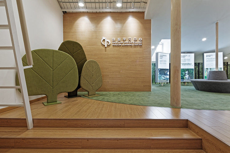
入口处的入口和展览厅的自然而简单的标志墙,轻轻地引导我们进入这个充满惊喜的“创新之林”。展厅讲述了从过去到现在的“森林”的故事,即整个空间本身的设计和改造过程。
The Entrance and the Exhibition Hall
Natural and simple logo wall at the entrance gently guides us into this "Innovation forest" which is full of surprise. The exhibition hall tells the story about "the forest" from the past to nowadays, which is, all the design and re-transformation process of the space itself.
© Wenjie Hu
胡文杰
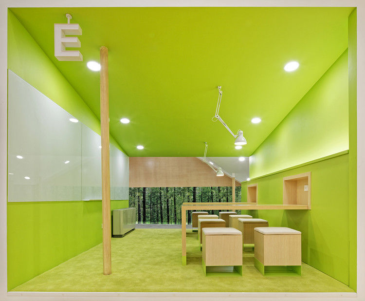
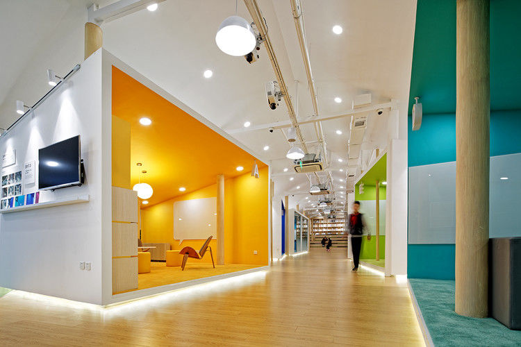
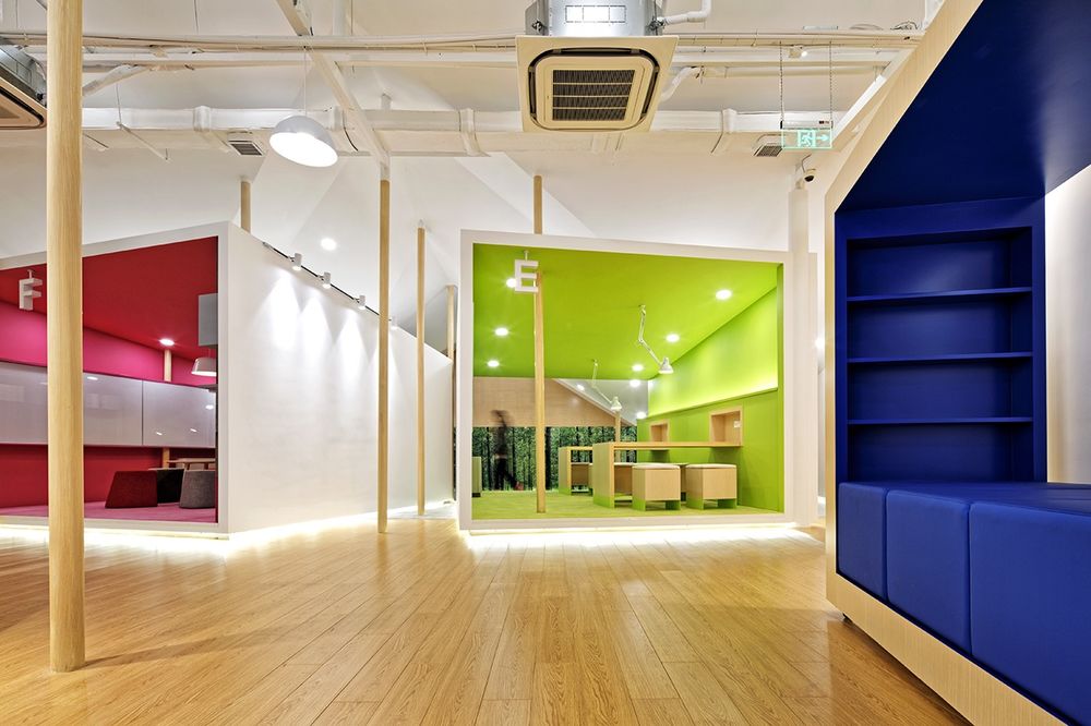
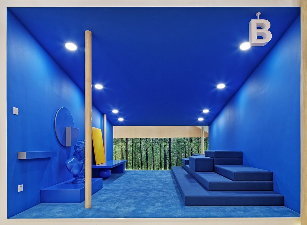
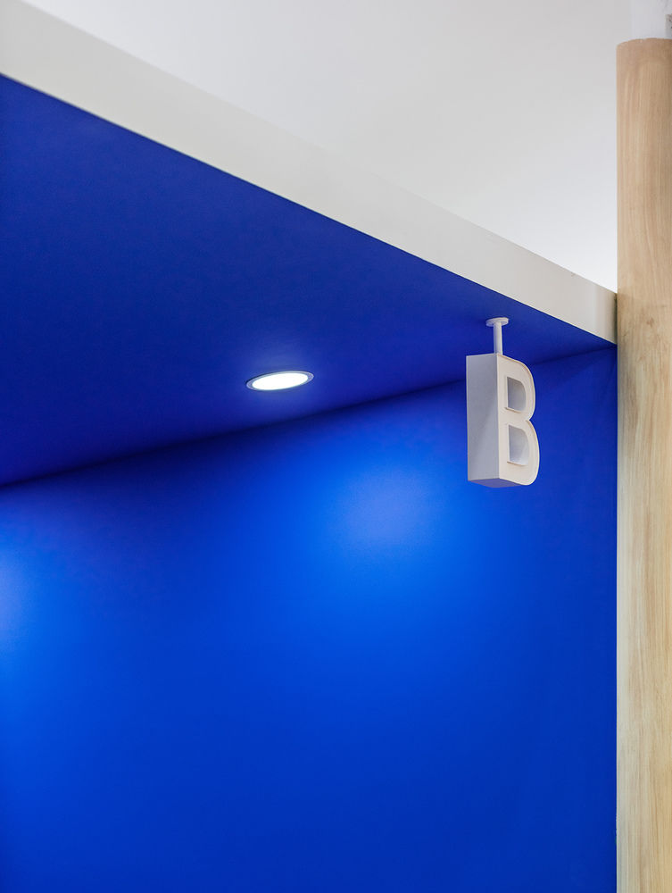
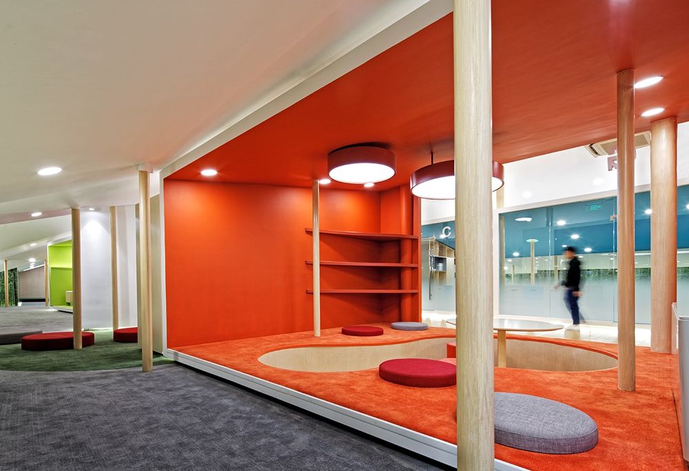
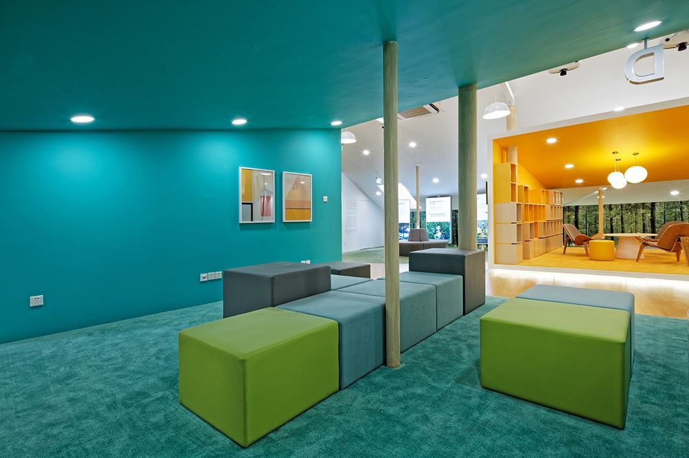
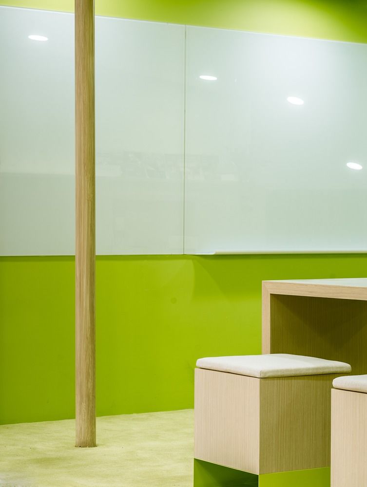
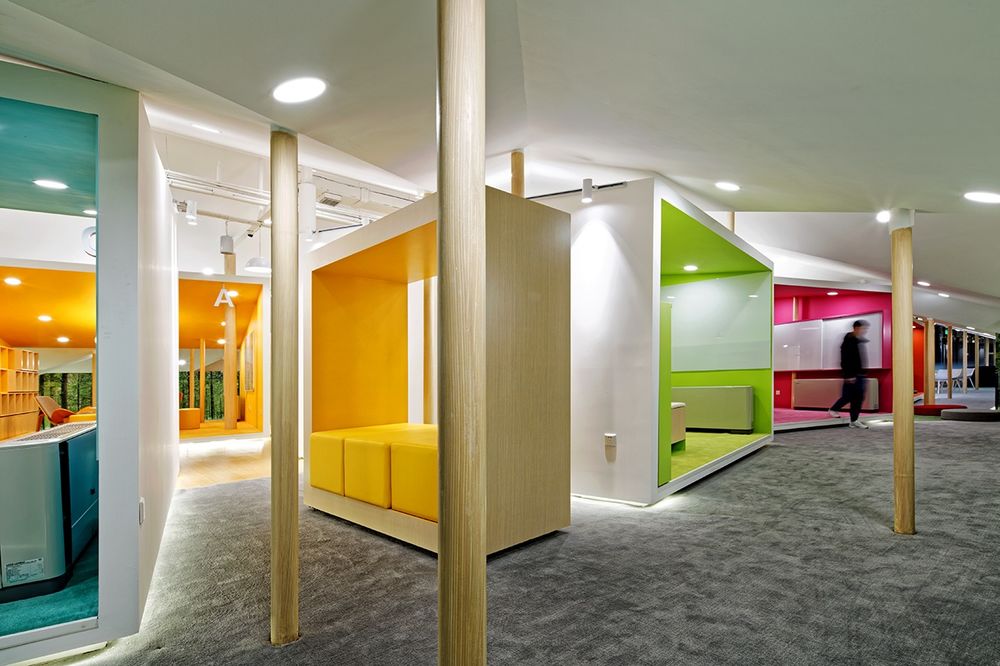
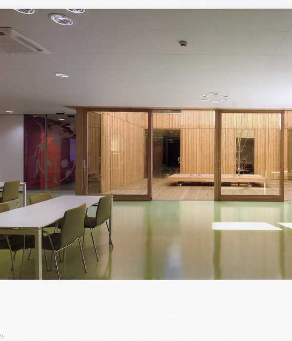
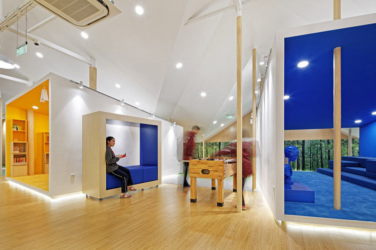
“创新立方体”每个立方体都有着不同的新鲜色彩,学生们可以在其中体验到不同的灵感空间。这些空间配备了不同几何元素的功能设备和家具,从而形成了一个多色彩的多维环境。
“Innovation Cubes”Each Cube is marked with a different fresh color, in which the students could experience a different inspirational space.
The spaces are equipped with functional devices and furniture with different geometric element, thus forming a multi-dimensional environment with multi-color & multi-shape co-combination, which serve better for inspiring students’ creativity and enthusiasm of exploring the space.
© Wenjie Hu
胡文杰
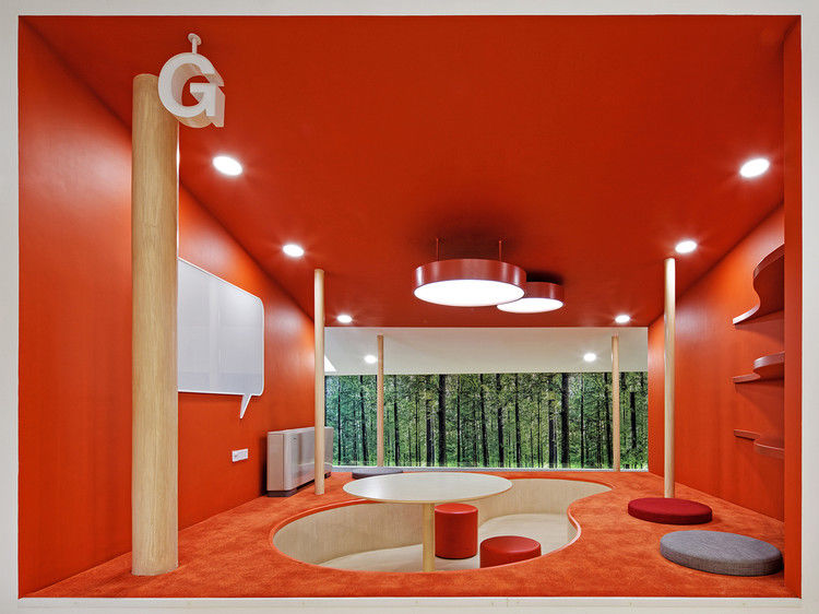
"立方体"之间的差距和"立方体"之间的各种差距为邻近的学生创造了各种各样的娱乐空间。
The Gaps among “the Cubes”The various gaps among “the Cubes” create a variety of recreational spaces for neighboring students.
© Wenjie Hu
胡文杰
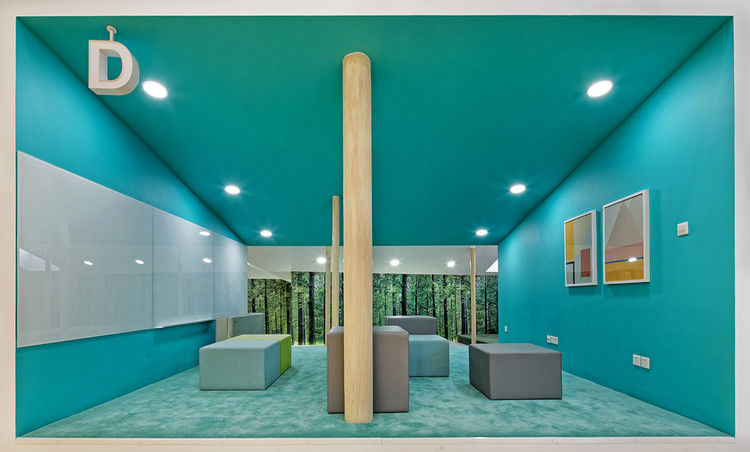
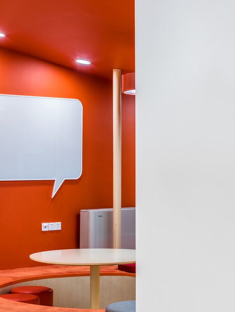
水箱!水箱?水箱!利用原来水箱的高度和体积,设计师们以会议、小组讨论、视频会议和阅读的多重功能,给我们带来了一个如此全面的领域。
Water Tank! Water Tank? Water Tank! Taking use of the height and volume of the original water tank, designers surprise us with such a comprehensive area with the multiple functionality of meeting, group discussion, video conference and reading.
© Wenjie Hu
胡文杰
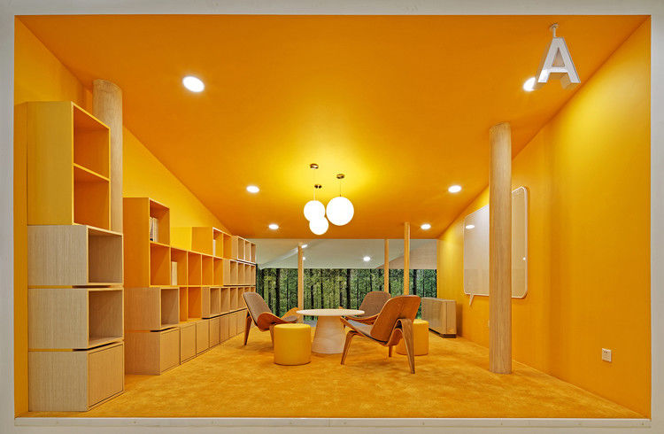
International interactive kitchen Through the internet video connection system, students in this area could connect all the international sister schools and carry out real-time interactive sharing, displaying Chinese cooking culture or exchanging methods of cooking western snacks.
© Wenjie Hu
胡文杰

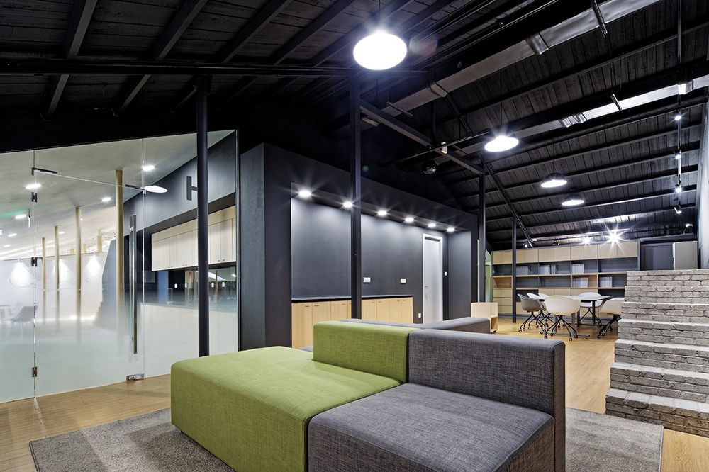
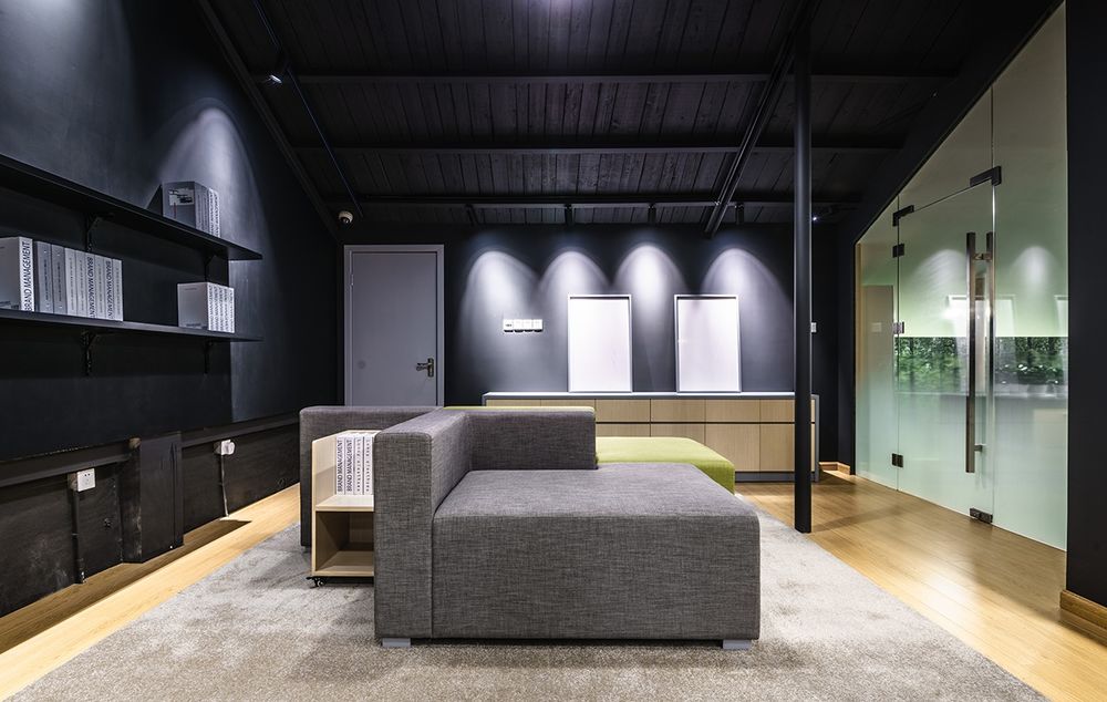
历史遗迹的设计作品给我们带来了全新的整体空间。同时,为了让学生更好地理解这里的原始结构,我们特别在后部预留了一个空间 (多功能制造者空间),保留原有的外观,以便现在的空间可以“说”出它的过去式。
Historical Remains
The design works bring us a brand new look of the overall space. Meantime in order to allow students to better understand the original structures here, we specially reserve a space in the rear part of the area (Multi-functional Makers’ Space) with retention of original appearance, so that the space now could “speak” to its past tense.
© Wenjie Hu
胡文杰

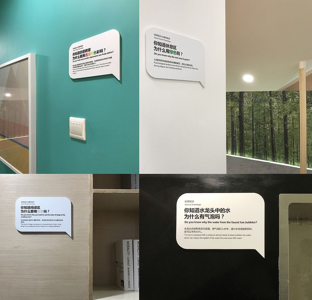
"软"植入知识通过平面设计的学习方法,我们将"软"植入相关领域和产品中,所有这些科普和设计心理学知识都应用在这个空间中,让学生在使用这一空间时,在他们注意到之前就可以访问相关知识。
"Soft" Implantation of the Knowledge
Through the graphic design’s study approach, we implant "softly" into the relevant areas and products all these popular science and design psychology knowledge applied in this space, so that students would access the related knowledge while using this space before they ever noticed it.
© Wenjie Hu
胡文杰
