在北京东四环至五环之间,有一块被数条铁轨划划分出的的菱形区域。当北京经历着迅速的扩张时,这块距离CBD不到5公里的“飞地”却隐匿在衰败的工业厂房中,渐渐成为了被都市文明遗忘的角落。
Between the East Fourth Ring Road and the Fifth Ring Road in Beijing, there is a diamond shaped area separated by several twisted rails. When Beijing is experiencing rapid expansion, this “enclave” less than 5 kilometers away from CBD is hidden in the decaying industrial buildings, and has gradually becomes a corner forgotten by urban civilization.
▼空间概览,preview © 朱雨蒙
北京西店记忆文创小镇的长期目标是通过引入文化创意产业,重新连接被铁路割裂的街区,逐步建立起一个总面积约十几万平米的混合社区。而舒梵,正是北京西店记忆文创小镇所需要的有价值和品位的家具品牌。
The long-term goal of Xidian memory cultural and creative town in Beijing is to gradually build a mixed community with a total area of more than 100,000 square meters by introducing cultural and creative industries and reconnecting the blocks separated by the railway. Shufan is a valuable and tasteful furniture brand needed by Xidian memory cultural and creative town in Beijing.
▼轴测图,axonometry © Nothing Design
建筑的外部由特殊定制的铁锈红耐候钢板表皮包裹着体量。透过材料与场域之间的“摩擦”,制造了一种张力。粗砺交错的红砖墙呼应了场地工业厂房的历史特质;各处精心安排的玻璃窗洞及玻璃门则将空间容器内的“主角”舒梵家具展现给公众。
The exterior of the building is surrounded by a special customized rust red weathering resistant steel plate skin. Through the special “sense of friction” between the material and the field, a tension is created. The rough and crisscross red brick walls echo the historical characteristics of the site, and the well arranged glass windows and revolving doors show the “protagonist” Shufan furniture in the space container to the public.
▼主入口立面,main entrance facade © 朱雨蒙
▼次入口立面,secondary entrance facade © 朱雨蒙
▼玻璃门将家具展现给公众,glass doors showing furniture to the public © 朱雨蒙
一层整体布置大胆,风格独特。平面上三角形和不规则多边形的空间划分,特殊的结构处理手法地面与外立面统一的铁锈红配色,都是设计师精心考量的成果。空间兼顾私密性和公共性,功能布置模拟家庭布局,满足了家具展览需求。
The overall layout of the first floor is bold and unique. The space division of triangles and irregular polygons on the plane, the special structure treatment method, and the uniform rust red color of careful consideration by the designers. The space takes into account both privacy and publicity, and the functional layout simulates the family layout, which meets the needs of furniture exhibition.
▼展示区B,采用特殊的结构,display area B with special structure © 朱雨蒙
▼铁锈红配色,rust red color © 朱雨蒙
楼梯和弧形台阶之间是有一面阶梯状的矮墙,划分了交通空间和主要空间,又和楼梯,地台刚好形成了三种不同的阶梯形式,暗示了空间的高度转换。墙上的圆洞既呼应设计的弧形元素,又可以作为实用的家具展柜,打破了墙的沉闷感。
Between the stairs and the arc-shaped steps, there is a ladder shaped low wall, which divides the traffic space and the main space, The low wall, the stairs, the platform form 3 different ladders, which indicates the height conversion of the space. The round hole on the wall not only echoes the arc elements of the design, but also can be served as a practical furniture showcase, breaking the dullness of the wall.
▼展示区C,main display area C © 朱雨蒙
▼弧形台阶,用于家具展示,arc-shaped steps for furniture display © 朱雨蒙
▼阶梯状的矮墙,圆洞呼应设计的弧形元素,ladder shaped low wall, round hole echoing the arc elements of the design © 朱雨蒙
▼楼梯,staircase © 朱雨蒙
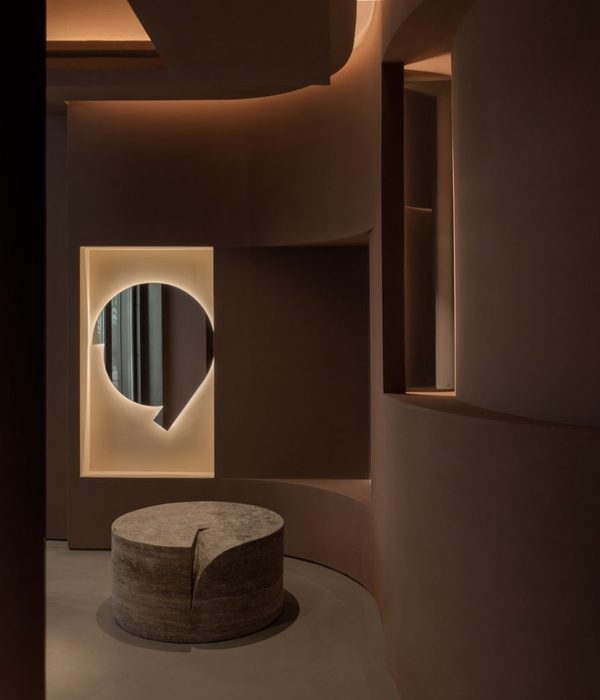
展厅中间的方形柱被处理成圆形,墙体也有一定弧度,整个空间也和家具一样变得柔软,舒适,温情。柱子外贴了定制的红砖片,呼应了外立面的红砖材质,实现了建筑内外的对话。
The square column in the middle of the exhibition hall is processed into a circle, the wall also has a certain radian, and the whole space becomes soft, comfortable and tender as the furniture. The columns are pasted with customized red bricks, which echo the red brick material of the facade and create the dialogue between the inside and outside of the building.
▼方形柱被处理成圆形,墙体也有一定弧度,square column is processed into a circle, the wall also has a certain radian © 朱雨蒙
▼细部,details © 朱雨蒙
客厅空间使用了暖色系的橘色乳胶漆,与暖色调的沙发椅子视觉高度统一,接近家居装修的风格。餐桌后面利用消防栓的深度做了一处壁龛,增加层次感。蚕丝吊灯彰显了精致小巧的奢华,与白色餐桌一道点亮了整个空间。极简造型的玻璃柜与椅子为空间增添了线条的元素,也丰富了构图。
The reception hall adopts orange latex paint of warm color system, which is highly unified with sofa and chair of warm color, close to the style of home decoration. The depth of the fire hydrant behind the dining table is used to make a niche to increase the sense of hierarchy. The silk chandelier highlights the exquisite luxury, lighting up the whole space together with the white dining table. The minimalist glass cabinet and chair add line elements to the space and enrich the composition
▼家庭布局展示区,family layout display areas © 朱雨蒙
▼客厅展示,living room display © 朱雨蒙
▼餐厅展示,dining room display © 朱雨蒙
门洞弧形和波浪形的特殊设计打破了普通方形门洞的桎梏,营造出一种多变轻巧的氛围。
The special design of the arc and wave shape of the door opening breaks the shackles of the ordinary square door opening and creates a changeable and light atmosphere.
▼一层平面,ground floor plan © Nothing Design
▼二层平面,first floor plan © Nothing Design
▼立面,elevations © Nothing Design
▼剖面,sections © Nothing Design
{{item.text_origin}}


