Set amidst Southern Kerala’s sumptuous green backdrop of rubber plantations, The Captain’s Residence, captures one’s attention right from the far access. The dwelling morally gels in its natural context with its exemplary features popping out to catch the eye’s gentle attention. We can say that the house stands as a unique representation of tropical adaptiveness wrapped in modernist contemporary design outlook. Our client Mr. Jerin Zachariah, who lives abroad, wished for us to design the house as an ode to his parents. The permanent residents of the house being Capt. P.C. Zachariah, who was a former Captain in Merchant Navy and his wife Mrs. Ponnamma Zachariah. Hence the name Captain’s Residence.
The house is designed in an open plan concept with its active spaces linked together as mutually dependent volumes. The Car porch and much welcoming sit out area are separated using a small coypond and camp jali screens which offers a play of complimenting red and green combination at the threshold of the house . The living, dining and kitchen spaces, all aligned in a row, have very limited wall separations between them. Thus these spaces which forms the active core of the house remain connected and open all the time. This also helps in overcoming the space constraints due to limited footprint that was available to build .
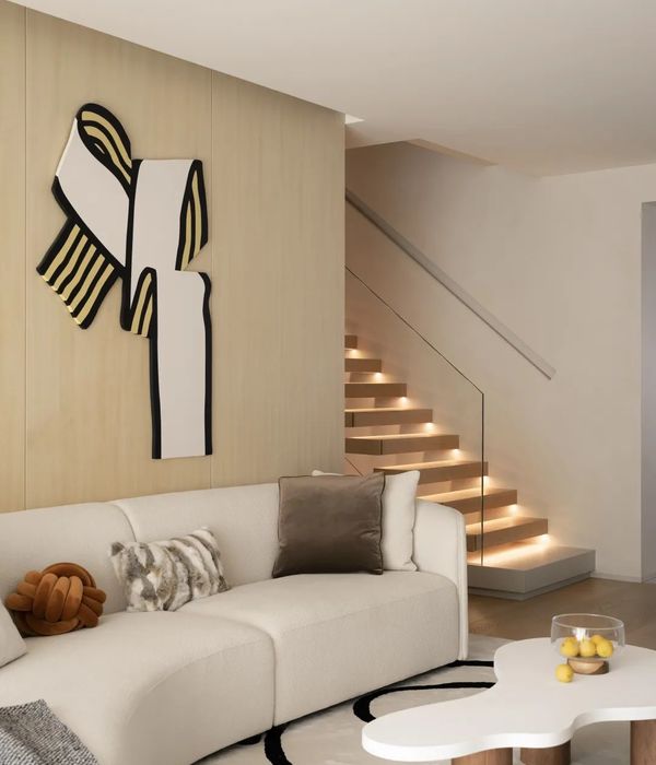
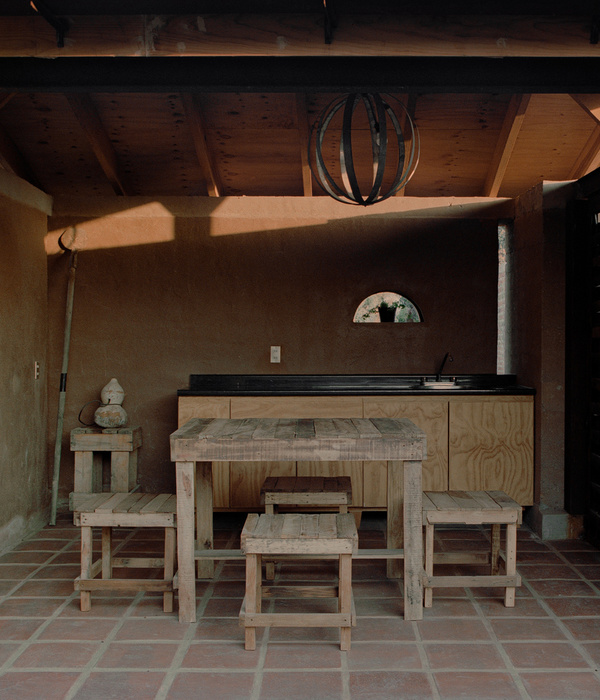
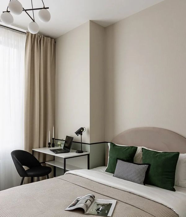
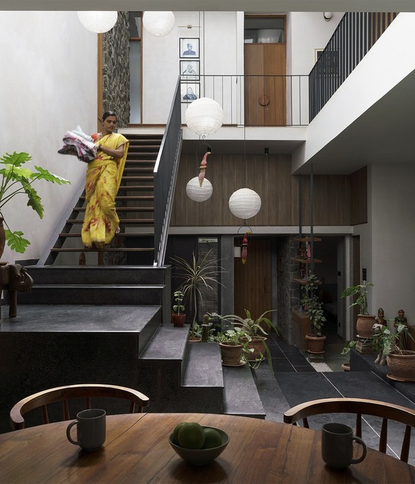
A courtyard is provided beside the dining area and between the bedrooms, bringing in the landscape to the indoors as well. Camp jali screens provided on either side of the core area and large windows opening towards the outdoor garden area ensures enough cross ventilation and air passage throughout. The courtyard adds life to the space with breathing walls and plants. The house has a total of 3 bedrooms- two on the ground floor and one on the first, which are zoned and placed considering the requested privacy. The interiors are adorned with minimalist furniture and designs in plywood , aiding in increasing the visual capacity of spaces.
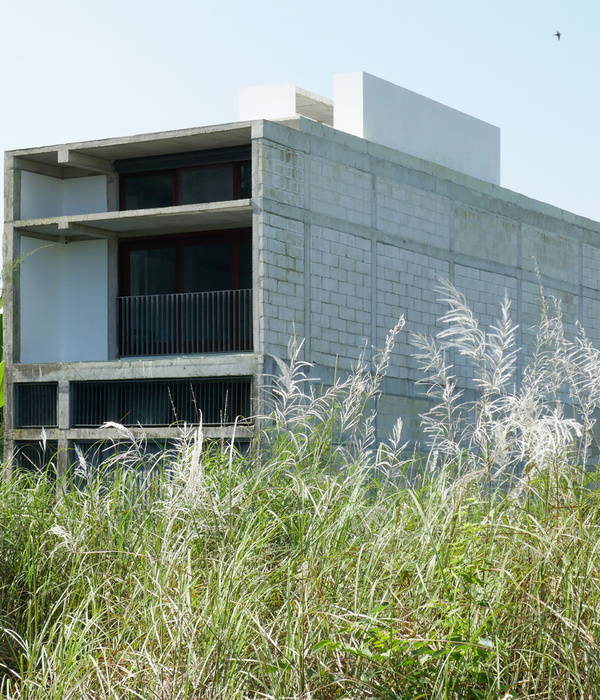
A color pallete of Red, white and greys are chosen for the house interiors as well as exteriors.The boldness of red balances the subtleness of greys and compliments the indoor and outdoor greens in the most natural way. This same technique of color balancing is used throughout the house , from the interior furniture to the elevation design. This 2300 sq.ft house looks, simple and minimalist at the very first glance itself with its design features leading the way to it. The laterally spread orientation of the elevation design is subtly disrupted with a cantilevered box , that cuts across and breaks the massiveness in elevation into lighter sections. The house balances the space proportions in a way that makes it rooted to its environs.
{{item.text_origin}}


