- 项目名称:印度绿意盒子住宅
- 设计师:TRAANSPACE
- 年份:2019
- 摄影:Tejas Shah Photography
- 建造商:AutoDesk,Dulux,Kohler,Akash Italian,Hybec,Jai Jalaram Bricks,Trimble Navigation
- 负责建筑师:Urvi Shah
- 设计团队:Kunjal,Helly,Sanjana
- 业主:Hardik Patel
设计师:TRAANSPACE
面积: 4800 ft²
年份:2019
摄影:Tejas Shah Photography
建造商: AutoDesk, Dulux, Kohler, Akash Italian, Hybec, Jai Jalaram Bricks, Trimble Navigation
负责建筑师:Urvi Shah
设计团队:Kunjal, Helly, Sanjana
业主:Hardik Patel
City:Vadodara
Country:India
The House is on plot area of 4500 sq.ft. which is located in gated community surrounded by bungalows on adjoining sides and access way only on the south. The client wanted the house to be outlined for a family of four. Having lived in a very utilitarian house until now, they desired a shift to a house closer to nature. Expecting the design to be very functional they at the same time believed in maximalism. To develop a concept which responds to the context and the client brief has been a journey for us.
The internal zonal articulation is kept simple, with a distinct delineation of common, semi-private and private zones. The common areas comprising of living, dining, kitchen and a guest bedroom are housed on the lower level, main bedrooms on the first and the semi-private spaces lie on the level above it. The heart of the design is the central courtyard strategically created to establish visual linkages and connectivity in all the three dimensions. The spaces on the ground floor are arranged in a C around this court. Together with the outdoor landscape, this quad frame beautiful views for the living and the dining. The staircase placed in this courtyard takes one to the above floor. Bedrooms on this floor are riveted by a common reading area. The staircase further takes one to the second level encompassing the entertainment room and a landscaped terrace.
The main concept was to open out each space and have green pockets in sync with nature. The heart of the design is the central courtyard strategically created to establish visual linkages. After leaving the regulation margins, an additional setback was planned on the front road facing side of the plot. A garden was conceptualized in this expanse. Living, dining and staircase forming the active core of the house, were designed with limited or no wall separation between them. Aligned to the client’s brief, landscaped pockets were planned in and around these spaces to keep them open, connected and in sync with nature. Spaces overlooking these green scopes were designed on the above floors.
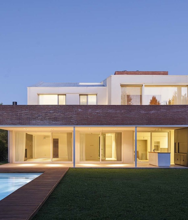
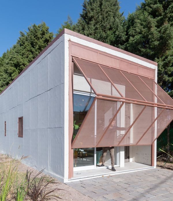
The facade is flanked by balconies and terraces at different levels to cut the direct entry of sunlight thus acting as buffer for the main functional spaces. The elevation thus strikes a balance between solidity and transparency. Boxes are used as elements to add character to the climate responsive balcony of the master bedroom. A shift in material from brick to exposed grey plaster distinguishes this volume. This concept of boxes is then taken further while developing the overall design language. The interior colour scheme is conceptualized to be neutral and the material palette minimal. All the furniture is either customized as per design or handcrafted on site as per details. Wood and metal became the key elements while developing the furniture. Used differently at different spaces against the subtle backdrops of white and grey, these materials are then overlaid with pastel furnishings and accessories.
The central courtyard was strategically designed to blur the boundaries between inside and outside. It further helps in establishing visual linkages and connections in all three dimensions. Along with the garden, it frames beautiful views for the living area. In line with the deck, it dispenses an experience of being set in the greens for the dining. In the vertical axis, it connects all the floors exuding different experiences at each level. The black terrazzo flooring done on site by local craftsmen and the umbrella tree becomes the highlight on the ground floor, the play of natural light through the slit window on the first and the sciography cast by the skylight on the second. Lastly, this courtyard houses the staircase. With its sleek design in wood and metal in line with the house’s furniture concept, the staircase is crafted elsewhere and then assembled on site.
Designed to add character to the façade, the window seating was designed in sync with the box concept. A shift in material from brick to exposed grey plaster distinguishes this volume on the exterior. Connecting the garden with the interior this seating in the living room is a cozy nook to sip a cup of coffee while enjoying the view.
On the second floor, overlooking the garden on the ground floor is the terrace. Designed to satisfy dual purpose, one as a spillover space for small parties or gatherings and two to act as a warm alcove for some family time. Most of the space was planned to be kept free or with loose furniture to cater to the first function while a metal gazebo with swing element was conceptualized for the second. Greenery was then added to complete the space.
项目完工照片 | Finished Photos
设计师:TRAANSPACE
分类:Houses
语言:英语
阅读原文
{{item.text_origin}}

