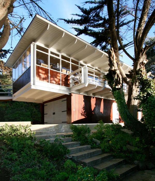
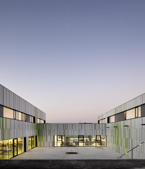
This addition opens up to an established back garden in the leafy suburb of Ivanhoe. Seven metre wide doors slide away and broad timber steps descend into the garden. A massive but finely detailed facade screen modulates northern sunlight in the main living area. The algorithmic pattern of the facade screen was inspired by foliage and textile patterns.
Ivanhoe is known for its period homes on large blocks and its green, hilly and picturesque landscape. Its character is recognised by the local council which stipulates that significant trees must be preserved and all roofs must be tiled. This project involved reworking a prime example of an Ivanhoe home which has a relatively complex pattern of use. The original Edwardian house had been the family home for several generations. A more recent studio in the northeast corner of the site housed a dressmaking workshop and served as overflow accommodation for guests. The studio required separate access for customers from the street.
The existing house is much loved and the original character of the front rooms had been preserved. But the house did not follow the natural slope of the site, meaning that the north facing living area was elevated from the garden which was accessed via a staircase. Views of the established garden with its enormous conifer trees and access to northern sunlight were underexploited.
The brief was to create living spaces, a kitchen and new bedroom with ensuite. The living space was to link in with the garden, take advantage of the views and sun while preserving the original parts of the house and maintaining the amenity of the northeast studio. Care was also required to ensure the upper level bedroom would have views of the treetops without compromising the privacy of the neighbours.
The resulting insertion is housed within a deliberately simple geometric form with the intention of bringing a sense of clarity, space, and ease to the home as a whole. Although the form of the extension looks simple, it has been carefully honed. The spaces are arranged in split levels, so that the living area and kitchen drop down closer to the garden level. The upper level bedroom is not so elevated as to be able to be seen from the street, so it does not compete with the original street façade. The outdoor deck is tapered to create space for outdoor dining immediately next to the kitchen. Broad steps, suitable for lounging on, face toward the best garden views. When seen from the back garden the new extension with its double height living space and intricately patterned screen are impressive.
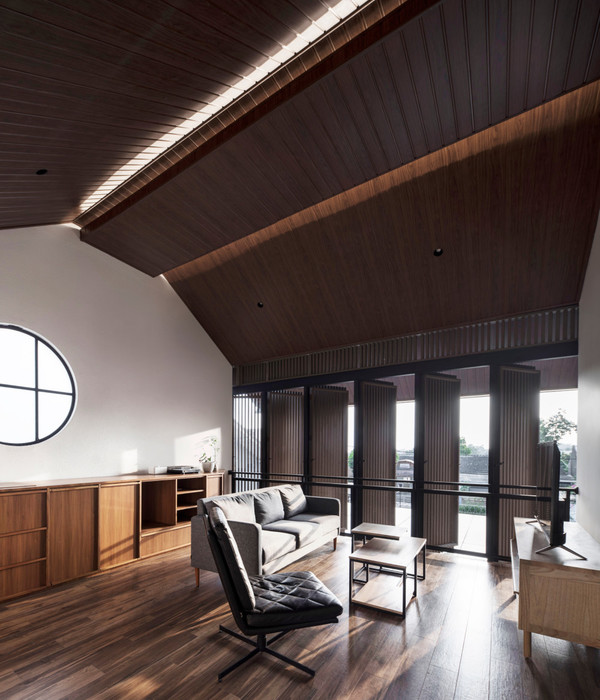
Inside, the living room, with its sloped, double height ceiling, draws the viewer’s gaze up to the finely detailed screen and greenery beyond. The screen casts dappled shade, creating a quality of light that is gentle and bright throughout the house. The algorithmic pattern employed for the screen is repeated throughout the house on glass splashbacks, air-conditioning registers and screen doors. The kitchen, laundry and a study nook are tucked beneath the upper level bedroom. The kitchen is understated, light and functional. It addresses both the living area and outdoor deck with an island bench that has an indoor-outdoor feel when the large sliding panels are drawn back.
{{item.text_origin}}


