Architect:VURPAS ARCHITECTES
Location:Lyon, France; | ;View Map
Project Year:2023
Category:Primary Schools;Secondary Schools
The Eugénie Brazier nurser y, pre-school and pr imar y school in Lyon. Rehabi l itation and extension of a former wholesale market.
AN EXEMPLARY EDUCATIONAL ESTABLISHMENT
Located at the heart of the Confluence district in Lyon, a new primary school has taken up residence in the buildings of a former wholesale market. The project incorporating a 45-place nursery and a 15-class primary school raises questions around some of the challenges facing our schools of the future. The historic building, renovated and extended with a new-build section, retains its allure and strength enhanced with the use of brick in both solid and lattice-work walls. In a dense urban setting, the building retains is low stature, full length, and grid-like layout, patterned and completed with its characteristic curved roofs. In the years to come the young children populating the classrooms and playgrounds will bring the project to life.
FROM A 1960S LOGISTICS HUB TO A FACILIT Y FOR CHILDREN AND INFANTS
The project is established in the former wholesale market located in the Perrache district of Lyon. This vast site covering 16 hectares was built between 1955 and 1961 by the Lyon City Council for use as a wholesale food market. This activity was transferred to Corbas in 2009, freeing up the land and buildings in time for the second phase of the development of the Confluence district. With a view to conserving the city’s heritage, some sections of the market were preserved.
The section we are interested in is known as C3. With its fifteen bays it is the longest section still in place. The architecture, designed by the Architect in Chief of the City of Lyon at the time, Louis Weckerlin, and his team, is deliberately functional, efficient and repetitive. It was designed to adapt to and withstand the demands of the handling operations, cleaning, deliveries, and HGV traffic etc.
The buildings are split into compartments each measuring six metres wide by twenty-five metres long and known as “squares”. Each square has a first floor and a basement. The functioning of the building is clear with a wide corridor intended for buyers to circulate and sellers to present their produce, with a platform on each side for loading and unloading deliveries. The architecture is drawn with care and precision to ensure maximum efficiency. It is defined by the fine, light, curved roofs reminiscent of the upturned hull of a boat. These are supported by a concrete column-and-beam structure which subtly houses the rainwater guttering and downpipes.
Transforming a 1960s logistics hub into an educational facility for young children might seem like a huge gamble given the gulf between the two uses. However, the architects were able to work with the “already there” and preserve the spirit of the existing building in a way that was relatively obvious and found just the right fit.
MAKING BEST USE OF THE EXISTING BUILDING AND MAKING IT LOOK LIKE CHILD’S PLAY
If you shift your perspective, this repetitive structure with its playful platforms, takes on a rather childlike quality. The very rigid grid framework of the market layout gives the programme a very clear, obvious distribution and an internal organisation the children can easily understand. The building has ultimately only been very slightly altered in terms of its layout.
A clear organisation allocated to the former market and the extension
In the former market, the nursery occupies the five southernmost bays with its own independent entrance and corridor and its own separate playground. Adjacent to the nursery, the preschool classes are housed on the ground floor with direct access to the playground via the former loading platforms which have been transformed into a large covered play area. The nine primary school classes and a support class for children with difficulties are found on the first floor with their rooftop playground located one floor above.
The new extension, perpendicular to the historic building, houses the communal spaces in the programme including the canteen, gymnasium, infirmary and the caretaker’s housing. With a view to creating a facility that is open to the local community and city, the canteen and gymnasium are open for use by external associations outside of school time.
The two separate entrances, one for the nursery and the other for the school, are accessed via a large pedestrianised forecourt designed by the landscapers Bigbang, which forms an extension to the rue Delandine.
An extension in the spirit of the existing buildingx
The extension is a natural yet astonishing prolongation of the existing building. The two parts form a whole which looks like it’s always been there. The design on the rue Smith facade reveals an architecture based on the composition and structure of the historic building. It is deployed using the three patterns from the market structure, repeats the same pattern, and uses the same construction method: a slender concrete column-and-beam structure, brick infill and a light timber roof.
Here, a small square sets the stage for the new extension side of the project, with the access leading directly to spaces used for community activities in the district, notably the gym. Running alongside the building, a four-metre-wide alleyway, closed off at either end, provides an access for logistics purposes including deliveries to the ground-floor canteen and storage spaces, as well as to the caretaker’s housing.
In the extension, calqued on the same pattern as the three northern grids, the gymnasium on the first floor conserves its view over the urban landscape of the surrounding district. Conversely, the views from the street are shielded to protect the privacy of the children and other users of the facility.
On the same level as the playground, the canteen kitchen separates the pre-school canteen dining room from the primary school canteen dining room. A direct access from the alleyway provides an independent logistics route to the north. Natural light illuminates all the spaces, even those used for food preparation. Careful attention has been paid to create spaces that are modular and offer excellent acoustic comfort. The views of the ground floor playground are playful and creative.
Fitting into an existing framework
The architects worked hard to find the right scale for children and infants. The framework of the columns provides a very clear layout: a central corridor leading to the activity rooms and classrooms which look out onto the playground. On the ground floor, the curved roofs, which protect the large floor-to-ceiling windows, now act as a canopy covering part of the pre-school playground. The intermediate columns have been removed and replaced with a new wood-concrete floor. This is the only substantial modification made to the structure. On the first floor, the primary school benefits from the existing windows.
A former basement put to excellent use
With a view to making the best possible use of the existing spaces, the lower level has been fully optimised. To the west, it houses the building’s plant rooms and City of Lyon storage areas. The east section is reserved for additional spaces for activities and rest rooms for the staff. These rooms do not necessarily have a dedicated purpose but can be used for a variety of activities depending on the different needs and groups. Each room has its own very distinct mood, created using the different primary colours. They create an “elsewhere”, an alternative to the purely educational spaces. This lower level opens up onto a border space, landscaped and graduated by digging out from the façade to free up this level. This basement courtyard space creates a distance from the public forecourt.
This new use for the former basement was not included in the original programme. It optimises a significant amount of the surface area of the existing building. It also facilitates the programme’s insertion into the former market and frees up the second floor to house the rooftop playground in complement to the one in the centre of the block. The latter is built on open ground and “de-densified”, thus allowing space for more planted areas.
Diverse spaces for an evolving educational approach…
Thinking the educational spaces “beyond” the traditional classroom, and creating a variety of moods and of scales adapted to different groups of pupils was a key guiding thread running throughout the project. The corridors first of all, wide and well-lit, which directly link to the primary school classrooms are well suited to small group work such as reading and quiet play. In the hall, the rooftop playground and the tiered seating in the basement courtyard offers opportunities for staging other activities. On the lower level, the fresh colourful rooms create their own unique atmospheres. Outside, the children can make use of areas for relaxation, reading, observation, thanks to the tiered seating, the rooftop greenhouse and the landscaped basement border. These are capable spaces, they have no precise purpose but suggest and encourage a variety of practices.
A peaceful interior
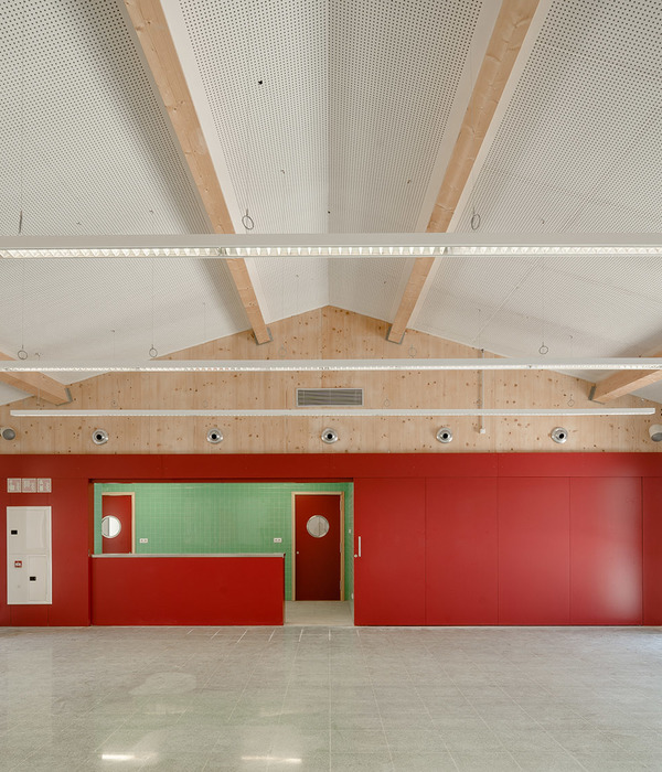
Everything here contributes to creating a gentle, nurturing interior. The activity rooms, multipurpose room and classrooms are all bathed in generous amounts of natural light. To the south-west, the first two grids of the roof have been replaced by identical translucent roofs to let in the light. Wooden ceilings fitted with acoustic baffles create a calm, comfortable and welcoming atmosphere. The colours chosen are light, the made-to-measure furniture fits perfectly into the corridors, changing rooms, and classrooms. The corridors themselves, generously sized, can accommodate small group activities.
BRICK, REVEALING THE PROJECT’S MATERIALITY
The volumes, facades, roofs and platforms of the former market are easily identifiable and remain part of the district’s shared points of reference. The new facades closely mimic the existing structures. By simply filling these facades with a single, unique material - brick - used alternately in solid form or moucharaby-style lattice-work lends the project a new kind of materiality. In this version it is soft, changing, playing between opacity and transparency, creating vibrations. With great care, it allows the children’s activities to be seen, or not, from the street, in particular the rooftop greenhouse and playground, the canteen and the gymnasium.
The concrete-wood-brick trio plays to its strengths. Each component reveals the other, in harmony. The bricks used were intended for scrap due to their slight colour defects. This allowed the architects to fulfil their intention of using recovered materials which are difficult to find in large quantities, but which would otherwise be destroyed. These bricks, which form a patchwork of brown shades, mirror the Orangerie, a rammed earth building on the other side of rue Jacqueline et Roland de Prury.
THE EXTERIORS TELL US A STORY
The outdoor areas also play an active role in the children’s learning, education and discovery of nature. Their generous surface area, thanks to the primary school playground on the roof, fit in perfectly with the landscaped interiors of the blocks across the Confluence district.
The nursery and pre-school playground covers two levels: that of the former platform which extends out from the classrooms and activity rooms and becomes a covered canopy, and the ground level. The height difference between the two levels is managed so as to offer a variety of opportunities to explore the slope: mini-slides, tiered seating, gently sloping mounds and steps at the entrance points. The ground level is marked by two gullies which channel rainwater, a representation of the geography of the city of Lyon. They come together, symbolising the meeting point between the Rhône and Saône rivers. Around these lines which may well guide the children’s games, an entire imaginary landscape is deployed, evoking the Croix-Rousse and Fourvière hills, the rocks carried along by the river, the terraced arable land to the west of Lyon… every detail can easily become a space for play or an improvised seat.
For security reasons, the nursery and pre-school playgrounds are separated by a simple fence, designed with saffroncoloured vertical bar railings, the colour forming a guiding thread throughout the outdoor spaces.
At the boundary of the neighbouring property, the vegetation becomes more dense. Different varieties of tall trees extend the planted border into the adjacent project. In this border area, a school garden is formed from raised tubs in which the pupils can grow, watch over and harvest their plants.
If the ground floor playground is dedicated to the water, the rooftop playground is dedicated to the wind. The playground provides an exceptional setting for the children, allowing them to view the city like a series of paintings through the large preserved windows. From the opposite perspective, the activities can be viewed from the street, marking the building’s revival. This is another “elsewhere” with new opportunities for new activities. It is a semi-open playground where you can feel the cool air. The landscape architects remind us that a confluence is often subject to crosswinds from different directions, an excellent source of learning inspiration. As on the ground floor, the surface is dotted with playful floor markings and furniture, forming large pathways the children can run or meander through, small mounds, decking stages, wind socks and windmills.
To the south, there is a greenhouse for educational activities to learn about nature and biodiversity. Further north, on the extension, are the spaces for outdoor sports and ball games. This organisation means these activities do not take over the whole playground as is often the case and means the rest of the children can benefit from a more peaceful play area.
On the lower level, the playground spaces give way to terraced, landscaped exteriors which distance the space from the forecourt and preserve the privacy of the users, children and staff members. As well as creating a backdrop of vegetation, this hollowed-out border supplies natural light and creates spaces for coming together and relaxing. In places, tiered seating can be used as the mood dictates as an outdoor reading room or an open-air stage.
SPECIAL ATTENTION TO SUMMERTIME COMFORT
Comfort in the summer months is a major concern regarding the well-being and health of young children, especially with the expected changes to the climate.
The solutions implemented to ensure summertime comfort include:
- Installing fixed or adjustable solar protection, horizontal and vertical, according to the orientation of the facade
- Harnessing the thermal inertia of smart slabs and interior structures to avoid heat peaks
- Significant natural cross-ventilation thanks to the tilt and turn windows used to refresh the classrooms and corridors and systems for night cooling ventilation.
- Brick moucharaby lattice-work and large overhangs on the south facade of the new building
- Partially opaque awnings
- Installing circulating fans in the classrooms and sensitive areas
TAKING CARE
The architects’ overriding intention was to take care. Take care of the existing architecture and its history, take care of young children as they learn about learning, living together, growing together, taking care of our resources, nature, comfort, the use, the uses, the space. Taking care of our urban environment in general and environmental issues in particular. Taking care of everyone, at every age, by building sustainably for the future.
Architects: Vurpas Architectes
Project management: SPL Lyon Confluence
Landscaper: BASE Paysage
Structure: UBC
Fluids, QEB: OTEIS
Acoustics: EAI
Signage: Vurpas Architectes
OPC: Arpeggio
Other speakers
SPS Coordinator: SP2SE
Control office: Alpes Controles
Special foundations: ELTS
Structural work - Masonry: Duron
Wooden frame - Zinc roofing: Vaganay
Waterproofing: Etandex
Exterior wood carpentry: White carpentry
Aluminum carpentry: Daniel Giraud
Metalwork - Locksmith: Cherpin
Interior wood carpentry: Durier Bourrassaud
Plastering - Painting - False ceilings - Flexible floor: Aubonnet
Tiles - Earthenware: Al'l Flor
Elevators: CFA Elevator
High and low current electricity: CEM Sotrelec
Heating – Ventilation – Plumbing: Raby
Custom furniture: Lagem
Kitchen Equipment: Perrier
Photo credits: © Vladimir de Mollerat du Jeu
▼项目更多图片
{{item.text_origin}}


