Wolt Offices - Tel Aviv 丨 studio shiri kedem 丨 以色列
studio shiri kedem used blue hues to implement a minimal aesthetic at the Wolt offices in Tel Aviv, Israel.
“Wolt” Global started its operation in Israel only in 2018 and has already grown to hundreds of employees. The company, which is a Courier service through an application from supplier to private customer, expands its field of activity from world of restaurants to additional logistics services.
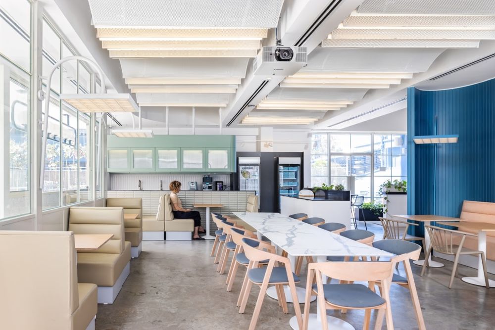
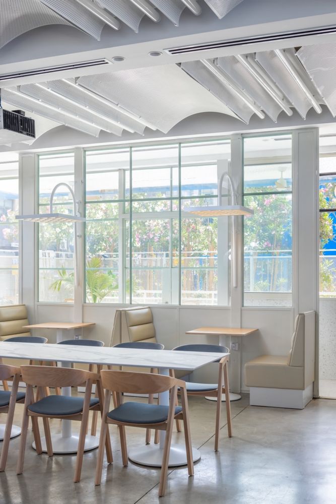
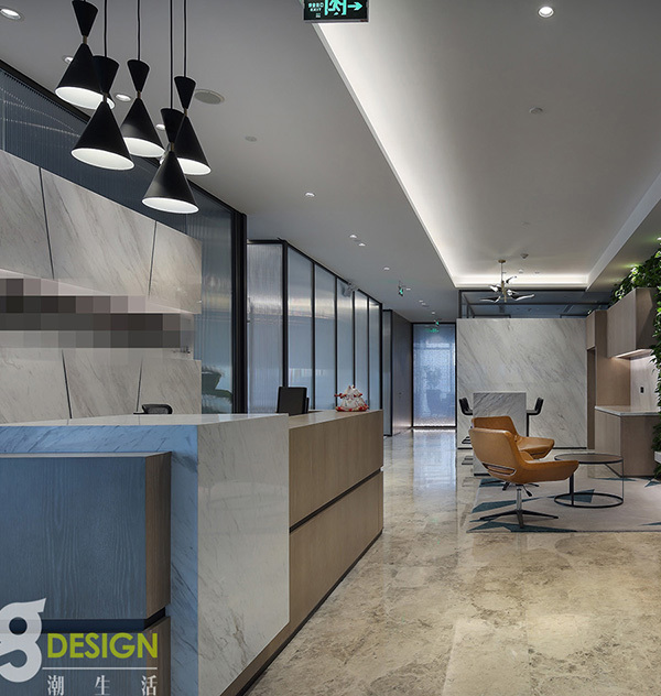
The old building with 6 floors in total, was completely renovated with the aim of occupying office spaces. The ground floor of Wolt’s office face the street and a wide space in front of the building, a significant advantage for a company that “lives” the street in all aspects. The main entrance from the ground floor passes through the reception desk, and the cafeteria faces the main hall allows sitting in a common courtyard.
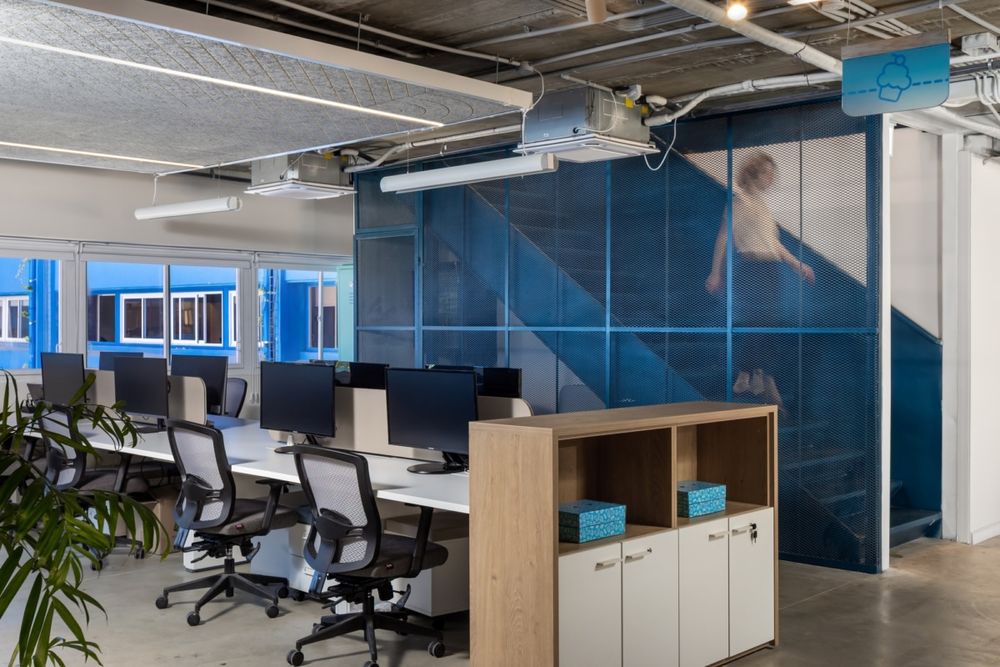
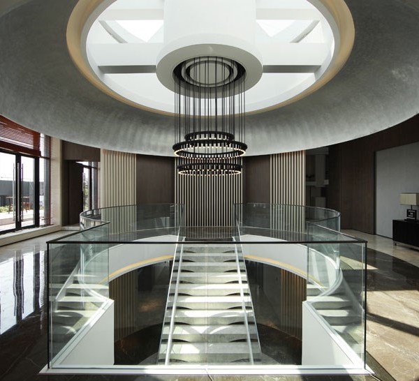
in the heart of the office specially designed staircase, connecting all open spaces across all floors. The 24/7 beating heart of the offices is the support area where the representatives work full-time and oversee the operation and supervise the carriers.
The inspiration for the design came from the thought of the movement of the brand in the urban space in an abstract way. The goal was to choose materials that would illustrate. The way in which they want to convey the service in a virtual view from one doorstep to the next destination.
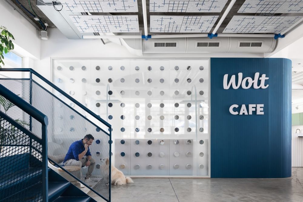
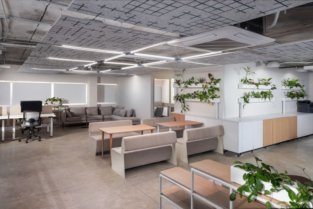
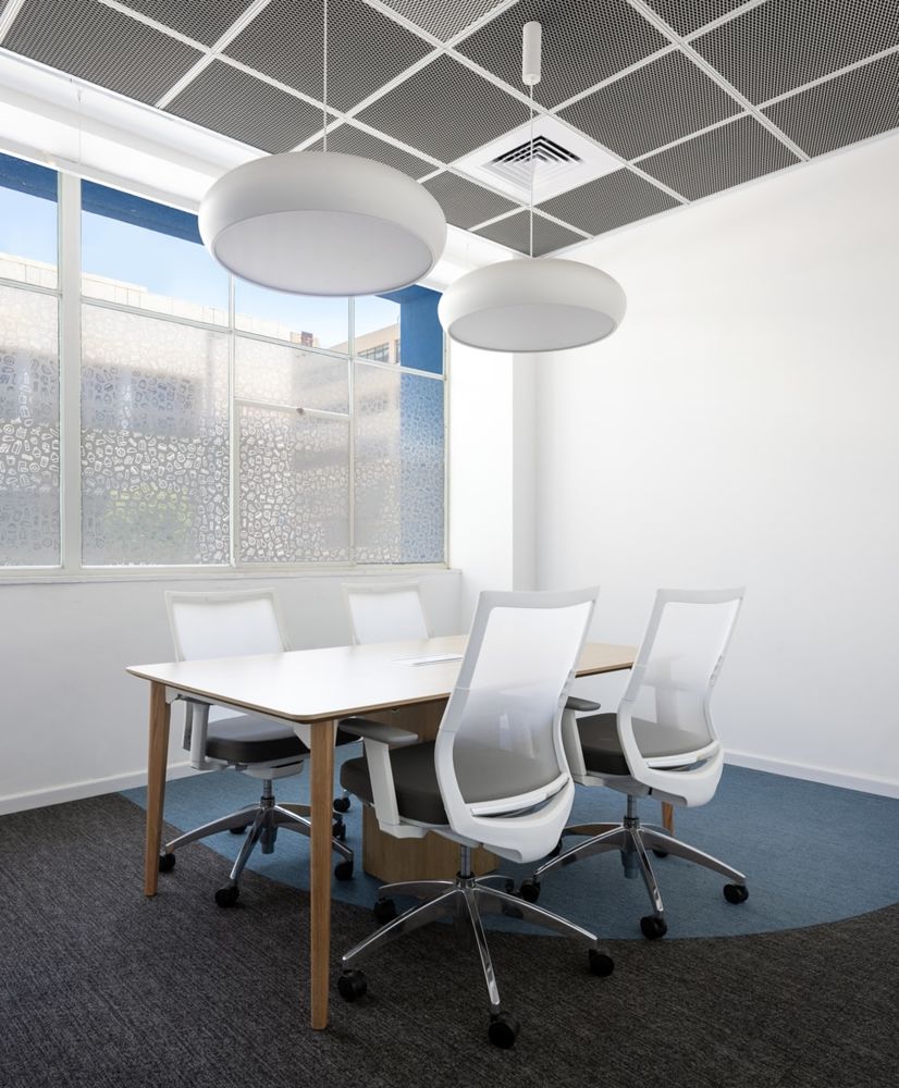
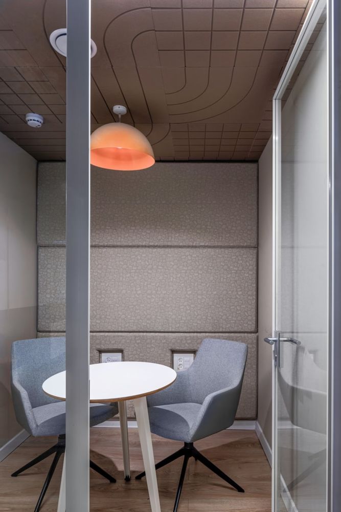
When working on the old building, a lot of thought went into utilizing the existing areas. After we placed the structure of the staircase passing between all the floors, each floor was divided into work areas and conference room spaces. From just one texture that represents the company’s familiar icons, we created images and textures throughout the space. On the ground floor at the conjunction of the reception area and the cafeteria we created an element of a wall of floating double-sided mirrors that abstractly translate the design concept.
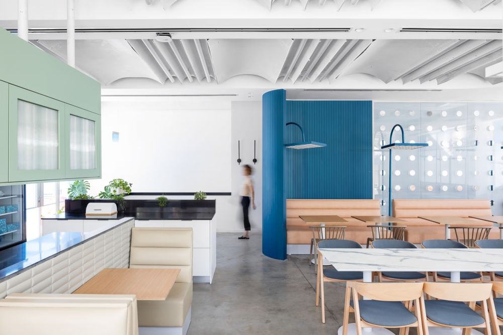
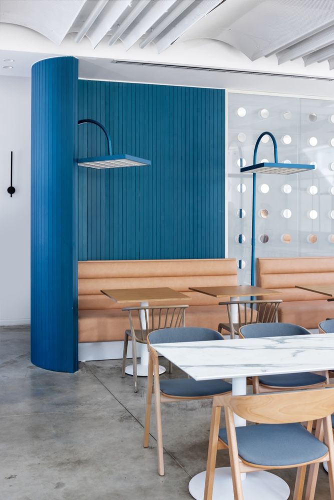
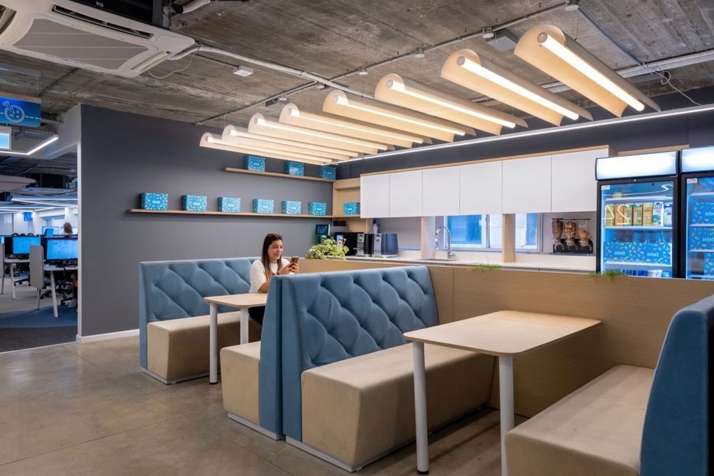
The office challenge for an exisitng and well-known brand like “Wolt” was in building an elegant design and using the right doses of familiar icons and colors. According to this concept, the chosen color palette implies the presence of the brand and the contrast between the old building and the new spaces creating a unique space and a design adapted to society and space.
Design: studio shiri kedem
Photography: Shai Epstein
17 Images | expand for additional detail


