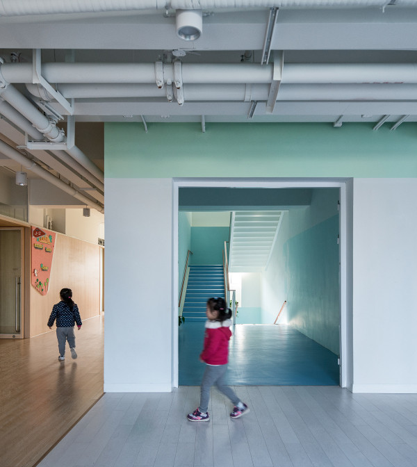
▼楼梯间,Stair well © Onnis Luque
▼从庭院望向入口门栏,View to the gate © Onnis Luque
One of our main concerns was not to be completely excluded from the street, which led us to seek the dematerialization of the barrier that is generated with the external environment. To achieve this, we sought that through the ambiguity of a fence a virtual border could be perceived in which the limit between the inside of the school and the outside of the street was not clearly delimited.
设计者的主要关注点之一是避免让项目完全隔绝于街道,这促使他们寻求如何让外部环境产生的屏障非物质化。为了实现这一目标,设计者试图通过围栏的模糊性来创造一个虚拟边界,在这个边界中,学校内部与街道外部之间的界限将变得不再明显。
▼庭院,Courtyard © Onnis Luque
At the entrance, a light trail that is shaded by a sundial can be seen from the entry slab, allowing people to appreciate the time passing as the shadow is cast on the ground.
从入口处的石板上,可以看到一条由日晷提供遮挡的光线小径。人们可以根据投射在地面上的影子感受和欣赏时间的流逝。
▼近景,Detailed view © Onnis Luque
▼教室间的平台,Terrace between the classrooms © Onnis Luque
▼教室内部,Classroom interior view © Onnis Luque
▼每间教室有着特定的朝向,Each classroom has its specific orientation © Onnis Luque
Lead architect: Miguel Montor Design team: Pilar Rico, Antonio García Instalations: Uriel García Constrution: SOLMEX Ingeniería & Construcción Client: S.E.D.A.T.U. Secretaría de Desarrollo Agrario, Territorial y Urbano Photographs: Onnis Luque
▼剖面图,Section © Taller de Arquitectura Miguel Montor
▼立面图,Elevation © Taller de Arquitectura Miguel Montor
▼二层平面,Upper floor plan © Taller de Arquitectura Miguel Montor
▼首层平面,Ground floor plan © Taller de Arquitectura Miguel Montor
We think that education is not only carried out inside the classrooms but also outside them, so the space between them is of great importance in the project. The specific orientation of each classroom promotes permanence in the transitory spaces. Through the rotation of the volumes of the classrooms we intend to generate a static space that invites the student to stay.
▼户外空间,Outdoor space © Onnis Luque
We seek to create an environment that can be universally understood through the senses, therefore the sensory experience of the property is presented in different aspects. The presence of a wide range of textures triggers both tactile and visual effects. The materiality of the walls was developed considering a specific texture for the children to touch and experience a stimulus to the senses. The exterior and interior link between classrooms is provided by the transparency provoked in the accesses that visually connects these areas. The classrooms have the possibility of fragmenting in two if required at any given moment.
该设计力求创造一个可通过感官获得普遍理解的环境,因此这种感官体验需要从不的同方面被呈现出来。各种材质和纹理的存在引发了一系列触觉和视觉效果。墙壁的特殊肌理使孩子们可以触摸,并获得感官上的刺激。在教室之间,室内与室外的连接通过透明的通道实现,使不同区域从视觉上相互关联。在需要的情况下,教室可以随时被分割为两个部分。
▼入口的钢制围栏,The steel fence at the entrance © Onnis Luque
The steel fence produces sensations of independence as it is perceived as generating a safe outdoor area. The geometry takes great importance in the project, circles that provide illumination, squares in the formwork and triangles such as details in it. Taking into account our previous experience with schools and educational institutions, we designed with the height of the main user in mind. The visual height of the children generates a more emphatic perception of the volumetry and size of the place, providing an enriching path for their development.
钢制的围栏给人一种独立的感觉,因为它创造了一个安全的室外区域。几何图形在项目中占据了重要地位:圆形提供照明,方形代表楼板,三角形则是其中的细节。鉴于之前设计学校和教育机构的经验,设计者考虑到了主要使用者的身高:孩子们的视觉高度会让他们对场所的体积和大小产生更强烈的感知,从而为他们自身的成长提供更丰富的路径。
▼沿道路视角,View from the street © Onnis Luque
▼设计草图,Sketch © Taller de Arquitectura Miguel Montor
The site’s topography has a difference in elevation of nearly two meters, so each classroom is terraced. We were able to achieve this unevenness through the decision of making each classroom independent, so that the change in floor levels was practically imperceptible and subtle.
学校的场地有着近两米的高差,因此每间教室都是阶梯状的。设计者决定将每间教室都独立分开,从而实现这种不均匀性,使楼层的变化变得微妙而难以察觉。
▼鸟瞰,Aerial view © Onnis Luque
The driving force behind the design of this project is to meet the needs and possibilities of our most important users, the schoolchildren. We thought about the age of those who have to study there so that through the shapes, spatial sequences and volumetry would be possible the realization of a clean education by supporting the child to develop experiences and identify themselves within the school.
该项目背后的驱动力是满足其最重要的使用者(学龄儿童)的需求和可能性。考虑到将会在这里学习的学生年纪较小,设计者通过形状、空间序列和体量上的变化,来鼓励孩子们在学校里发展经验和自我认同,从而实现不惨杂质的纯净教学。
▼主入口区域,Entrance area © Onnis Luque
This Urban Improvement Program has a socio-cultural and educational approach, therefore, within the portfolio of possibilities, it was sought that one of the projects would contribute a facility within the educational field. The objective is to have more inhabitants with access to an education of a good quality right from an early age. After conducting a study that revealed the necessity of promoting this issue, the proposal for the construction of a kindergarten was made.
改善计划采用了以社会文化和教育为中心的方法,因此其中一些项目被寄予了提升教育设施质量的期望。该项目的设计目标是让更多的居民能够从小就接受优质的教育。为此,项目团队经过了充分研究,发现有必要加快对这一问题的解决,Nueva Creación幼儿园便是在此种背景下诞生。
▼项目外观,Exterior view © Onnis Luque
This project is part of a program planned for the municipality of Tultepec, State of Mexico. A developing entity recognized for its work with the manufacture and detonation of pyrotechnic fireworks, which for many years has been the focus of economic activity at a national and international level. After a thorough sector study by the Ministry of Agrarian, Territorial and Urban Development (SEDATU), necessities arose within the framework of the Urban Improvement Programs (PMU) of this entity.
设计者认为教育不仅应该在教室内进行,也应该走向室外,因此教室之间的空间在项目中变得尤为重要。每间教室的特定朝向能够促进暂时性空间的持久作用。通过转动教室的体量,一个静态的、能够吸引学生驻足和停留的空间得以被创造出来。
▼圆形天窗和花园,Circular skylight and garden © Onnis Luque
In our perspective, as long as the light is more homogeneous in the transition spaces there will be a greater comfort, so we looked for the zenith light to be transmitted by omnidirectional geometries, which is projected through circular skylights from where it passes into the interstices of the classrooms. This light entry extends without direction or breaks, allowing an immersive illumination. Preventing the light from being framed leads to a sense of tranquility that causes lingering in the spaces, which is what we were aiming for.
只要过渡空间的光线更加均匀,使用者的感觉便会更加舒适。为此,设计者希望天顶的光线能够通过全方位的几何结构进行传输,并通过圆形天窗投射到教室的间隙中。这种光线入口无方向或间断地延伸,带来一种沉浸的效果。避免光线被限制在框架中,有助于营造一种宁静感,使人在空间中流连忘返,而这也正是设计的目标。
该项目是墨西哥州图尔特佩克市规划项目的一部分。图尔特佩克是一个发展中的城市,以制造烟花而闻名,多年来一直是国内外经济活动的焦点。在农业、国土和城市发展部门(SEDATU)实施行业研究后,该市的改善计划(PMU)框架被勾勒出来,其中包括一些必要的设施和项目。
▼教室的边角被设计为圆形 The corners of the classrooms are designed to be rounded © Onnis Luque
▼庭院,Courtyard © Onnis Luque
Because of our experience, we are been aware of the fact that an efficient classroom is not a squared one. This is one of the reasons why we have sought to erase any sharp edges by rounding the corners of the classrooms. On the other hand, this gesture generates a safe environment for children and non-linear transitions that cause a better flow trough spaces, providing an unconscious sense of security for students as there are no sharp edges or angles.
根据设计者的经验,一个高效的教室并不需要保持方正,这也是他们将教室的边角设计为圆形,并消除了各种尖锐棱角的原因之一。另一方面,这种做法能为孩子们创造安全的环境,以及能够让空间变得更加流畅的非线性过渡。由于没有尖锐的棱角,学生们的安全感将在不知不觉中到提升。
▼首层平面图,Ground floor plan © Taller de Arquitectura Miguel Montor
{{item.text_origin}}

