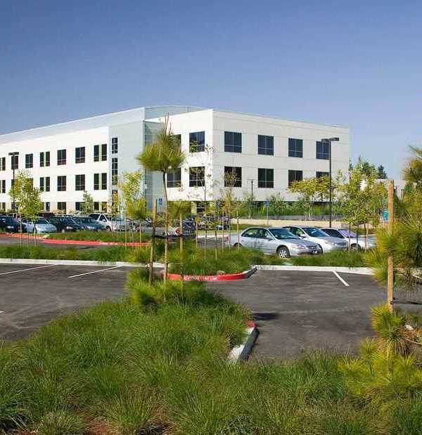
The extension of Oeiras Clinic and its transformation into Luz Hospital involved the construction of a new building on the plot of land adjacent to the existing building.
In addition to an overall reorganisation of the programme, the core theme when designing this project involved giving the new building an entirely different design to the existing one, whilst conferring a homogeneous image to the whole, an important aspect for the perception of the future hospital.
The new building houses the outpatients’ area, examinations, laboratory clinics and some common services such as administrative offices, staff dining room, cafeteria and esplanade.
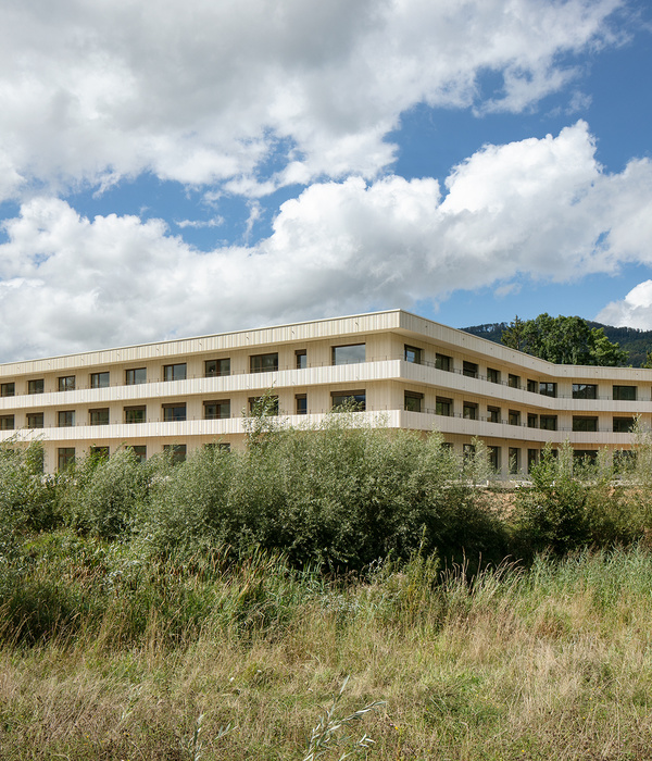
This is a rectangular volume divided by two outdoor patios at either end, to break the monolithic nature of the building, making it lighter and indeed suggesting/hinting at two volumes mainly clad in shiny corrugated ceramic tiles.
The west and east façades are made up of large-scale sheets of the same ceramic material, forming a brise-soleil, to protect the offices from the sunlight and also increase the building’s energy efficiency.
As these two buildings were built in different eras, each with its own character and image, we decided that the public link between the two should have a different nature. A light, transparent element, simply juxtaposed against the façades, to clarify its autonomy regarding the different lines of the other two buildings, namely the existing one which was not designed by RISCO.
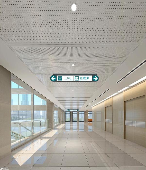
The space is organised around a dominant central void that links the three storeys and brings light into the heart of the building, and two vertical units that structure a circulation ring on each floor, providing connections between work/reception areas and the various waiting zones.
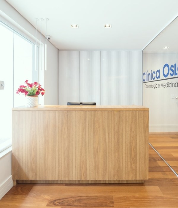
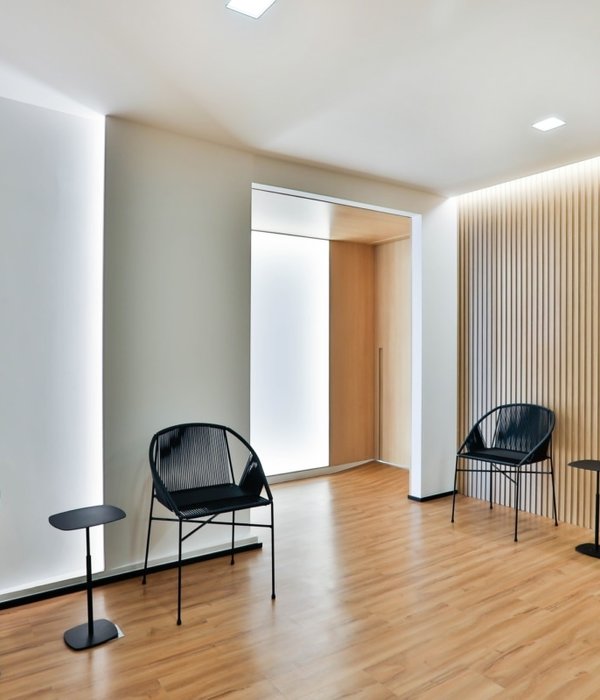
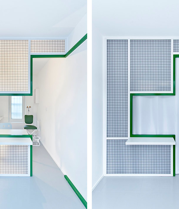
The interior project of the public access spaces acted as a prototype for Luz Saúde’s new corporate image. Contrary to what is customary, the strategy involved studying the integration of the architecture, the signage, furniture, technology and internal communication, from the initial phases of the project, to produce a global quality design that would control in advance the final result. A new image to break with treaditional models, focusing strongly on comfortable ambiences and redirecting the brand to the new generations of clients and doctors.
Year 2018
Work started in 2016
Work finished in 2018
Client Surgicare – Unidades de Saúde S.A.
Status Completed works
Type Hospitals, private clinics
{{item.text_origin}}

