伦敦 King’s Cross 站前广场 | 历史与现代的完美融合
Designed as a place to celebrate arrival, for passengers to feel uplifted as they disembark from their journey and move into the city, the Square is now seen as a welcome addition to London’s public realm:
“King’s Cross Square is a fantastic new public space which has been enjoyed by millions of people since it was opened last year. It provides locals and visitors with a stunning view of the station’s historic façade and highlights the amazing change that this part of London has undergone in recent years.” — Phil Verster, Network Rail’s route managing director
▽ 位于城市中心的广场,square and its surrounding area
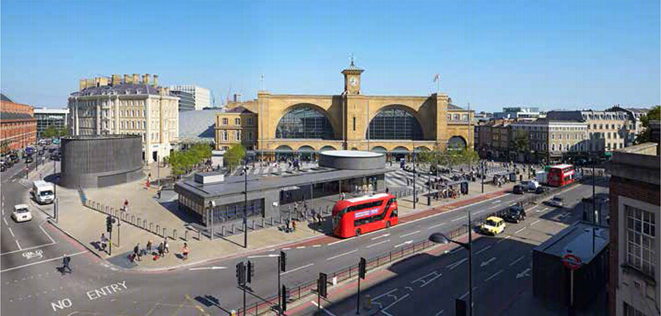
King’s Cross站前广场改造项目为这片位于城市中心的场地注入了新的活力,让其一改过去数十年间默默无闻的尴尬境地,跃升为区域的焦点所在。设计方案需要在以通过性人流为主的站前广场叠加上更多的功能,让其真正为市民所用。方案必须契合所在区域深厚的历史沉淀,同时作为开放性的现代广场,也需要承担 King’s Cross和St Pancras两个火车站交汇处大量的中转人流。此外,由于伦敦地铁在其下通过,广场上还需要设置地铁出入口、通风井以及放置相应的技术设备的空间。
Stanton Williams的设计方案将服务于地铁的各项设施转化为景观元素,并以此界定出数个不同功能的广场区域。改造后的广场上新增了两片笼罩在树荫下的座椅区和小商店。开放的集散场地指引着过往人们前行的方向。
King’s Cross Square forms a focal point at the heart of a district which, following decades of neglect, is currently being injected with a new energy through a range of major urban and transport projects. The design brief presented a unique opportunity to transform the site into a significant new civic space for London. The new Square had to complement the area’s rich history while providing a modern, open space that functioned as a vital part of the major transport interchange around King’s Cross and St Pancras stations. The Square also had to accommodate the entrance stairs, technical equipment and vent shafts for the complex London Underground structures that lie beneath it.
Stanton Williams’ design met these complicated challenges by creating a number of distinct zones, defined by landscaping elements which incorporate the London Underground structures. It provides a welcoming meeting and orientation space with two tree-shaded sitting areas and retail amenities.
▽ 休息、穿行、集合,广场上多样化的行为,diverse activities happening on the square
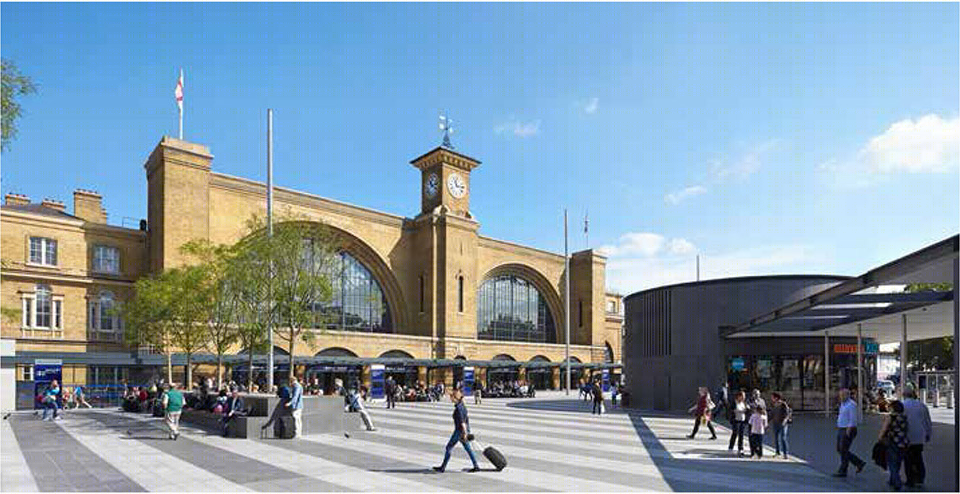
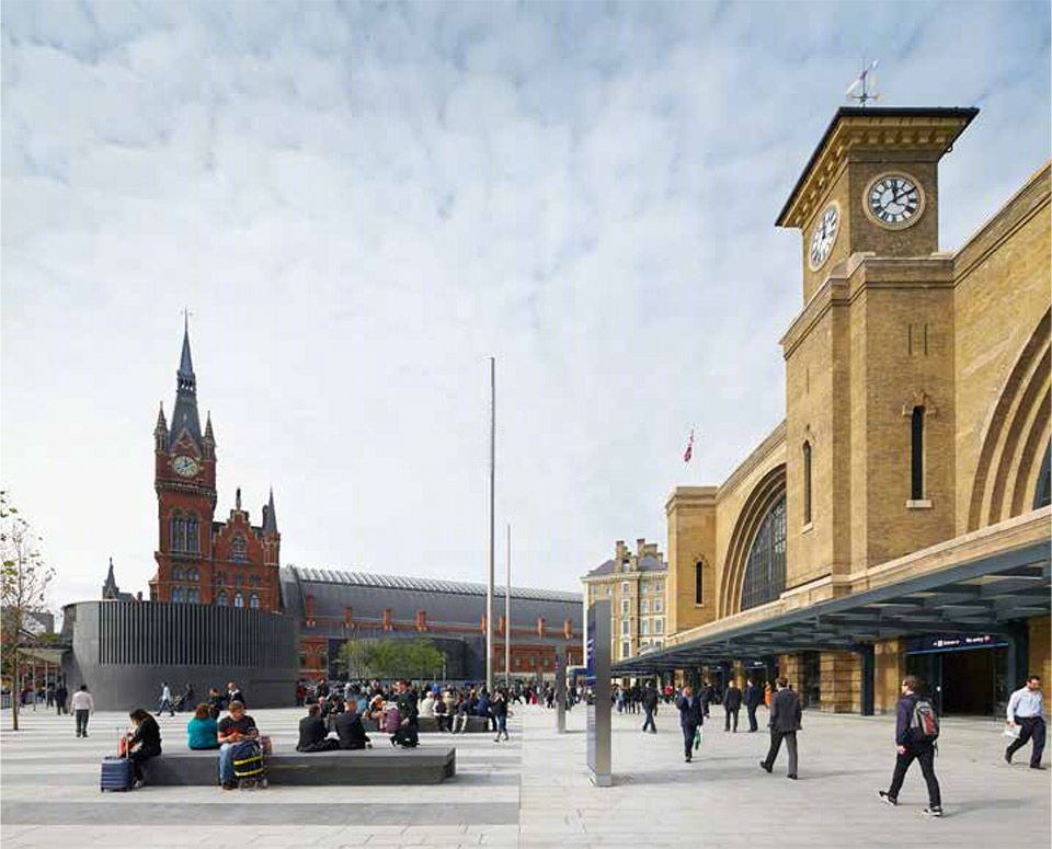
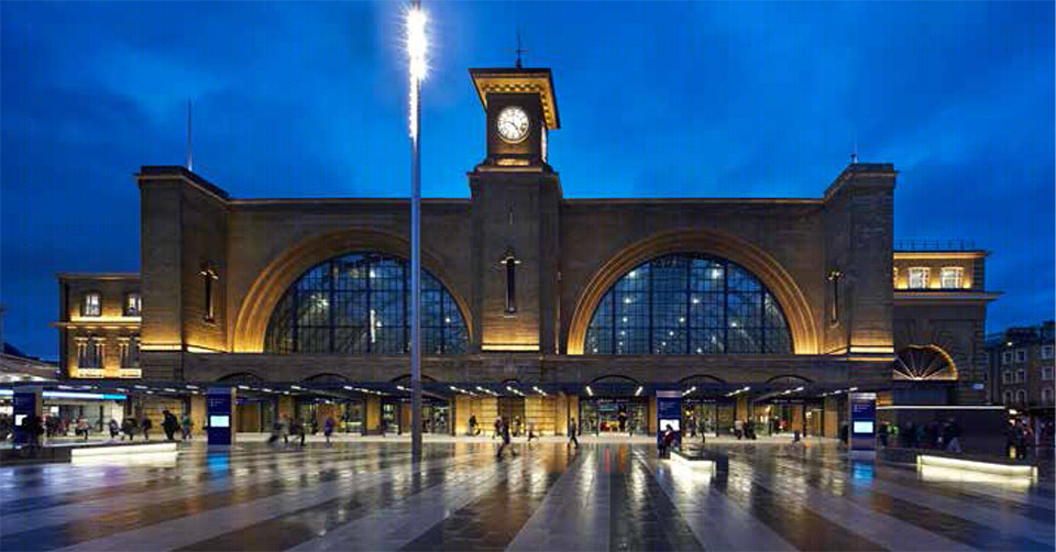
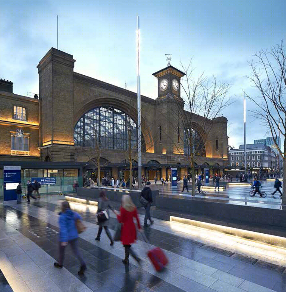
King’s Cross站前广场位于繁华地带,适宜的尺度、复杂的功能和深厚的历史令其足以比肩伦敦市内任何公共空间,Stanton Williams的设计方案也正是意图让其能在市民的日常生活中占据一席之地。改造前的火车站入口外是一个建于70年代的售票厅,巨大而笨重的顶棚将火车站这座百年建筑遮挡的得严严实实。如今,7000平米的大广场将这片空间解放了出来,火车站优雅的维多利亚时期立面150年来第一次完整地展示在人们面前。
The design aimed to give the Square a greater civic importance, as its busy urban location, scale, function and historic context held a potential significance that matched other public spaces in the City such as Trafalgar Square and Leicester Square. The existing site was neglected. Occupied by a 1970s ticket hall, it lacked a station entrance with a visible presence commensurate with its function while a large bulky canopy blocked the view of the impressive station building, designed by Lewis Cubitt in 1851. The new 7,000m2 Square opens up this space, removing the canopy to reveal the stunning Grade I listed Victorian station façade for the first time in almost 150 years.
▽ 重见天日的维多利亚建筑立面,the stunning Grade I listed Victorian station façade
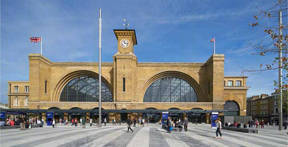
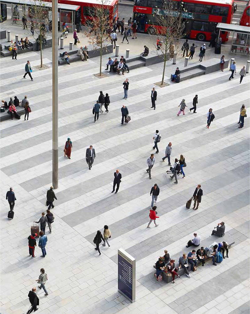
由于建筑与道路距离较远且不平行,King’s Cross火车站并没有诸如St. Pancras火车站建筑般对周边区域的统领力。新设计将建筑立面与广场空间融为一体,暗喻铁轨的条状铺地深浅相间,硬朗现代的线条与繁忙的来往人流十分相称。
在材料方面,随处可见的花岗岩带来了连贯而强烈的视觉冲击力。深色的花岗岩铺地在部分凸起,形成了一系列深灰色的长凳和树池。新广场成为了火车站到达大厅的室外延伸部分。其外围空间则使用了与花岗岩有较大差异的约克石铺地,作为广场与城市的过渡,保证外部人行流线的畅通。
The station itself is set back and offset at an angle from Euston road, effectively diminishing the station façade relative to the nearby buildings and notably the towering presence of St. Pancras International Station. In response, King’s Cross Square was designed to visually link the square to the restored historic façade. The Square is paved with striking bands of dark and light grey granite, recalling the railway lines that terminate behind the station’s façade and accentuating the hard-edged, urban feel appropriate for the square’s busy location.
The use of granite is consistent throughout the Square, providing a strong visual identity. All the landscape elements such as benches and tree planters are clad in dark grey granite, visually locking into the dark paving stones. The brief demanded that the façade should function solely as the Station’s exit. The new Square therefore acts as an external ‘arrivals’ concourse for the Station. A new ‘welcome mat’ to the western end of the Square is paved in Yorkstone in contrast to the granite of the main part of the Square, aiding circulation and ease of movement across the site.
▽ 深浅相间的铺地及其尽端的长凳和树池,striking bands of dark and light grey granite paving,with the benches and tree planters at the end
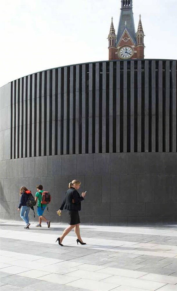
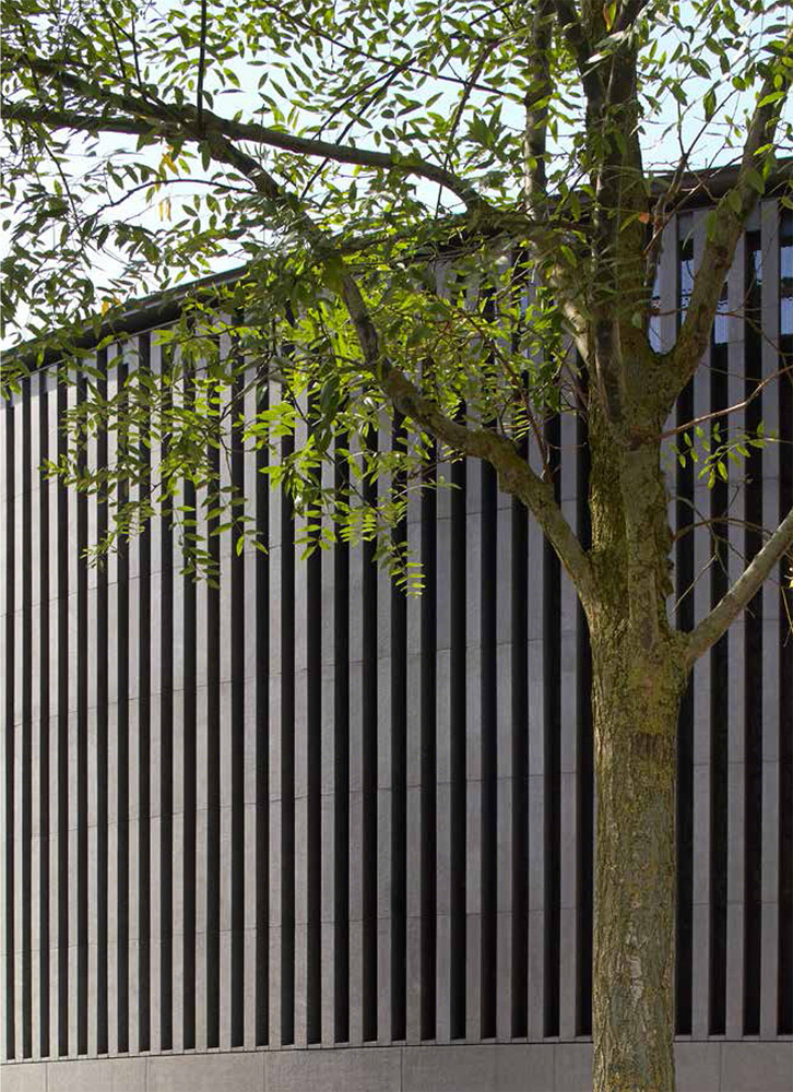
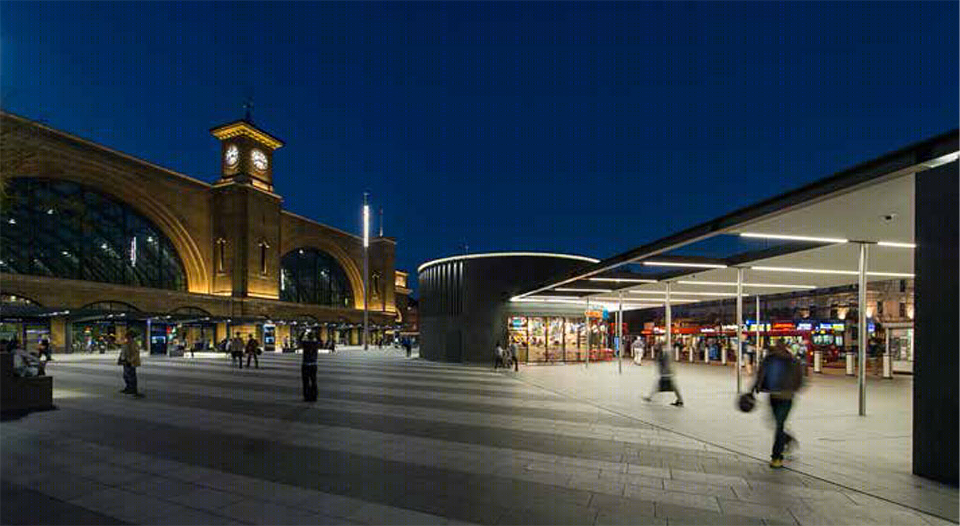
伦敦地铁隧道的三个通风井拔地而起,巨大的体量高出地面约有两层。建筑师将其纳入了整体建筑方案,统一以深色花岗岩包裹,体量顶部的百叶状通风口在实用的同时不减美观。
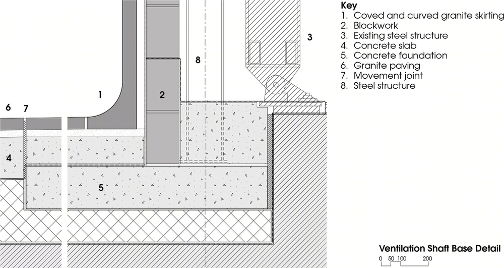
The new Square lies directly above London Underground tunnels and infrastructure, and had to incorporate three large ventilation shafts which protrude up to two storeys above the ground, forming an imposing presence. The design solution expressed these structures as part of the Square’s architecture, minimising their visual impact and incorporating them into the overall scheme. Solid granite folds up the base of incorporated vent structures, while solid fins are formed to allow ventilation and help maintain a substantial appearance when viewed from paving level.
▽ 广场西边巨大的通风井,位于其左侧的是小型灯柱,背后是St. Pancras火车站建筑,large ventilation shafts to the west end and St. Pancras International Station in the background

▽ 美观实用的百叶状通风口,solid fins for ventilation while maintaining a substantial appearance
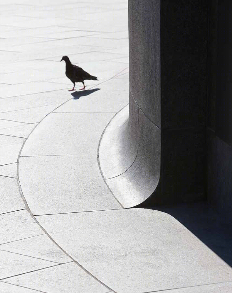
通风井的底部流畅的圆弧曲线让极富雕塑感的体量浑然天成。建筑师将两个较大体量的通风井下部改造成商店,为这个新建城市公共空间带来了更多的人气和活力。一个轻薄干净的顶棚将体量之一与地铁出入口连接起来,既为出入的人流遮风挡雨,同时减小了Euston路上繁忙交通对广场的负面影响。
The skirting details to the base of these ventilation shafts are subtly curved to merge with the surrounding urban landscape, as if they are part of a single unit. The effect brings out their sculptural qualities and visually ties them into the Square. Two ventilation shafts now incorporate retail units that enliven and animate the new public space. A slim elegant canopy links one of these shafts to the entrance for London Underground. It provides pedestrians with shelter from the elements and acts as a buffer against the Euston Road traffic.
▽ 通风井底部的流畅曲线,The skirting details to the base of these ventilation shafts
▽ 连为一体的通风井、商店和地铁入口,ventilation shaft,retail store and the underground entrance as a whole
抬高的树池让种植设计不再受地质条件的限制,列植的树木软化了硬质广场的线条,进一步提升了整体景观品质。树池的边缘处设有座椅,为行人提供阴凉的休息空间。广场上四散的石质座椅让过往行人不再脚步匆匆,而是在此稍作停留,欣赏和享受喧嚣都市生活宁静的片刻。
The overall design quality is also enhanced by soft landscaping, introduced as a row of trees located in raised planters to overcome the below ground constraints. Benches are integrated into the design of the planters and provide a shady area for pedestrians to sit. Further provision of granite clad benches across the site encourages people to pause, enjoy and engage with the Square.
▽ 抬高树池下休息的人们,people sitting along the raised planters

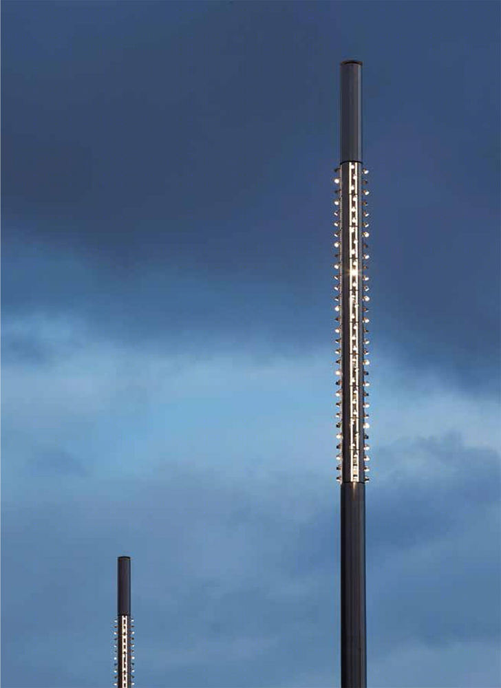
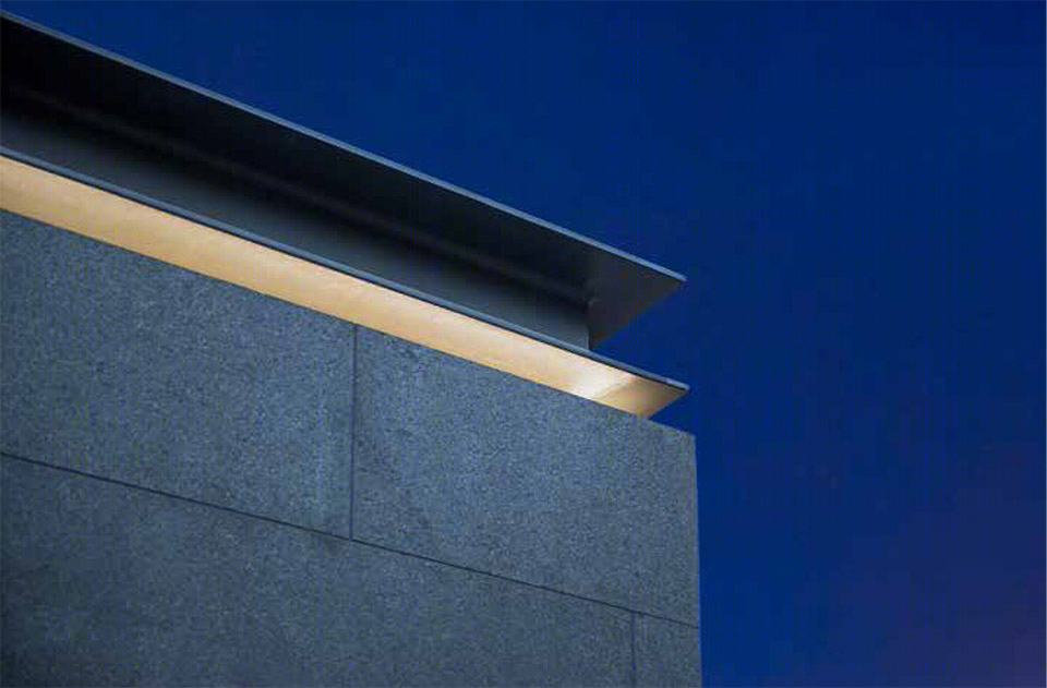
火车站前方的三个高大灯柱,西侧边缘的六个小型的灯柱以及座椅下缘的照明设计在视觉上形成了一个缓缓下降的空间序列,成为人类尺度与建筑尺度之间的过渡。Studio FRACTAL精巧的设计将照明系统和花岗岩砖面结合在一起,为夜晚的广场带来柔和的光线,保证着行人的安全,指引着他们前进。
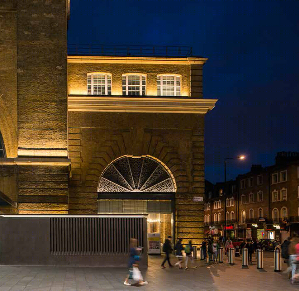
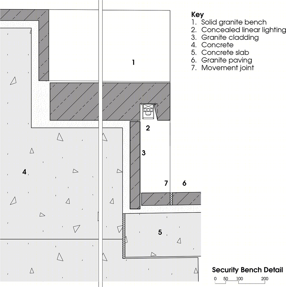
Three tall lighting masts, complemented by six smaller lighting masts which define the western edge of the Square and low level bench seat lighting, act as a visual aid to bring the civic scale of the Station facade forward into the Square. Designed by Studio FRACTAL, the sophisticated and dramatic scheme incorporates lighting into the granite cladding to provide nocturnal and ambient lighting, addressing the critical public space issues of safety, security and coherent way finding.
▽ 灯柱成为建筑与人之间的过渡,tall lighting masts in front of the station
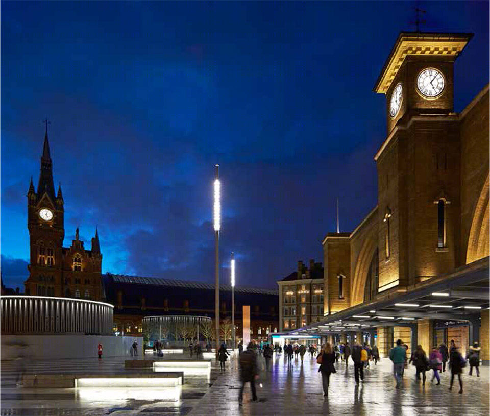
▽ 在夜间被点亮的广场,square at night
▽ 照明设计,lighting details

King’s Cross站前广场风格简洁、空间开敞、环境宜人。由单一材料铺设而成的广场低调而统一,连接着繁华的现代社会和古老的建筑,让建筑成为了空间的主角。商店、座椅、树木、遮雨棚和清晰的路径规划提高了空间的品质,极富魅力的广场默默迎接着所有过往的路人。
King’s Cross Square is a high quality, generous and welcoming space. The consistent use of granite across the Square provides an uncluttered and understated visual coherency, enabling the original Cubitt façade to play the central role once again, and restoring a sense of connection to its historic context. The new Square is now an attractive meeting place to be enjoyed by all, with retail, seating, trees, covered areas for shelter and way finding, all of which help to animate the Square and positively enhance the overall quality of the environment.
▽ 建筑作为空间的主角,广场则默默迎接着过往的路人,the original Cubitt façade to play the central role and the square is enjoyed by all
“这个广场将成为这片70英亩新区的入口,也为未来所有火车站的再开发设计提供了一个优异的例子。” 伦敦市长Boris Johnson说道。
“This wonderful new square will be the perfect gateway to almost 70 acres of new public spaces, businesses and homes for Londoners, setting a new standard that we should aspire to for all future station redevelopment.” —
Boris Johnson, Mayor of London
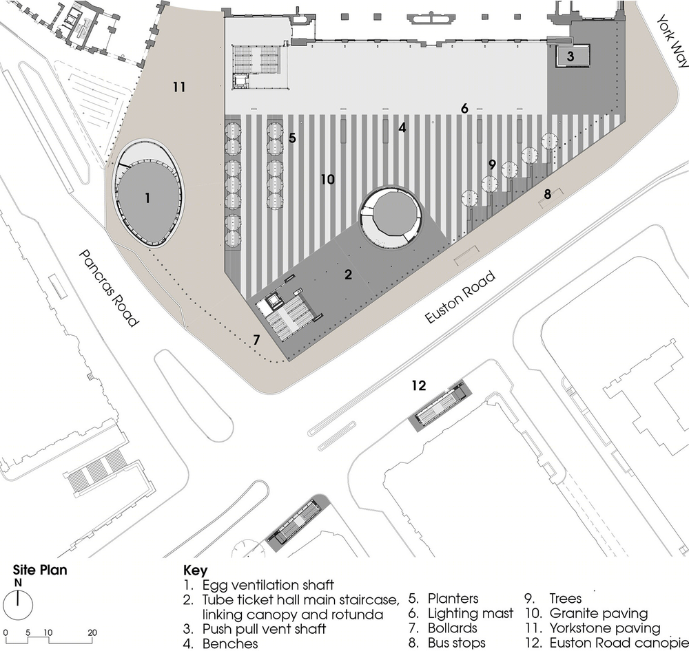
▽ 平面图,plan
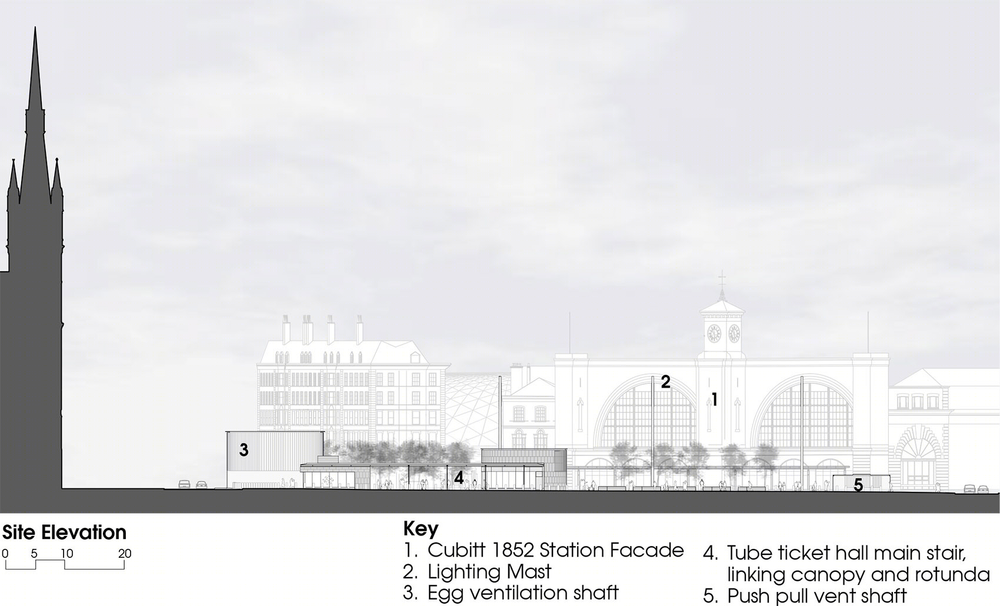
▽ 立面图,elevation
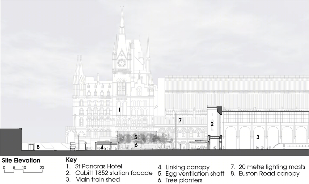
▽ 剖面图,section
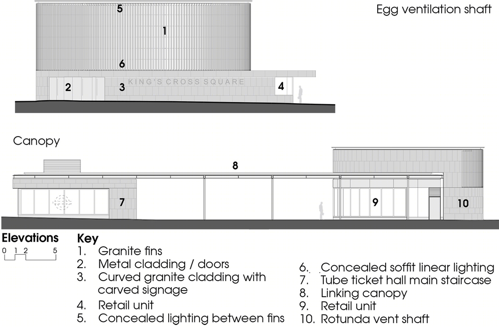
▽ 通风井立面图,elevations of the ventilation shafts
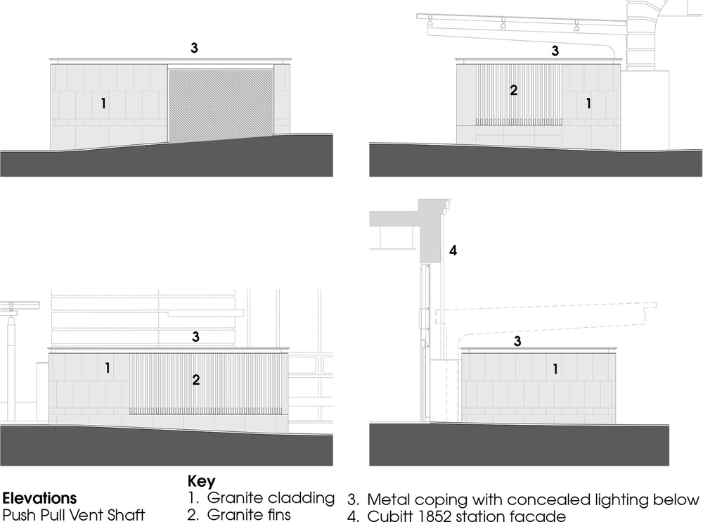
▽ 通风井底部构造图,ventilation shaft base detail
▽ 座椅构造图,security bench detail
Construction value: confidential
Completion Date: September 2013
Construction phase: Sept 2012 – Sept 2013
Design Competition won: April 2010
Location: Euston Road, London N1
Surface: 7,000m2
Retail Units: ‘Rotunda’ -36m2; ‘Egg’ -33m2
Client: Network Rail
Architect: Stanton Williams
Multidisciplinary Engineer: Arup
On Site Engineer: Robert West
Lighting Design: Studio Fractal
Arboricultural: Consultant BHSLA
Contractor: J Murphy & Sons
Station Architects: John McAslan + Partners
Photography: Hufton & Crow / Will Scott Photography
Drawings: Stanton Williams
English Text: Stanton Williams
MORE:
Stanton Williams
,更多请至:


