达林顿砖厂公寓 | 融入街区的三层 terrace 设计
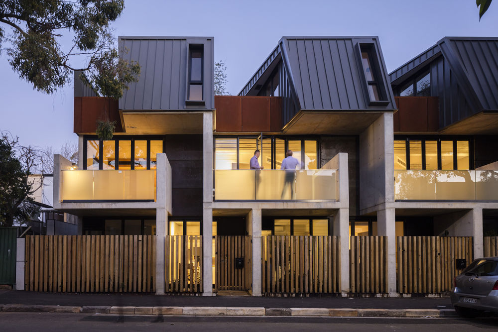
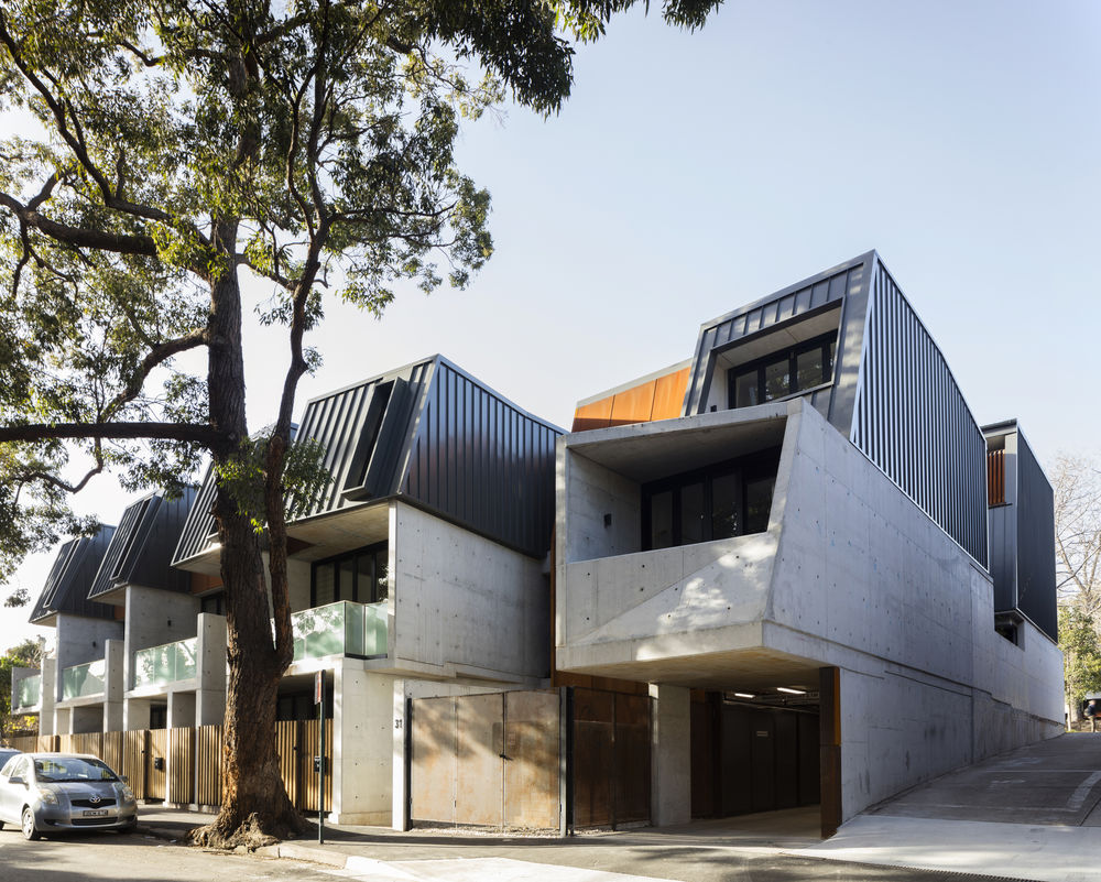
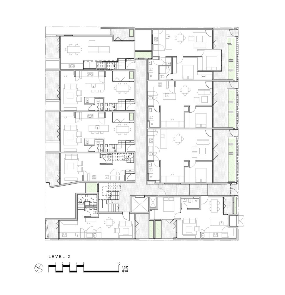
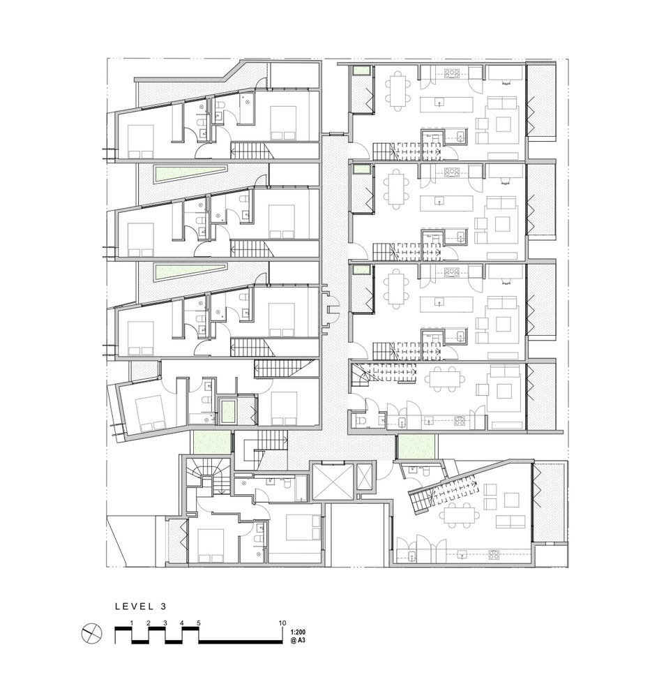
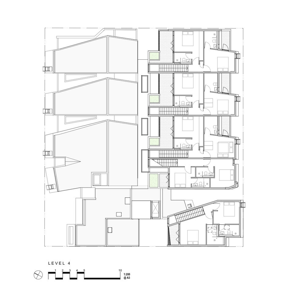
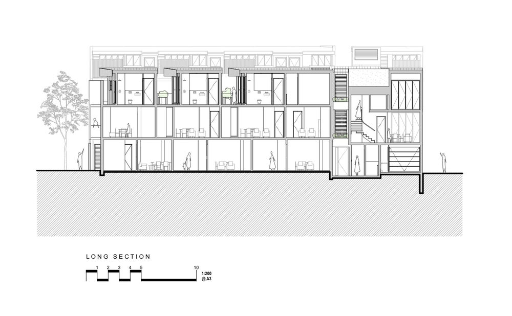
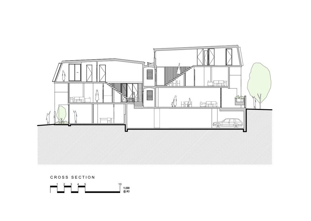
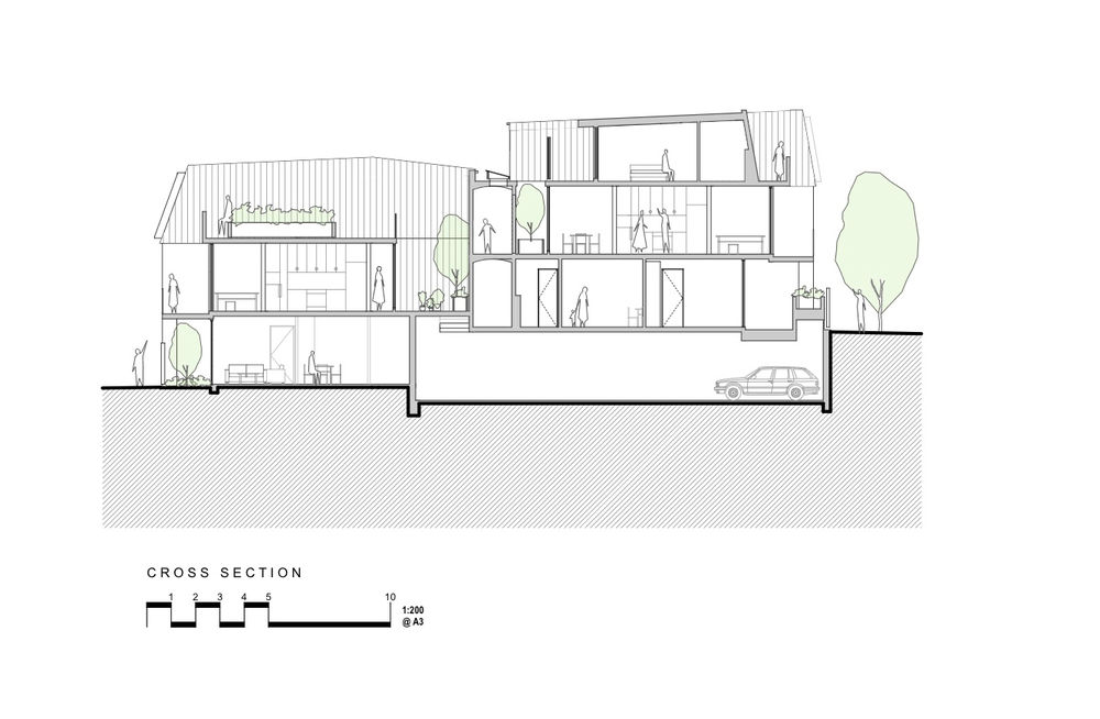
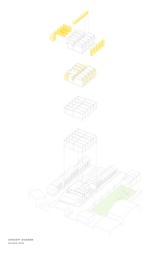
The primary concept for this multi-residential project is to create a sense of place using a terrace form typology reflective of its context. The council controls allowed for two stories for the area. An interpretation of ‘story’ within the council’s controls allowed for an attic form that presents to the streets as a roofing element and essentially provides for the third level in each apartment. The primary idea was to cut deep internal fissures into the building perpendicular to the street frontages to increase the surface area of light and ventilation into each dwelling.
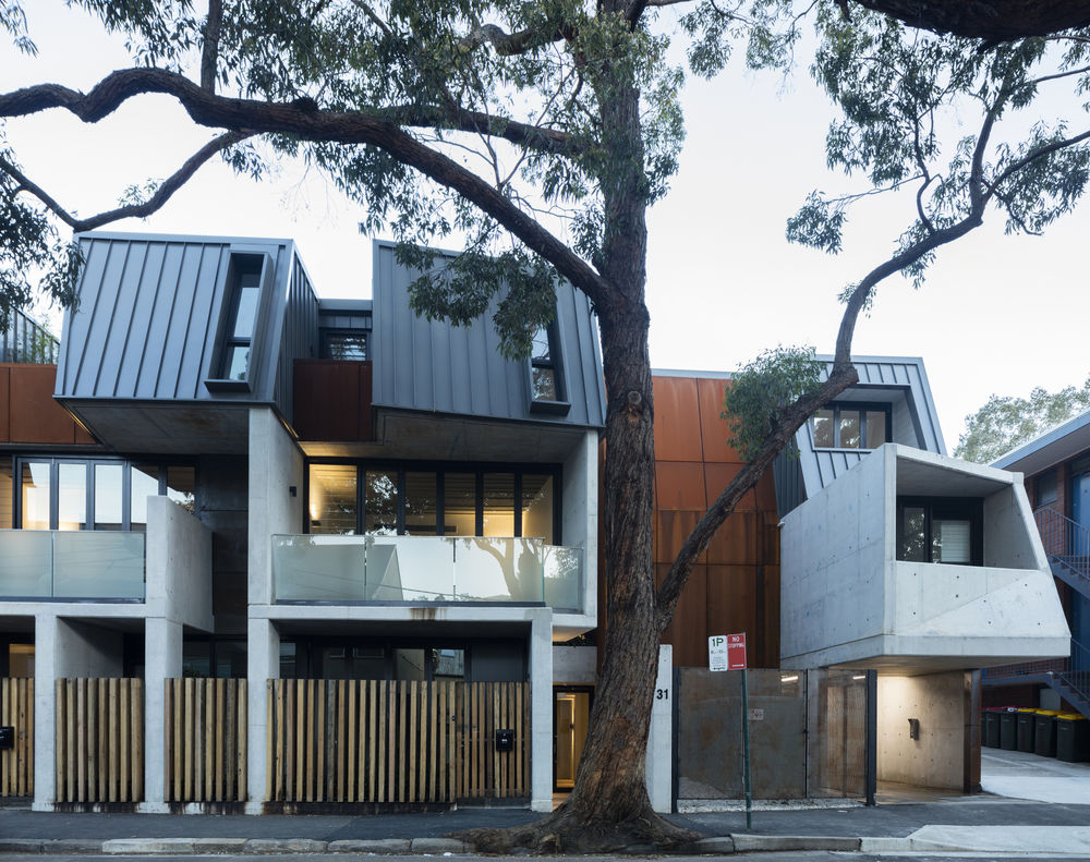
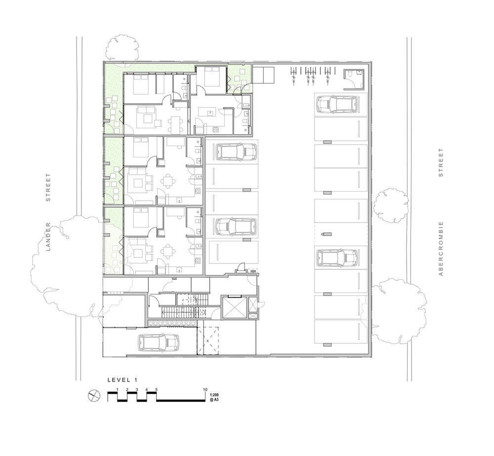
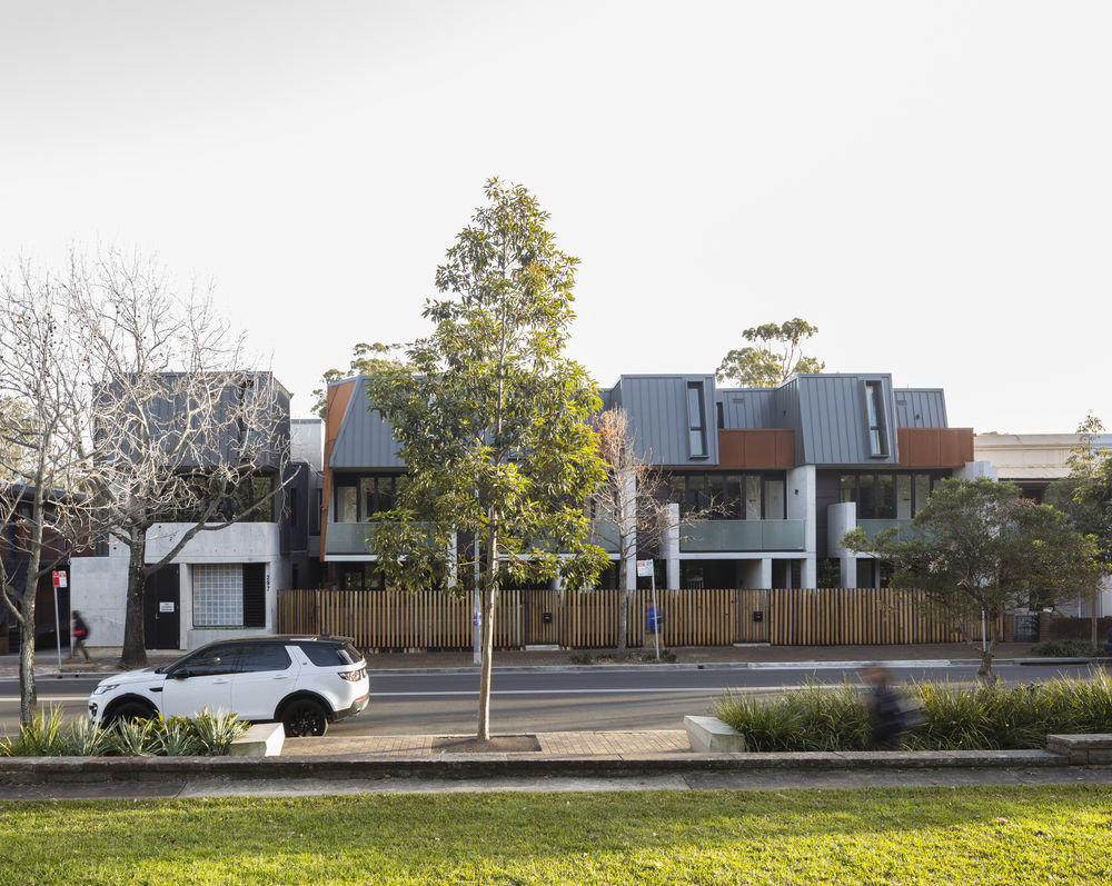
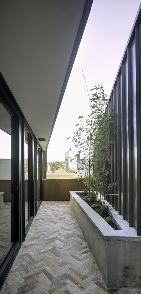
Typically apartment buildings have private open space located on street edges with privacy often compromised. Our design layers private open space deeper into the building form reducing the fishbowl effect and minimizing anonymous façadism. The lack of dependency on windows to the street allowed us to be more confident in using solidity and materiality. Each street frontage has been carefully broken down and eroded to produce a fine urban scale commensurate with the human body. Landscape helps fill in the gaps.

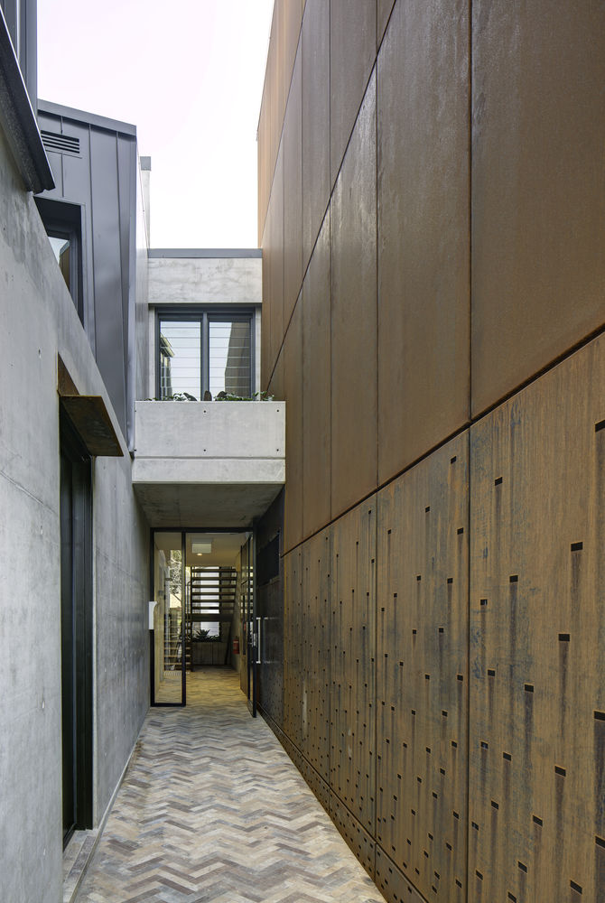
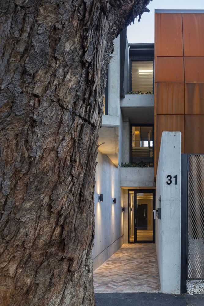
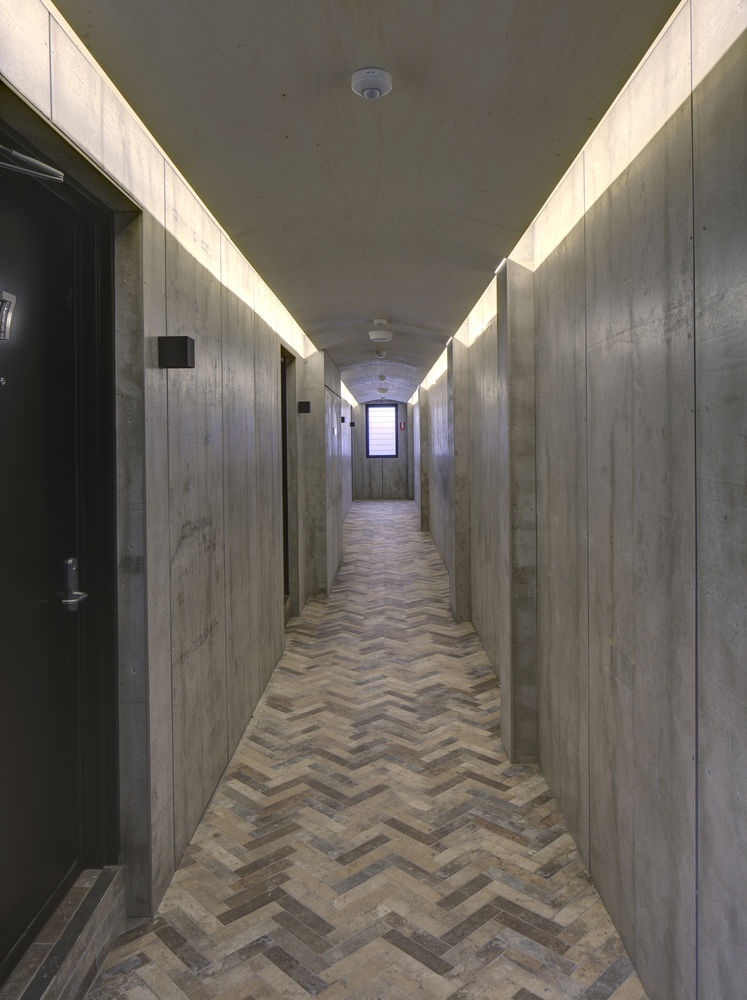
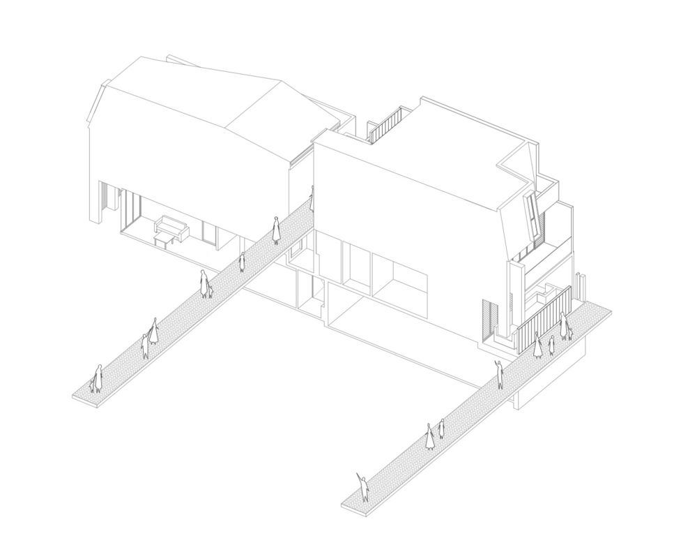
Internal corridors have been designed like external streets. Usually, internal corridors are utilitarian and treated as low-grade space. In our building corridors have been treated as an extension of the local streets as a celebration of its urban environment. The common location of the main lobby entries and vertical circulation allow a landscaped ‘mid-block’ link to occur between both Abercrombie and Lander Streets and provide permeability within the street block. Subtly faceted steel and folded concrete further reinforced these entries at street level.
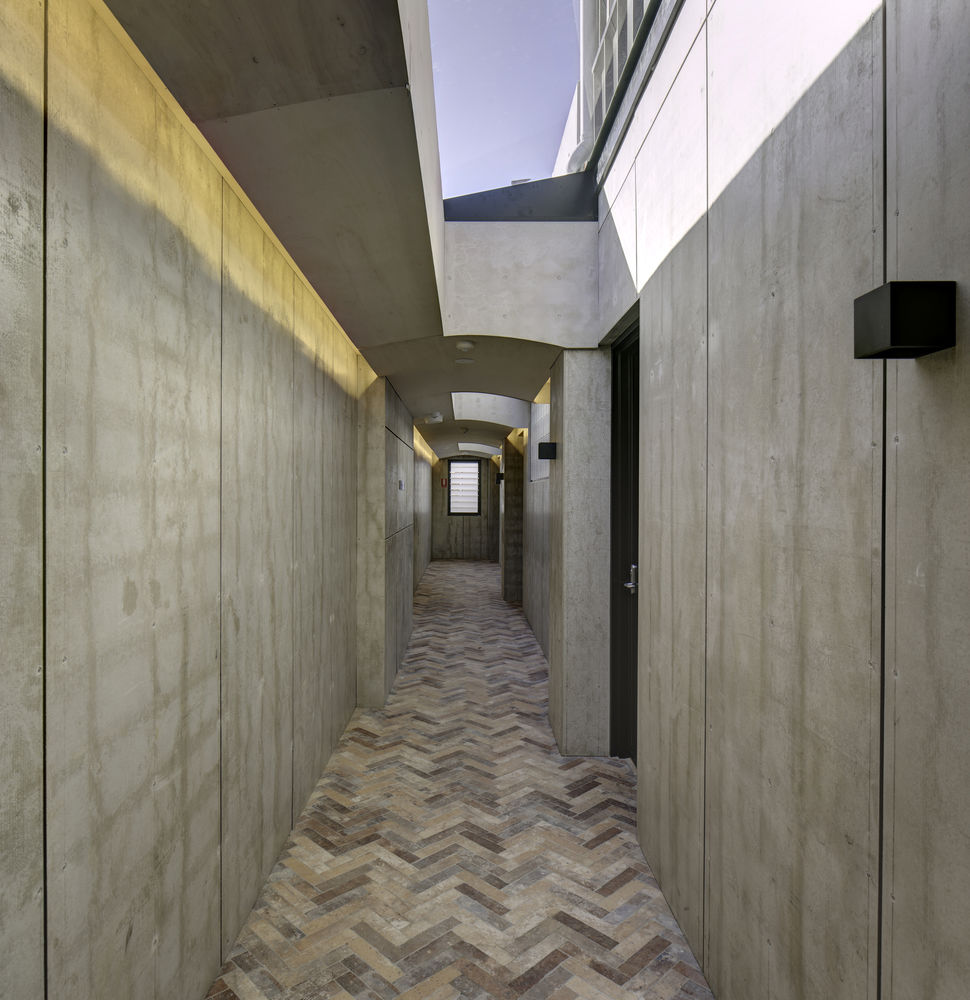
External materials have been used as internal materials. The use of unpainted materials to internal lobby areas such as fiber cement sheet and Corten steel walls, plywood ceilings, brick paving to the floors and natural light is in contrast to the dingy ‘motel lobby effect’ and gives these semi-public spaces a sense of place. The upper-level corridors have skylights and glass brick walls to allow winter sun to penetrate deep into the building. The predominant materials of off-form concrete and rusted steel are materials that reflect both the heritage of Darlington and its immediate context.
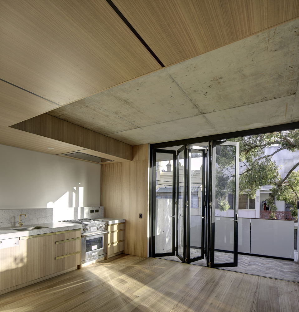
An example of this is the rear entrance to Sydney University at the end of Lander Street where Corten steel is used as a screening element. Our decision to use Corten steel as cladding provided another opportunity for our building to connect within its context. All the markings used in the construction of the building have been preserved such as pencil set outlines for cladding, spray paint markings on concrete, even mistakes made during construction are not deliberately covered over or hidden. Rather they are left as scars commemorating the human condition.
