巷弄文化向来是历史进程和社会风貌的缩影,居住其间,令人亲近的生活气息反映出环境、人与场地之间友善的互动关系。而轻易被捕捉或感知到的尺度感使我们能够快速地区分所处场景的不同,其中由日常所构成的生活,犹如细部所构成的整体,“微”的意义体现,成为了一种合乎逻辑的建造方法。
Alley culture has always been a miniature of historical process and social landscape, where the intimate atmosphere of life reflects the friendly interaction among the environment, people and site. The sense of scale that is easily captured or perceived allows people to quickly distinguish between the different scenes in which they are located. The life composed of daily scenes is just like the whole comprised of details, with the meaning of “micro” embodied, which becomes a logical construction method.
▼空间概览,overview
01建造 – “微”的意义
Construction – Meaning of “micro”
临近绍兴路的 house04 是一间改造而来的顶层住宅,建于 1940 年的建筑主体奠定项目独特的整体基调,砖混结构、局部区域的层高优势、承载着主要空间功能的矩形体块以及公共的屋顶露台,场地不同因素、条件的叠加,如何诠释“表象下的真正建构”是衡量设计动作精确与否的前提标准。
House 04 near Shaoxing Road is a renovated penthouse. Its main body built in 1940 lays the unique overall tone of the project, with a visible brick-concrete structure and floor height advantage in the local area. The rectangular block plays the main space function. The public roof terrace and the superposition of different factors and conditions of the site are also eye-catching. How to interpret the “real construction under the surface” is the premise standard to measure the accuracy of design action.
▼入口玄关,entrance vestibule
谈论建筑或空间的存在意义,维特鲁威提到“安全感、实用性、美观度”是其基本的三要素,这也揭示了空间具备着多元的丰富面向。基于现有的场地情况,私属区域被有意扩大,楼梯而上设置了入口的玄关,相较原始平面里“开门见山”的方式,适当的尺度安排营造出入户情绪转换的场所。
Speaking of the meaning of architecture or space, Vitruvius mentioned that “security, practicality and aesthetics” are its basic three elements, which also reveals that space has multiple rich aspects. Based on the existing site situation, the private area is deliberately expanded, and the entryway is set on the stair. Compared with the “intuitive method” in the original plane, the appropriate scale arrangement creates a place of emotional transformation at the entry.
▼玄关上方通向阁楼的廊桥,bridge leading to the attic above the vestibule
▼楼梯间转角处的摆件,the sculpture at the corner of the stairwell
02场景 – 对角线的启示
Scene – Implications of diagonal
破局于矩形的空间形态,45°角的切割方式似乎蕴藏着无限的可能性。在费尔舍住宅里,路易斯·康尝试非正交的方式打破平稳的秩序,由对角线构建的“房间社群”的概念浮现出来。所以,house 04 的平面布局因对角线的存在,使具体的功能空间有序落位,单一场景的面貌因不同立面的生成而呈现有机的“动态景观”。
▼空间示意图 01,spatial diagram 01
Breaking the rectangular space, the cutting method at a 45° angle seems to contain infinite possibilities. For Felsher House, Louis Kahn attempted to break the smooth order in a non-orthogonal way, and the concept of “room community” constructed by diagonal emerged. Therefore, in the plan layout of House 04, the diagonal makes the specific functional space placed in an orderly manner, and the appearance of a single scene presents an organic “dynamic landscape” due to the generation of different facades.
▼一层卧室,ground floor bedroom
▼从客厅望向一层卧室,view from living room towards ground floor bedroom
基于 4.5 m 的层高,局部楼板搭建实现空间利用最大化的同时也满足业主的客观需求,于木盒子里上下嵌入卧室的功能。垂直方向高低错落的节奏感和水平方向井然的秩序感并存,对角线的出现以及立面不同的开口,使公共区域与私属区域之间建立清晰又模糊的边界,相互连接,并彼此独立。
Based on the floor height of 4.5m, the local floor construction maximizes the use of space and meets the objective needs of the owner, with the bedroom embedded in the wooden box. The rhythm of vertical height and the order of horizontal direction coexist. The diagonal and different openings of the facade form clear and blurred boundaries between public and private areas, making them interconnected and independent of each other.
▼从廊桥望向阁楼卧室,view from the bridge to the attic bedroom
▼阁楼卧室细部,detail of the attic bedroom
03功能 – 简单的复杂性
Function – Simple complexity
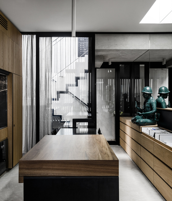
垂直空间中楼梯有着举足轻重的作用,借助平面锐角的位置,去往阁楼的楼梯以轻盈、透明的形态盘旋而上,及至同等标高,又以“桥”的意象展现,从视觉上间隔了玄关与客厅的空间属性。功用的结构一层层叠加,虚实、厚薄、方正与圆弧之间既表达了建造的内在秩序,又有助于设计的逐步深入及观察者的理解。
▼空间示意图 02,spatial diagram 02
The stair plays a pivotal role in the vertical space, and with the help of the sharp angle of the plane, the stair to the attic spirals up in a light and transparent form, reaches the same elevation, and shows an image of a “bridge”, visually separating the spatial attributes of the entryway and the living room. The functional structures are layered, and the virtual and real, thick and thin, square and arc not only express the internal order of construction but also help the gradual deepening of design and the understanding of the observer.
▼旋转楼梯,spiral staircase
进而是材料的策略,由地面反至立面,看似墙裙的铺贴,实则是介于客厅外窗的台面高度为基准延伸开来,形成常规意义上的踢脚线或墙角,同时使空调暗藏于客厅背面半高台下,材料的选择、使用和材质肌理的变化,构建了公共区域理性、硬朗、易于清洁以及私属区域柔和、亲近、温暖的家居氛围。
Regarding the strategy of materials, from the ground to the facade, the seeming laying of wall skirts is actually the extension from the height of the exterior window of the living room as the benchmark, forming a skirting board or wall corner in the conventional sense, while making the air conditioner hidden under the semi-high level at the back of the living room. The selection and use of materials and texture change create a home atmosphere with a rational, tough, easy-to-clean public area and soft, close, warm private area.
▼旋转楼梯细部,detail of the spiral staircase
▼旋转楼梯望向入口,view from the spiral staircase towards entrance
04借用 – 界面的消隐
Borrow – Blanking of the interface
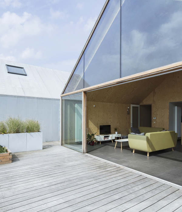
穿过玄关,拾级而上,原本公共的屋顶厨房被改造成开放式的餐厨区域。拆除实墙,同样以斜切的方式外拓,利用室外的平台,搭建局部玻璃屋顶,确保盥洗区、餐厨区、室外露台的功能齐备。地面石材延伸至立面,于适当的高度退让给白色涂料,虽然材料的种类不多,但表现出了协调性、纯粹性和连续性的特征。
▼空间示意图 03,spatial diagram 03
Through the entryway and up the stair, the originally public rooftop kitchen is transformed into an open kitchen area. The solid wall is removed and also extended in a diagonal way. The outdoor platform is used to build a local glass roof to ensure complete functions of a washroom, kitchen area and outdoor terrace. The ground stone extends to the facade, giving way to white paint at the appropriate height. Despite the fewer kinds, the materials show characteristics of harmony, purity and continuity.
▼餐厅与庭院概览,overview of the dining area and the terrace
柱,首先是结构的,承重是其第一责任,其次才是被表现的。在餐桌一侧,纤细的钢柱与结构外框材质保持一致,承担着屋顶的结构承重,独立的细柱生成了一种不可见的界面,与真实存在的玻璃界面的情景却又截然不同,这种模糊的点,创造了抽象的线、面和体积,最终消隐于餐厅与外窗玻璃的缓冲区之间。
The column, first of all, is structural, and its first purpose is to bear the load, followed by expression. On the side of the dining table, the slender steel column is consistent with the structural frame material, bearing the load of the roof structure, and the independent thin column generates an invisible interface, completely different from the real glass interface. This blurred point creates an abstract line, surface and volume, and finally disappears in the buffer between the dining room and the exterior window glass.
▼纤细的钢柱承担着屋顶的结构承重,the slender steel column bearing the load of the roof structure
▼轴侧图,axon
▼总平面图,site plan
▼平面图,plans
项目名称:house 04
设计事务所:隹禾设计工作室
项目类型:公寓,适应性改造
场地地址:中国上海 黄浦区
完工日期:2022
室内面积:45 sqm
设计团队:熊莉
联系信息:
主要材料:橡木木饰面, 大理石,金属冲孔网板
摄影师:WM Studio
施工团队:上海添赐建筑装饰有限公司
{{item.text_origin}}

