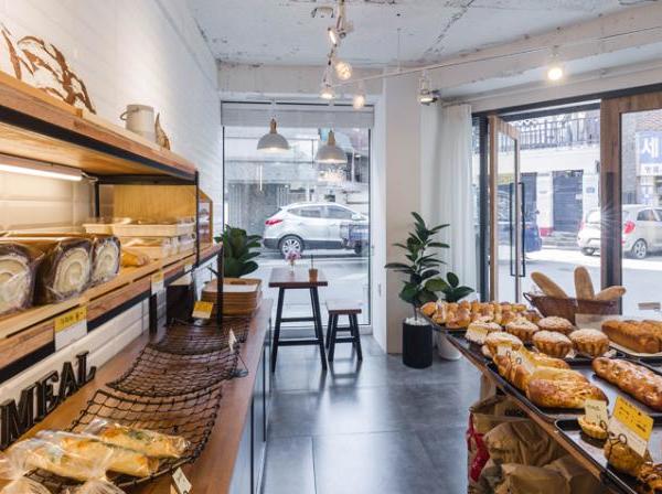
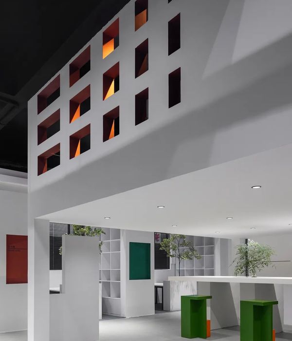
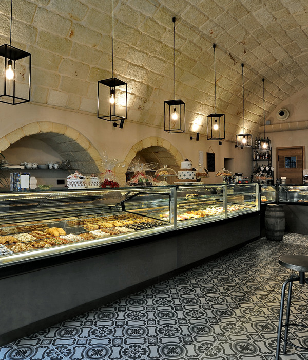
藤王面包店以从日本聘请来的具有多年烘焙经验的匠人作为主厨,旨在打造一家高端日式烘焙连锁品牌。首家藤王旗舰店位于地标性建筑广州东塔下的艺术购物中心K11。为了配合品牌雄心勃勃的发展策略,藤王面包店K11旗舰店需要拥有具有视觉冲击力的空间特征,在众多周边商铺和竞争对手中脱颖而出。同时此空间特征应有潜力演变成独有的品牌DNA,应用在分店的设计上,从而视觉元素和品牌之间建立起强烈的联系。令人印象深刻的室内空间设计让顾客乐于拍照并在社交媒体上分享,促成品牌信息的二次传播。
Operated by an experienced Japanese bakery master, Fujio aims at building a high-end Japanese Bakery brand in China. Its first flagship store sits at the premium shopping mall K11 under the iconic landmark Guangzhou East Tower. In line with the ambitious business strategy, the interior shall have a powerful space identity that distinguishes itself from the surroundings and competitors. Also, it shall have the potential to evolve into the unique branding DNA of Fujio which could be applied to other branches. As the result, a firm connection between the brand and the space identity is built. In addition, the impressive space experience may trigger customers to take photos and then share with friends on social media which increases the brand’s public exposure.
▼面包店概览,view of the bakery
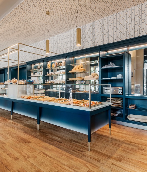
业主希望突破传统的以玻璃柜把面包隔离起来的展示方式,改为将实物直接呈现给顾客。这种新型陈列方式在欧洲和日本已经广为接受,但是在国内较为少见。展示台的革新可以给顾客以新颖、与食物更加亲近的购买体验。
Instead of the traditional way of putting bread behind the glass, the client prefers to show them directly in front of the customers without any cover. This new method of bread display has been widely accepted in Europe and Japan, but rarely in China. By applying the innovation, people would have a refreshing and intimate shopping experience.
▼不使用传统玻璃柜的陈列方式,display the bread without traditional glass cover
以上方面综合启发了藤王面包店的设计核心,有别于传统的室内装修,本案以模块化空间装置为设计语言,将商铺作为一体的空间考虑,将展示柜台和天花的无缝连接,力图创造连续、完整的空间。整体空间给予人们强烈的视觉冲击和现场感,同时满足了展示面包的需求。面包店的设计原型来自于传统日式屋顶的形态,层层叠叠的屋檐叠加,成为连绵不断的城市景观。同时,原色的松木配合暖色的灯光,进一步烘托了面包的美味可口,增强了人的食欲。
▼室内设计以传统日式屋顶形态为原型,design was inspired by the traditional Japanese roof
▼层层叠叠的展示台,display stands in multiple layers
To achieve above mentioned visions, the design concept of Fujio Bakery was conceived: a unique modular system with stacked up units that forms the display stands and gradually evolves into the ceiling. Different from traditional interior design, the interior space was considered as one single piece of installation seamlessly wrapping the whole space. The design impresses people visually and fulfills the function needs of presenting breads. The design of the installation module was inspired by the traditional Japanese cityscape composed of layers of tile roofs. The natural pine wood is the main material of the installation against which the bread looks more delicious.
▼面包店屋顶,ceiling of the bakery
▼展示柜台与屋顶相连,display stands seamlessly connect with the ceiling
此外,在正对面包店入口处,厨房部分设计为开放式,顾客可以看到面包师所有的工作。这里的设计灵感来源于剧院的镜框式舞台。设计师希望面包师精湛的手艺,可以将面包制作过程展示得如同一场表演,让顾客对藤王面包的了解更进一步。
Furthermore, through a proscenium-like opening, customers can watch the skilled bakers working inside the kitchen at the far end side of the space as if they are performing on a theater stage.
▼镜框舞台式的厨房,kitchen as a theater stage
▼轴测,axonometric drawing
▼平面,plan
▼立面,elevation
▼剖面,section
{{item.text_origin}}

