- 项目名称:Mu-A甜品咖啡馆
- 设计方:Inexdesign
- 设计负责人:Won Myoung Hyun
- 摄影师:Jae Yoon Kim
Korea Mu-A Dessert cafe
设计方:Inexdesign
位置:韩国
分类:商业建筑
内容:实景照片
委托人:Geum Sik Yoon
建造方:Design Chang
建筑设计负责人:Won Myoung Hyun
图片:39张
摄影师:Jae Yoon Kim
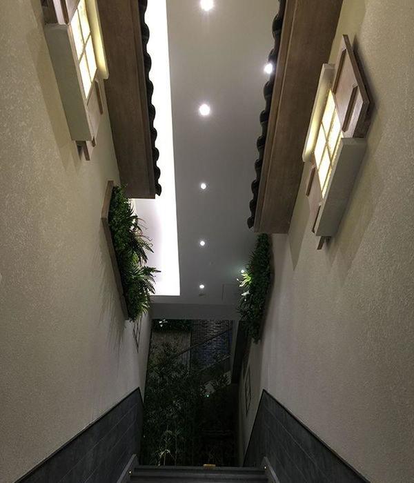
这是由Inexdesign设计的Mu-A甜品咖啡馆,位于大邱市中心的一片混凝土建筑群之中。这座韩风的甜品咖啡馆位于一条小巷里,还存留着大邱市的现代和当代历史。在游览现代小巷的同时,还欢迎游客享用经过改良的多样化的传统菜单。建筑师想设计一座漂浮空中的建筑,因此借鉴了传统的韩式多层建筑(Nu-gak)的造型。立面诠释了传统建筑的大门,古人借此感受季节变换,呼吸新鲜空气。建筑师考虑到大邱市夏季炎热,而且建筑下午会受到西面强烈的阳光照射。因此建筑师配置了大型电动百叶窗,以控制光线和阴影。
译者: 艾比
From the architect. In a forest of heavy concrete buildings, turning toward inside of the downtown main road to narrow and dense alleys, located near Yakjeongolmok of Donseongro, center of Daegu, the Korean style dessert cafe Mu-A is a space for time travel with fragrant tea in an alley where modern and contemporary history of Daegu is alive. This space where we can drop in while touring modern alleys, welcomes visitors with diverse improved traditional menus such as Chalddeok (glutinous rice cake), Jeolpyeon (pounded rice cake) and Seolgi (steamed rice cake), Buchimgae (vegetable pancake) in three colors, Sujeonggwa (cinnamon punch with persimon), and Sikhye (sweet rice punch), as if it reflects the feature of this alley.
This building borrows the shape of a traditional Korean many-storied building (Nu-gak), according to designer’s wish to embody a mass of structure floating in the air. The facade reinterprets the gate of the traditional building in which our ancestors felt season changes and breathed naturally. As we know Daegu is very hot in summer, and moreover,this building faces west with strong sunlight in the afternoon. Thus, the designer equipped a big motor-operated louver shading to control light and wind. Exterior scenery of the cafe Mu-A is not wonderful just like that of ordinary downtown back alley.
The punched louver showing exterior scenery also plays a role of bringing the strong afternoon sunlight and surrounding scenery into the interior space more softly by filtering them. The louver was derived from the traditional Bunhapmun (a sliding door to shut the plank-floor room off from the yard), and to which color of Hanji (traditional paper made from a mulberry tree) was applied. In addition to this, a flower muntin pattern, one of the traditional decoration techniques used at Buddhist temples and palaces, was also applied repetitively to both inside and outside.
In terms of structure, the designer though out cantilever and floating mass of the first floor. The first floor which looks floating is large yard to embrace its surroundings. This is a traditional and buffering space between the alley and the building, and also an important element to neutralize difference between this building floating tranquilly and the crowdedness of the street. It expresses the layer of traditional space with skip floor by borrowing the method from a village with level difference by natural slope, and presents dynamic human traffic line and attractions.
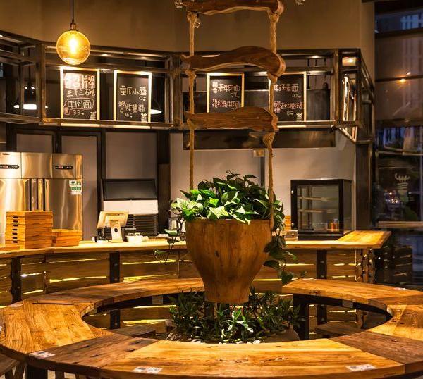
‘Welcoming’ space on the stereo bate of the first floor tells the start of space. Human traffic line becomes complicated due to the interior space with six steps, which influences service style of each space. With this reason, interior space assumes the from grafting self-serving style on staff-serving style. Centering around the counter table on the first floor, there are a main kitchen and an auxiliary kitchen on the basement and the second floor each. Meals are sent from the main kitchen to each floor through a dumb waiter, and served in each floor. To employees, human traffic line of multi-storied building is more complicated than that of one-storied building.
However, the human traffic lines from the hall of the second floor to room and service area half floor up and from the hall half floor up, give diversity to the space through the repetition of wideness and narrowness. There is a small pond between the hall of the second floor and service area half floor up, and a flower muntin door has a fragrance in the middle of the space, revealing shy looks. The pond can be also used as a small stage for performance. Flower muntins are connected to the wall pattern and are in full bloom as thousands of flowers on the louver of the facade.
Ceiling of the third floor is high in order to give openness to visitors on the top floor, to attempt natural movement through human traffic line, and arranges the ‘tea room’, the most sacred place in this building. Wooden ceiling frames woven in three dimensions emphasize the identity of the building and play a role to stabilize the hanging tea room visually. In terms of structure, the tea room applicable to the fourth floor means a divine room and the bright sunlight pouring through skylight creates dreamlike atmosphere.
The designer used familiar materials like wood, steel, stone and paper as finishing materials, and tried to express this space plainly and cleanly. For designers working with clients is all precious but that with clients giving full trust gives the most pleasant time. This work involved a series of time-consuming, complicated processes from design to construction. Thus, without the client’s trust, it could not be possible to finish this work. I would like to thank to the client again. For me was really valuable time to look back and learn more.
韩国Mu-A甜品咖啡馆外部实景图
韩国Mu-A甜品咖啡馆内部实景图
韩国Mu-A甜品咖啡馆内部局部实景图
韩国Mu-A甜品咖啡馆局部实景图
韩国Mu-A甜品咖啡馆内部一角实景图
韩国Mu-A甜品咖啡馆内部过道实景图
韩国Mu-A甜品咖啡馆略图
韩国Mu-A甜品咖啡馆平面图
韩国Mu-A甜品咖啡馆剖面图
韩国Mu-A甜品咖啡馆立面图
{{item.text_origin}}


