▲点击蓝字
“知行 Design”中华优秀作品第一发布平台!
知行DESIGN
Between example|样板间
琚宾/中国
项目是从深圳目前最高楼平安金融中心的第 77 层那左右包裹着木质灯箱的电梯厅开始观看的。但其实并不是,准确应该说是连同楼下换乘的那一段空旷的常规路线也包括在内,似无意间的对比,却显得极为不同,这欢迎场景甚至有点近乎隆重。
The project starts from the elevator hall covered with wooden light boxes on the 77th floor of Ping An Financial Center, currently the tallest building in Shenzhen. But in fact, it is not. Exactly, it should be said that it is also included with the empty conventional route of the downstairs transfer. The contrast seems unintentional, but it is very different, and the welcome scene is even a little close to grand.
阳光、水体、绿植、文化、艺术、舒适且自由的空气……这些是构建安逸晚年的环境因素,同时也是用在平安臻颐年里的设计元素。墙布、石材、木地板、烤漆板、手工皮质混合藤编、金属、肌理漆、木饰面……这些是品质承载体,是实际参与物,是可以配合着水压按摩床、FLEX 步态训练和评估系统、天轨训练系统等等智能科技,以达到功能性与美学统一的空间组成部分。
Sunshine, water, green plants, culture, art, comfortable and free air... These are the environmental factors for building a comfortable old age, and also the design elements for a peaceful old age.
Wall cloth, stone, wood floor, painted board, handmade leather mixed rattan, metal, texture paint, wood veneer... These are the quality carriers, the actual participants, the space components that can be combined with hydraulic massage table, FLEX gait training and evaluation system, sky rail training system and other intelligent technologies to achieve functional and aesthetic unity.
平安金融大厦外部风景极佳,各个方位一览无余,观者于内,很难不被吸引而减弱参观时的感受。基于此,我们采取较低的开窗方式,来“限制”这点——在大开间场所采用敞开式落地窗将对应的景观引入室内,在展示空间中采取高开窗方式避免光线直射展示内容,同时保持空间光线的柔和度,通过在小空间贴近地面处开窗,营造空间趣味性,舍去其余,“框”住部分,像作画,便于入眼然后入心。
The ping An Financial Building has an excellent view from the outside, and it is difficult not to be attracted and weaken the feeling of visiting. Based on this, we take the lower window way, to "limit" of that - in the place of big width room with open French window to the introduction of the corresponding landscape indoor, in the exhibition space to avoid direct light display content high window way, keep the space at the same time the light is downy, through the window in little space close to the ground, build space interesting, give up the rest, "Frame" the part, like a painting, for easy access to the eye and then the heart.
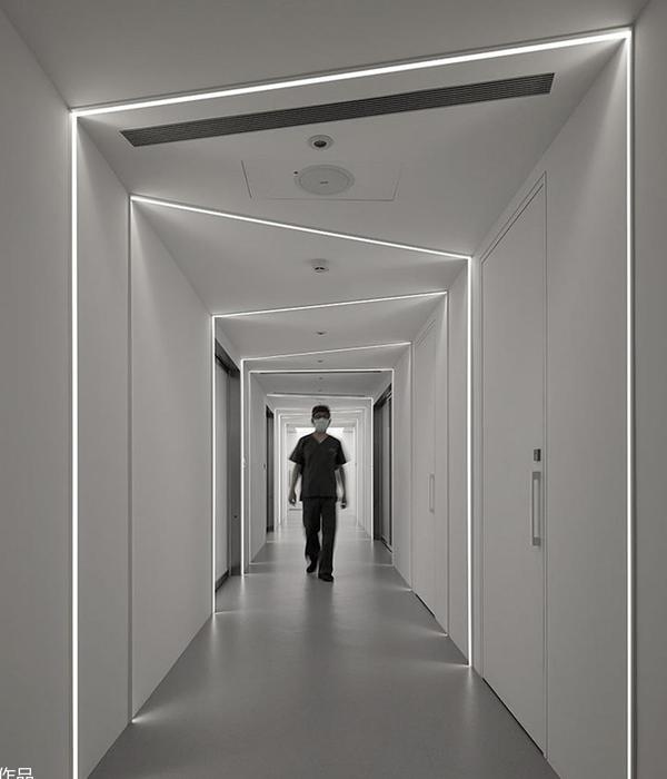
用水、石、苔、树四个篇章来谱了整个空间内的起、承、转、合、聚,看似在功能以外的不同材质却又十分和谐统一的四个空间,平衡着整个动线的气韵秩序,暗藏了模数体块,同时穿插着建构,以有机的带着虚实变幻的节奏,通过开阖、对比等手法,强化、拉长、放大空间尺度的同时,也引导观者对所在场所的感知、增强对展示内容的认同感。
Water, stone, tree moss, four chapters to within the spectrum of the whole space turn up, bearing, and, together, seemingly outside the function of different material but the harmonious unification of the four space, is to balance the whole -process artistically order, hide the module block, weaving construction at the same time, with organic with the actual situation of the changing rhythm, through the comparison methods, such as open close, While strengthening, elongating and magnifying the spatial scale, it also guides the viewers to perceive the place and enhance their sense of identity to the display content.
我很喜欢树院的那部分,如果抛开设计参与者的身份,我会不由地被那些灌木、蕨类、槭树、菖蒲所吸引,在一线城市的最高处,那些带着旺盛生命力的存在本身就代表着时代科技,体现着人与自然的和谐、人内心向往的平静和价值观。
I like court that part of the tree, if you design the identity of the participants, I will not be attracted to those bushes, ferns, maple, calamus, the highest office in the first-tier cities, those with a strong vitality existence itself represents the era of science and technology, embodies the harmony of man and nature, people are yearning heart calm and values.
In addition to having more profound details than all previous projects, how to better and more appropriate infiltration of humanistic care has been fully applied in this project. The furniture in the "Tea Courtyard" and "Academy", which have excellent views of Shenzhen, is movable, which is convenient for different scenes to be presented in a new way in the future. In fact, all the Spaces, including the reception and the two VIPs, are equipped with the properties of hosting various activities and participants. In the final analysis, space needs the unity of function and beauty.
我一直喜欢设计的一大原因是,需要不断地学习相关的专业知识。康养的理念、如何适老、怎样安全,从室内无高差到助力扣手、坐式厨房,拉线报警器的设置到防雾镜面角度及浴室的软质隔断,对细节更深层次的思考和使用……还包括了解怎么转移不方便人士时的姿势和正常 85 岁后的关节机能等等。很感谢平安臻颐年这个项目,让我和我的团队深入探究了康养更专业的领域。感谢平安集团的支持,使得作品完成度很高。
One of the reasons I have always liked design is that I need to constantly learn relevant professional knowledge. The concept of health care, how to be old, how to safety, from indoor no height difference to help buckle hands, sitting kitchen, pull alarm Settings to fog-proof mirror Angle and bathroom soft partition, on the details of deeper thinking and use...... It also includes learning how to move an inconvenient person and how joints function normally after age 85. I am very grateful for the project of Ping An Zhen Yinian, which allowed me and my team to explore the more professional field of health. Thanks to the support of Ping An Group, the completion of the work is very high.
△ 平面图
Floor plan of Pingankang Exhibition Hall
样板间设计
Model room design
活力公寓兼顾生活便利性与生活多样性 专为自理长者打造
卧室独立,大方简洁,搭配高效率起居厅 让生活更加自主自由
Vitality apartment is designed for the elderly who take care of themselves by taking into account the convenience and diversity of life. Independent bedroom, generous and simple, with high efficiency living room to make life more independent and free.
项目名称:平安臻颐年
Project name: Ping An Zhen Yinian
项目地点:深圳福田区平安金融中心 77F
Project location: 77F, Ping an Financial Center, Futian District, Shenzhen
项目规模:2100
Project size: 2100
主持合伙人:琚宾、刘胜男/水平线设计
Presiding Partners: Ju Bin, Liu Shengnan/Horizontal Design
设计团队:杨怡嘉、廖纯赟洢、陈茂生、张哲雄、黎珠、全灵佐、杨文浩
Design team: Yang Yijia, Liao Chunyun 洢,Chen Maosheng, Zhang Zhexiong, Li Zhu, Quan Lingzuo, Yang Wenhao
软装/物料团队:魏来、岑玉华、潘周婧、邓扬文、邱炯斌、陆跃飞
Soft decoration/material team: Wei Lai, Cen Yuhua, Pan Zhoujing, Deng Yangwen, Qiu Jiongbin, Lu Yuefei
业主方:平安集团
Owner: Ping an Group
摄影:井旭峰、林惠敏
Photographs: Jing Xufeng, Lin Huimin
内容策划 /Presented 策划 Producer:知行排版 Editor:Tan 校对 Proof:Tan 图片版权 Copyright:原作者知停而行
{{item.text_origin}}


