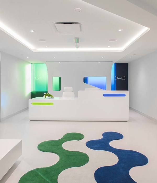
- 项目名称:太原查觉医美
- 设计方:末染设计
- 项目地址:山西省太原市
- 建筑面积:100
- 摄影版权:RICCI空间摄影
如果给人们『虚无』,人们能够从中思考『虚无』可以实现什么。
If “nothingness” is given to people, people can think about what “nothingness” can achieve.
——安藤忠雄
01.
想象驱动着空间的边界
Imagination drives the boundaries of space
沉浸的环境下,肌理所包裹的空间,隐秘深邃的尺度, 带来前所未有的冲击感与未知力量。嘈杂与安静的转换,光影与空间的交互,变幻的月球,彰显着它的潮汐力,其自然力量指引着我们探索内部空间。
Under the immersive environment, the space enclosed by the texture and the hidden and deep scales bring unprecedented shock and unknown power. The transition between noise and silence, the interaction of light and shadow and space, and the changing moon show its tidal force, and its natural force guides us to explore the inner space.
▲入口空间概览 Overview of the entrance space
从入口往里进入室内的区域,将生硬的阳角变圆润,透着微光的洞口顺应这地面灯带的引导,提前预告了温暖且舒适的空间属性。散射灯带、矩形展格、弧形墙体以及通往未知的洞口等结合品牌本身的理念和对与空间的创新,构成了一个在未知中探索的故事。
Entering the indoor area from the entrance, round the blunt sun corners, and the faintly luminous opening conforms to the guidance of the light strip on the ground, predicting the warm and comfortable space attributes in advance. Combining the brand’s own concepts and innovations with space, such as diffuser light strips, rectangular booths, curved walls, and openings leading to the unknown, constitute a story of exploration in the unknown.
与查觉CHANGE品牌理念的结合,将能量的碰撞、扭曲、自由的张力,通过流动的线条及独特的动线在空间中表达出来。向上,发散,反射,悬挂及大片柔和纯粹的颜色,围绕着CHANGE的品牌扩散。盘旋环绕的动线引导着体验者的方向,行走的人成为空间里最亮的元素,最终形成这家极具自身吸引力的查觉医美·太原店。
The combination with the brand concept of Chajue CHANGE expresses the collision, distortion and free tension of energy in the space through flowing lines and unique moving lines. Upward, divergence, reflection, suspension and large soft and pure colors spread around the CHANGE brand. The circling moving line guides the direction of the experiencer, and the walking person becomes the brightest element in the space, and finally forms this very attractive Taiyuan store.
02.
品牌文化/空间特质
Brand culture/space characteristics
基于原来的场地是位于写字楼内的两个独立空间 ,如何建立有趣及有效引导人群的动线是末染团队一如既往重视的问题。而在平平无奇的楼层过道内,让查觉CHANGE成为独树一帜、显眼但同时内敛的存在是设计团队的根本目的。
Based on the original site being two separate spaces in the office building, how to create an interesting and effective way to guide the movement of the crowd is a problem that the finishing team always attaches great importance to. In the mediocre floor aisle, it is the fundamental purpose of the design team to make Chafee CHANGE a unique, conspicuous but at the same time introverted existence.
▲空间生成 Space generation animation
▲前厅功能区 Foyer function area
▲步入中庭 Step into the atrium
我们提取品牌的DNA-自由、个性、探索,而吸引力则是其核心的本质。像是地球忠实的好伙伴月球,依附这引力的作用周而复始的环绕地球旋转。融合品牌气质及提取自品牌理念中的引力,在人与空间的共同作用下,创造出一个无法被定义的想象共同体。
We extract the brand’s DNA-freedom, personality, exploration, and attractiveness is its core essence. Like the moon, the earth’s faithful and good partner, it revolves around the earth again and again depending on the action of this gravitational force. The fusion of brand temperament and the gravitation extracted from the brand concept, under the joint action of people and space, creates an imaginary community that cannot be defined.
03.
轨道外的神秘天体
Mysterious celestial body outside the orbit
吊顶的造型作为新增结构,所以比层高要矮,而从空间缝隙中仰视这个造型的时候,目光又如同星轨般层层递进;仔细一看,不知从何而来的光影在沟壑的最上方洒下,光影正沿着墙体潸然下落。
The shape of the suspended ceiling is a new structure, so it is shorter than the height of the floor. When looking up at this shape from a gap in space, the gaze is like star trails; when you look closely, there is light and shadow coming from nowhere in the gully. The light and shadow are falling along the wall.
▲中庭全景 Atrium panorama
▲中庭轴测图 Axonometric view of the atrium
设计师运用体态份量感,通过星系间的相互吸引的一个进化方式,从而得到一个富有张力且力量感的向上体验。整体造型由七个不同直径的同心圆旋转组成,圆形之间的高低错落排列,最终形成了空间中最引人注们的黑洞。而黑洞中渗出的光束,也见证无数璀璨的星星与它擦肩。
The designer uses the sense of posture and weight, through an evolutionary way of mutual attraction between galaxies, so as to get a strong and powerful upward experience. The overall shape is composed of seven concentric circles of different diameters rotating, and the heights and lows between the circles are arranged staggeredly, which finally forms the most eye-catching black hole in the space. The beam of light oozing from the black hole also witnessed countless bright stars rubbing shoulders with it.
▲依附空间形成的休息区 Relying on the rest area formed by the space
▲顺应空间,保持克制 Follow the space, Remain restraint
弧形盘绕的灯带结合连贯空间结构,顾客在空间中沿着光的指引,移动、停留、感受、驻足,进入中庭的休息区后,抬头仰望,犹如浩瀚星系中的天体围绕着轨道转动,如此一来,空间和人便有了互动,自成风景。
The arc-shaped coiled light strip is combined with a coherent spatial structure. Customers move, stay, feel, and stop along the direction of the light in the space. After entering the rest area of the atrium, they look up, as if the celestial bodies in the vast galaxy revolve around their orbits. In this way, space and people interact and become landscapes by themselves.
04.
被光吸引
Attracted by light
空间中所有的动线,都围绕着中庭发散而形成了引力的自然动线。而中庭的所在处则是空间中最暗的地方,前方的洞口光,沿着地面灯光指引的方向,带人们走向空间的深处。
All the lines of movement in the space diverge around the atrium to form a natural line of gravity. The atrium is the darkest place in the space. The light from the opening in front, along the direction of the ground light, leads people to the depths of the space.
▲从后区望向前区 Looking from the back area to the front area
沿着中庭向里踏向未知的旅程。随着盘旋的道路逐步入胜,一点点窥探着神秘的内部空间,如同黑洞般吸引着人们进入且向内延伸。
Walk along the atrium into the unknown journey. As the circling road gradually wins, a little peek into the mysterious inner space, attracting people to enter and extend inward like a black hole.
设计师希望通过设计持续吸引着客人的好奇心。后区空间的色调完全不同于中庭的幽暗,呈现出来的则是极度温柔的色调,地面的灯带顺着墙面攀爬,在墙面肆意的伸展,而闭环的流线使顾客自然而然中便游逛穿梭完了整个展示区域。
The designer hopes to continue to attract the curiosity of the guests through the design. The tone of the rear space is completely different from the darkness of the atrium, and it presents an extremely gentle tone. The light strip on the ground climbs along the wall and stretches freely on the wall, while the closed-loop flow line makes the customer feel natural. Wandering through the entire exhibition area.
▲颜色区分动静,光作为界限 Use color to distinguish movement and light as a boundary
为了维持空间幽暗的整体调性,在色彩的选择上我们做了很多次的推敲。以深色为基调,纯粹的材质通过互相作用,在反射与折射的多重影响下创造出奇特的光感。最终在多个自由弧形的空间体块中,多重反射下柔和均匀的光感造就了纯粹的空间仪式感,看似强势且霸道的体块却在人们行走入内时呈现柔情似水水的灵动感。
In order to maintain the overall tone of the dark space, we have done many scrutiny on the choice of colors. Based on dark colors, pure materials interact with each other to create a peculiar sense of light under the multiple influences of reflection and refraction. Finally, in multiple free arc-shaped space blocks, the soft and uniform light feeling under multiple reflections creates a pure sense of space ritual. The seemingly powerful and domineering block presents tenderness like water and agility when people walk inside. feel.
05.
回归空间的本质
Back to the essence of space
温柔的调性配以可控的漫反射光源皆有效的提供了使用者可自由选择的柔和光效,令使用体验更自由及浑然沉浸,同时也提供仪器操作者更安全的皮肤检审光效。而高效率的VIP室布局释放了大面积的空间予以公区形成更优越的公共体验令‘概念’,有了更充裕的演绎区间。
The gentle adjustment and controllable diffuse light source effectively provide users with soft light effects that can be freely selected, making the experience more free and immersive, and also providing the instrument operator with safer light effects for skin examination . The high-efficiency VIP room layout releases a large area of space to form a better public experience in the public area, so that the ‘concept’ has a more abundant interpretation area.
▲VIP管理室 The VIP room
从设计技法角度,’极简’意味着从设计初期即对于可能性的材料与工艺有高度系统性驾驭感。我们常把这种驾驭感粗糙的理解为‘收口’,以至于‘创作’‘材料’‘工艺’这原本相辅相成的系统性三点之间被片段式的斩裂。
From the perspective of design techniques,’minimalism’ means a high degree of systematic control over possible materials and processes from the early stage of design. We often interpret this sense of control as ‘closing the mouth’ so that the originally complementary systemic three points of ‘creation’, ‘material’ and ‘craft’ are fragmented apart.
人们总乐衷于赞颂‘要去倾听每一颗石头自己的声音’这种低智化的呓语,却避免通过复杂深刻的洞悉去触碰当材料更趋近一种学科时的“系统性”。
People are always happy to praise the low-intellectual babble of’Listen to each stone’s own voice’, but avoid using complex and profound insights to touch the “systematic nature” when materials are closer to a discipline.
▲房间一角 Corner of the room
光,是幽暗空间下唯一主体,是虚幻与现实的对话媒介,通过光,超自然,未知,探索,梦幻的情绪被诉说涌现。真切的感知追本溯源,呈现于时间之上。
Light, the only subject in the dark space, is a dialogue medium between illusion and reality. Through light, supernatural, unknown, exploration, and dream emotions are told to emerge. The true perception goes back to the source and is presented in time.
06.
美和自由
Beauty and freedom
▲水吧 Bar
▲中庭造型细部 Atrium styling details
▲微妙的空间氛围 Subtle space atmosphere
人与人之间很多的关联都未必是以语言来连接,有时“润物细无声”的情感传递才是沟通的更高境界。利用空间给予人更深层的五官享受,让客人们身心同步,便是拢合。一切的初始状态,杂乱无序形成一个有机的空间,让时间和光轻柔地流入内部场所。在整个空间序列上,我们并没有拘泥于横纵线上的排列,而是通过分割、叠加、等设计手法,使空间错落有致,同时注入空间应有的自由与寂静。
Many connections between people are not necessarily connected by language. Sometimes the emotional transmission of “moisturizing things silently” is the higher level of communication. Using space to give people a deeper enjoyment of the five senses, allowing guests to synchronize their body and mind is to close together. Everything in the initial state, chaotic and disorderly forms an organic space, allowing time and light to flow gently into the internal place. In the entire spatial sequence, we are not constrained on the arrangement of horizontal and vertical lines, but through design techniques such as segmentation, superposition, and so on, to make the space staggered, and at the same time inject the freedom and silence that the space should have.
▲平面布置图 Layout plan
项目信息——
项目名称:查觉医美
设计方:末染设计
项目设计&完成年份:2021.04设计2021.10完成
主创及设计团队:孟飛、末染设计
项目地址:山西省太原市
建筑面积:100
摄影版权:RICCI空间摄影
装修主材:大理石、艺术涂料
{{item.text_origin}}

