悦汇城蜕变 | 旧市场焕发新活力
- 项目名称:悦汇城
- 业主:越秀地产
- 项目地点:广东省广州市西湾路150号
- 项目类型:购物中心
- 项目面积:280,000 平方米
- 完工时间:2020年9月26日
- 设计范围:建筑,外立面,室内改造设计
- 主创设计师:Josh Goh
- 灯光设计:RDI瑞国际
- 结构顾问:广州瀚华
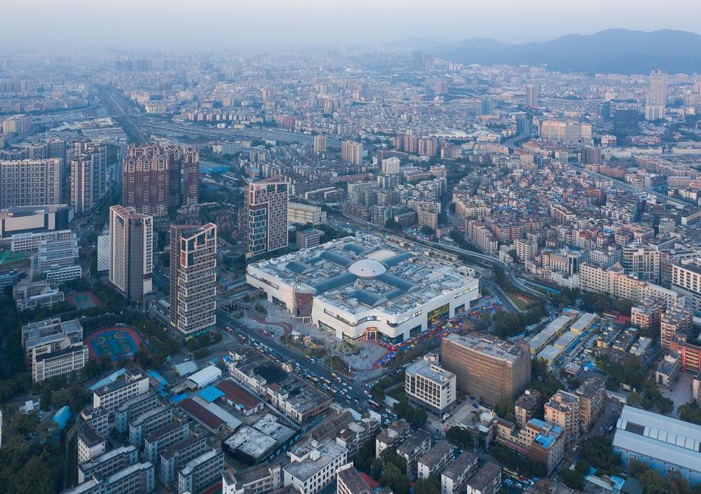
▲蜕变后的悦汇城©吴鉴泉
悦汇城,地处广州市荔湾区北部,紧邻南北干道西湾路,经过600天的改造,于2020年9月落成,成为广州第二大商场、广州西部最大型的综合商业项目,为周边片区乃至整个广州带来了新的活力,带来激活旧城,更新城市形象的作用。
YUE City is located next to Xiwan Road in the northern edge of Liwan District in Guangzhou, China. After going through a demanding 600 days of transformation effort, it was unveiled to public in September 26th 2020 as the largest shopping mall in the western district and the second largest in overall Guangzhou city, turning a new page in urban revival.
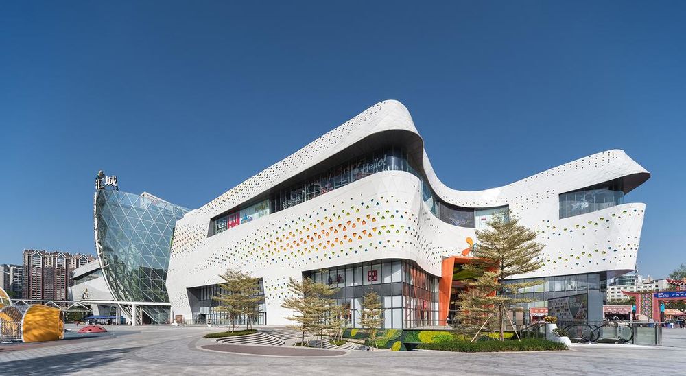
▲蜕变后的悦汇城©吴鉴泉
广州有“千年商都”的美誉,荔湾区是广州老三区之一,俗称“西关”,古往今来是中国对外通商和文化交流的重要口岸,也曾是著名的外贸商埠-十三行所在地。本案距离广州白云机场27公里,广州南站18公里,距离广州火车站仅2公里。
Historically known as the capital of commerce, Guangzhou City is one of the major gateways of commercial and cultural interchange. The site sits on the northern edge of the Liwan District, about 27km from the Guangzhou Baiyun International Airport, 18km from the Guangzhou South Railway Station, and 2km from the Guangzhou Railway Station.
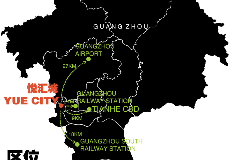
▲悦汇城区位与广州商圈布局© DYML
项目改造前,曾是广州规模最大的三大旧改项目之一:财富天地国际鞋业广场,并且是由80年代的旧水泥厂变身而成。其周边紧邻广州火车站、省市客运站,当时全场入住3000多商家,在广州大城市发展历史里是泛火车站批发商圈的重要商贸场所之一。而随着时代的进步,财富天地广场逐渐褪色:单一的业态、设计老旧、流线复杂以及电商冲击,日渐消失昔日繁荣的景象。
Back in the 80’s, the site was once a cement production plant which was an iconic landmark of the developing communities. In 2006, in accordance with the government’s vigorous plan to upgrade the business service industries, and as part of the three major urban reform projects at the time, the plant was demolished to make way for the Fortune World International Footwear Wholesale Plaza which housed more than 3000 tenants.It was a historical effort ever made in the local wholesale industry to consolidate majority of the footwear wholesalers under one roof.However, with the fast growing competitions particularly the e-commerce, the traditional wholesale market has become lethargic and obsolete. Many dull and cumbersome wholesale big boxes were either converted into different uses or left vacant.
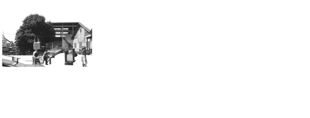
▲悦汇城项目改造变革历史© DYML
2018年我们开始了悦汇城的改造设计任务:将一个旧有的批发专业市场改造成全功能型家庭式潮流购物中心。毫无疑问,重塑、激活与繁荣成为了该项目的核心。
In 2018 Yuexiu Group approached DYML as the lead designer and was tasked to convert the existing building into a regional shopping landmark that will fill the huge retail void in the Liwan and neighboring districts.
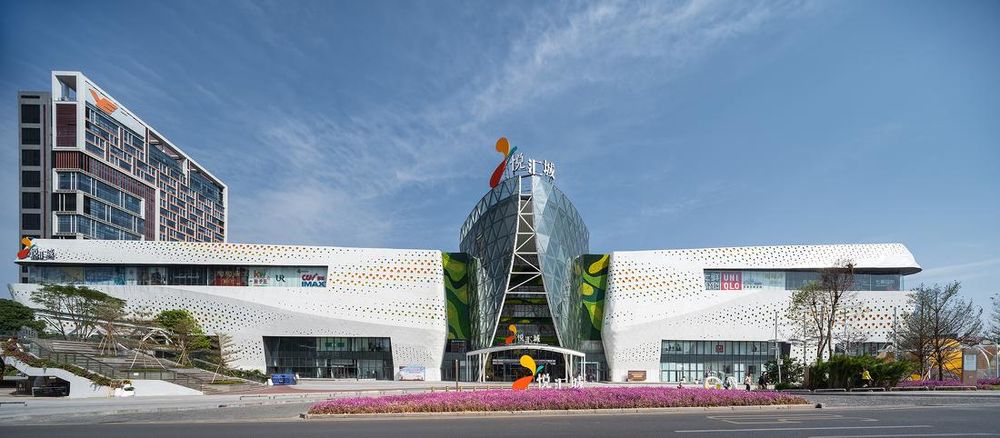
▲悦汇城沿西湾路展示崭新的姿态©吴鉴泉
原状条件
Existing Conditions
一、项目周边
1.SiteContext
悦汇城北侧与西北侧为新建居住社区;在东侧相隔了广汕、广九铁路的是典型岭南城中村-王圣堂,汇聚了大量在火车站周边批发城工作的人群,靠横跨铁路的人行天桥连接本项目;南侧与西南侧是荔湾旧城,拥有多所广府知名中小学,因此周边3公里内的客户群体肖像以亲子家庭为主。
The site is surrounded by newly developed residential communities at the north and west sides. To the east, separated by commercial railways is one of the few traditional southern quarters that houses many workers in the wholesale industry. The quarter is connected to our site only by a pedestrian bridge over the railways and has huge daily traffic. The south and west sides of the sites are the older parts of the town which have many popular elementary and middle schools. Therefore, the consumer group of the project is mainly targeted at young families with children.
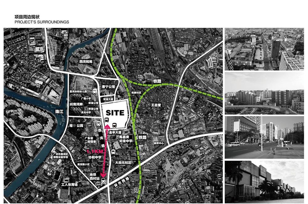
▲项目周边概况 © DYML
前期项目周边考察调研阶段,不难发现项目周边沿街的旧城交通与步行体验欠佳,离项目最近的地铁站广州五号线西村站约一公里,步行在西湾路整体人车混杂,缺少开阔的城市节点。对于周边片区也缺乏一个市民日常体验与聚集和休闲的一站式场所。市民对于该片区的印象依然停留在“水泥厂”、“批发城”的灰色、混杂印象。
The Xiwan Road at the west is the one and only primary access to the site, and the nearest subway station is the Xicun Road Station of line No. 5 at about 1km away. The huge traffic on Liwan Road and confused pedestrian walkways, coupled with the lack of urban pockets has made the travelling experience less desirable. The old image of the lackluster and disorganized cement production plant sticks in the mind of the community.
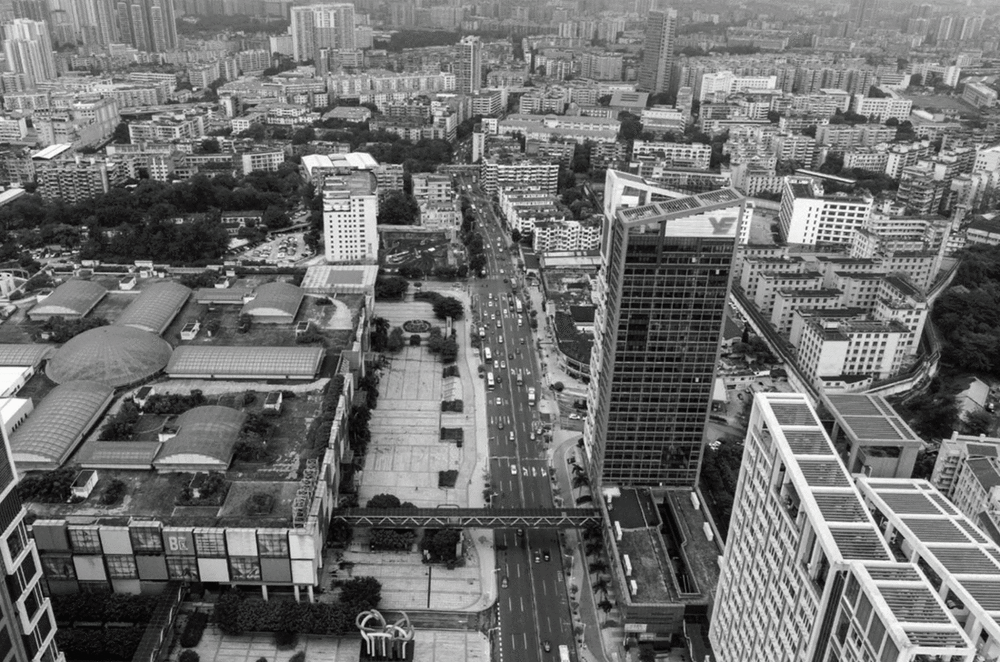
▲项目周边现状
图源:DYML & 网络
二、原建筑条件
2. Existing Structure
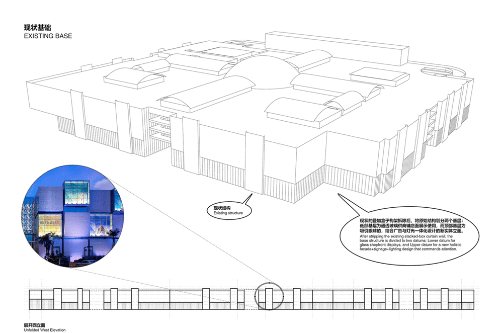
原建筑条件为四个方块盒子组成的大的矩形体块,约为100米x90米,地上五层,地下两层,总建筑面积约28万平方米,通过十字主动线和环字次动线串联起来。位于体块中央是面积达1900平米的圆形中庭。主体矩形体块的东侧,是原批发城设置随层停车的停车楼。原外立面是灰色凹凸的波纹铝板,整体规则缺少变化。南北与西侧退让了宽阔的前广场,西南西北朝向道路节点预留了下沉广场,但由于停业,已很少居民走近基地。很明显,这是原有的批发专业市场独有的平面布局与整体形象,停业之后更显得与这个时代格格不入。改建条件对原有的建筑主要结构、建筑条件有苛刻的约束要求。出于可持续发展和项目成本等因素,原建筑消防策略、天窗范围、主机电设备、主要结构等仍可正常运作的内容,需要尽量保留和利旧。
The existing building was four identical square blocks, 100m long by 90m wide, 5 levels above ground and 2 levels below, a total of 280,000 sqm of building area organized by cruciform shaped promenades. At the intersection was a majestic 1,900 sqm circular plaza capped with a domed skylight. There was a five levels annex at the east side of the main building, used to serve predominantly as loading docks of the wholesale stores. Surrounding the building particularly the west side were huge entry plazas with no distinctive identities. Meanwhile, the facade was composed of identical square boxes all around which was quite easy to lose direction in such symmetry and lack of hierarchy. Clearly, it was designed for a wholesale market and has becomes out of place.
The existing building posed a huge limitation for major changes. With time, cost and sustainability in consideration, we have decided to keep structural changes to the minimum, recycle most of the major equipment, and stay on course with the existing fire escape strategy. Our proposed design will have to work around these restrictions and improvise.

▲改造前条件
图源:DYML & 网络
设计概念:蜕变
METAMORPHOSIS
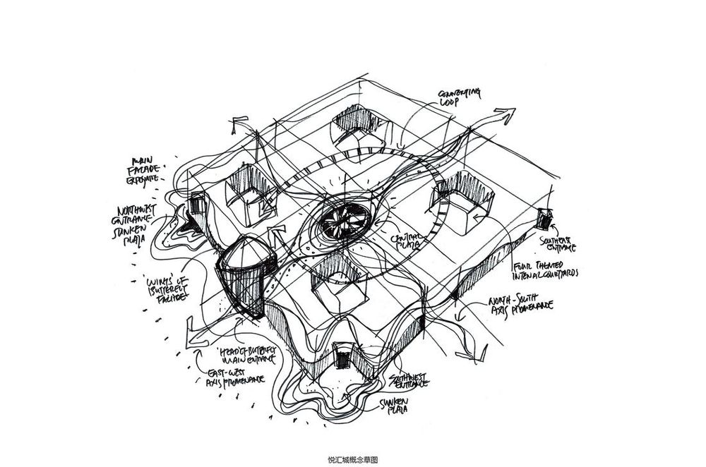
我们从建筑立面、室内布局、业态规划、动线组织四个维度对原建筑进行改造设计,引入“蜕变(METAMORPHOSIS)”的概念,将旧有的专业市场由内而外蜕变成一个集娱乐亲子、休闲体验、零售潮流、互动主题、人文情感、文化艺术等新型复合功能的商业中心,提供各种购物、漫步、休闲、聚会和放松的机会。
同时打破原项目旧有的城市印象,以一个更加鲜明、灵动、轻盈、标志、现代的姿态和形象呈现在了老城区之中,打造一个富有场所感、全维度的城中热点。
From a holistic approach towards the program, architectural design, and space planning, we arrived at the Design Concept - METAMORPHOSIS, a complete transformation that signals the rebirth of the development and rejuvenation of the community. It transforms the current big boxes into a series of fun and meaningful spaces, a joyful shopping destination, and an iconic landmark of the community.
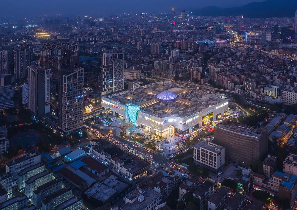
▲夜幕下悦汇城成为荔湾旧城的亮点©吴鉴泉
立面焕新
Façade Renewal
一、缤纷幕墙
一个洁白又色彩斑斓的蝴蝶
1. Colorful Screen
The Wings of a Butterfly
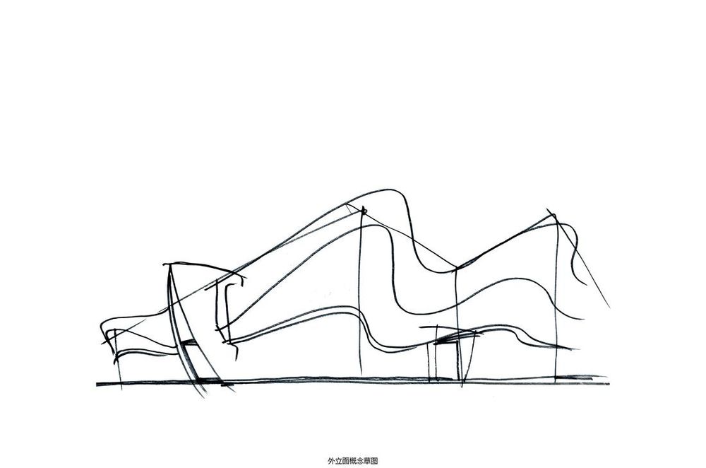
▲外立面概念草图©DYML
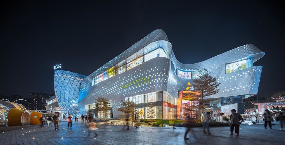
▲新的外立面呈现流线与优美感©吴鉴泉
外立面作为建筑第一印象,不局限于形式的展示,更要向城市和用户传达商场的信息和姿态,连接消费者的认同。我们摒弃原有专业市场的琐碎、灰沉与单一的城市形象,取而代之的是更现代的设计语言,通过建筑数字化表达“蝶变”的概念,让项目“蜕变”成一个更加轻盈、整体的外立面效果。
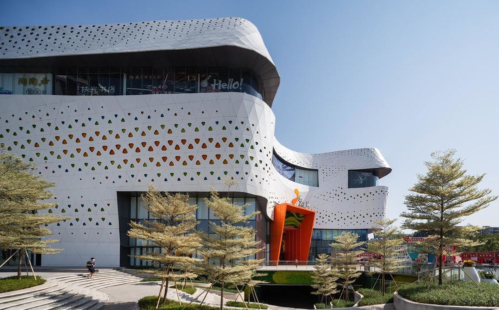
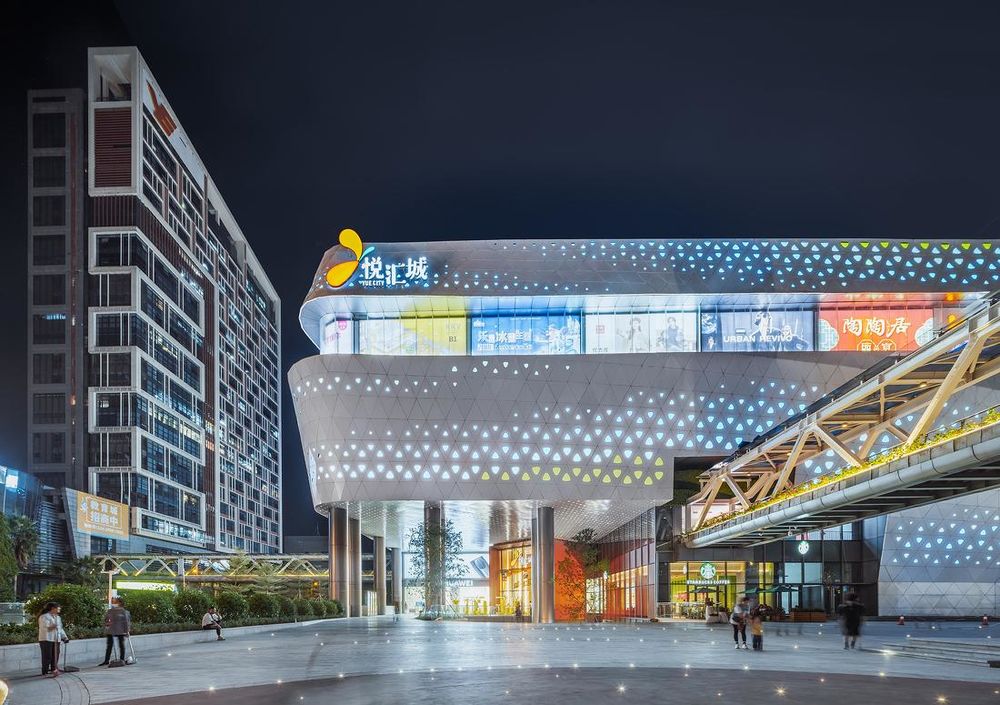
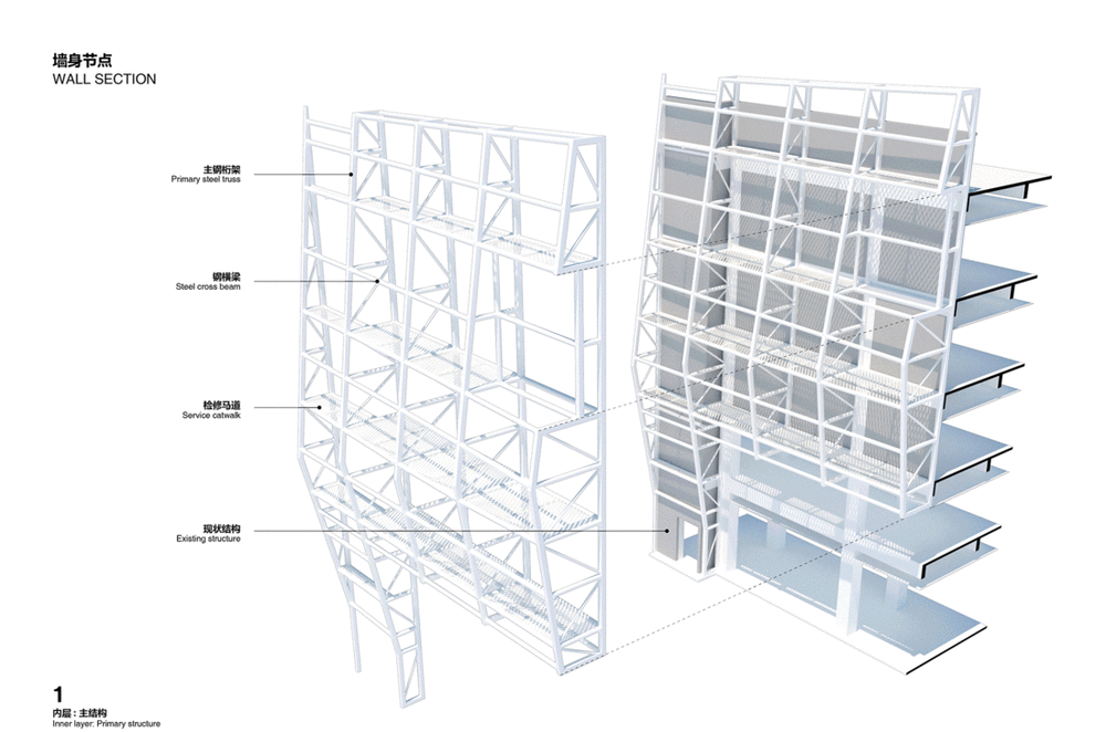
The new façade has to leave a strong impression to the city and its people. With the parametric design tools, we drape over the existing massive boxes with more than 30,000 pieces of white aluminum panels with 5 different colored LED perforations, forming undulating waves that mimic the wings of a butterfly. At night time, the LEDs are programmed to lit up an impressive show, transforming and animating the urban streetscape.
▲外立面参数化设计过程©DYML
▲白色基调外立面点缀渐变的彩色灯箱©吴鉴泉
夜景下外立面营造色彩丰富的效果©吴鉴泉
在夜晚的建筑效果营造上,我们在每个灯箱中设置单点可控的LED光源以实现柔和可变的灯光动态氛围,使得在夜景中也能增加立面的温度、动感与活力,形成独特的气质和印象,为城市带来焕然一新的面貌,从而达到“点亮”旧城的愿景。我们保留原有建筑结构的基础下,采用擅长的程序设计工作流,在整体外立面设计运用尺寸不等的白色三角铝板,创造了统一简洁的流线造型外立面,再结合蝴蝶本身的图案纹路特征,数字化逻辑去筛选3000多个铝板作渐变穿孔,置入5种颜色匹配的半透明树脂灯箱,在统一的白色中点缀了色彩,为建筑立面创造更丰富的层次,模拟了“翩翩起舞”的动态与“色彩斑斓”的调性。
▲墙身节点©DYML
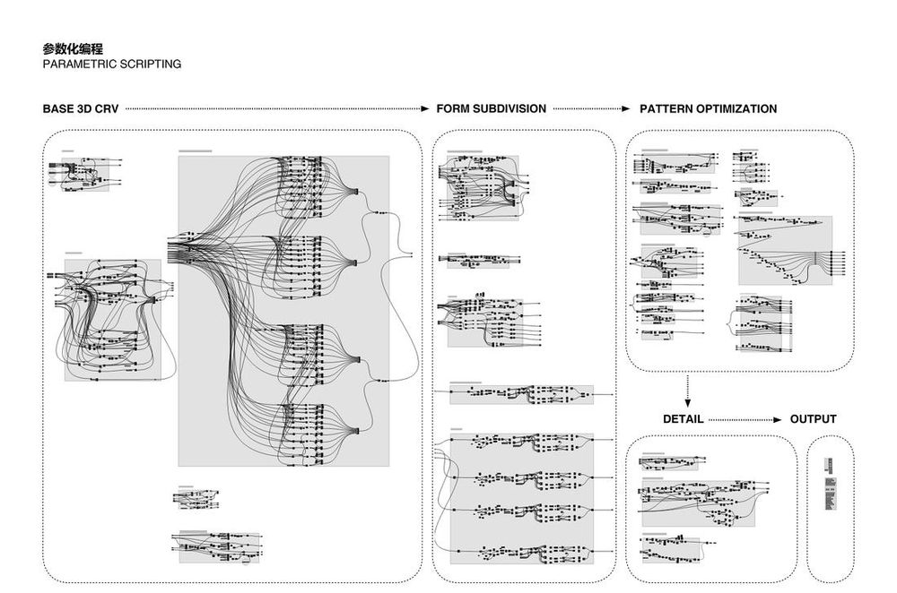
▲外立面参数化设计编程工作流©DYML
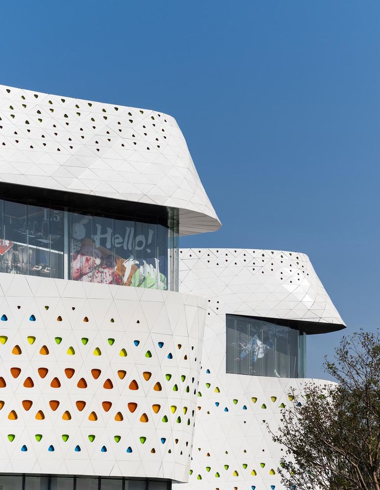
▲外立面局部©吴鉴泉
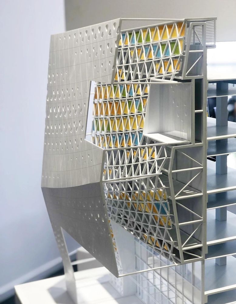
▲墙身剖面细节模型©DYML
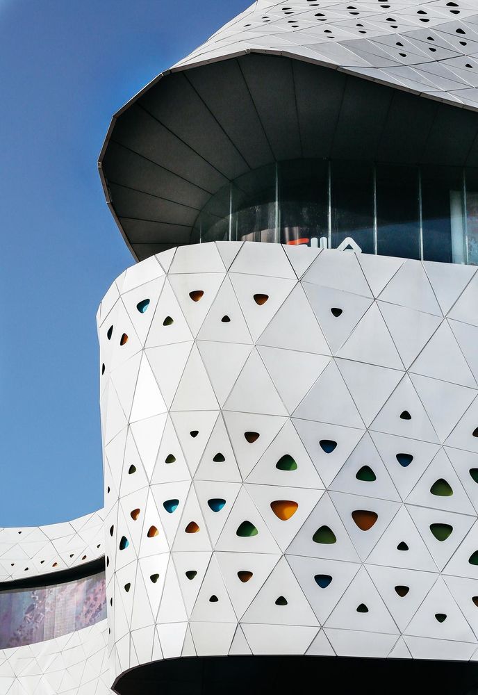
▲外立面细节© 何明智
二、电光主入口
晶莹通透的巨型LED头部
2. Grand Gateway with Mega LED
The Head of a Butterfly
沿西湾路的主立面长达200多米,建筑退让道路约20米形成大型的城市广场。我们在西立面正中嵌入巨型对称的弧形玻璃体,倾斜悬挑并凸出整体外幕墙。为了达到通透的效果,采用了280多片尺寸不一的超白玻璃,在玻璃内侧结合轻盈的格栅LED屏幕,极具昭示感地屹立在主广场。
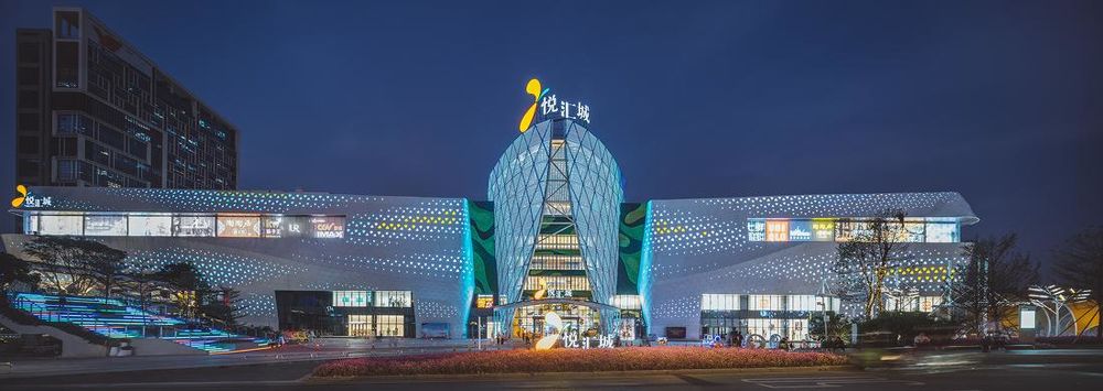
▲电光主入口成为项目的城市焦点©吴鉴泉
通透的玻璃效果打破了室内与室外的间隔,形成了室内空间、室外城市广场、城市道路与城市之间的内外远近呼应互动效果,向城市传递了项目改造后的活力。到了华灯初上,玻璃主入口摇身一变成为了城中独特的发光体,从入口就营造了具有科技感的空间感受,成为西湾路的焦点。
Along the 200m west main façade facing the urban plaza, we broke the plane and inserted a grand gateway into the building. The gateway is a set of symmetrical curved structure symbolizes the head of a butterfly made of 280 pieces of faceted glazing panels with LED media mesh. This feature creates a strong focal point and draws attention from near and far, and complements the transition between indoor and outdoor space. The new gateway design breaths new energetic vibes to the city, especially at night when the LED media mesh is lit up.
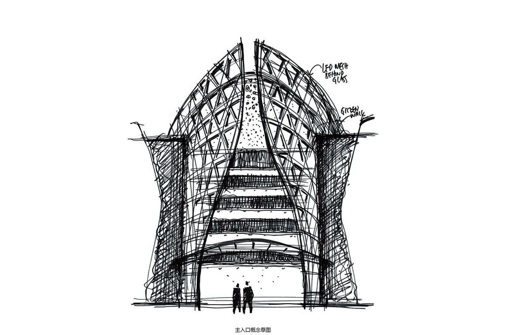
▲主入口设计草图©DYML
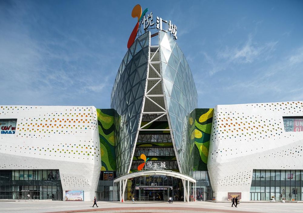
▲极具标志的玻璃主入口©吴鉴泉
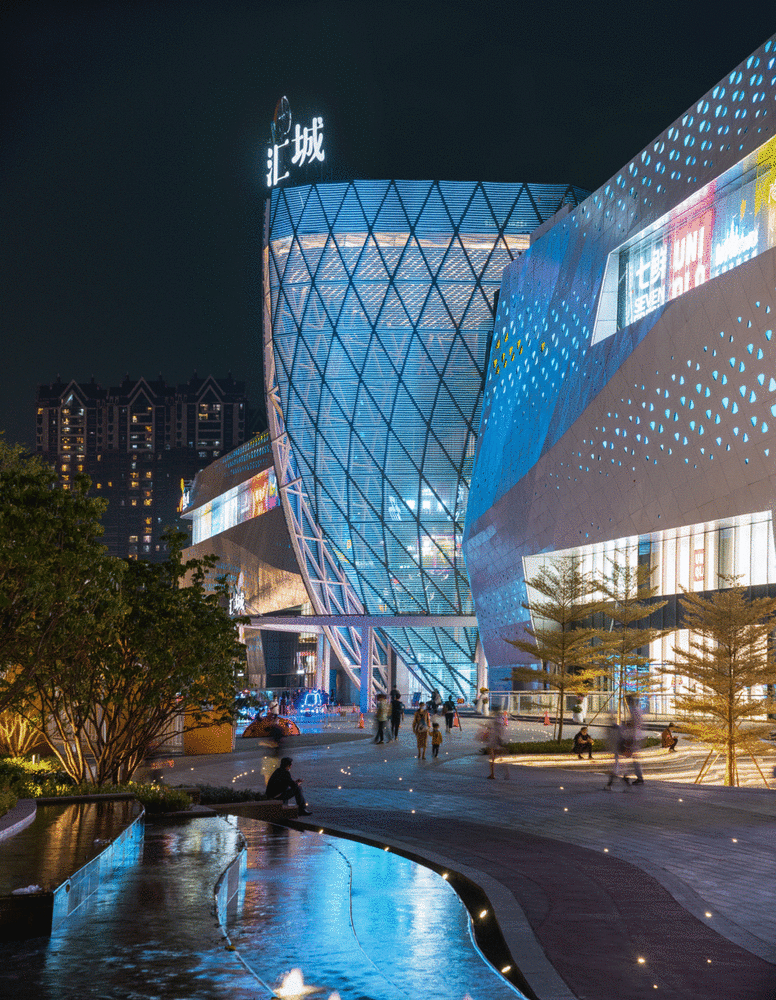
▲主入口可展示丰富的LED多媒体内容,向城市和市民展示不同的主题©吴鉴泉
三、广场与次入口
渗透与日常
3. Entrances and Plazas
Permeable and Welcoming
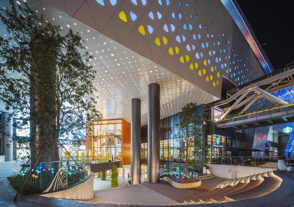
悦汇城的西南、西北两个次入口设置在城市主干道与次干道交汇点。由于场地南高北低的高差条件,分别设计两个不同尺度和形态的下沉广场,从流线上把市民从前广场渗透到负一层,使负一层的业态向外展示,提升负一层的活力。入口面朝着街角开敞,以欢迎的姿态迎接客群。行人通过前广场的台阶进入场地,再经过下沉广场进入项目内部。结合丰富的水景、绿植、互动装置、休息台阶,下沉广场不再是枯燥单调的步行台阶,而是可以成为周边居民四季日常休息、交流聚集、聊天停留的空间节点。
There are two secondary entrances each allocated at the northwest and southwest corners. The entrances are designed with sunken plazas to ease the natural slope of the site, and connect people at both the ground and basement levels. The sunken plazas not only bring values to the basement corner retail with more natural lights and visibility from the street level, but also provide social interactive venues which are articulated with four seasons landscape pods, water features and alfresco.

▲西南下沉广场剖面透视©DYML
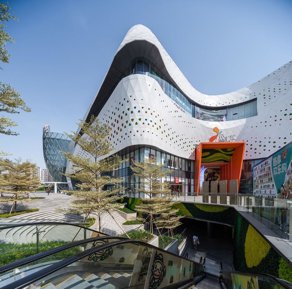
▲西南下沉广场©吴鉴泉
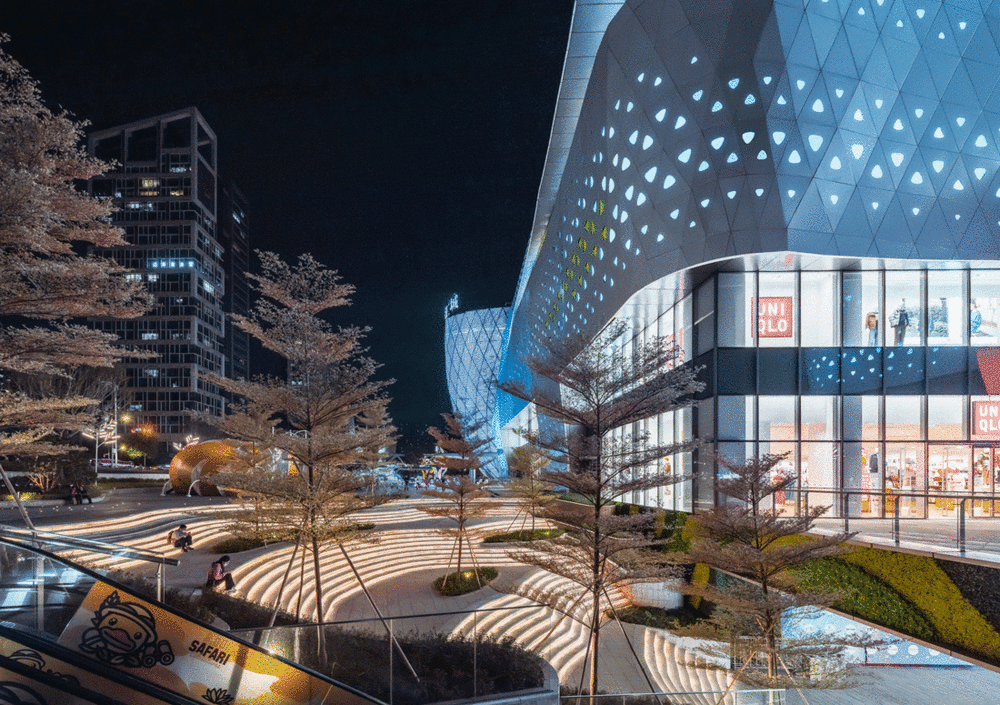
▲西南下沉广场©吴鉴泉
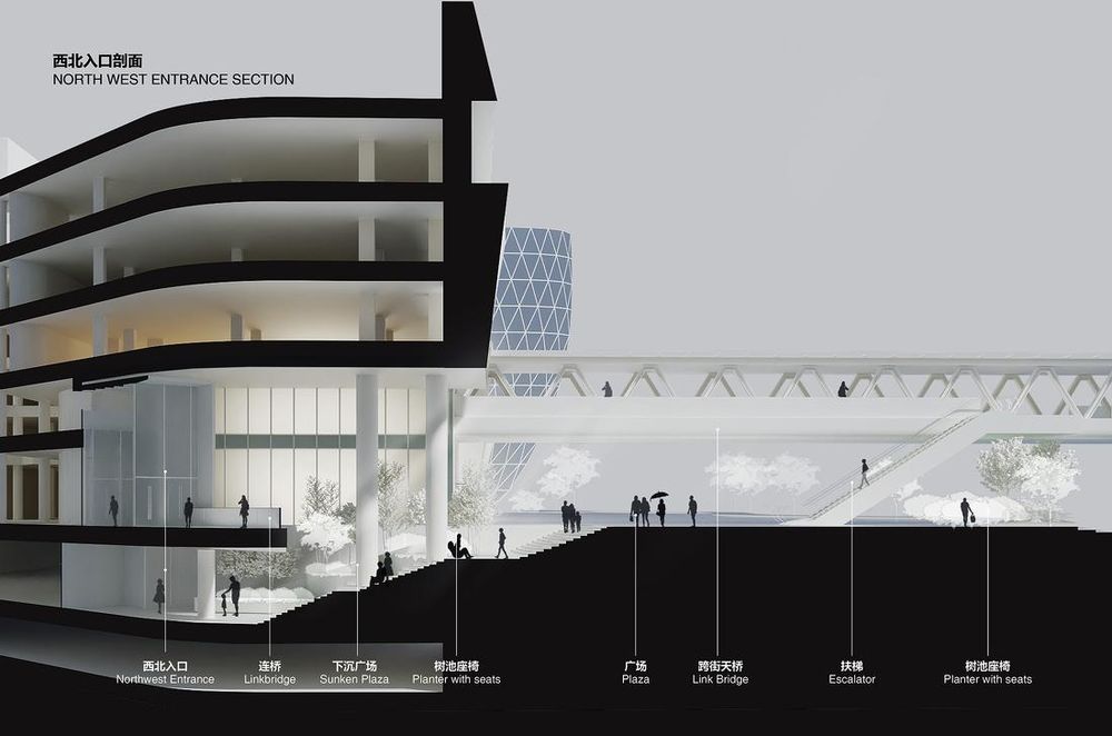
▲西北下沉广场剖面透视©DYML
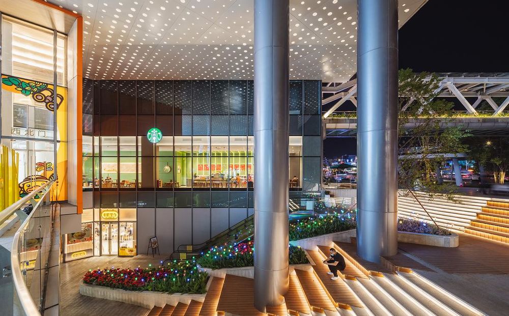
▲西北下沉广场©吴鉴泉
▲西北下沉广场©吴鉴泉
空间内核重组
Spatial Reorganization
如今建立用户的粘性不再是靠以往单纯的“购物”“消费”,而需要更多新时代消费理念和体验场所的打造,以迎合目前的用户需求。“悦游园”正是悦汇城营造体验室内空间设计的灵感源泉,我们将重点放在“一步一景”、“愉悦畅游”的概念上,把岭南特色、多媒体艺术、业态主题区、自然生态、美学场馆等缤纷多彩的主题空间贯穿起来。
Ironically a successful shopping mall nowadays isn’t built simply on the idea of shopping, but more on an integrated consumer experience. Working hand in hand with the leasing team, we came up with the idea of ’an excursion in wonderland’ where we emphasized on creating memorable scenes inspired by a mix of indigenous, artistic and cultural, natural and high-tech elements at every important intersections to heighten the sense of explorations and the joy of discoveries.
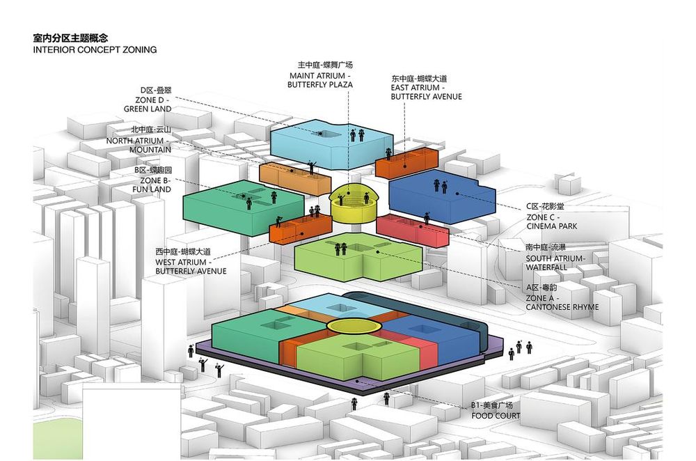
▲室内主题功能分区概念©DYML
一、动线
1. Circulation
首先在功能布局上,从批发市场改造成购物中心,需要颠覆原来的格子铺的平面布局,在不能大改原有的建筑结构条件下,重新规划的室内空间、业态布局和动线组织使其更加符合新功能需求。我们构建了“十字”主动线结合环形次动线的洄游空间,全场共设置14个大小中庭,形成四主、三副商业入口,确保客流能有效导入和横向、纵向流动。
In the efforts of converting a rigid wholesale box to a more sensible shopping mall layout with minimum impact on the existing structure, we kept the existing cruciform promenade and improved its circulation by linking to all the 14 atrium spaces and 7 entrances with a new loop. The combination of the cross and loop circulation avoids dead ends and enable people to travel easily from one point to another in a clear and simple manner.
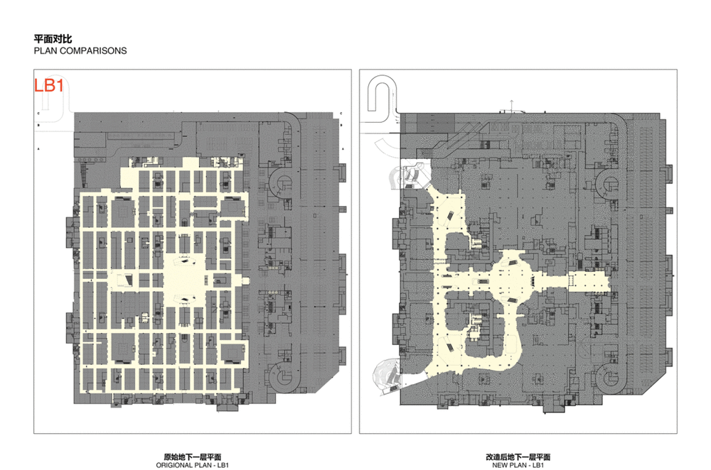
▲对原有平面改造前后对比图©DYML
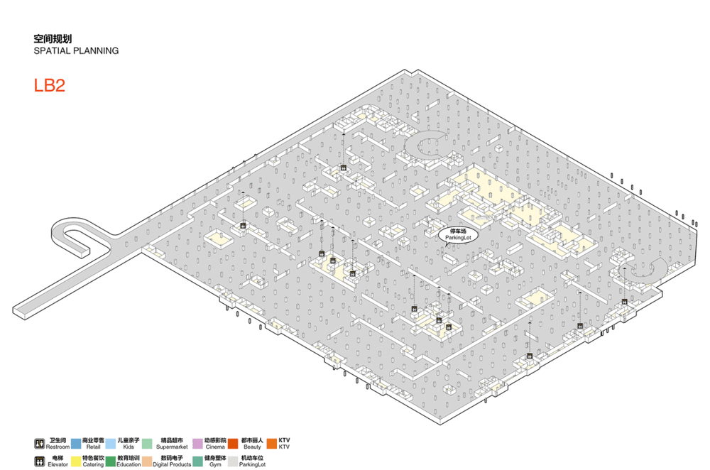
▲改造后悦汇城3D平面图©DYML
二、设计色调与语言
2. Design Tone & Language
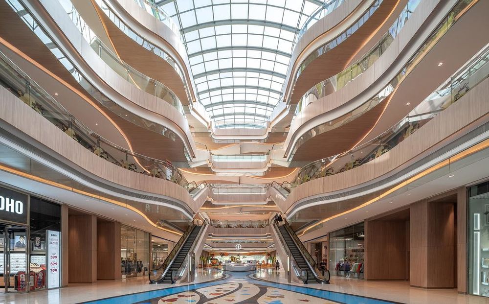
悦汇城整体室内色调以浅暖色橡木和白色为主,天花和地面采用弧线条设计语言,制造引导性,也柔化了原有建筑方正的空间感受。利用主次空间的串联叠加,各种类型业态的分区组合,创造出丰富的主题区,带来兴致盎然的购物体验。
The overall interior space uses light warm oak and white as the basic color scheme, while the floor and ceiling design utilizes curvilinear profiles in order to brighten up and soften the rigidness of the space. This also serves as a continuous backdrop for a mix of retail themes and programs.
▲暖色调与流线语言的室内空间©吴鉴泉
三、彩蝶大道
3. Grand Butterfly Boulevard
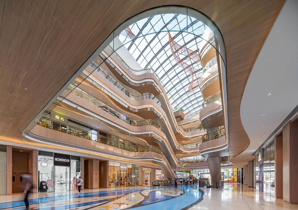
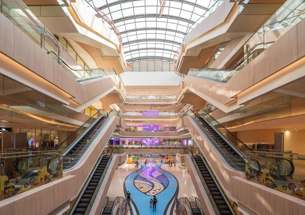
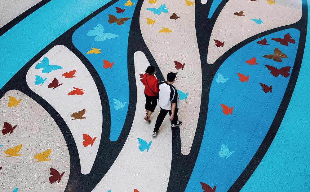
在东西向的主要动线中庭,我们大胆定制了一条“彩蝶大道”:以西入口为起点,主中庭为中心,东中庭为尾声,结合每个流线节点进行设计,颜色丰富的大道如长轴画般慢慢铺开。这条面积达接近2000平方米,长达约200米的定制水磨石主题大道,整体奠定了整体室内:“丰富”“缤纷”“生动”“时尚”的基调。在主中庭,一只巨型的“蝶后”图案,成为360度环形俯视主中庭的焦点,呼应“蜕变”的主题。
Connecting the gateway at the west, the central plaza and the main elevator lobby at the east is the Grand Butterfly Boulevard. An elaborated and colorful ribbon of butterflies pieced together by mosaic tiles, paving a meandering pathway and leading up to the Grand Butterfly Plaza with a gigantic butterfly imprint that could be viewed in 360 degrees around the atrium. The Grand Butterfly Boulevard distinguishes itself and set the tone for an exciting and lively experience inside the mall.
▲进入西主入口呈现的彩蝶大道©吴鉴泉
▲彩蝶大道成为中庭的重点©吴鉴泉
▲彩蝶大道细节© 何明智
四、蝶舞广场
4. Grand Butterfly Plaza
主中庭的蝶舞广场,是悦汇城的核心主场。原建筑是一个拥有1900平米的360度穹顶天窗的圆形中庭,预留了足够的面积承办各类活动之外,该如何打破单一的空间体验?我们引入了时下最热门的沉浸式体验的概念,通过360度全景环形LED和LED时光瀑布,运用数字技术打造一个视觉、听觉互相交融的无边界体验空间。在主中庭内,可自然生态、可瞬时四季、可科技朋克,空间的意义不再是沉静的。
The Grand Butterfly Plaza is the main attraction of the mall. It is an impressive 1,900 sqm of atrium space capped with a domed skylight structure. It is an ideal space large enough to house any promotional or social events with an unobstructed 360-degree view from all floors above. We incorporated a large vertical LED screen in the plaza and applied rings of LED panels around the balustrade in order to program a borderless sound and visual effect, an absolute immersive experience.
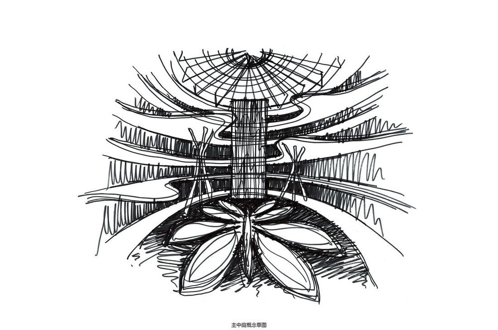
▲主中庭概念草图©DYML
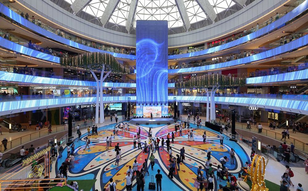
▲拥有360度LED和巨型“蝶后”图案的蝶舞广场成为了悦汇城核心主场©何明智
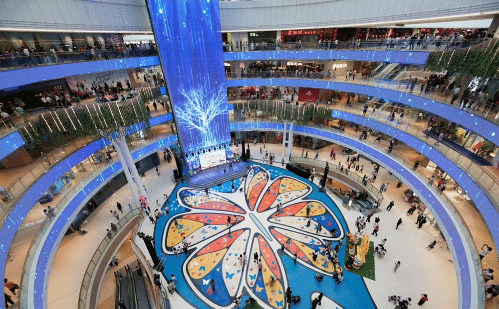
▲沉浸式主中庭 ©何明智
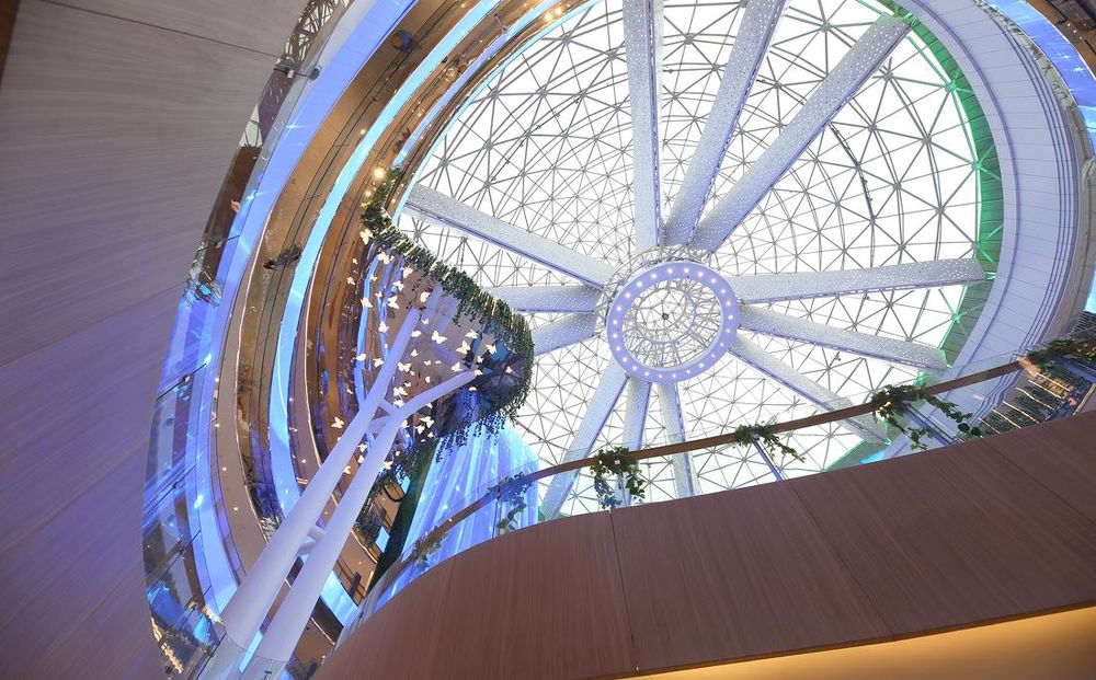
▲沉浸式主中庭©何明智
五、八大主题中庭
5. EightUniquely Themed Atriums
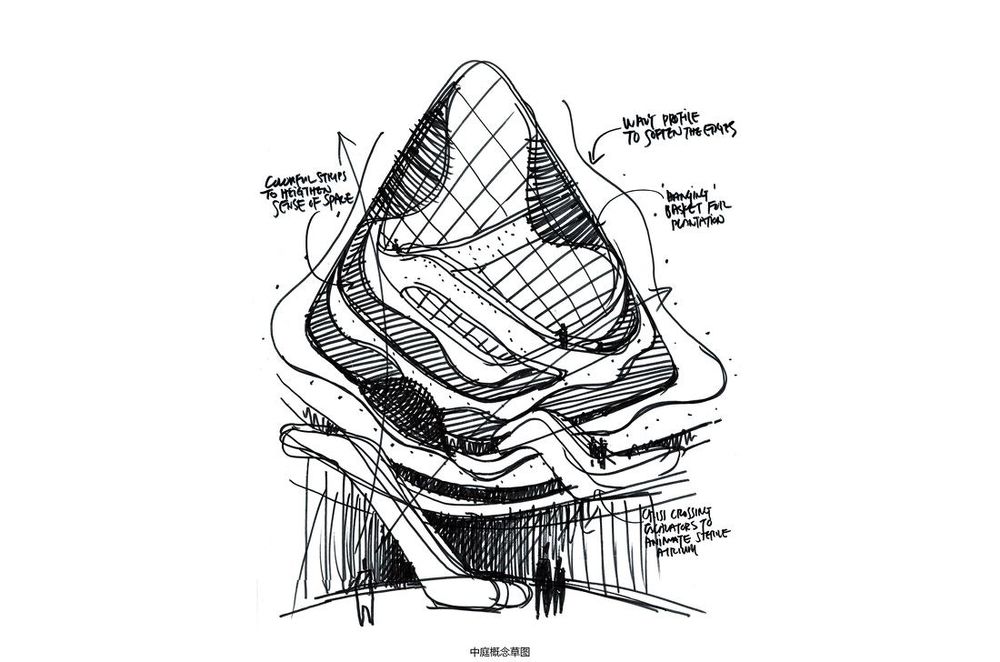
▲蝶趣园中庭概念草图©DYML
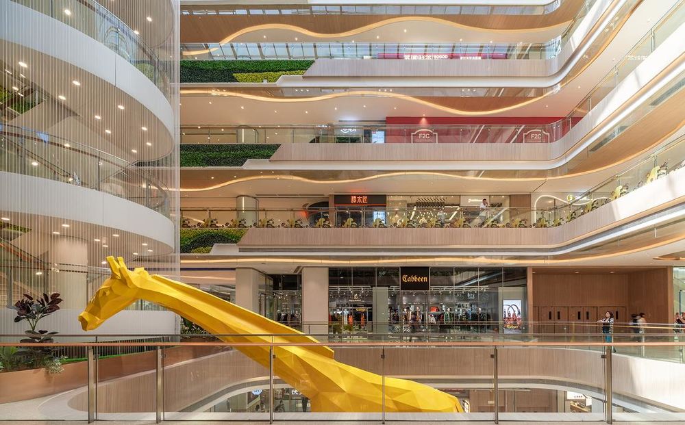
悦汇城内空间共有八大主题中庭。通过不同的设计手法,打造除了蝴蝶大道、蝶舞广场之外,还有层叠云山、珠水映月四个自然生态的主题空间,也有博粤庭、蝶趣园、花影堂、白云涧四大岭南特色主题中庭。每一个主题空间结合声、光、电、艺术造型、绿植搭配等一系列层出不穷的设计手法,让悦汇城内部变得精彩纷呈。
A total of 8 uniquely themed atriums are purposefully planned across the mall. Besides the Grand Butterfly Boulevard and Plaza, there are also the Canton Avenue which is a clash of trend and culture, the Butterfly Wonderland which engages lifestyle techs and sports, the Floral Fantasy World that inspires imaginations and creativities, the Garden of Oz which is filled with trendy games and entertainments, and last but not least, the Cascading Mountains and the Streaming Waterfalls. It is a blend of impressions of art, culture, nature and technology working together to entice the five senses.
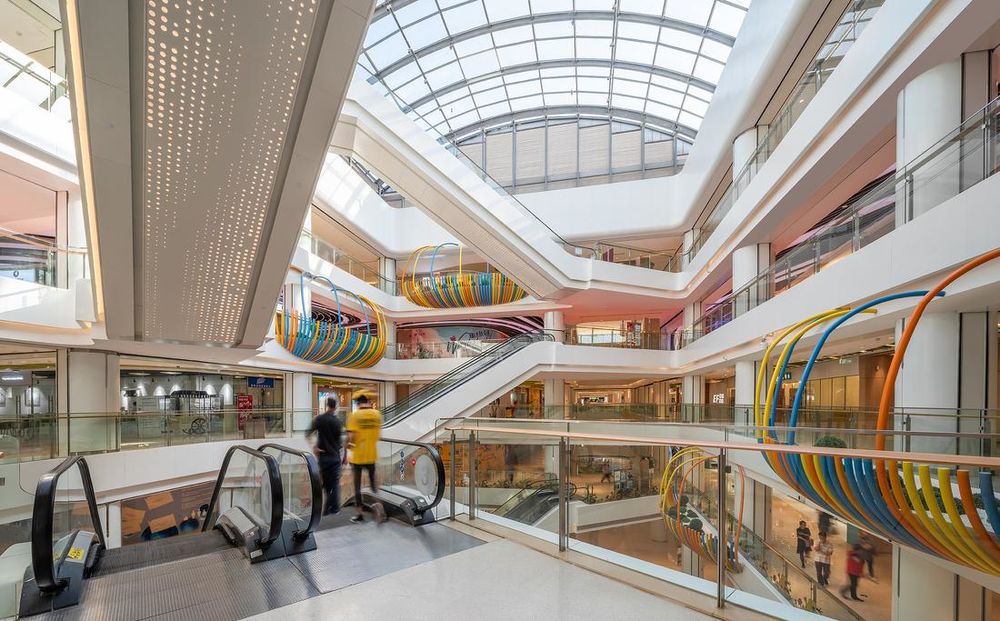
▲蝶趣园中庭©吴鉴泉
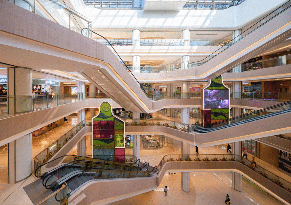
▲博粤庭、花影堂、白云涧中庭©吴鉴泉
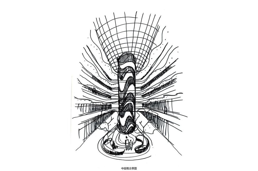
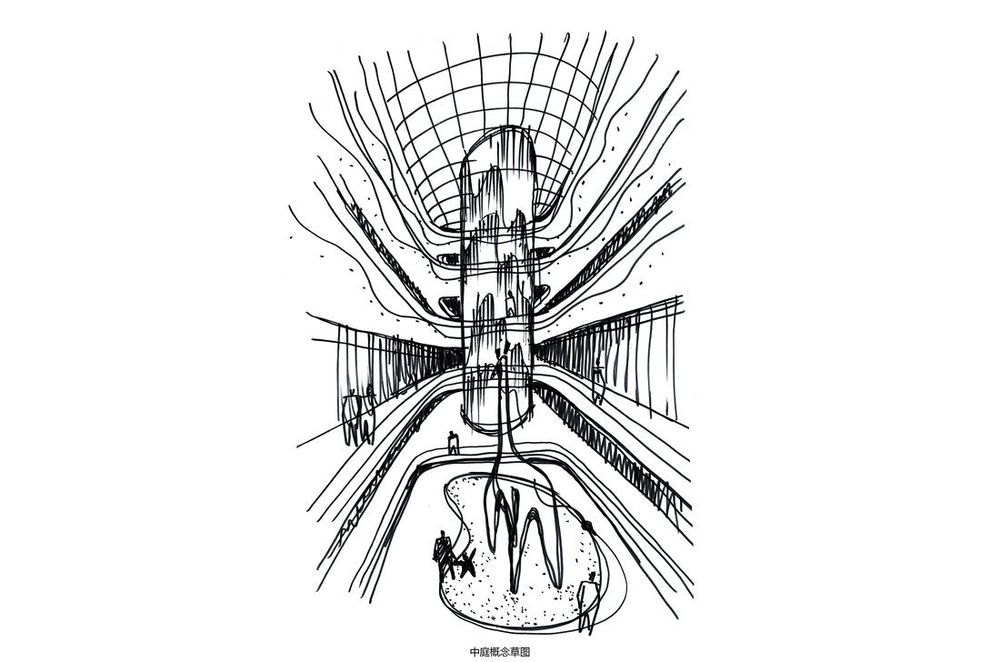
▲南北中庭概念草图©DYML
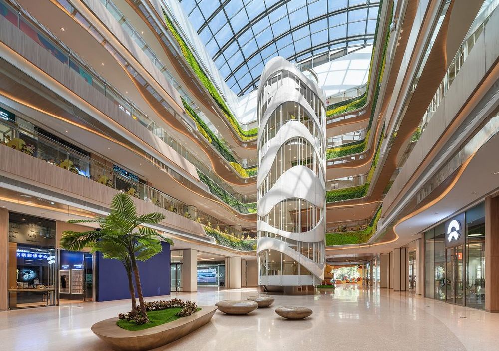
▲层叠云山中庭©吴鉴泉
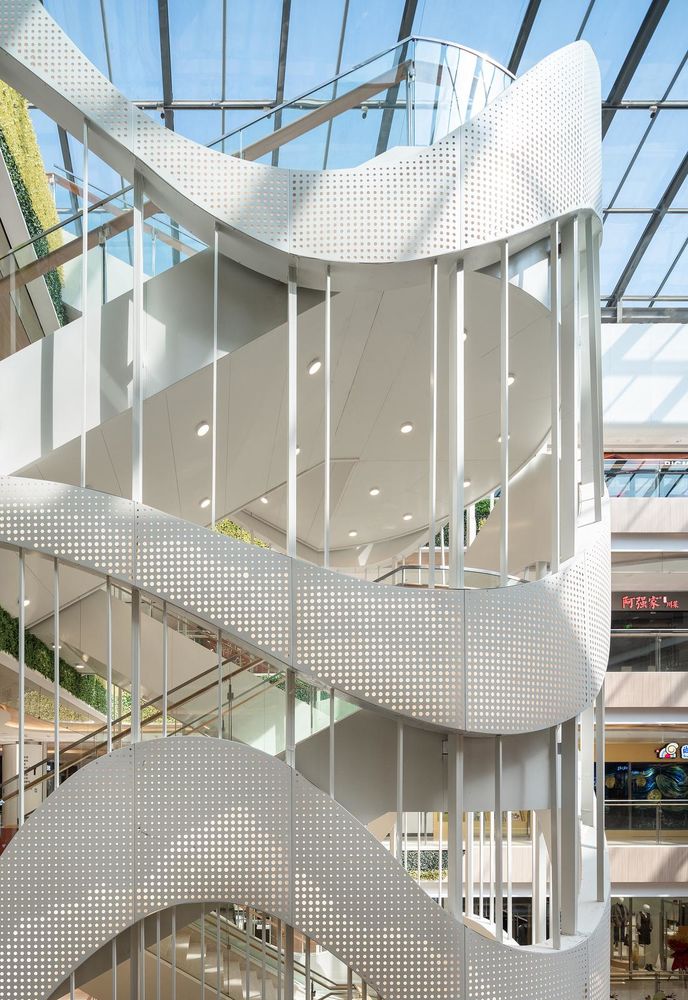
▲起伏的曲线铝板透着层山的图案©吴鉴泉
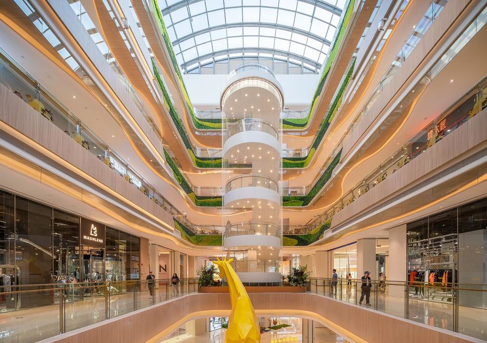
▲珠水映月中庭把水景带进主中庭©吴鉴泉
▲珠水映月中庭©吴鉴泉
六、三大街区
6. Three Main Streetscapes
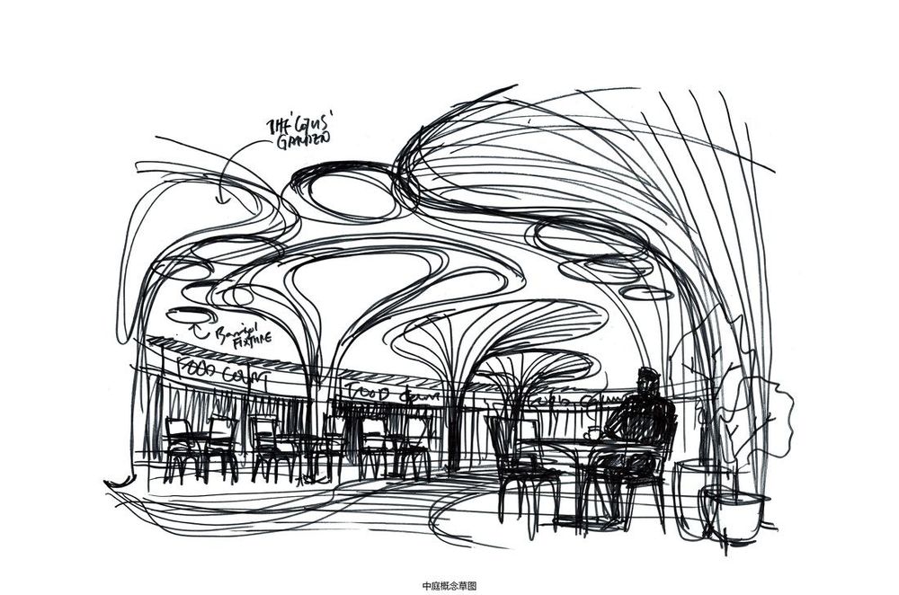
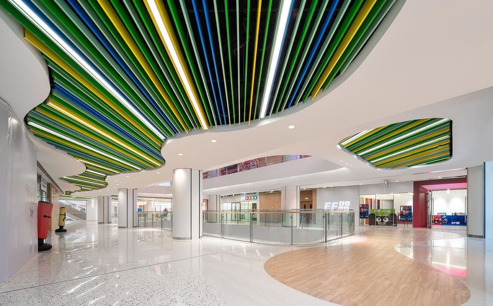
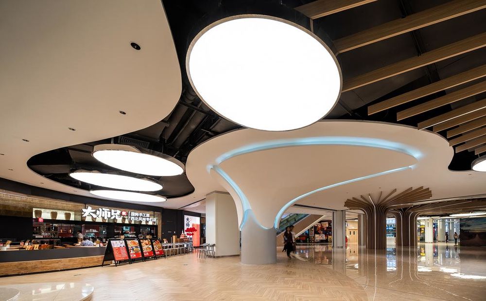
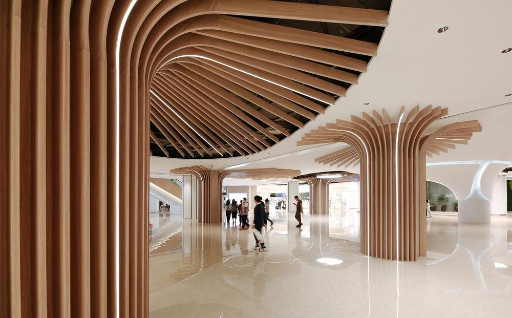
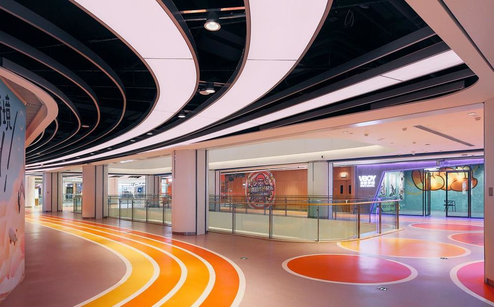
八大主题广场依然内有乾坤。依据不同的业态聚落布局,悦汇城内打造出三大街区:美食广场、童梦天地、运动酷乐,分别对应不同的目标客群。美食广场热闹轻松,树状造型柱仿佛置身丛林之中,享受一次郊外野餐的愉悦;童梦天地搭配柔和色彩,创造乐园般空间;运动酷乐以流畅的天花造型和炫酷的LED灯带结合,让运动感渗透整个街区。
We also branch off from the main themes to create several streetscapes that enhance certain retail programs. They are the Canton Food Court with a parade of good eats, Kids World with fun interactive play yards, and Techno Sport with energized neon runways. These are elements of surprise and instagrammable moments which intensify the overall retail experience.
▲三大主题区概念草图©DYML
▲童梦天地 © 吴鉴泉
▲美食广场©吴鉴泉
▲美食广场©何明智
▲运动酷乐©何明智
七、细节关怀
7. Intimate Design Details
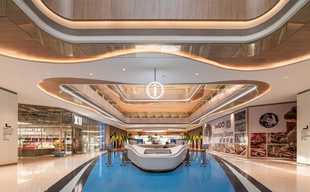
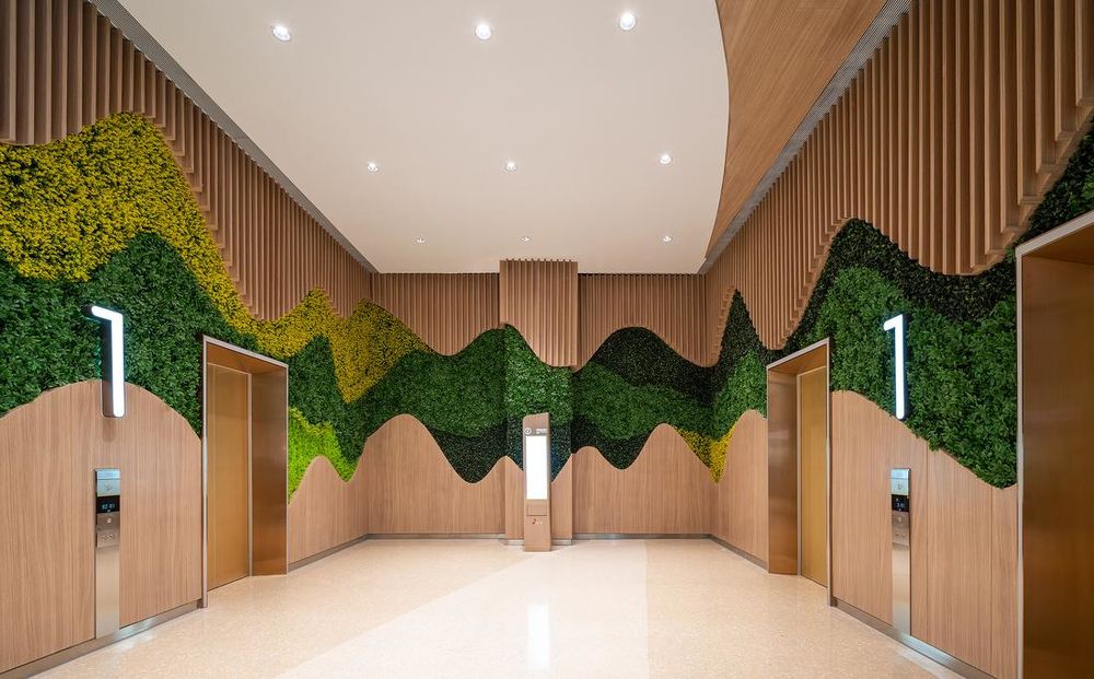
其他附属空间设计,遵循整体温馨、丰富、人性化的原则,从电梯厅、服务台到卫生间,均考虑到细节、人性化设计、符合人体工学,让购物中心从配套服务上营造关怀感。
The careful and intimate design details are reflected in all the auxiliary space as well. The overall consideration for human scale and comfort extends throughout the malls even in the restrooms, elevator lobbies and information desk.
服务台位于东中庭,便于为顾客提供服务©吴鉴泉
电梯厅运用绿植美学制造自然氛围©吴鉴泉
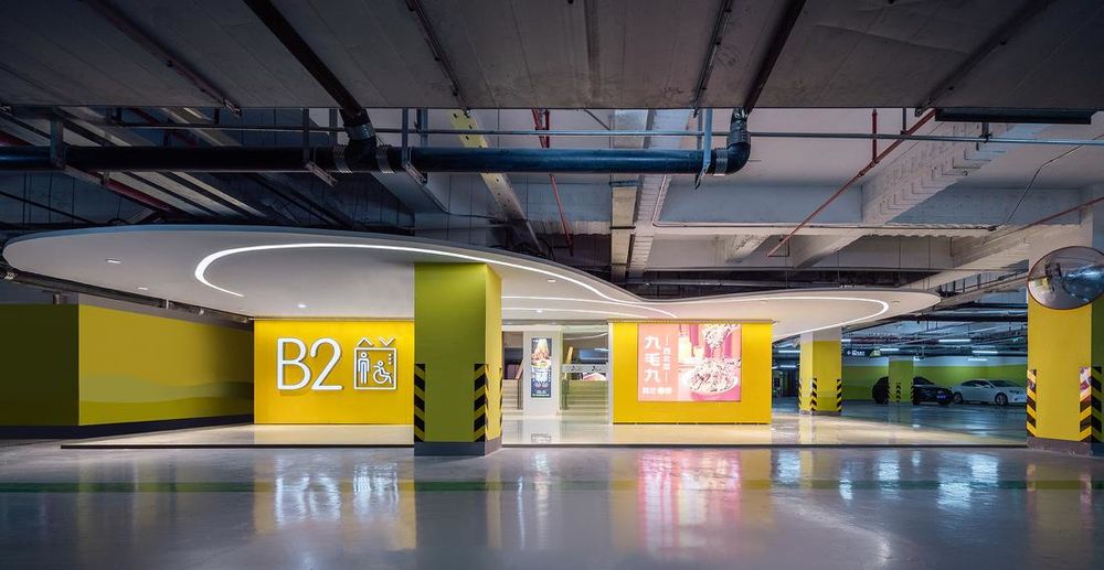
▲电梯厅运用绿植美学制造自然氛围©吴鉴泉
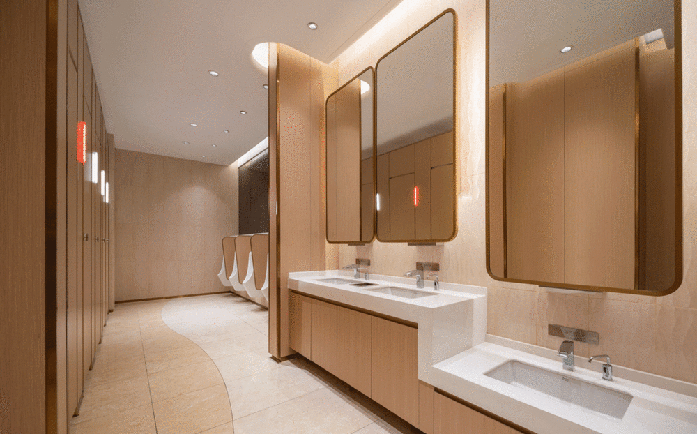
▲不同场景的卫生间和母婴室提供多元、人性化的服务
摄影师:吴鉴泉、何明智
改造难点
DesignChallenges
悦汇城改造的工程,共拔掉柱子36根,拆除楼板17000平方米,加固柱子1196根,加固梁4340条,约占原结构柱梁总量的22%,其中电影院区域涉及3层楼板的拆除重建,原西南入口钢制网架重达110吨。其改造工程复杂、时间紧迫、专业交叉,都需要我们建筑师团队及时反馈和快速应变,而建筑师驻场能够最直观的直面所有现场的问题,建筑师的任务不仅仅是停留在项目图纸上。
The YUE City makeover was a demanding process of 36 of structural columns uprooted and 1,196 reinforced, 4,340 of structural beam reinforced, 17,000 sqm of concrete slabs razed, 110 tons of structural steel trusses removed, and many more staggering numbers and efforts in the midst of the Covid-19 global pandemic. We as the lead designer were responsive both on paper and on site to resolve issues that arise during the design and construction stage.
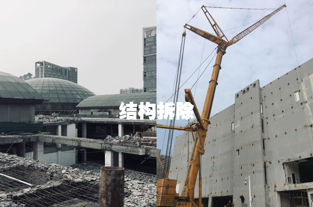
▲改造记录©DYML
存量改造的时代,如何以“认同感”获得重生
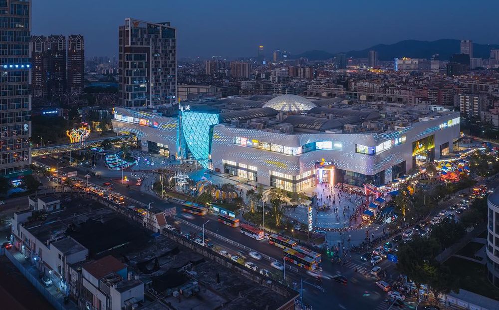
夜景 ©吴鉴泉
公共空间是城市人居环境的重要组成元素,是一个城市生活的容器和载体。当城市发展导致的变迁和饱和,一定程度会稀释出旧城区和存量建筑。对旧城区进行城市更新和存量改造的任务,使其回归当代城市感的营造是建筑师值得探讨的课题。其中商业旧改属于旧城改造类型之一,其使命不仅是盘活存量项目,更为目前国内存量商业建筑改造探索和寻求一条明确、可操作的路径,利用建筑改造和城市更新的方式延续城市的历史和文化,探求创新项目与文化历史的平衡点。无论是建筑功能、设备老化、结构损坏、业态过时等,都是悦汇城或者其他改造项目所面临的实际问题。经过600天改造后的悦汇城,自然而然成为了广州荔湾区一个城市形象的窗口,使得城市的社交空间得以延续和发展,我们也希望来此的居民也能在此重新获得记忆,收获一份认同和独特的体验。
Any form of public space is an important part, a vessel of life and activities of an urban community. Major changes in social and economic aspects usually result in decay of the public spaces particularly retail. As a retail designer, we understood that the key purpose of retail space regeneration is not only to restore its economic and culture viabilities but also to encourage survival. This project has faced the same decay and through a 600-days of vigorous transformation, YUE City re-emerge as a vibrant development, with a sense of identity in the new horizon.
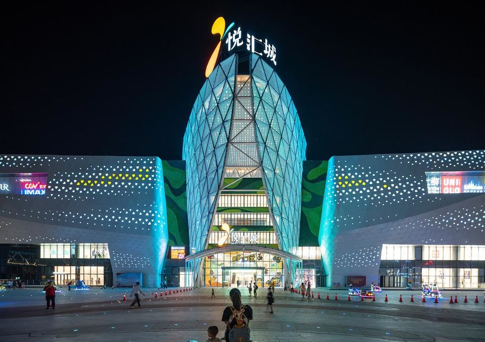
夜景©吴鉴泉
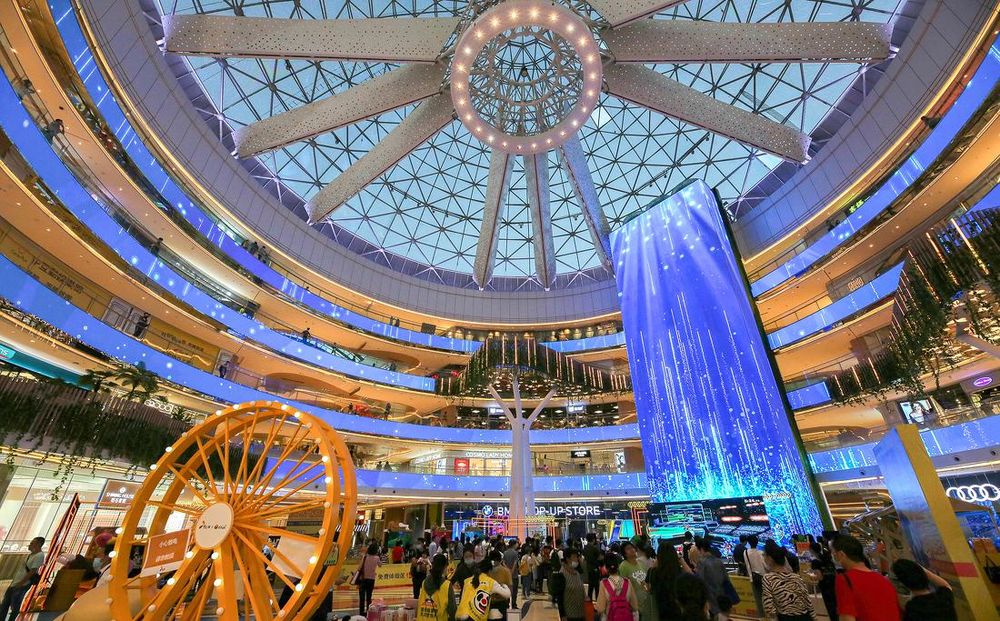
▲悦汇城开业后吸引大量市民到访©何明智
项目名称:悦汇城
业主:越秀地产
项目地点:广东省广州市西湾路150号
项目类型:购物中心
项目面积:280,000 平方米
完工时间:2020年9月26日
建筑设计公司:大奕明亮建筑事务所
设计范围:建筑、外立面、室内改造设计
设计服务:总建筑师、概念至扩初设计、施工图审核、施工现场协调
主创设计师:Josh Goh
设计团队:华亮(建筑设计主管)、何明智(室内设计主管)、陆梦(外立面设计主管)、奥德慕、徐韫、张丁文、母丽矫、洪畅、陶俊熹、钟其豪、缪炽煌、谭宏宇、陈君洛
摄影师:吴鉴泉、何明智
建筑设计院:广州城建开发设计院有限公司
景观设计:广州城建开发设计院有限公司
灯光设计:RDI瑞国际
幕墙深化单位:深圳市中深建装饰设计工程有限公司
施工单位:中建五局安装工程有限公司
结构顾问:广州瀚华
Project Name: Yue City
Client: Yuexiu Property
Project Location: No. 150, Xiwan Road, Guangzhou City, Guangdong Province, China
Project Type: Shopping Mall
Project Area: 280,000 sqm
Completion Time: September 26th, 2020
Design Scope: Architecture, Façade, Interior Retrofit
Design Service: Lead Architect, Concept to Design Development, Construction Documents Review, Construction Site Administration
Design Firm: Atelier DYML
Creative Lead: Josh Goh
Design Team: Liang Hua (Architecture Design Manager), Mingzhi He (Interior Design Manager), Meng Lu (Facade Design Manager), Demu Ao, Yun Xu, Dingwen Zhang, Lijiao Mu, Chang Hong, Junxi Tao, Qihao Zhong, Zhihuang Miu, Hongyu Tan, Junluo Chen
Photographers: Jianquan Wu, Mingzhi He
Architecture Design Institute: Guangzhou City Construction & Development Design Institute Co., Ltd.
Landscape Design: Guangzhou City Construction & Development Design Institute Co., Ltd.
Lighting Design: RDesign International Lighting
Curtain Wall Detail Development: Shenzhen C.S.C Decoration Design Engineering Co. Ltd.
Construction Design: China Construction Fifth Engineering Bureau Ltd.
Structural Consultant: Guangzhou Hanhua Architects+Engineers Co. Ltd.

