- 施工方:北京顺航永利建筑装饰工程有限公司
- 设计方:CAA建筑事务所
- 设计指导:刘昊威
- 项目负责人:张盼
- 设计团队:Edward Ednilao,邓越,任卓颖
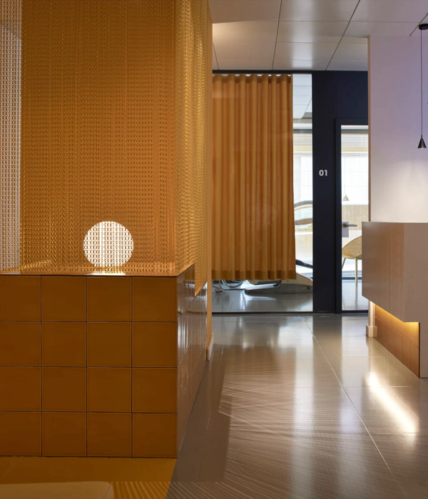
每一条弧线都有自己独立的灵魂,在不经意的空间处回旋出恰到好处的状态,这是建筑语言对女性与其所追求美的再诠释。CAA设计的又一个医疗项目落成。作为克丽缇娜集团旗下的最高端医疗美容品牌,雅檏麗德今年年初在北京万科公园五号开设了第一家品牌旗舰店。空间包含全专业的医疗美容手术室及为VIP用户专属定制的私人理疗空间。
Curves dance, and maneuver with free spirit, until they settle perfectly within space, with female grace. CAA has worked together with Chilitina’s high-end spinoff brand Uplider, and recently completed the design and construction of its new flagship cosmetic center in Beijing.
▼空间内部,interior view
摒弃传统硬朗的棱线,空间中柔中带力的曲线,让原本固态的空间变的灵动,以此体现出在女性身上独有的特性。正如刘昊威所说,“我不希望它只是一间的有医疗功能的空间,作为一个塑造美的地方,我更期待来访的人都能在踏进这片空间时即刻开始从身体到心灵重塑美的历程。”
Gentle curves and sweeping lines create a free flowing sense of space, whilst taking references from the elegance of the female form. CAA Founder Liu Haowei added, “Our concept was to make the space and environment clean, and hygienic, whilst creating a more comfortable, and relaxing experience for all visitors.”
▼空间中柔中带力的曲线,让原本固态的空间变的灵动,gentle curves and sweeping lines create a free flowing sense of space, whilst taking references from the elegance of the female form
入口处的水幕遮挡让这片空间成为了女性专属的私享空间,而看似狭小的入口是为了迎接等候区的通畅明亮。如母体般的茧状空间配合柔和的光源,给予等候区温度,以此来减少医疗机构一贯给人的冰冷,缓解顾客首次来访的紧张感。
A “curtain of tranquil water” breaks visitors away from the city outside, and provides a sense of privacy. The entrance space plays to the idea of compress and release, with visitors then flowing into the enlarged waiting room. The waiting room introduces warm lighting, and soft lines that create a cozy, cocoon-like space that works to put patients at ease.
▼通畅明亮的等候区,the bright waiting room
▼如母体般的茧状空间配合柔和的光源,the waiting room introduces warm lighting
由于场地本身进深较长,且项目对于功能空间需求大,过多的功能空间排列不可避免的产生狭长的通道。为破除过长空间给人造成的不适,设计在此将墙体做了不同角度的线性转折,用玻璃砖的通透创造曲径通幽的神秘感,平面的线条同立面线条随势起舞,重塑空间体验。
The sites long and narrow footprint and project function area requirements meant finding solutions to in tackling the need for a long corridor. Glass brick walls designed at varying angles in order to break up the corridor space into a more flowing, playful experience.
▼狭长的通道设计出不同角度的线性转折,glass brick walls designed at varying angles in order to break up the corridor
入口端看去,光线穿透玻璃砖墙,不断在地面,墙面反射,仿佛置身阳光下的海底。在此,利用不同透明度的玻璃砖制造肌理实现墙体与玻璃的过度关系,柔的语言被映射在各个角落。玻璃砖通而不透的性质让它在保存墙体功能的同时将空间的层次与神秘体现的意犹未尽。
From the entrance to see, light spots on the floor then reflects on the walls through transparent glass brick. Different types of glass bricks wave the wall’s texture and from opaque gradually become to transparent. This shifting helps create crystal-like light reflections at different intensities and directions, creating a spacious and light space.
▼用不同透明度的玻璃砖制造肌理实现墙体与玻璃的过度关系,different types of glass bricks wave the wall’s texture and from opaque gradually become to transparent
▼诊疗室内部,consulting room
曲折的廊道将人导向转角处。楼梯在此意想不到的出现,一处小空间中赫然出现一座巨大的艺术雕塑,却没有丝毫违和感。木栅格状的结构让楼梯的虚与整个空间的实形成对照。木板的递进扭转,让空间节奏由会客区至走廊流水般的4/4拍节奏变为了华尔兹跳跃的3/4拍。整个空间将欲扬先抑的概念贯彻始终,入口处的遮挡为了让转角后的等候区看起来更通亮,狭长的走廊尽头楼梯的出现让人豁然开朗,一切就如破茧的蝴蝶,只有历经蛰伏才能更加深刻感受美的意义。
The corridor guides visitors around the corner, leading to the main staircase. Visitors are enveloped by double-height sculpture as they process towards the 2nd floor – a representation of manmade form that reflects natural beauty. The sculptures splits the space into two. Its timber louvers progressively rotates, changing the special rhythm along with them.Sequences of small spaces, large spaces, and experiences runs through project as a whole. From its intimate entrance, large waiting area, narrow winding corridor, and double height sculptural staircase, the design reflects that of the graceful morphing of a butterfly.
▼楼梯在曲折的廊道转角处不经意出现,the corridor guides visitors around the corner, leading to the main staircase.
▼如同巨大的艺术雕塑,a sculpture-like stair case
▼木栅格状的结构让楼梯的虚与整个空间的实形成对照,the sculptures splits the space into two
此项目是CAA众多医疗项目中的最新作品,通过对线性空间的重新塑造展现女性所追求的美,同时赋予医疗美容机构更前瞻的品牌价值。
This is CAA’s latest healthcare project, and takes inspiration from the female body, as well as natural forms. Applying this design language to architecture and interior design, provides Uplider not only aesthetic, and further brand value, but also a unique experience for its patients and visitors.
▼一层平面,the first floor plan
▼二层平面,the second floor plan
▼玻璃砖排列,the arrangement of glass brick
▼轴测图,axon
业主方:雅檏麗德医美中心
设计方:CAA建筑事务所
设计指导:刘昊威
项目负责人:张盼
设计团队:Edward Ednilao、邓越、任卓颖
设计时间:2017/06
竣工时间:2018/03
项目面积:600m²
项目地点:万科公园五号,北京
施工方:北京顺航永利建筑装饰工程有限公司
摄影:高峰、任卓颖
Client:UPLIDER CO.
Architects: CAA (Core of Architecture & Art)
Lead Architect: Liu Haowei
Project Manager: Zhang Pan
Design Team:Edward Ednilao, Deng Yue, Ren Zhuoying
Design Date: 06/2017
Completed:03/2018
Area:600m²
Location: Vanke park, Beijing
Manufacture: Bei Jing Shun Hang Yong Li architecture coorpration
Photographs: Gao Feng, Ren Zhuoying
{{item.text_origin}}

