Masquespacio近日展示了最新设计作品Hikari Yakitori餐吧,这是第二个来自Nozomi寿司餐吧创始人的项目,其位于瓦伦西亚的鲁萨法区,与其第一间餐厅只有两步之遥。
Masquespacio presents its last design for Hikari Yakitori Bar, the second project from the founders of Nozomi Sushi Bar, located in the same district of Ruzafa in Valencia two steps ahead from their actual restaurant.
▼店铺门面,Storefront
设计师想通过Hikari烧鸟餐吧引入新理念,背离传统串烧吧的理念,如同Nozomi店将日本高速列车的名字悬挂在餐厅内。与之前的项目不同,此次室内由Masquespacio设计,其受到东京小巷Kabukicho, Omoide Yokocho y Hajimeya-烧鸟店的发源地的启发。
This time they wanted to introduce a totally new concept through Hikari, Yakitori Bar, traduced literally in a skewers bar that as well as his big brother Nozomi carries on the name of a high velocity Japanese train. Differently to the previous project the interior designed by creative con-sultancy Masquespacio, has been inspired by the different quarters and alleys of Kabukicho, Omoide Yokocho y Hajimeya in Tokyo, where most of the of the yakitori bars are established.
▼餐厅一览,Overall view of the bar
“我们将日本街头最真实的烟火景象带到餐厅中,同时改良了其视觉的美观性。”
“We went to one of the most authentic neighborhoods from Tokyo bring-ing back their noise and smell, but reinventing their visual pollution”
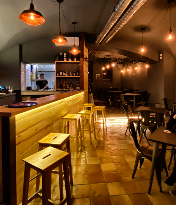
从建筑立面开始,设计师创造了一种东京街头的真实感,使人可以立即辨认出并走进不拘一格的餐厅内部,欣赏昏暗的灯光和厨房忽明忽暗的火焰。室内从头到尾都金装人们的眼球。在这里,人们可以感受到高贵和工业材料的融合,传统与现代的交融。
Starting from the façade we can immediately recognize the entrance to one of Tokyo’s tunnels, that invites us to enter to the intimate and at the same time eclectic interior, that with the dimmed light and flames coming out of the kitchen catches the visitor from the beginning till the end. Here you can recognize straight away the fusion between noble and industrial materials, classic and contemporary, always through an own vision that clearly represents the identity from Nozomi’s company.
设计师运用单一的灰色和粗狂的质感以及温暖的木材质来重现了Kabukicho, Omoide Yokocho y Hajimeya街道的感觉,并以此统领整个设计理念。
“The reinterpretation of the Kabukicho, Omoide Yokocho y Hajimeya alleys is done through a monochrome color scheme represented by grey and rusty finishes, as wall as a touch of wood that adds warmth to the overall concept. ”
当人走到餐厅的尽头,就能看到木材和混凝土与金属的交融,传统的灯笼在过道打下点点阴影。
“During our walk till the end of the tunnel we can see how wood is mixed with concrete and metal, while the classic lanterns cast a shadow of typical alley light in the corridors”
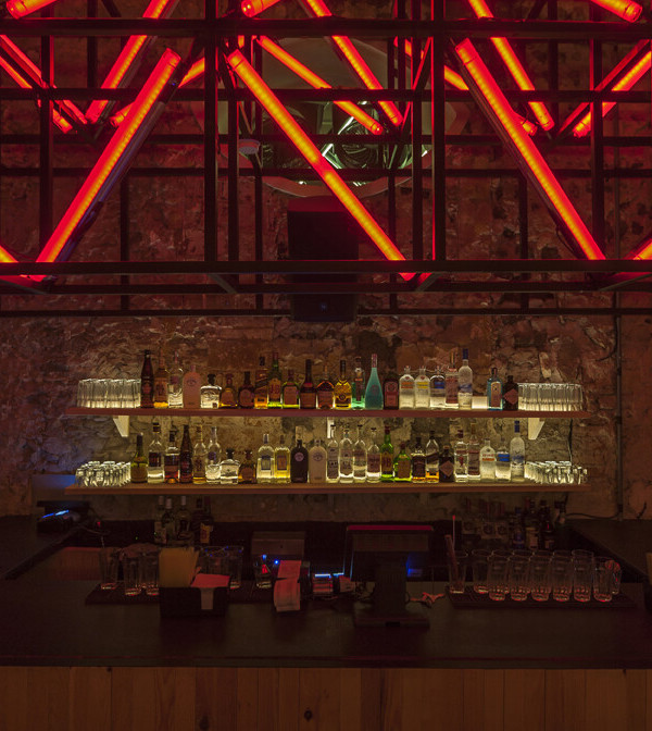
右转便可以看到一个没有出口的小广场,能看到天花板上悬挂着的灯光板和来自日本首都著名商业区的小吃摊。在餐厅里被用作安置顾客的小房子。
Once turned right we can see a square without exit full of lighted boards that hang from the ceiling, a small food stand and a reinvention of the commerce of the famous district from the Japanese capital, here used like a set of small houses that settle the visitors of the restaurant.
金属,水泥和木材共同装饰了这个小房子,在昏暗的灯光下,顾客可以在中心区域饱览如同坐在日本城市街道一般真实的景象。
From the metal, cement and wood interior of the small houses, below a dimmed light, the visitor enjoys an overwhelming view on the central place full of contrasts like if they wear sitting in one of the most authen-tic streets of the Nippon city.
▼卫生间,Bathroom
Credits: Client: Hikari Address: Calle dels Tomasos 18, 46006 Valencia Art Director/Designer: Ana Hernández Architect: Paula Pina Architect junior: Jessica Alejos Technical investigation: José Espejo Graphic Design: Ana García Photography: Luis Beltran Materials: Technical lighting: Onok Lighting Decorative lighting (sculptures & lanterns): Masquespacio, local pro-duction Concrete Wall finishes: Viroc Metal grids: Masquespacio, local production Cerrejeira wood: Maderas Blanquer Granite floor: Terrazos Fuster Neon signs: Masquespacio, local production Chairs & bar stools: Ondarretta Leather backrests: Original Contract Fabrics & pirography: Masquespacio, local production Construction: Helix
{{item.text_origin}}


