藏马山月空礼堂,青岛 / BUZZ庄子玉工作室
▼视频,Video © 融创阿朵小镇
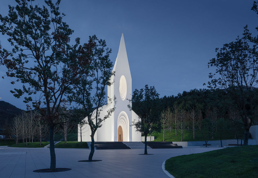
月空礼堂旨在打造一个既尊重过去又能面向未来,既具有宗教体验又面向世俗感触的空间容器。礼堂分为上下两部分,下部的半下沉空间以及出口庭院与周边场地景观相连,嵌入与广场相连的山体,关联亘古既有的存在,是隐; 上部圣堂本身则应傲立于山水之间,宏天地之正气,传造物之福音,是显。
The Chamber Church aims to create a spatial container that both respects the past and looks towards the future. It shall provide a religious experience and secular touch.
The lower part of the auditorium is divided into two parts: the semi-sunken space and the connected patio form a link to the surrounding landscape. It is embedded in the mountain and connected to the square. It is the hidden foundation on which the upper part of the auditorium can stand proud between the mountain and the water, reflecting the power of heaven and earth and spreading the gospel of creation.
▼项目概览,Overall view © 苏圣亮
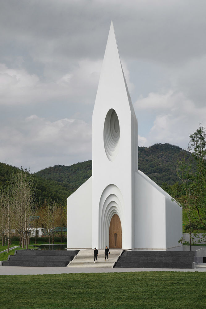
而这一显一隐中,一方面我们回溯历史中的建筑关联原型,并试图与与之关联的相关记忆产生呼应; 一方面我们从中寻求一种无时效(timeless)的当代性甚至是未来感; 建筑试图通过平面和剖面关系中,将这种二元关系并置甚至融合。
Looking backwards we find the archetypes of architectural associations in history. The design echoes the memories associated with them, but interprets them in a timeless modernity creating a sense of the future. The architecture integrates this duality in plan and section.
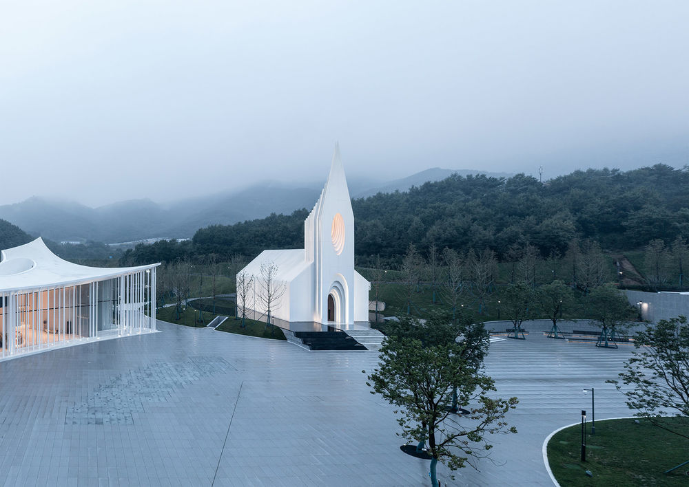
▼鸟瞰礼堂和广场,Aerial view to the church and the square © 融创阿朵小镇
▼教堂外观,Exterior view © 苏圣亮

01. 原型与传统
Prototype and Tradition
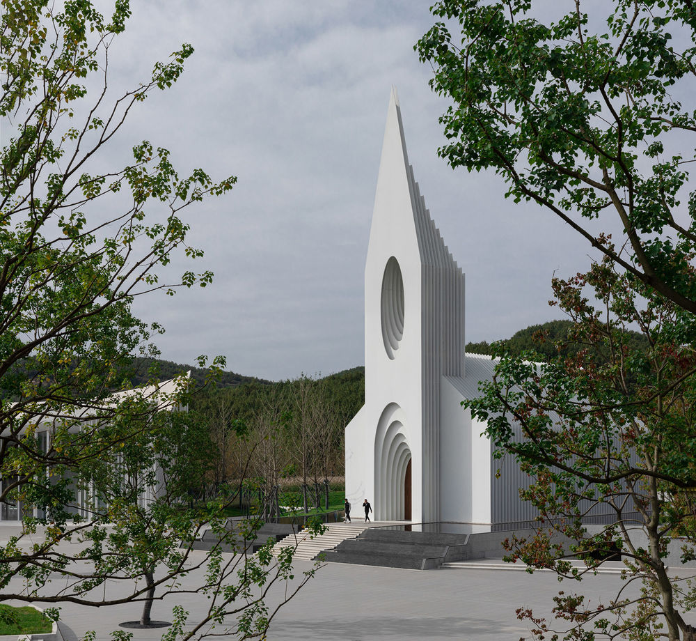
作为建筑的外部形象,我们认为它必须是纯粹的,以使人得以回归小礼拜堂的原型和认知。故而设计过程中,数百个乡野传统教堂的空间及立面形象的抽取,共同勾勒出了一个符合认知意义通感的体量轮廓(切片)系列。
To create a modern icon, we needed to create a pure shape, that’s still evokes the archetype of a church. Therefore, during the design process, we integrated different vernacular façade images of traditional churches. The derived base volume is then expressed through a series of slices.
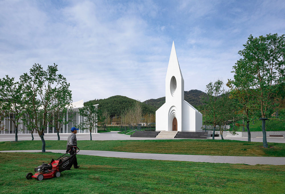
▼建筑立面,Facade © 苏圣亮
▼轮廓提取,Profile extraction © BUZZ庄子玉工作室

▼教堂日景,Daytime view © 融创阿朵小镇

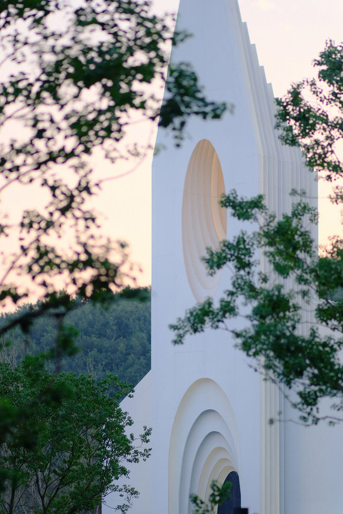
这样的轮廓也从第一重的视觉的体验上符合业主和使用者对这一空间的想象与期待;而连续的每部分切片又以相对纯粹且现代的方式得以呈现,故而使礼堂的外部效果会根据观察者的角度变化而呈现出不同的效果。
The created contour meets the expectation of client and visitors of the space`s first visual impression. The sequential slices are introduced in a pure and modern way, whilst the gaps of the façade create various visual effects depending on the angle of the observer.
▼东立面和西立面图,East Elevation & West Elevation © BUZZ庄子玉工作室
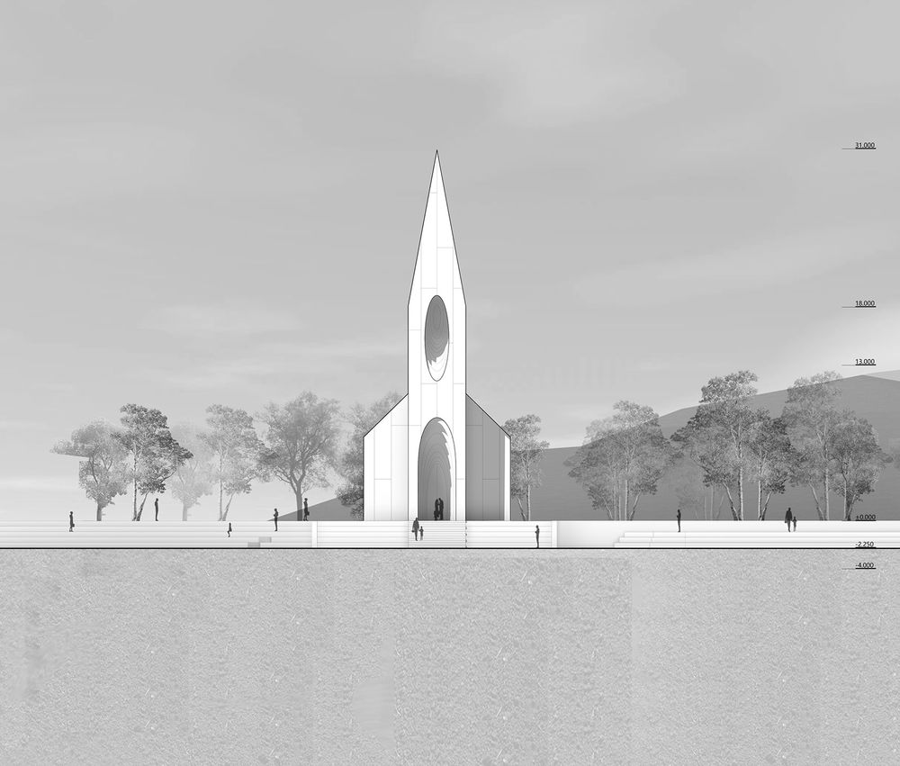
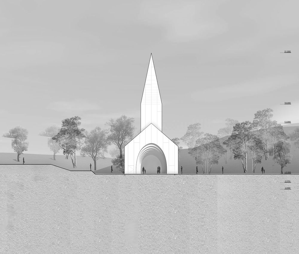
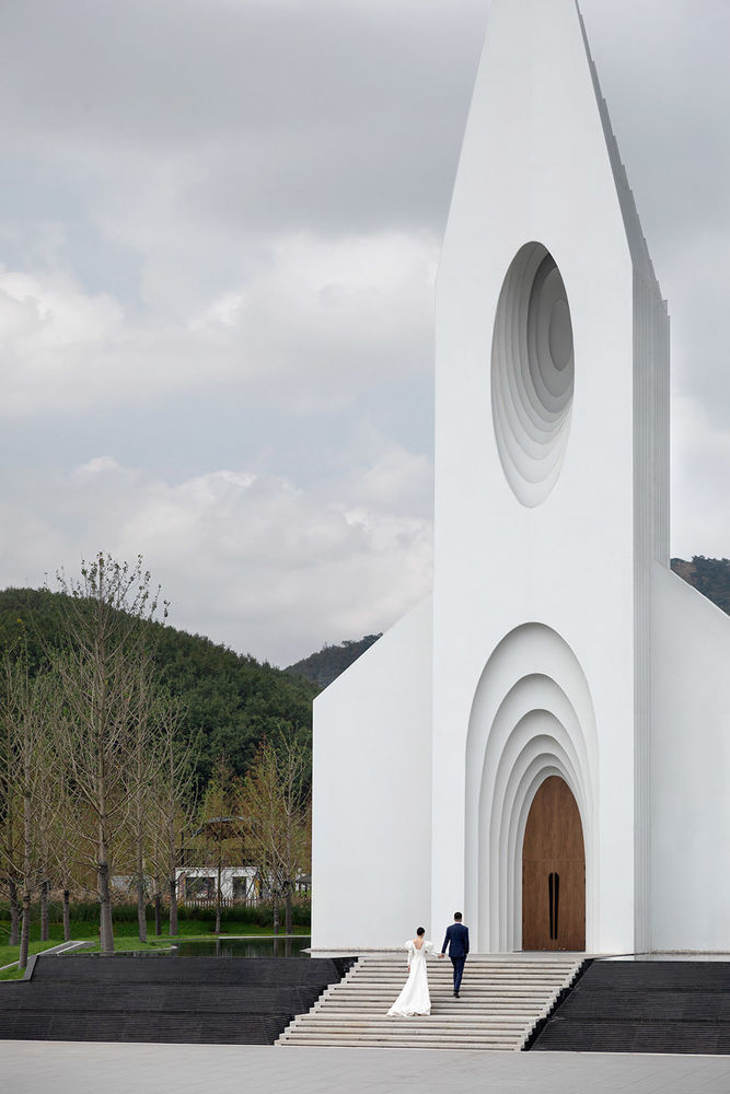
这个被提取的原型,依然拥有具有尖顶和花窗的钟楼、层叠内嵌拱门、巴西利卡式的空间布局等教堂所具有的经典组成要素,但多数的装饰要素均被抽象化 – 这并非源于对装饰的厌恶和反叛,而是期待以相对纯粹的体量展露出属于此一命题相关的原型与体验层面的关联,以及与其相关的核心议题:神性与仪式感。
The derived prototype still features the classic components associated with a church, such as the bell tower with spire and rose window, the cascading interior arches, and the Basilica layout, but most of the decorative elements are abstracted – not out of an aversion or rebellion against ornament, but in order to reveal both the interaction of archetype and experiment, and the core issue associated with it: divinity and ritual.
▼礼堂外观展现神性与仪式感, The appearance of the auditorium shows a sense of divinity and ritual © 苏圣亮
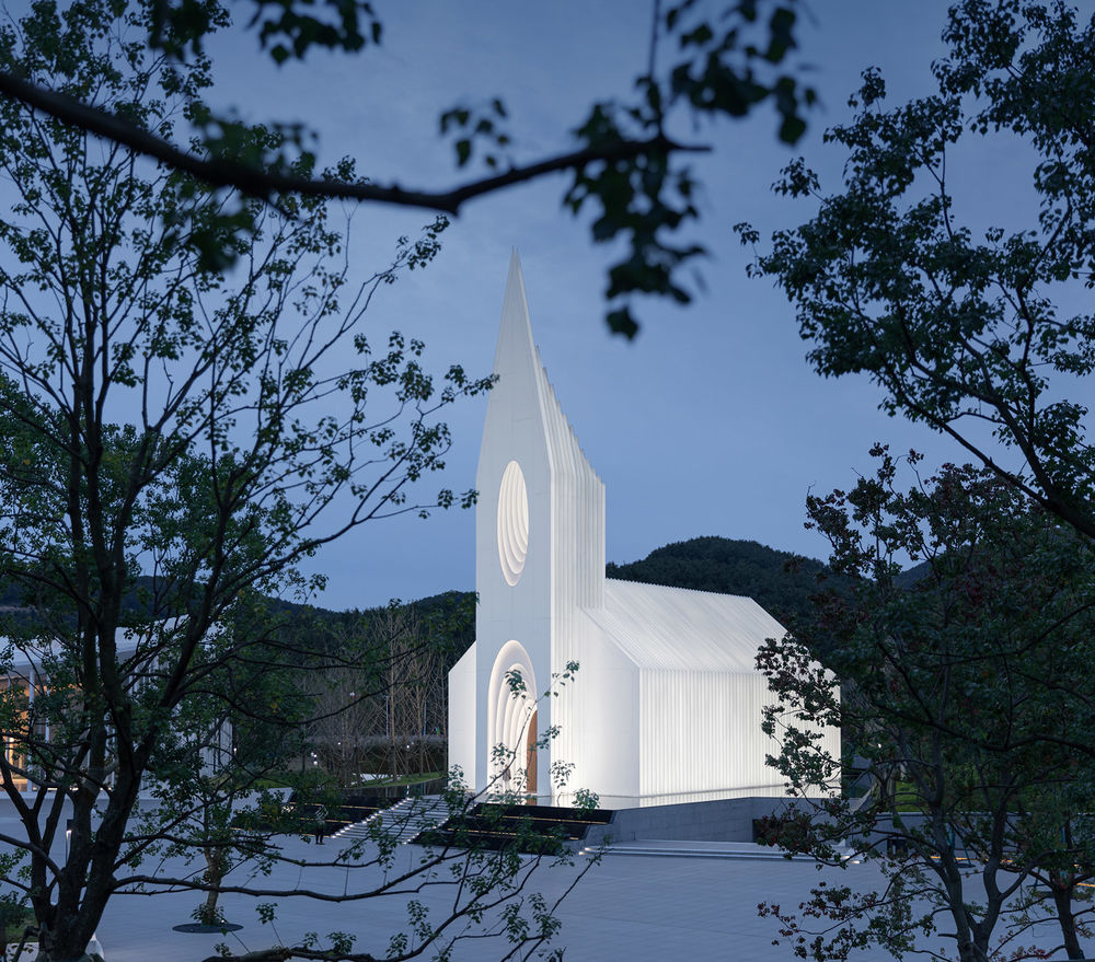
▼东立面夜景,East facade by night © 苏圣亮
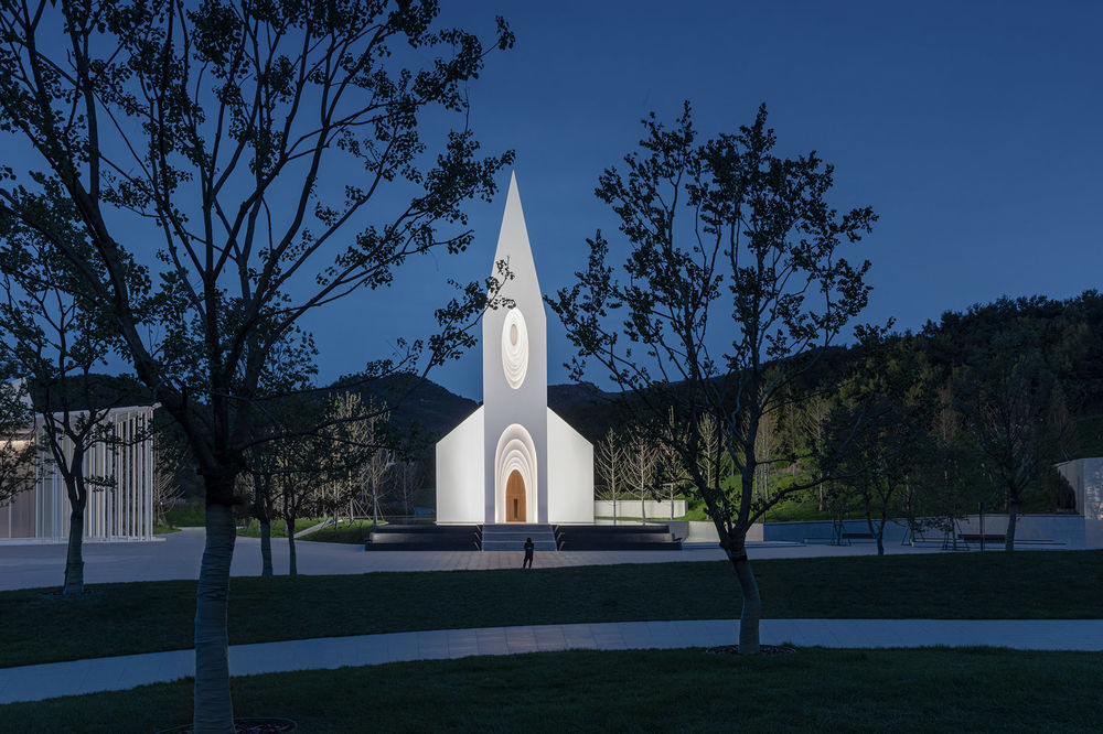
不光在剖面与立面上,平面上建筑同样寻求对经典空间原型的回归:轴向的延伸,对称的布局,逐级抬升的标高,递进的切片节奏,隐喻的巴西利卡,无一不是对传统的致敬与回归。
Not only in sections and elevations, but also in plans, the building seeks to emulate its predecessors: the axial prolongation, the symmetrical layout, the stepped elevation, the progressive sectional rhythm, the implied basilica, these are all tributes to and an evolution from tradition.
▼总平面图,Site Plan © BUZZ庄子玉工作室
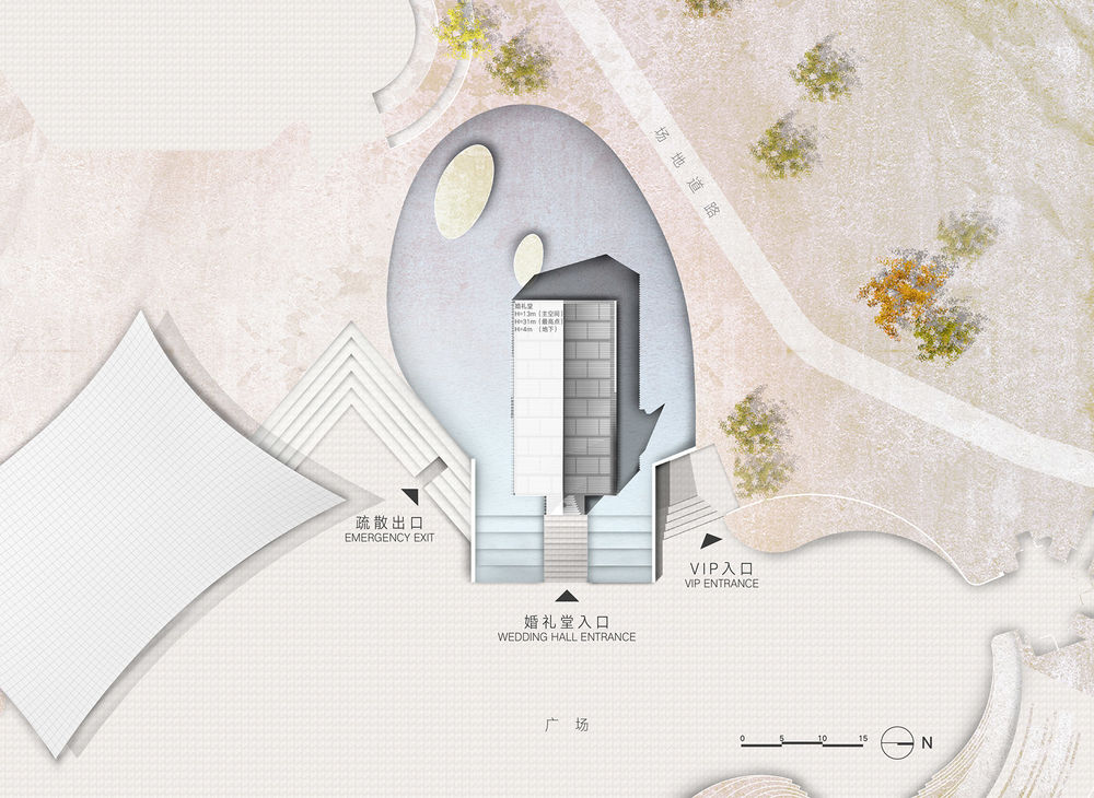
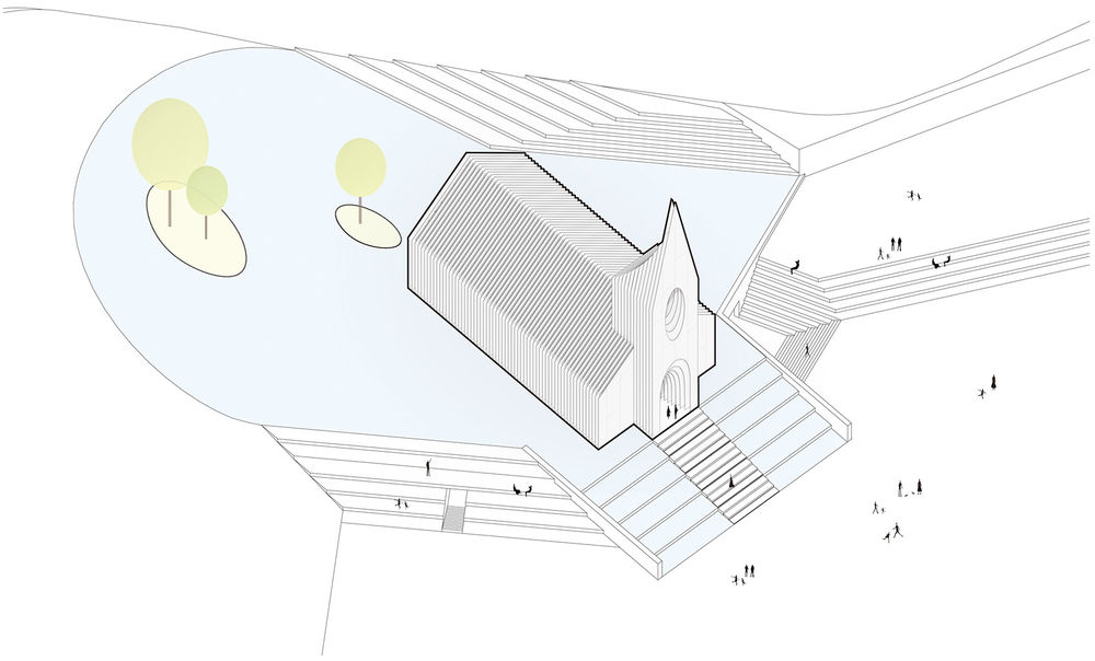
为了强调建筑的传统根源,顺延传统布局方式,礼堂主体的朝向直接设置在正东西。并作为精神性建筑置于整个场地建筑群体的中间部位,高差的变化沿着建筑的前侧边缘流过,将场地自然的划分成东侧的广场与西侧环绕建筑的坡地景观与人工湖。
Emphasizing the traditional roots of the building and following that layout, the principal direction of the building is strictly east-west oriented. The topography changes its height at the front edge of the building, naturally dividing the surroundings into a plaza in front and a sloping landscape with a manmade lake behind the building.
▼建筑体量自然地划分场地,The building naturally divides the site © 苏圣亮
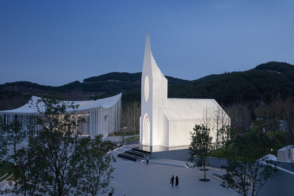
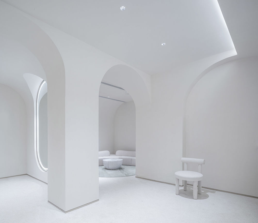
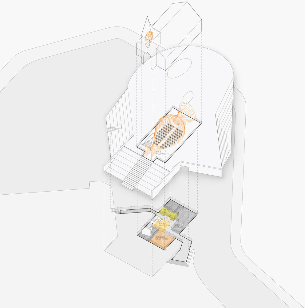
景观部分移步异景,强调私密性;广场部分相对开场,强调开放性和公众性。 高差的变化使得教堂前场形成水景阶梯产生的抬升空间,作为视觉上的底座部分进一步强化礼堂主体的仪式感与神圣感,相应建筑的下半部分则作为圣堂主体空间的辅助空间,包括接待台、准备间。
The landscape part of the exterior features an artificial lake to create privacy, while the open space of the plaza emphasizes the relation to the public. The change of height between building and plaza is bridged by large water feature steps. They form a visual base to further strengthen the sense of ritual and sanctity of the main hall.
The lower part of the building serves as an auxiliary space for the main sanctuary, including the reception desk and preparation room.
▼功能示意,Function Diagram © BUZZ庄子玉工作室
▼底座部分进一步强化礼堂主体的仪式感与神圣感 © 苏圣亮
The base part further strengthens the sense of ceremony and sanctity of the main body of the church.

礼堂的主体到访人群从南侧进入前场广场,从西侧拾级而上进入主体建筑中,亦可从背侧的景观之中回望建筑,亦可从广场东北侧的VIP入口进入建筑辅助功能部分。 背侧景观试图打破建筑层面的硬质边界感与轴向关系,偏心的湖体轮廓,与置于其中的岛洲,亦和礼堂室内的轴线形成了偏心的对景画面。
The path towards the main entrance of the church leads past the southern side to the western portal. An alternative access exists on the northwestern part of the plaza, where a direct connection to the VIP facilities in the base exists.
The back view seeks to break the rigid impression of the building edge, and forms a fluid connection to the lake. The strategically placed island creates a counterpoint to the central axis of the hall, diffusing the symmetric tension.
▼主空间概览,The main hall © 苏圣亮
▼地下层空间,Lower floor interior © 苏圣亮


总平面倾向于一种更加内向的氛围,利用一系列景观对视线的遮挡和背侧湖水的平静,打造一个教堂入口前的“舞台“去强调其核心的位置。
The program favors a more inward-looking approach. Taking advantage of the series of landscapes slopes that block the view behind the calm lake we use that as a passive space to look at from inside the hall. In front of the church entrance, we create a “stage” to emphasize its central position.
▼湖面倒影,Lake Reflection © 苏圣亮
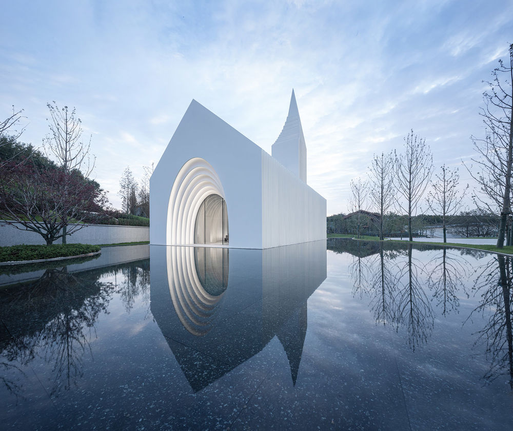
02. 洞穴与永恒
在建造技术成熟之前,洞穴作为原始人类最初的庇护空间,帮助人们躲避了寒冷、风雨、暴晒以及危险动物的伤害,因而其环绕遮蔽的形态给人类的基因中埋入了一种强烈的安全感。这种安全感随着人类文明的发展被崇拜,进而使得其空间来源——洞穴,很早就被奉为神圣场所,成为了原始人类举行祭祀活动或群体仪式的场所,例如拉斯科洞穴(Grotte de Lascaux)或希拉山洞等等(Jabal al-Nour)。
由此,礼堂的腔体空间尝试以环抱的形态给人们某种安宁和庇护的感受,正如洞穴曾经那样,为举办仪式的人们提供所需求的仪式感和神圣感,并进一步触发人们现实与精神层面之间的关联。
Before the advancement of construction technologies, caves were the first sheltered spaces for primitive humans, offering refuge from cold, wind, rain, sun and dangerous animals. Their encircling form is deeply embedded as a sign of security in humanities DNA. This sense of security was worshipped with the development of human civilization, which led to the early enshrinement of its origin, the cave, as a sacred place of ritual, such as the Caves of Lascaux (Grotte de Lascaux) or the Cave of Hilla (Jabal al- Nour).
The cavernous space of the assembly hall thus attempts to give people a sense of peace and shelter in the form of an enclosure, just as the cave once did. It again provides a frame for the ritual and sacredness desired by the people holding the ceremony, thereby triggering a connection between the real and spiritual dimensions.
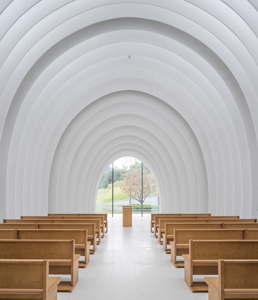
月空,拆解自“腔”,既是对建筑静谧神圣的美好意向的,也是对内部柔和曲线的隐喻。 礼堂的室内空间是一个柔软的流动的腔体,与几何化的外部轮廓,形成了有趣的疏离。 这形成了两个结果,一个是洞穴一般的空间形式,一个是光线丰富的环境氛围。
The interior space of the assembly hall is a soft, flowing cavity that creates an interesting detachment from the sharp geometric exterior contours. Its construction creates at the same time a cavernous space and a bright ambience.
▼星空下的“洞穴”,The “cave” on a starry night © 融创阿朵小镇

腔体形态的提取同时也可以视为自然中一系列与永恒的时空相关的造物:除了人类赖以庇护几十万年的洞穴,海洋中的蓝洞,爆发的超新星,母体的子宫,这一系列的存在均深深植根于人类亿万年进化过程所塑造的基因深处,使我们进一步超越形式,在时空的深处,与天地对话,与万物依存。
During the design process more references for the cavernous space became apparent. It can also be seen as a series of creations in nature: in addition to the caves that have sheltered humans for hundreds of thousands of years, the blue holes in the oceans, the exploding supernovas, the mother’s womb, all these series of existences have taken root in the depths of human consciousness, allowing us to further transcend form and speak to heaven and earth.
▼腔体意向,Diagram: cavity © BUZZ庄子玉工作室

▼剖面图1,Section 1 © BUZZ庄子玉工作室

设计提取一系列柔和的曲线随空间序列缩放,形成一个内敛的腔体,其基线关系依然延续传统的巴西利卡的形制,而同时具有极强的流动感。而这些曲面在三维层面则形成一个更具未来感甚至永恒感的状态。
同时,这种柔美与其外部坚硬的状态形成强烈对比,以形成内外视觉的互动。
The design subtracts a series of gentle curves that scale with the spatial sequence to form an introverted cavity. Its primary layout continues the traditional Basilica form, while at the same time having a strong sense of fluidity. This softness contrasts with the hardness of the exterior to create a visual interaction between the interior and exterior.
▼柔和的曲线构成内敛的腔体, Soft curves form an introverted cavity © 苏圣亮
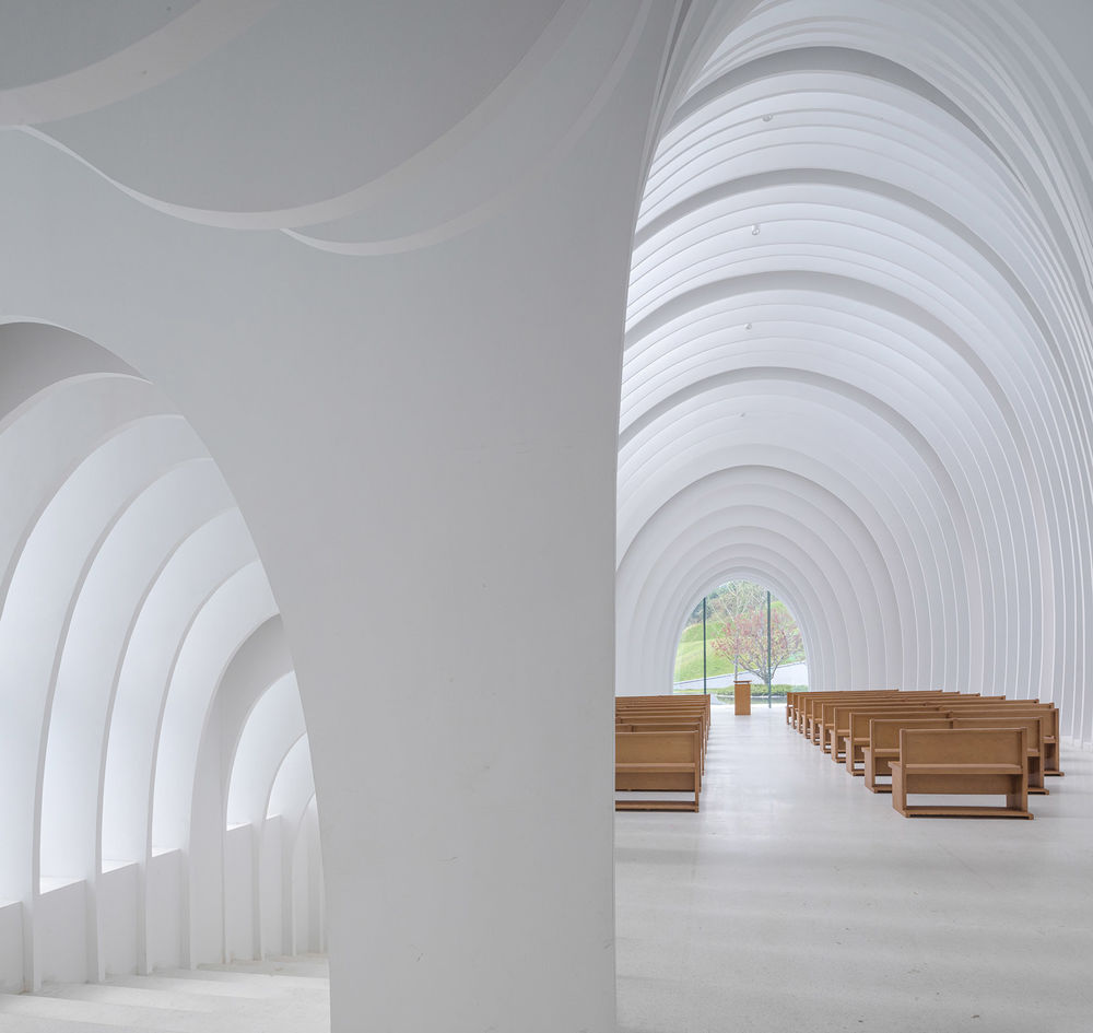
诚然如此,腔体的原型在大量先例中早已有之,但基本上皆是在体量轮廓与腔体空间之间,形成了一个图底关系上虚实分明的横剖面。 比如卒姆托的克劳斯兄弟小教堂(Bruder Klaus Kapelle),先行勾勒出内部腔体空间的轮廓,再进行体量完形。
The prototype of the cavity already exists in a number of projects. Setting this design apart from its predecessors is the balance between reality and fiction. In comparison to the Bruder Klaus Kapelle, where the void exists before, and therefore determines the building, the volume and void are in this case in an equal relationship.
▼Bruder Klaus Kapelle剖面图, Sections of the Bruder Klaus Kapelle

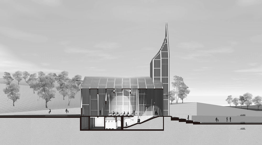
月空礼堂在纵剖面上的黑白分明的部分增加了灰度与横剖面关系上光影介入的可能,且以一种连续的切片方式将传统的腔体关系进一步异化。
Due to its construction, the longitudinal section is added a grayscale, which increases the possibility of light and shadow intervention, while isolating from the traditional cavernous space with a continuous slice method.
▼剖面图2,Section 2 © BUZZ庄子玉工作室
▼从室内望向背侧景观,View to the rear yard © 苏圣亮
03. 光与切片
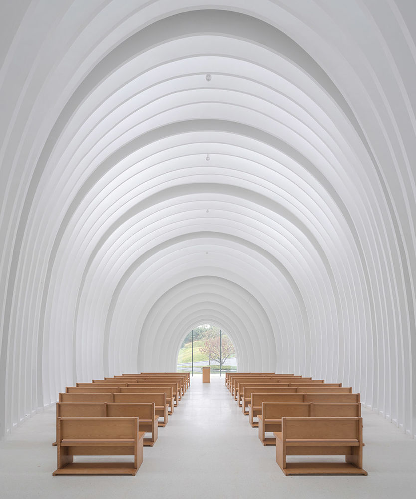
建筑在纵轴方向被以统一的间距切片,断面之间则是光的入口。光线透过白色切片之间的缝隙,在其间往复反射后均匀且柔和的洒入室内。随着太阳角度的变化,这些缝隙及其界面对光线产生了千变万化的影响,形成了直接和间接光斑叠加的不定形的柔和光晕,赋予了“洞穴”空间以光的神性与仪式感。
The entire building is sliced at uniform intervals along the longitudinal axis. The created gaps allow the light to enter. As it passes between the white slices, it reflects back and forth between them and then spreads evenly and softly into the interior.
Throughout the day, the changing angle of the sun and its relation to the gaps and interfaces create varying visual effects. The play between direct and reflected light gives the “cave” a sense of divinity and elation.
▼婚礼堂,The wedding hall © 苏圣亮

故此,作为主要使用空间的礼堂内部我们希望它体现一种心灵回归和庇护,就如达芬奇的名画“岩间圣母”中所传递的意向,内部的空间是访者心灵的“庇护所”,或如婴儿在母体中的状态,或如克利姆特画中金色的环抱,在这个纯粹的普照光芒的空间中,人们方能感受造物对众生之爱与造物之美好。故而礼堂的内部是一个软性而更为环抱的轻柔的存在。
The intention behind the cave is to form a space of shelter and of spirituality. An Intention best conveyed in Leonardo da Vinci’s famous painting “Virgin of the Rock”, where in a sheltered space of pure light, one can feel the love of creation for all beings.
▼光线透过白色切片洒入室内,Light pours into the space through a series of white slices © 苏圣亮

柔和的弧线形的内部空间遵循传统的长方形教堂的平面形式,用一种更加现代的解读方式,创造一系列弧顶架使得内部空间具有更佳流动的体验感。
The softly curved interior follows a traditional basilica layout with a more contemporary interpretation.
▼流动的体验,A flowing experience © 融创阿朵小镇

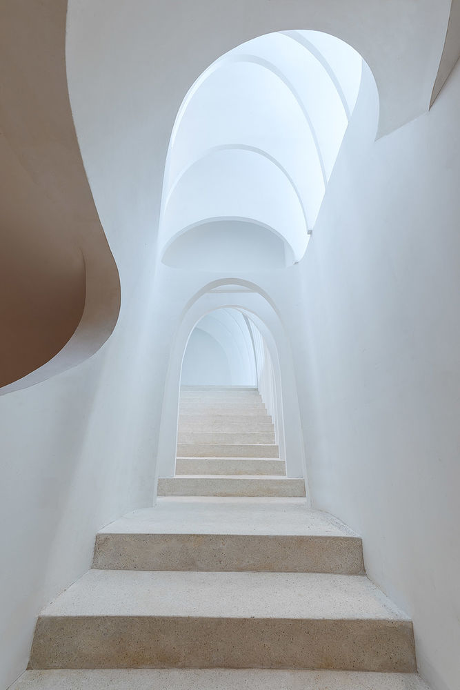
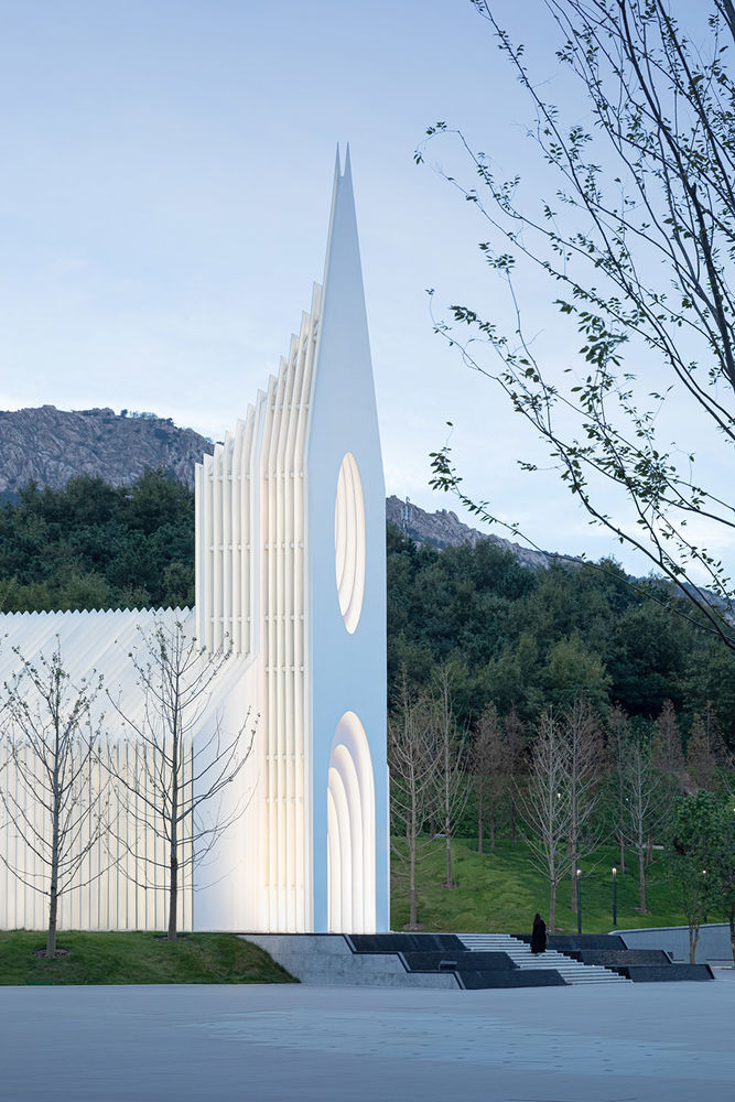
切片的形式所形成的内外轮廓的交叠使建筑在夜间泛出柔和的光线与简洁的外轮廓刚柔相济,同时让即使路过的行人也能感受到圣堂所散发出的神圣光芒。
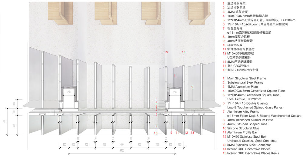
但其形式是用一种独特的方式形成的:一系列的铝板(外)/ GRG(内)切片纵向排列,每个切片为5公分厚,每个切片间的缝隙为40公分。所有这些切片组成的形成整个墙壁,屋顶以及塔楼。这些切片形成体量的内部是另外一种形式的切割形成一种更加自由形态的空间。
The remaining blades after the substraction of the inner and outer contours allow the building to be softly lit at night, and offering passers-by to feel the sacred light emanating from within.
The form is constituted in a unique way: a series of aluminum (outside) and GRG (inside) slices arranged vertically, each 5 cm thick, with a gap of 40 cm between each slice.
All these slices are combined to form the entire wall, roof and tower.
▼细部结构平面,Plan Details © BUZZ庄子玉工作室
▼弧顶架细节,Detailed view of the frame © 融创阿朵小镇

层叠的白色切片在柔化室内光线的同时,也包裹了建筑的主体框架和构造系统,使整个月空礼堂呈现出一种简明而抽象的氛围,它既是属于当代的审美倾向,又是对传统教堂形态的呼应,是传统与当代一种融合。
The cascading white slices soften the interior light while wrapping the main frame and construction system of the building, giving the entire assembly a concise and austere atmosphere, which is both a contemporary aesthetic tendency and an echo of tradition – a fusion of heritage and contemporaneity.
▼室内细节,Interior details © 苏圣亮
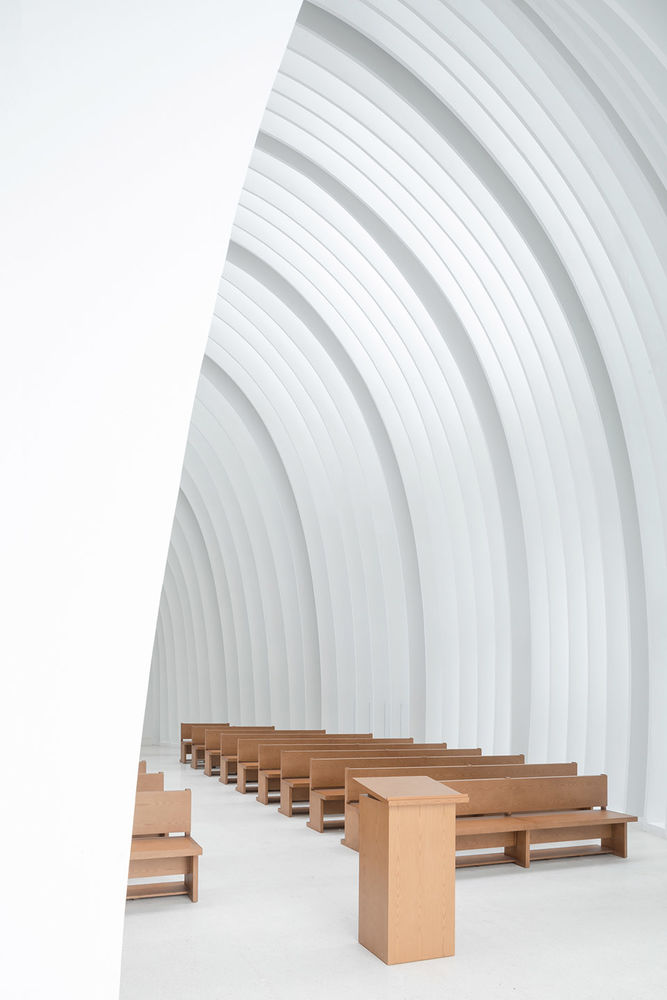
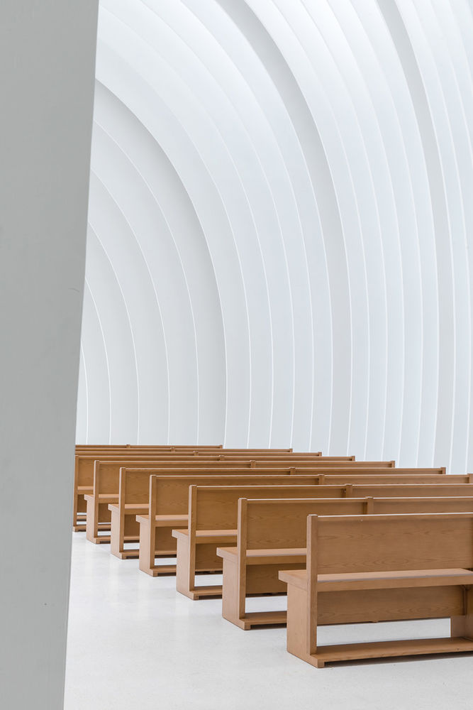
建筑表皮的分层结构有两个效果:首先教堂呈现的外部效果会根据观察者的角度变化而呈现出不同的效果。从侧面观察时一个闭合的墙面,但是从垂直方向(例如内部的人从内看外部的天空),整个建筑的立面的一个开敞的,视线可以透过这些缝隙。 其次外部肃穆的造型和内部流畅的空间是的效果不停的产生变化,从而形成一种变化的表皮。
In this setting, the observer defines his experience: The look forward to the congregation closes the slices and emphasises the void of the cavern and the unity of the people gathered. The look towards the skies is unobstructed at every place in the hall and connects the individual to nature and heavens, resulting in an archaic form of modernity.
▼变化的表皮,The surface changes in appearance © 苏圣亮
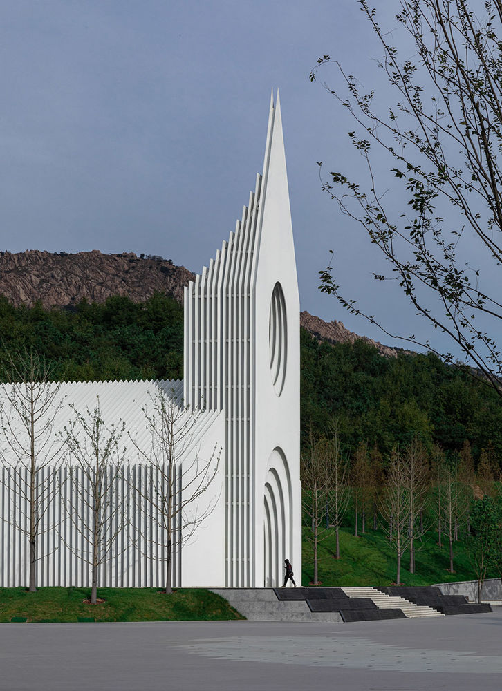
▼夜景,Night view © 苏圣亮
04. 结构与秩序
结构作为一个隐性元素贯彻着建筑空间布局的始终。从西方传统教堂的穹顶、飞扶壁,到中式殿堂的大型斗拱、飞檐;仪式空间的塑造,始终伴随着空间对于结构的表达。
同样作为仪式性空间,在月空礼堂的设计中,我们认为形式到包括结构的内在逻辑都应是简洁纯粹且贯穿始终的,基于此,礼堂的结构设计分别从几个方面进行了尝试:
1. 除钟楼外的建筑主体空间采用了系列门式钢架的结构形式,这一方面是与白色建筑切片的对应,使切片从建构逻辑上真正成为婚礼堂的形式语言与空间构造的主体。同时也从结构层面对传统教堂原型进行了回应。
Structure as an underlying element is always implemented in the layout of architectural space. From the dome and flying buttresses of traditional Western churches to the large gables and flying eaves of Chinese halls; the shaping of ritual space is always accompanied by the expression of the structure of the space. As a ceremonial space, we believe that the internal logic from form to construction should be simple and pure throughout the design of the Chamber Church.
1. The main space of the building, except for the bell tower, adopts the structural form of a series of portal steel frames, which are positioned in correspondence with the white architectural slices, making them slices truly the subject of the formal language and spatial structure of the main hall. At the same time, it also responds to the traditional church prototype from a structural point of view.
▼模型,Model © BUZZ庄子玉工作室
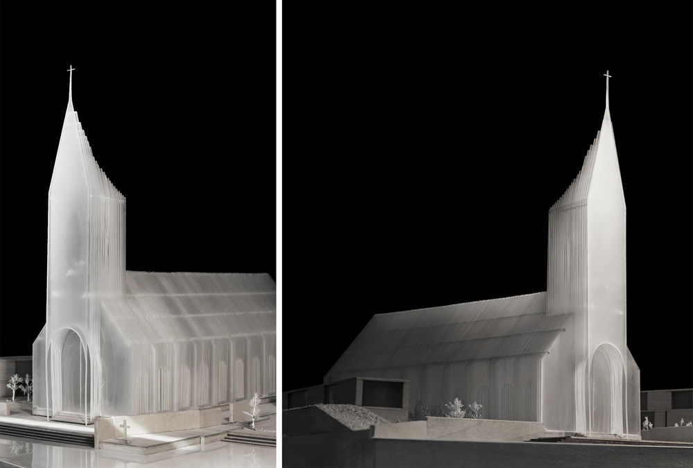

2. 门式钢架由11组主框架,和每组主框架之间的10×6组副框架共同构成。主框架定义了婚礼堂的横向外轮廓,副框架则在龙骨的协助下定义了婚礼堂内部的“洞穴”空间的内部轮廓。两重轮廓也形成了建筑外刚内柔的基本关系。
2. The portal steel frames consist of 11 sets of main frames, and 10×6 sets of sub-frames between each set of main frames.
The main frames define the horizontal outer contours of the church, while the sub-frames, assisted by the girders, define the cavernous spatial contours of the interior of the hall.
The two contours also form the basic relationship between the external rigidity of the building and the internal softness.
▼门式钢架,Portal-shaped frame © BUZZ庄子玉工作室

▼玻璃纤维增强石膏,GRG © BUZZ庄子玉工作室
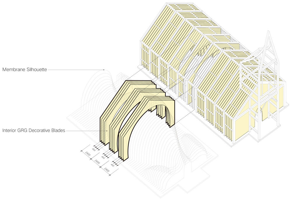
3. 系列门式钢架之间的联系同样由两种级别的结构杆件实现:主梁贯穿并拉结所有钢架,同时明确地勾勒出婚礼堂的纵向外轮廓。副梁与主梁不同,其在设计中被有意错动了。一方面是在没有增加杆件的情况下,减少了杆件之间的间距,使得整个建筑形成了一个类箱体的结构。结构的表达在纵向上被异化与消解,而横向门架在纵向上形成的空间递进感得以加强。另一方面,副梁同时成为了外立面构造的龙骨,实现了表皮与结构的融合。
3. The connection between the series of portal steel frames is achieved by two levels of structural bars: the main beam runs through and ties all the steel frames together, while clearly outlining the longitudinal outer contours of the church.
The secondary beams differ from the main beams in that they have been deliberately misaligned in the design. On the one hand, the spacing between the bars is reduced without increasing them, making the whole building form a box-like structure. The expression of the structure is alienated and dissolved in the longitudinal direction, while the spatial progression formed by the horizontal portal frame in the longitudinal direction is enhanced.
On the other hand, the secondary beams become the backbone of the façade structure at the same time, achieving the integration of skin and structure.
▼整体鸟瞰,Aerial overall view © 苏圣亮

05. 场所、内容与连续剖面
作为在各个项目中贯彻始终的设计理念,我们始终认为,建筑是空间的运营、内容的载体。空间原型相对于内容的发生,具有与场地之间时间上的恒性关系,与过去产生关联,又与当下密不可分。对于空间的解读,使用者是主体,内容使空间变得丰富和多元化。
设计试图跳出对空间符号化的功能定义,以抽象的元素理念,塑造一个使人放松下来的精神场景,而后以使用行为,赋予空间更为丰富的场所内容。
As a design principal that we carry with us in each project, we believe that architecture is a carrier of space and of content. The prototype of space is relative to the content, and has a constant relationship with the site in time, linked to the past, and is inseparable from the present.
For the interpretation of space, the user is the main body, and the content makes the space rich and diversified. The design attempts to go beyond the symbolic functional definition of space, to shape a place of relaxation with the abstract idea of elements, and then to give the space a richer content of location through the users’ behaviors.
▼建筑与场所,The architecture and the place © 苏圣亮
礼堂的60个各自独立又连续渐变的“切片”,可以被视为60个独立的剖面;与传统平面叙述功能的理念相左,BUZZ在实践中一直在探索剖面的特质性与其对应功能与运营可能性之间的关联。
从铜陵山居,到雀巢感咖啡,到林盘行馆以及成都花间堂,连续渐变的剖面所产生的空间流动性以及空间内容的对应性和可置换性,都在这一系列的剖面设计和迭代图谱中有所尝试。
In contrast to the traditional concept of floor function, the 60 separate and gradual slices can be regarded as 60 independent sections. BUZZ has been exploring the relationship between the characteristics of sections, corresponding functions, and operational possibilities in practice for years.
From Tongling Recluse, to Sense Café Beijing, to The Cropland Loop Resort and Chengdu VUE Hotel, the spatial fluidity generated by the continuous gradual change of profiles has been experimented on.
▼月空礼堂,施工图剖面与功能对应性描述,Constrution sections © BUZZ庄子玉工作室
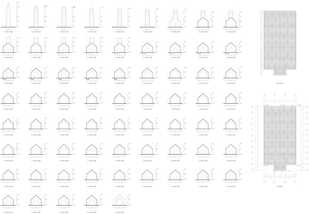
这一系列剖面的变化,也使得月空礼堂从外部的传统与坚硬,向内因渐变腔体,变得柔软而感性;转化为一个可以承载多种内容的空间,之于场地和场地使用者,在长期的运营和使用过程中,衍生出更多的使用方式与更丰富的场景意义。
The variation of sections makes the outside of the Chamber Church traditional and hard; while the inside, due to gradual cavity, becomes emotional and soft. It transforms into a space that can carry a series of contents, deriving more ways of usages and richer meanings for the site and its users in the long-term operation and using process.
▼月空礼堂,The Chamber Church © 苏圣亮
▼绘画:新月,Painting: The New Moon © 韩锐

▼地上空间,Space on the ground © BUZZ庄子玉工作室
▼地下空间,Space underground © BUZZ庄子玉工作室

▼总平面图,Site Plan © BUZZ庄子玉工作室
▼首层平面图,Ground Floor Plan © BUZZ庄子玉工作室

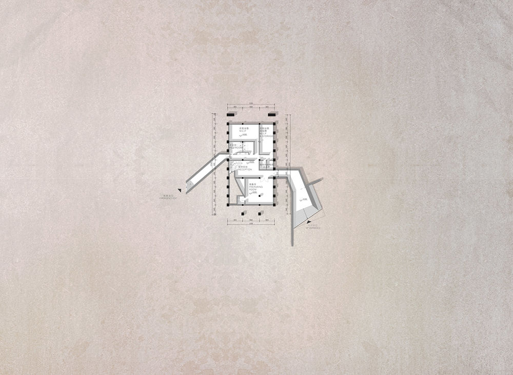
▼地下层平面,Basement Floor Plan © BUZZ庄子玉工作室
▼南立面图,South Elevation © BUZZ庄子玉工作室

▼剖面图1,Section 1 © BUZZ庄子玉工作室
▼剖面图2,Section 2 © BUZZ庄子玉工作室
▼剖面图3,Section 3 © BUZZ庄子玉工作室

▼立面结构细部,Elevation Details © BUZZ庄子玉工作室

项目地点:中国青岛; 建筑面积:770.91平方米; 设计时间:2019 建成时间:2021.9.24 业主单位:融创中国控股有限公司; 建筑及室内设计团队:BUZZ庄子玉工作室; 项目主创:庄子玉,喻凡石,Fabian Wieser,李娜; 设计团队:星梦钊,宋佳琳,刘盈(实习),刘毅,陈东东,董威宏,陈玉冰,陈阵东,田迪,宋若祎,周楠(实习),孟令蔚(实习); 建筑施工图团队:青岛腾远设计事务所有限公司; 建筑施工单位:青岛九安建设集团有限公司; 精装施工图:苏州金螳螂建筑装饰股份有限公司; 精装施工单位:工程北京港华国际建筑装饰工程有限公司; 景观设计单位:澳派景观设计(深圳)有限公司上海分公司; 景观施工单位:广州市雅玥园林工程有限公司; 结构顾问:荷捷建筑顾问(北京)有限公司; 照明顾问:Puri Lighting Design-北京光湖普瑞照明设计(胡芳、李亚辉); 幕墙顾问:弗思特建筑科技有限公司; 钢结构及幕墙施工单位:沈阳黎东幕墙装饰有限公司; 摄影:是然建筑摄影-苏圣亮、融创阿朵小镇
Location: Qingdao, China Floor Area: 770.91㎡ Year: 2019 Completion: 2021.9.24 Client: Sunac China Holdings Limited Architectural and Interior Design: BUZZ/Büro Ziyu Zhuang Principal Designer: Ziyu Zhuang, Fanshi Yu, Fabian Wieser, Na Li Design Team: Mengzhao Xing, Jialin Song, Yingliu (Intern), Yi Liu, Dongdong Chen, Weihong Dong, Yubing Chen, Zhendong Chen, Di Tian, Ruoyi Song, Nan Zhou (Intern), Lingwei Meng (Intern) Construction Drawings: Qingdao Tengyuan Design Institute Co., Ltd. Construction: Qingdao Jiuan Construction Groups Interior Construction Drawings: Gold Mantis Construction Decoration Interior Construction: Ganghua International Landscape Design: ASPECT Studios Landscape Construction: Guangzhou Yayue Landscape Construction Co., Ltd Structure Consultant: Hejie Architectural Consultant Lighting Consultant: Puri Lighting Desgin (Fang Hu, Yanhui Li) Curtain Wall Consultant: Forcitis Steel Structure and Curtain Wall Construction: Photography: Schran-Shengliang Su, Sunac Aduo Town


